Do you want to learn how to boost your conversion rate using popup content? If so, you're in the right place!
Business owners across all industries, myself included, have figured out that popups are an excellent way to engage with your audience and turn first-time visitors into subscribers and subscribers into customers.
The thing is, not all popups are created equal. If you want to get the most value from these tools, think carefully about when, why, and what type of popup you'll use to connect with your audience.
Article Shortcuts:
- What All Successful Popup Content Has in Common
- Should I Track My Popup Content Performance?
- Common Mistakes and How to Avoid Them
My goal today is to show you the most effective types of popups, what good popups have in common, common roadblocks, and more so you can make smart choices when designing popups for your brand.
By the end, you'll have a comprehensive understanding of how to leverage popups to maximize conversions without compromising user satisfaction.
Let's begin!
4 Most Effective Types of Popup Content
Before we get into strategies and roadblocks, let's talk about the four most common types of popups, what they are best for, and how you can use them to connect with your audience and boost conversions.
- Click-Triggered Popups
- They are activated when a user clicks on a specific button or link.
- This type is best for providing additional information, showcasing related products, upselling, or presenting opt-in offers.
- I suggest placing triggers within your content or navigation to enhance user experience. For example, if someone clicks your newsletter page, a popup suggesting they join can help you grow your email list.
- Exit-Intent Popups
- These appear when a user takes steps to leave your website.
- Exit-intent popups are super effective. If used correctly, they can help you connect with around 53% of visitors before they leave.
- They are best used for last-minute offers, newsletter sign-ups, or requesting feedback.
- In this case, you'll set the popup to appear when the user's mouse moves toward the browser's close button or address bar.
- Time-Based Popups
- As the name implies, time-based popups appear after a visitor has spent a specific amount of time on your site.
- These popups are great for engaging with visitors who have shown interest by spending time on your page.
- Normally, these popups appear after 30-60 seconds on blogs and landing pages. However, the time can be longer for content-heavy sites.
- Scroll-Based Popups
- Finally, scroll-based popups trigger when a user scrolls to a certain point on your page.
- We've found that these are great for offering content upgrades or related products/services via landing or product pages.
- For the best results, set this popup to appear when a user has scrolled 50-70% of the page because this indicates that they are actively engaging with your content.

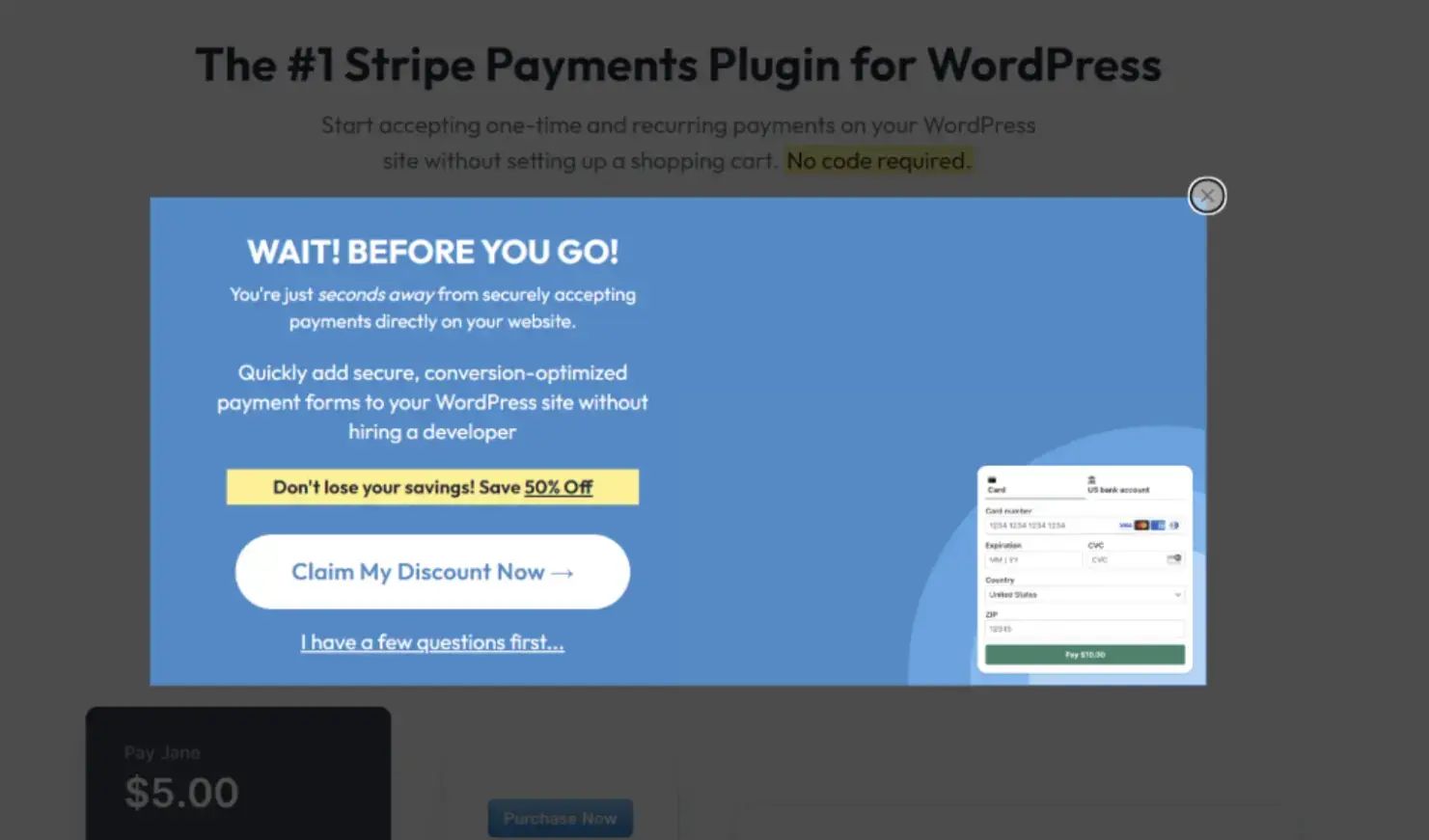
Source: WPSimplePay
What All Successful Popup Content Has in Common
Now that you know a little more about the different types of popups and when they're useful, let's discuss how to make one that converts. In my experience, all high-quality popups seem to have the same elements in common.
I want to explain each factor in more detail so that you can better understand why they matter and how they can skyrocket sales and engagement.
-
Clear Messaging and Strong CTAs
First, successful popups rely on concise, easily digestible messages that quickly capture the user's attention. This makes perfect sense since your goal is to get visitors to understand your offer and take action.
With this in mind, it's very important to use action-oriented language to drive readers and craft strong Call-to-Actions (CTAs) that clearly communicate the desired action.
For example, coupon popups should use phrases like "Claim Your 20% Off Now!" instead of vague statements like "Get Your Discount."
When people understand what you're trying to say, they are far more likely to take the next step.
-
Offering Value to the User
Understanding your message isn't enough. Your audience needs to see why your offer matters to them.
It doesn't matter how good your discounts are; if the person doesn't understand how your product will add value to their lives, they will probably not buy.
So, when crafting your popup content, focus on what's in it for the visitor.
Highlight the benefits of taking action, not just the features of your offer. You could consider providing exclusive content, discounts, or early access to new products to make your popup more enticing.
Try to be as specific as possible with your offer. We found that when popups that say "exclusive discount" as opposed to an actual percentage (like 40%), they do not perform anywhere close.
Showing an actual percentage will win every time because people instantly understand the value, which means they are more likely to click.
-
Visual Design Best Practices
The way a popup looks will have a big impact on how people engage with it. I suggest aligning your brand aesthetics and using contrasting colors to make your CTA button stand out.
This step will make your popup instantly more visually appealing. But there are other things you can do to make it even more eye-catching.
You'll want to incorporate high-quality, relevant images or videos to add value and make your offer more interesting.
For instance, if you're offering a discount on a specific product, showing a picture of it with the slashed price or a video of it in action makes it more likely that the reader will click through.
I suggest choosing a popup builder with clean, professional, customizable templates so you can make the perfect popup for your site. Of course, you'll also need a reliable hosting company, like WPEngine, to ensure your site consistently loads quickly.

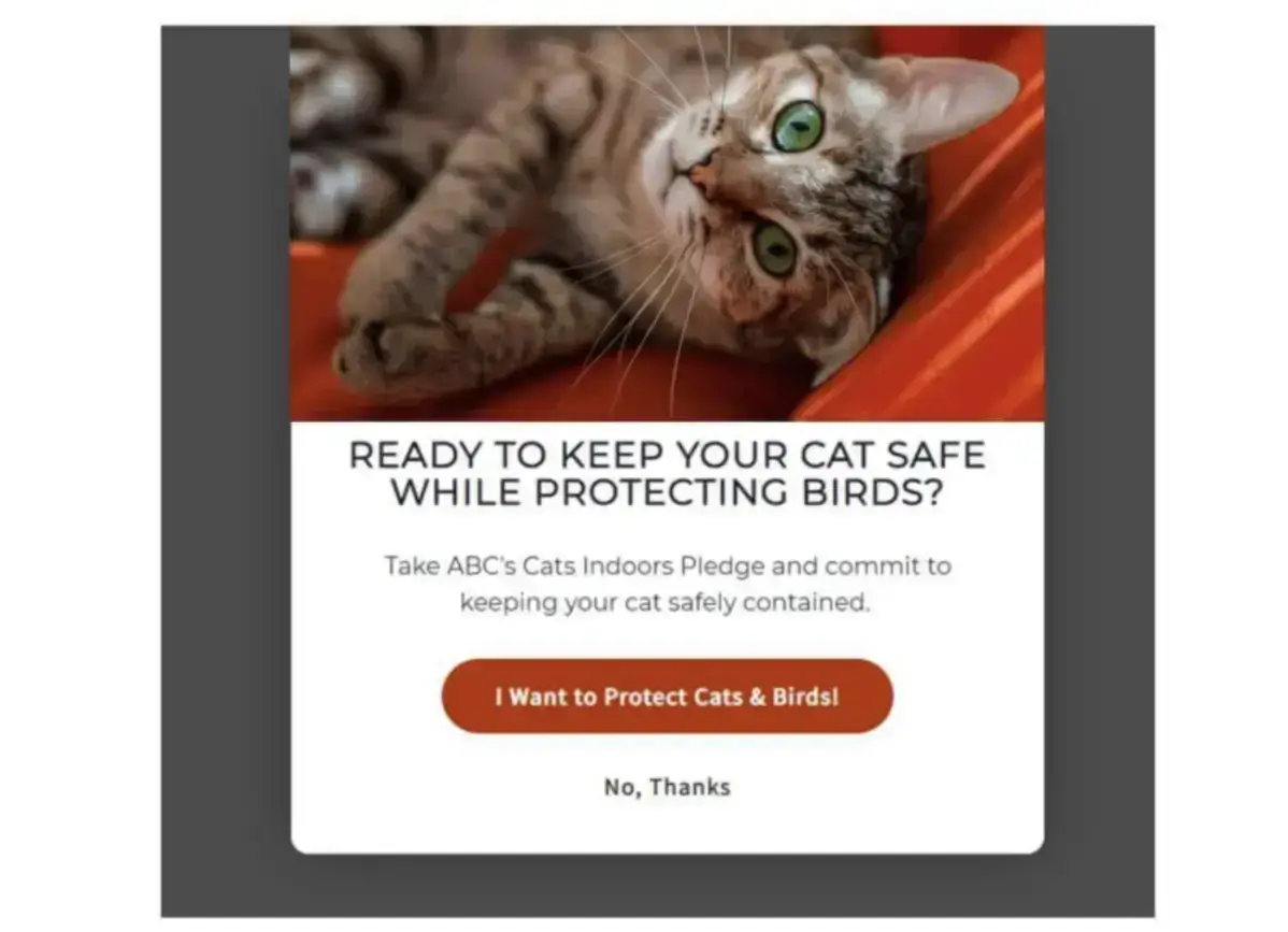
Source: American Bird Conservatory
-
Personalization
Personalization in marketing is more important now than ever before.
The average person is far more likely to engage with a brand that understands their interests and goals. When you consider all the choices out there, this shouldn’t come as a surprise.
Since this is likely one of the first times you're reaching out to your audience, you'll need to use context clues to personalize your popups, such as the current page they're on or what products they've added to their cart. We will touch on this a little more in the next section.
And if you're reaching out to existing customers, you have even more options.
Use their order history, profile information, frequently visited blog posts, and other factors to create personalized and actionable popups.
-
-
Timing and Context
-
Now, let's talk about why timing and context can play a major factor in the effectiveness of your popups.
Context ties back to value and personalization. If you understand what your audience needs while presenting a solution, the next step is to get it in front of them at the right time and place.
We do this by creating popups for our audience segments and triggering them on blog posts with specific tags. In this instance, we have an eBook on email marketing and set our offer up to trigger when someone gets halfway through any post with the 'email' tag.
These people are most likely to want our book, so it makes sense that we would do what we can to reach them at the perfect time.
My advice is to think carefully about the average user journey on your site. Figure where certain segments spend their time and what they want, and you'll have a better chance of creating a conversion-worthy popup.
-
Testing and Optimization
All people who make successful popups know that continuous improvement is key to great performance.
What might work well one month will stop after a month or two. If you're not regularly testing and optimizing, you can miss out on these clues, which means fewer opportunities to connect with your customers.
You'll want to get a popup creator that allows you to run A/B testing. A/B testing is when you tweak designs, copy, and offer slightly to try and get the best results.
For example, you could change a 20% discount to 25% to see how that change impacts sales.
Analyzing the results at least once a week is a good idea to understand what resonates best with your audience. Each test should run for at least two weeks so you can get accurate, reliable data.
Then, you'll want to refine your popups based on what you learn. If you always strive to improve based on new information, you'll have an easier time driving engagement and boosting conversion rates through your popups.

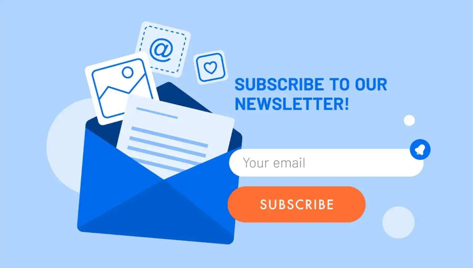
Source: Adobe Stock
Should I Track My Popup Content Performance?
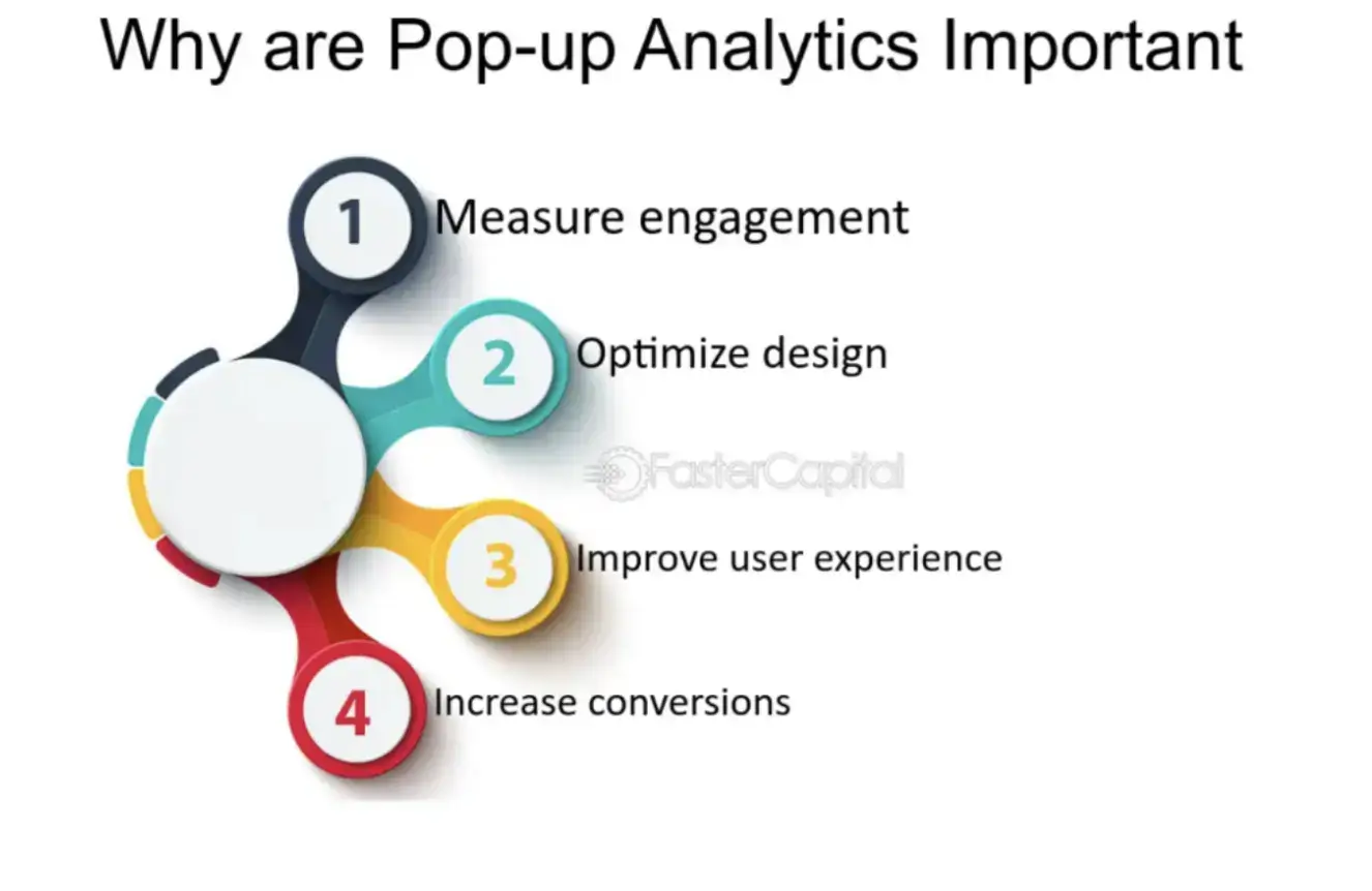
Absolutely! Measuring and optimizing your popups is crucial for boosting clicks and engagement.
Without tracking your results, you won't have enough information to innovate and create the best user experience possible for your audience.
With this in mind, let's take a quick look at key metrics you're going to want to track and what they mean:
- Popup Views - This factor represents how often your popup is displayed to visitors. It's important because you'll want to know how many people saw your popup before determining the weight of these other factors.
- Conversion Rate - This number shows how many visitors took the desired action (e.g., joining your newsletter, buying a product, registering for a webinar) after seeing your popup.
- Click-Through Rate (CTR) - The number of visitors who clicked on your call to action. The average rate varies across industries and types.
- Bounce Rate - Bounce rate determines if a user quickly leaves after landing. A high bounce rate on a page with a new popup could be a sign it's not a good fit.
- Time on Site - Much like your bounce rate, time on site will help you decide if popups affect how long visitors stay on your pages, for better or worse.
- Close Rate - This percentage shows how visitors closed your popup without engaging. Sharp increases or decreases can help you determine the quality of your popups.

Source: FasterCapital
Common Mistakes and How to Avoid Them
We are only human, and it's easy to make mistakes, especially if you're new to popups. I wanted to close out this article by discussing some common pitfalls and what you can do to avoid them on your journey.
-
Overly Aggressive Tactics
If you bombard your visitors with popups from the moment they land on your site, you will push them away. There's no easy way to say it. Luckily, it's pretty easy to avoid this situation.
My advice is to avoid using too many popups by using and triggering them too early.
Instead, you should allow users time to engage with your content and get comfortable before presenting a popup. A well-timed, relevant popup is far more effective and less intrusive.
-
Ignoring User Experience
Popups should enhance, not hinder, the user experience. Ensure your popups are easy to close and don't cover essential content. This will allow visitors who are not interested to get back to what they were doing.
Poorly designed popups that disrupt the browsing experience can lead to higher bounce rates and annoyed customers. With that in mind, always test your popups to ensure they're user-friendly and mobile-responsive.
-
Legal and Ethical Considerations
I can't stress the importance of being mindful of legal requirements and ethical standards when creating popups.
For example, GDPR requires explicit consent from users before collecting personal data. Make sure your popups comply with all relevant regulations to avoid unnecessary problems.
You should also respect user privacy and maintain transparency because it builds trust and can improve overall engagement.
-
Forgetting to A/B Testing
One of the biggest mistakes is not testing your popups. Testing makes it easy to compare two or more versions of the same popup and see what works best. We talked about this strategy a little bit earlier.
But it's worth mentioning again here because this is the mistake I see more than any other.
Even your best campaign will lose traction. If you're not A/B testing, staying on top of your audience's wants and needs will be hard, which typically translates to fewer conversions. Regularly test and optimize your popups based on performance data to continually improve their effectiveness.
-
Failing to Segment Audiences
Not all visitors are the same, which is why personalization is essential.
However, you need to segment your audience to get to that point. This means encouraging people to tell you a bit about their goals and interests.
Sometimes, this takes place on an attached popup form. For example, a pet supply company trying to get users to join their email list might ask, "What type of pets do you own?" on its popup.
They can take this information and create curated experiences for their new subscribers, likely leading to sales.
Final Thoughts
Implementing popup content that boosts conversions is both an art and a science.
By understanding the various types of popups, following best practices, and analyzing your results, you can create popups that engage your audience and drive sales.
My last piece of advice is to remember to always prioritize user experience, personalize your approach, and continuously test and optimize your strategies.
These techniques will help you grow and evolve alongside your audience and, ultimately, find success.
Author Bio
Syed Balkhi is the founder of WPBeginner, the largest free WordPress resource site. With over 10 years of experience, he’s the leading WordPress expert in the industry. You can learn more about Syed and his portfolio of companies by following him on his social media networks.


