Email newsletters are still one of the most powerful tools in digital marketing. In fact, email generates $42 for every dollar spent, making it one of the highest ROI channels out there.
However, none of that matters if people don’t sign up, and over 80% of visitors who start filling out a form end up abandoning it. So, you can craft the perfect email, but if your newsletter signup form doesn’t pull in subscribers, your message won’t reach anyone.
The reality is that a lot of marketers underestimate the potential of their signup forms. It’s often seen as a quick afterthought – a simple box slapped on the homepage or buried in the footer.
Yet, optimizing your newsletter signup form can be the key to transforming casual site visitors into loyal subscribers who actually convert.
Article Shortcuts:
- Tactic #1: Anchor Your Signup Form to Your Value Proposition
- Tactic #2: Capture Attention with Exit-Intent Pop-Ups
- Tactic #3: Boost Signups by Offering an Incentive
- Tactic #4: Promise (and Deliver) Real Value
- Tactic #5: Keep the Design of Your Signup Form Minimal
- Tactic #6: Craft a CTA that Clicks
- FAQs
Source: Freepik
This article is going to walk you through six proven strategies to do just that.
We’ll accompany each one with real newsletter signup examples that have worked wonders for us and our clients. From irresistible incentives to smart design tricks, we’ll cover it all.
Let’s get into it!
Tactic #1: Anchor Your Signup Form to Your Value Proposition
Your visitors are most engaged when they’re interacting with your main value proposition – the core reason they’re on your site in the first place.
That’s why placing your newsletter signup form near this key messaging can be incredibly effective. It catches attention when visitors are already interested in what you offer, making them more likely to sign up.
Here’s how to nail it:
- Position the signup form near content that highlights your brand’s core value. For example, if you run a blog, place the form near a popular post or a product page that explains your unique offering.
- The closer your form is to high-interest content, the more relevant it becomes.
- Don’t forget the copy. Make sure your signup form’s message aligns directly with what your visitors care about.
- Avoid generic language like “Subscribe to our newsletter.” Instead, tie it to your value proposition. For instance, “Get exclusive tips on [topic] directly to your inbox” feels more personalized and appealing.
A great example of this method is Investing.io, a thriving community focused on investing, startups, and small business deals.
They position their newsletter signup form directly beneath their main value proposition. So when visitors are thinking, “Yeah, I’d love to be part of this investing community,” there’s the form, ready and waiting.
It’s a smooth move that catches people at their peak interest, turning that initial excitement into subscriptions.

Source: investing.io
This strategic placement has helped Investing.io capture more subscribers by meeting their audience’s needs at exactly the right moment.
Tactic #2: Capture Attention with Exit-Intent Pop-Ups
Exit-intent pop-ups give you one last chance to re-engage visitors who are about to leave your site. These pop-ups appear when someone’s cursor moves toward the top of the screen, signaling their intent to exit.
By presenting a well-timed message, you can capture potential subscribers who might otherwise be lost.
Here’s how to make this tactic work:
- Design an exit-intent pop-up that’s both unobtrusive and eye-catching.
- Keep the design clean, and avoid cluttering it with too much information.
- Timing is essential here – only trigger the pop-up when the visitor shows signs of leaving. That way, it won’t interrupt their browsing experience.
- The message should be clear and to the point, offering something of value like a free guide, discount, or exclusive content that encourages them to subscribe.
- Remember, your pop-up has to feel relevant. A well-crafted headline and call-to-action can make all the difference.
- Instead of a generic copy, try something like, “Don’t Miss Out – Get the Latest Deals and Tips Straight to Your Inbox.”
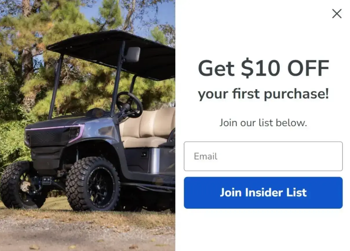
One of the best newsletter signup examples of exit-intent pop-ups comes from Golf Cart Tire Supply, a leading supplier of golf cart tires and accessories.
They’ve implemented a pop-up that appears just as visitors are about to leave, offering a special deal in exchange for signing up. It’s relevant, it’s enticing, and it’s perfectly timed, allowing the brand to experience a solid bump in conversions.
Source: golfcarttiresupply.com
By catching visitors at that critical moment, they’ve successfully captured more email signups, ensuring potential customers don’t slip away.
Tactic #3: Boost Signups by Offering an Incentive
Who doesn’t love a good freebie or discount? Offering such incentives is one of the easiest ways to lower the barrier for potential subscribers.
By giving visitors something of value upfront, like a percentage off their first purchase or exclusive content, you turn signing up into a no-brainer decision.
Here’s how to do this effectively:
- Make sure the incentive is enticing yet realistic.
- Your offer should align with what your brand sells. For example, an ecommerce store might offer 10% off the first order, while a content-driven site could offer a free ebook or guide.
- The key is to provide something that feels valuable but still makes sense for your business.
- Highlight the incentive clearly in the signup form. Don’t bury it in small text or make the visitor hunt for the benefit.
- Instead, use compelling, straightforward language like, “Get 15% Off Your First Purchase When You Subscribe.”
- Make sure the incentive stands out visually, too, so it’s hard to miss.
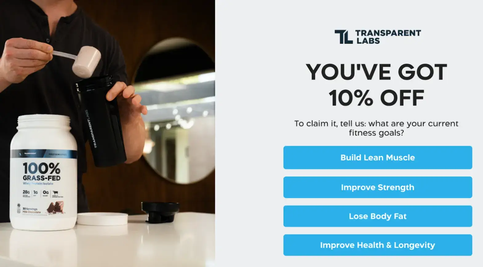
There are many newsletter signup examples of this tactic, but we picked Transparent Labs, an online store specializing in supplements, as the best one.
On their ProteinSeries collections page, they offer new visitors a discount on their first purchase in exchange for taking a very short one-question quiz and signing up for their newsletter. By making this offer prominent on their signup form, they provide an immediate, tangible reason for visitors to subscribe.
Source: transparentlabs.com
Tactic #4: Promise (and Deliver) Real Value
Visitors are much more likely to subscribe if they see real, ongoing value in doing so.
While a one-time discount can work, long-term engagement comes from offering something that lasts – whether that’s exclusive content, insider tips, or special deals over time.
Here’s how to get this right:
- Clearly outline the specific benefits of subscribing directly on your signup form.
- Make it obvious what subscribers will gain beyond just the initial offer. For example, mention perks like “exclusive content,” “early access to sales,” or “insider news,” depending on your niche.
- Use bullet points or brief descriptions to break down the value in a way that’s easy to digest. This helps visitors immediately understand what they’ll miss out on if they don’t subscribe.
- The value proposition should be front and center, leaving no room for confusion.
- Avoid vague promises – tell subscribers exactly what they’re signing up for and why it’s worth their time.
- Delivering this value consistently. Make sure your newsletter lives up to the hype.
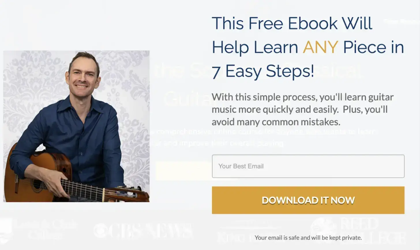
Classical Guitar Shed, an online guitar training site, shows how it’s done.
Their signup form highlights a free E-book they offer, along with the ability to learn any piece in just 7 steps.
Source: classicalguitarshed.com
By clearly listing the perks of signing up, Classical Guitar Shed makes the value proposition clear and compelling. This approach can help you attract more loyal, long-term subscribers.
Tactic #5: Keep the Design of Your Signup Form Minimal
A clean, uncluttered signup form can drastically reduce friction and make the signup process faster and more appealing.
When visitors encounter a simple, straightforward form, they’re less likely to hesitate, leading to more conversions.
Here’s how to nail this minimalist approach:
- Focus on the essentials. Minimize the number of fields to just what you need – typically, an email address and maybe a first name.
- Avoid overwhelming visitors with too many requests for information upfront.
- Keep the design simple and distraction-free, ensuring the form is easy to find and quick to complete.
- A clear and straightforward call to action (CTA) is also key. Instead of a generic “Submit” button, use action-oriented text like “Join Now” or “Get Exclusive Updates” that reflects the benefit of signing up.
- The goal is to make it as easy and compelling as possible for someone to take the next step.
Check out Pinch, a mobile med spa company, to see why they’re one of our top newsletter signup examples.
If you look at the bottom of their Lip Flip page, for example, you can see the signup form is as minimal as it gets. It’s easy to spot, but also not in your face, and asks only for an email address.

Source: bookpinch.com
This minimalistic approach ensures that visitors aren’t overwhelmed by choices, making it quick and easy to subscribe. Pinch proves that sometimes, less really is more when it comes to driving signups.
Tactic #6: Craft a CTA that Clicks
A strong, clear call to action (CTA) is essential for guiding visitors to take the next step.
The right CTA makes it obvious what someone will get by signing up and can even create a sense of urgency or personalization that pushes them to act now.
This CTA might also be your last chance to convince them to become a dedicated subscriber.
Here’s how to craft a CTA that clicks:
- Focus on clarity and relevance. Your wording should reflect the specific value subscribers will receive.
- You should also tailor it to your audience’s needs. For example, instead of a generic “Sign Up,” try something more direct like “Get Weekly Tips” or “Access Exclusive Deals.” The more personalized and clear the CTA, the better.
- Alternatively, you can try and create a sense of urgency. “Join 10,000 happy subscribers today” or “Yes, I want to save money” can be very effective.
- Experiment with testing different CTAs to find which ones resonate best with your target audience. Small tweaks in wording can often lead to big differences in results.
FAQs
1. What is the best place to put a newsletter signup form on my website?
The best spot for your signup form is near your value proposition or where visitors are most engaged.
For example, place it near popular content, product pages, or at the top of your homepage. Test different placements to see which drives the most signups.
2. Should I use an incentive to encourage newsletter signups?
Yes, offering an incentive like a discount, free guide, or exclusive content can significantly boost signups. Just make sure the incentive aligns with your brand and is clearly highlighted on your form.
3. Are exit-intent pop-ups effective for newsletter signups?
Yes, exit-intent pop-ups can capture potential subscribers just as they’re about to leave your site. To avoid annoying visitors, make sure the pop-up is well-designed, unobtrusive, and offers something valuable.
4. How many fields should my newsletter signup form have?
Keep it minimal. The fewer fields, the better. Typically, asking for just an email address is enough. Every additional field can create friction and reduce signups.
5. What are some effective newsletter signup examples I can learn from?
Our newsletter signup examples often feature a clean design, minimal fields, and a clear CTA.
Brands like Transparent Labs offer discounts to new subscribers, while Pinch uses a minimalistic approach with just an email field and a straightforward CTA.
Studying these examples can help you design a form that boosts conversions.
6. What should I include in my signup form to promise real value?
Clearly outline what subscribers will gain by joining – exclusive deals, insider tips, valuable content, or early access to sales. Use bullet points or short descriptions to make these benefits immediately clear.
7. How can I reduce form abandonment on my newsletter signup?
To reduce cart abandonment, simplify the process by using fewer fields, offering an incentive, and ensuring your form loads quickly. Use clear, concise copy and a strong CTA that communicates the benefits of signing up.
Final Thoughts
These six tactics and newsletter signup examples can be your secret weapons for turning your signup form from a wallflower into the life of the party. But remember, the real magic happens when you put these ideas into action.
Think about it: every new subscriber is a potential long-term customer, a brand advocate, or even your next big success story. So why settle for a lukewarm signup form when you could have one that sizzles?
Take your email game to the next level and give POWR’s app suit a spin. It’s packed with tools to help you optimize your signup forms and squeeze every ounce of potential from your email list.
Author Bio
Natasha Lane is a content marketer and one hell of a geek. She's been working with individual clients and companies of all sizes for more than a decade. Natasha specializes in crafting compelling content about design, branding, digital marketing, and business growth. She's happily addicted to art in all its forms and grilled tofu.


