An effective contact form design should draw users and increase website conversions. There are various ways to make a contact form design more attractive and functional. This article will guide you through cutting-edge contact form design with several salient points on best practices.
Of course, you can always consider using form builder software to help construct your contact form without complicated coding. But for now, let’s explore the best practices when coming up with contact page ideas for your website.

Source
Why Is A Good Contact Form So Important?
A contact form is an integral part of a website, whether a personal blog or a business site. It allows users to contact you as they browse through the website.
However, a contact form differs from, say, social media comments. A contact form is a private communication between you and the user, promoting customer confidence and generating sales.
Most people neglect the importance of contact forms, but properly establishing one can maximize conversions.
Making The Most Out Of Contact Forms To Boost Conversions
If you wish to create the perfect contact us form, here are some main key points and characteristics you should consider when optimizing your contact form page.
Keep The Contact Form Concise
There is no limit to the number of fields you can have in a contact form. Keep in mind that lengthy forms are inconvenient to users as they have more details to fill out.
So, concisely tailored contact forms are preferred. Incorporate fields that ease communication, such as simplifying users' inquiries.
Don’t worry if you are in a situation where a lengthier form is necessary. We’ll be sure to share tips to lower the likelihood of users deserting their forms.
Design An Engaging Contact Form Page
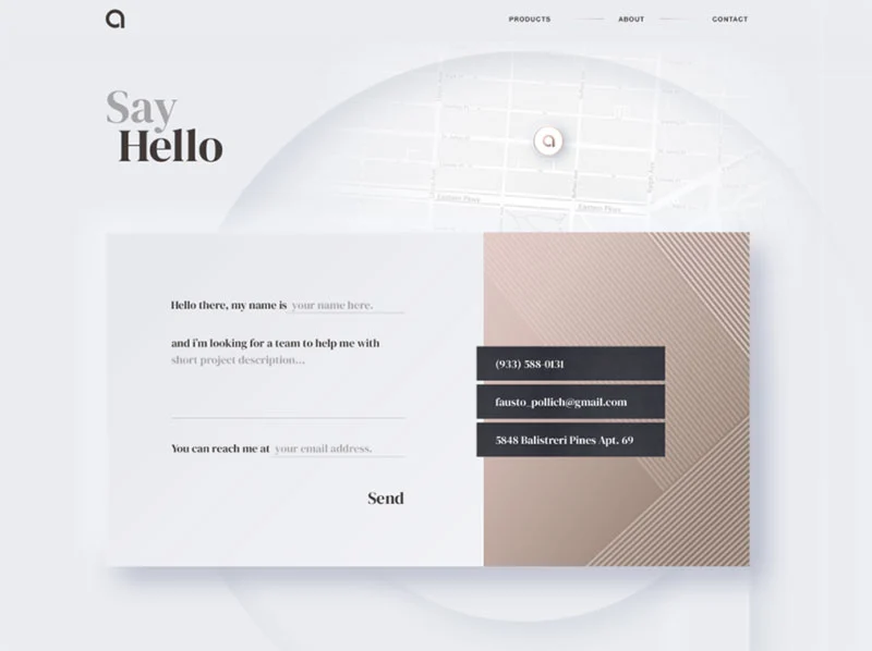
Unlike a prim, austere-looking static page, a dynamic page can land with a bigger splash. An excellent idea for positive promotion is to include photos of the main office, support team, and staff! Take this opportunity to portray the culture and values of your brand, driving customer engagement.

Source
Show Users That You Are Open To Suggestions
Greet users with a welcoming remark! Even in digital interactions, it is crucial to let users know that you can answer their questions and follow up on relevant suggestions.
Be A Flexible Communicator
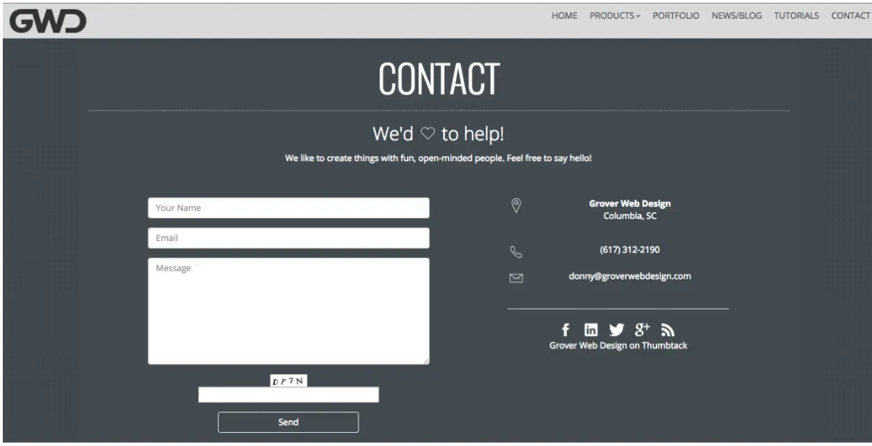
Although a contact form is the easiest way for users to contact you, indicating other means of contact displays your flexibility, which users will find favorable. Attach an email address, WhatsApp, or phone number where they can reach you, no matter their preference.
Be Accessible On Social Media
Some users may prefer to reach you on Facebook or Twitter rather than through private messages. For this reason, add social media buttons that link to company or personnel profiles and contact info.
Utilize FAQs And Links To Resources
The problems encountered by users may be similar. Be proactive, and create a Frequently Asked Questions (FAQs) section for your website where users can instantly look up the answers to common queries.
Invite Users To Join Your Email List
An email list allows users to be informed about company discounts and updates. Include an option where users can join the mailing list by sharing their email addresses on the contact form.
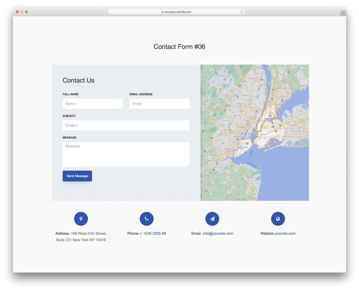
Show Your Address With A Map
An address combined with a picture of your location on a map encourages users to engage in online transactions. If you lack a physical store or office, it gives users some level of assurance that you are accessible to them anyway.

Source
Don't Let it End With The Confirmation Page
After submitting the form, users receive a confirmation message. Take advantage of the confirmation message to inject more marketing into your customer experience! It would be best if your site directs users to another page that provides discount codes or trending content.
Final Thoughts
Contact forms are more than they seem. You can make the most out of this form of client communication by including engaging content, respect for website visitors with pleasant greetings, as well as access to contact info and social media sites.

