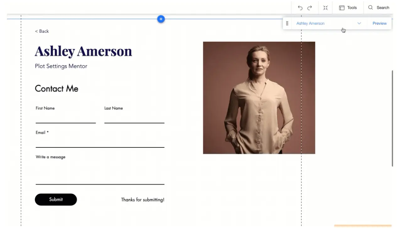
What comes to mind when you hear about excellent website design? You may think of the quality of a homepage, product pages, usability and animated effects. But have you ever considered the Contact Us form to be an essential part of your website?
If not, you should.
Contact pages rarely get the attention they deserve. Can you recall the number of contact pages you've seen that seem outdated, even when the rest of the website is current and very well-designed?
The conversion rates of a site owner can drastically drop when there is a design oversight, such as outdated information or a page that seems forgotten by the website managers. In reality, the Contact Us page is one of the top four most important, highly-visited pages. You simply cannot afford to neglect it.
Well-designed contact forms are an excellent way to build your brand. You can turn to form builders to help you efficiently design and create your Contact Us form. These can help you implement best practices when creating a Contact Us form. Click here if you are curious about how to increase your lead conversion rate.

Source
What Makes An Effective Contact Us Form?
Everyone has their preferences about what they consider to be attractive, but there are a few things to consider for your design of a Contact Us form.
For example, they must be easily accessible for all site visitors, which explains why they are usually placed on the home page. You must place the Contact Us link on your website so that it is visible to everybody.
It would be best to also include it in the footer of every page, allowing visitors to get in touch with you efficiently no matter where they are on the website. Better communication translates to a better customer experience for your visitors.
Consider a clean design when creating a Contact Us form. The way your form looks must also reflect the visual identity of your company.
There are various ways to encourage your customers to interact with you, but they expect nothing less than quality work when visiting your web page. You can use numerous techniques to catch a customer’s attention, so communication is critical. Your consistency and availability in meeting their expectations can significantly benefit your business.
When creating the best Contact Us form, provide information on why a customer should contact your company and explain how your team can help. You may include your company’s email, phone number, social media links, personal information forms, and a list of recent articles or posts about your business.
Providing a call-to-action to keep customers on your web page can also come in handy for those who do not want to fill out any forms.
Lastly, redirect visitors to a page highlighting your company’s gratitude to them and explaining how and when they can contact you.
Designing the Perfect Contact Form
Unfortunately, many businesses aren’t as successful because their contact forms don’t have a great design. Sometimes, brands neglect their contact pages.
A first step in determining page design comes from confirming where in the marketing funnel your customer may be. Once you understand that, you can decide the number of form fields you should include.
For example, you can establish as many leads as you want if your form is part of a promotion aimed at the top of the funnel where only a few form fields are needed. For this target audience, you may email them regarding a sale or any other company news.
However, if your offer is in the middle of the funnel, you may need to more thoroughly explain why the product you are selling is the best choice for your customers. Your company can show its creativity through webinars, case studies, free samples, or other creative marketing approaches.
If you place your contact form at the bottom of the funnel, also known as the purchasing stage, the prospective buyer has most likely considered all their options and can buy your product. Therefore, these contact forms tend to be longer since the company will want to provide as much convincing information as possible to close the deal.
Final Thoughts
There is no perfect formula to determine how many form fields should be included on a Contact Us form and how many are optional. A well-designed Contact Us page will build your brand quicker than you think! Follow some of the effective methods shared today to foster your company’s growth.

