

A contact form rarely gets anyone excited. It’s not the flashy homepage hero, the clever product demo, or the checkout flow everyone’s busy optimizing. It sits in the corner of the site doing its job until it quietly stops doing it well. Then the damage starts.
A customer hits a snag, has a question, wants reassurance before buying, and lands on a form that feels clunky, cold, or vaguely sketchy. That moment matters more than most teams realize.
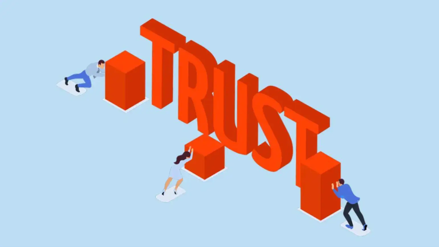
Trust doesn’t disappear in one dramatic collapse. It leaks out through small details.
A form that asks for too much, explains too little, or feels outdated can make a legitimate business look careless. That hesitation costs replies, sales, and repeat customers long before anyone notices the pattern.
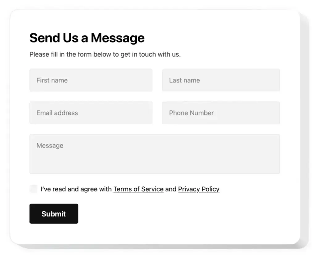
How Users Judge Your Business Through Your Contact Form
Source: eqs
Someone who reaches your contact page is usually not a casual browser anymore. They’re already interested, already hesitant, or already trying to solve a problem.
That means they’re arriving with intent, and intent makes people more sensitive to friction. They’re looking for signs that they’ll be heard, helped, and respected.
A contact form becomes a stand-in for your brand the second a customer sees it.
If it looks messy, asks strange questions, or feels like it’s going to vanish into a black hole, people start filling in the blanks themselves.
They assume support is slow, the business is disorganized, or their issue won’t matter enough to get a real response.
That’s why contact forms carry more emotional weight than teams give them credit for. Nobody says, “Wow, what an amazing form.”
But they absolutely notice when one feels off. It’s the digital equivalent of walking into a store, asking for help, and being greeted by a dusty counter and a shrug.
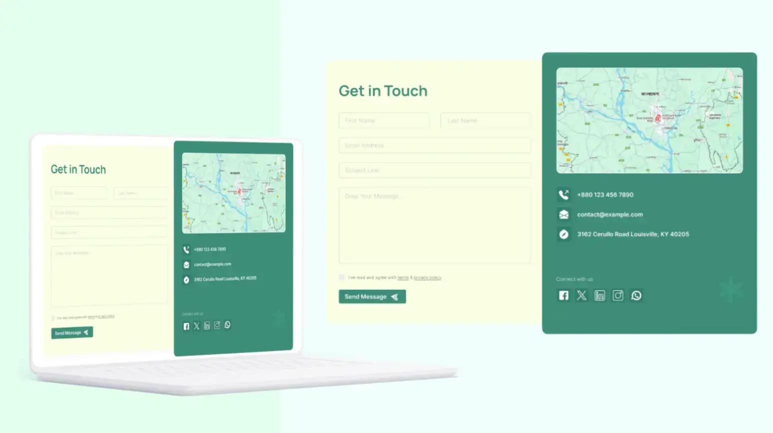
Form Friction: The Hidden Trust Killer
Every extra field in your contact form asks for a little more trust. Name, email, message, sure. Past that, the form starts entering negotiation territory.
Phone number, company name, order size, budget, website, preferred contact window, issue category, account type. Each new request makes the customer wonder why you need it and what you plan to do with it.
Source: elfsight
That uncertainty creates a subtle defensive reaction. People stop thinking about the help they need and start thinking about what they’re giving away.
The form stops feeling like a support channel and starts feeling like lead capture in disguise. Once that switch flips, goodwill drops fast.
It gets worse when the form gives nothing back. No clarity on response time, no properly annotated data or anything helpful, and worst of all, no explanation of why certain details matter.
When customers feel interrogated before they’ve even been acknowledged, the form starts communicating the exact opposite of trust.
Bad Design Makes Good Businesses Look Untrustworthy
Source: Figma
It’s been proven that trust is visual long before it becomes logical. A contact form can technically work and still feel unreliable.
Tiny fields, awkward spacing, broken mobile alignment, vague error messages, and sterile button copy all create the same impression: nobody’s paying attention here.
That’s not what you want attached to your support experience.
Design datedness plays a bigger role than many teams admit. Customers might not know why something feels off, but they know when an interface looks abandoned.
A contact form that feels stuck in another era can make the whole business seem slower, less secure, and less responsive, resulting in form abandonment.
Then there’s the truly damaging stuff. Forms that reset after one mistake. Required fields with no obvious reason.
CAPTCHA that punishes actual humans more than bots. Mobile keyboards that cover input fields. Buttons that say “Submit” and vanish into silence. None of that feels neutral. It feels careless, and careless is dangerously close to untrustworthy.
What Happens After Submission Matters More Than You Think
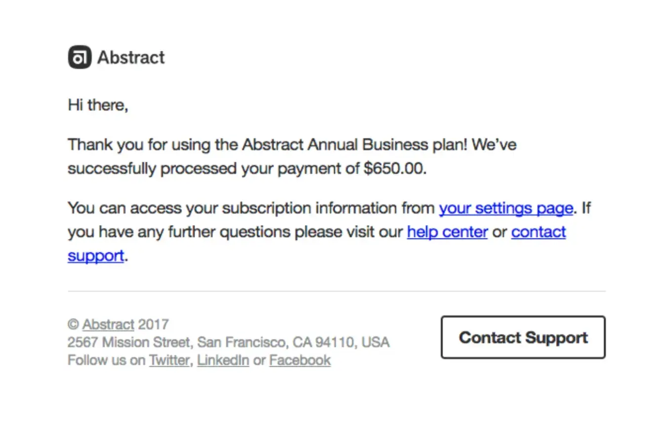
Source: automizy
The form experience doesn’t end when someone clicks send. That’s where the real trust test begins.
A lot of businesses treat the thank-you message like a technical formality and focus more on the CSS they’re including, but customers treat it like a promise.
They want to know what happens next, how long it’ll take, and whether their message landed somewhere real.
A vague “Thanks for reaching out” isn’t enough anymore. People are used to instant signals. They expect clarity, even if they don’t expect an instant answer.
A solid confirmation message lowers anxiety immediately because it tells them the system worked and gives them a sense of what to expect from the human side of the interaction.
Silence turns ordinary uncertainty into suspicion. If there’s no confirmation email, no time expectation, and no visible sign of follow-through, customers start wondering whether they should contact you again, try another channel, or give up entirely. That’s how trust erodes after the form has technically done its job.
What High-Trust Contact Forms Do Differently
The strongest forms don’t try to prove sophistication. They try to reduce doubt. They ask for the minimum needed to move the conversation forward.
They explain anything that might feel intrusive. They look clean on mobile, feel calm on desktop, and guide the user without making them work for basic understanding.
Contrary to popular belief, tone matters here more than people expect, when compared to traditional content. Cold, generic labels make the exchange feel transactional.
Lest we forget, the same goes for follow-up expectations. A simple note like “We usually reply within one business day” does more trust-building work than a dozen decorative flourishes.
It tells people you’ve thought about their experience after submission, not just before it. That kind of clarity makes a business feel competent, and competence is one of trust’s strongest building blocks.
Conclusion: Small Form, Big Trust Impact
A contact form looks small until you see what customers are doing with it. They’re measuring your responsiveness, your clarity, your attention to detail, and your respect for their time.
That’s a lot of pressure for a humble form, but that’s exactly why it deserves more care. Clean it up, trim the friction, and make the experience feel human.
There’s trust hiding in that page, and you’re either earning it or quietly losing it.
FAQ
1. Why do contact forms affect customer trust so much?
A contact form is often the first direct interaction a user has with your business. Any friction, confusion, or lack of clarity signals how you handle communication overall, shaping trust instantly.
2. What is the biggest mistake in contact form design?
Asking for too much information without context. Each additional field increases hesitation and makes users question your intent.
3. How many fields should a contact form have?
Keep it minimal. Name, email, and message are usually enough. Anything beyond that should be justified or optional.
4. Why is a confirmation message important after submission?
It reassures users their message was received and sets expectations for response time. Without it, uncertainty turns into distrust.
5. How can I improve my contact form quickly?
Reduce fields, improve mobile usability, add a clear response-time message, and ensure a visible confirmation after submission.

Author Bio
Magnus Eriksen is a copywriter and ecommerce SEO specialist with a degree in Marketing and Brand Management. Before embarking on his copywriting career, he was a content writer for digital marketing agencies such as Synlighet AS and Omega Media, where he mastered on-page and technical SEO.