

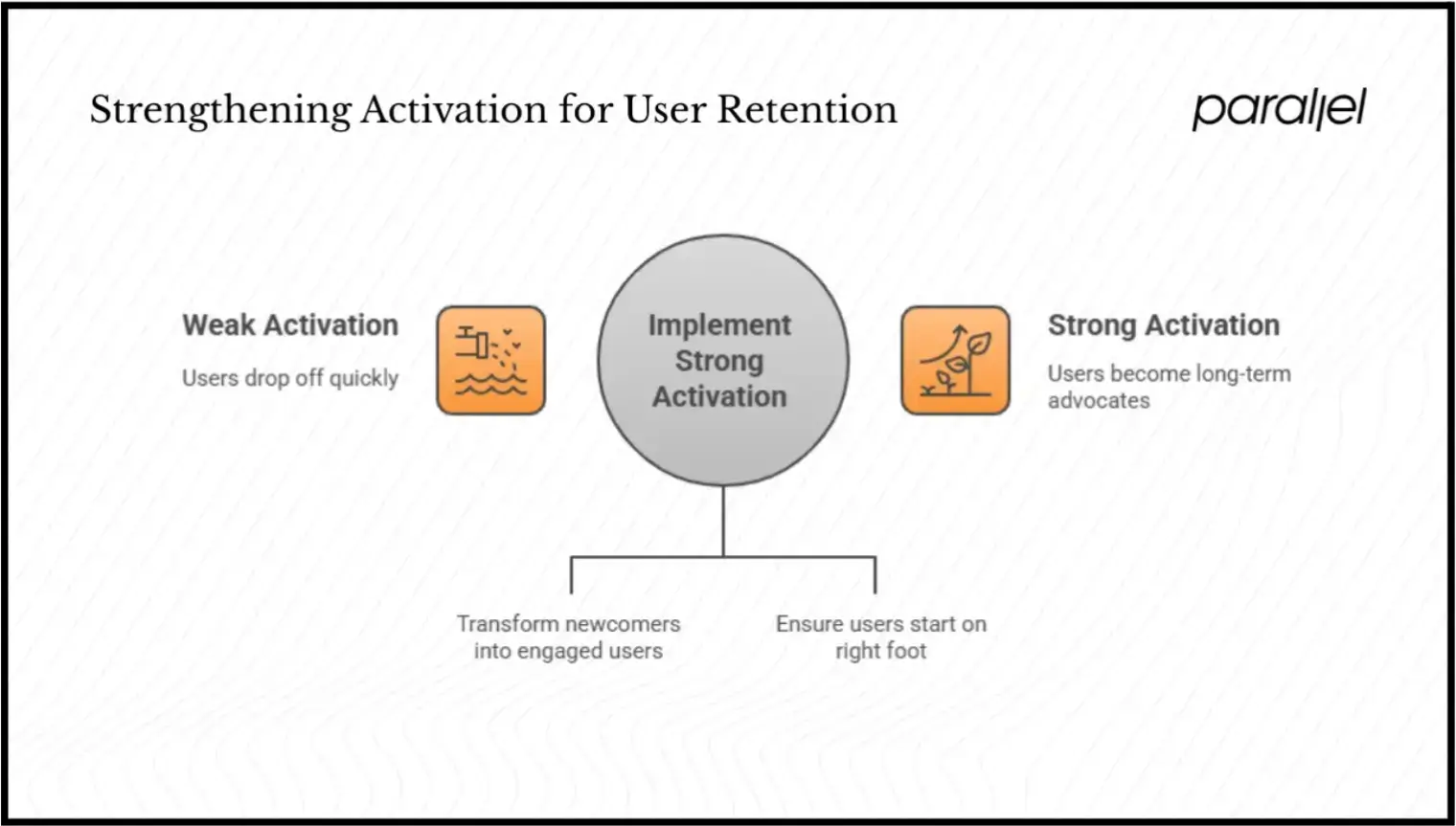
Onboarding is where most SaaS products lose users they should have kept.
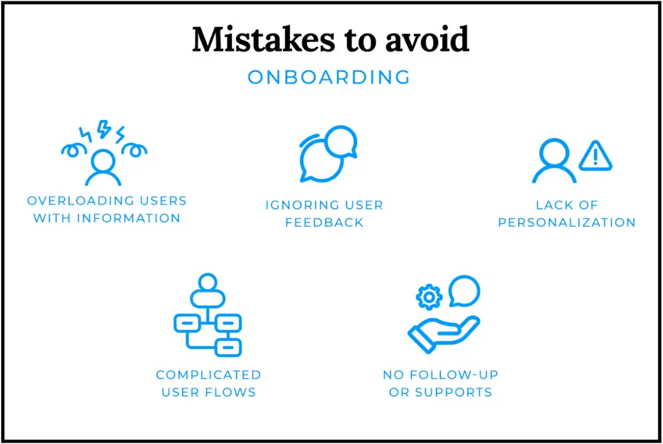
That is where teams try to do everything at once: identify the user, personalize the experience, collect data for sales, configure permissions, push activation, introduce features, and reduce support load.
The result is often an onboarding flow that feels internally logical but externally exhausting.
Embedded onboarding forms help when they are treated as part of the product experience instead of administrative checkpoints.
Done properly, they reduce decision fatigue, collect information progressively, and move users toward value without making onboarding feel like data collection disguised as UX.
What Are Embedded Forms?
Embedded forms are inputs placed directly inside the product experience instead of separating users into external flows, clunky modals, or disconnected setup pages.
In practice, that can mean:
- Sign-up flows
- Onboarding checklists
- Role-selection steps
- Onboarding surveys
- Upgrade forms
- Support requests
- Lightweight feedback prompts after key actions
The best embedded forms appear exactly when users already have enough context to answer the question being asked.
That is what keeps onboarding moving.
Most modern SaaS products already rely heavily on this pattern:
- Project management tools ask what kind of work you manage before recommending templates
- Analytics platforms ask about your use case before configuring dashboards
- Collaboration tools wait until after the first successful action before prompting teammate invites
That sequencing matters more than most teams realise.
The Role of Embedded Forms in SaaS Onboarding
Why do users abandon onboarding?
Usually not because it's too long. Because it's in the wrong order.
The actual problem:
- Teams ask for information before users understand why it matters
- Data gets collected for internal teams, not for the user's benefit
- Forms add work instead of removing uncertainty
Users feel this immediately. Mobile users, especially, have near-zero tolerance for friction at the start.
What good sequencing looks like:
- Billing request after activation converts better. Before it, users haven't committed yet.
- Permission requests land better during feature use; context makes them feel necessary, not intrusive.
- Feedback prompts before the user has done anything meaningful get ignored or skipped.
Source: Justinmind
Nielsen Norman Group calls this progressive disclosure, revealing complexity gradually, not all at once. The user doesn't need the full system. They need the next clear step.
How to Design Effective Embedded Forms For Onboarding
A lot of onboarding optimization work is really subtraction.
The highest-performing onboarding forms usually collect less information than internal teams originally wanted. You may want qualification data, but users want to get into the product.
Start With the User’s Next Decision
If a field does not improve the immediate next step, it probably does not belong in early onboarding.
This is where many SaaS teams overbuild. They design forms around future CRM enrichment instead of immediate user progress.
HubSpot, Baymard, and other UX researchers have repeatedly shown that reducing unnecessary fields improves completion rates, particularly on mobile devices.
Source: HubSpot
That result is not surprising if you have watched real onboarding recordings. Users move quickly when momentum feels uninterrupted. They hesitate the moment forms begin feeling administrative.
Remove Fields That Do Not Improve Activation
Desktop onboarding hides a lot of problems. Mobile exposes them immediately.
Tiny tap targets, delayed validation, unstable layouts, overloaded dropdowns, and long scroll-heavy forms create abandonment much faster on phones.
Teams often focus heavily on visual polish while ignoring interaction cost. But users care more about effort than aesthetics during onboarding.
💡Kashif Ali, Growth Specialist at PsychologySchoolGuide.net, says mobile onboarding friction becomes obvious very quickly when users are already multitasking or distracted.
He says, “A lot of users first interact with onboarding flows on their phones while switching between apps, commuting, or researching quickly between classes or work. Small issues that seem minor internally, like unstable layouts or forms resetting after an error, create abandonment much faster on mobile than most product teams expect.”
Use Inline Validation Instead of Delayed Errors
Bad validation logic quietly kills onboarding completion.
Generic Invalid input messages force users into trial-and-error behaviour. Delayed validation is worse because users only discover problems after mentally moving on from the field itself.
Inline validation works because it reduces interruption.
The important part is clarity. Users should immediately understand:
- What failed
- Why it failed
- How to fix it
Without friction escalating into confusion.
Reveal Complexity Gradually
Most SaaS products eventually become complex. The mistake is exposing that complexity before users have enough context to process it.
Source: Medium
Progressive disclosure helps by limiting cognitive load early while still allowing depth later. Good onboarding flows delay advanced configuration until users actually need it.
That sounds obvious. Teams still ignore it constantly.
Make Accessibility Part of the Onboarding Experience
Accessibility problems tend to survive longer than teams expect because they rarely block launches internally.
But they absolutely affect onboarding quality.
Unlabelled fields, keyboard traps, weak contrast, inaccessible error states, and poor screen reader handling create friction that many teams never properly test for.
WCAG 2.1 and WAI form guidance provide the baseline standards here.
Accessibility work is not separate from onboarding quality. It is onboarding quality.
How SaaS Teams Can Use Embedded Form Data
Embedded forms generate some of the clearest onboarding signals product teams get, as it exposes intent very quickly.
Completion rates, drop-off points, and time-to-value metrics let product teams iterate quickly and create onboarding experiences that work for different user segments.
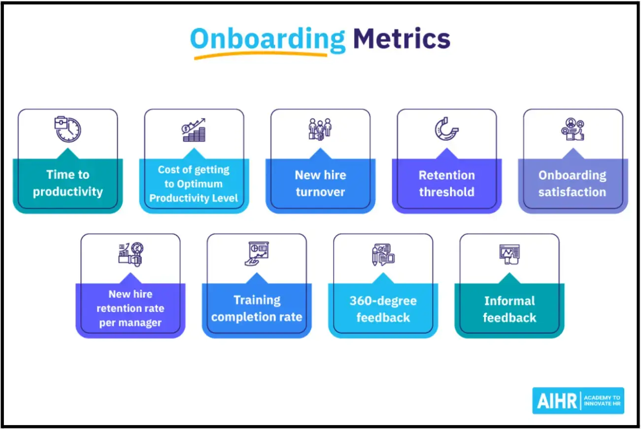
Source: AIHR
The useful insights usually come from patterns between steps, not isolated metrics.
For example:
- Users who skip onboarding entirely
- Users who stall after permissions
- Teams that activate faster when invites are optional
- Segments that are repeatedly abandoned on mobile during specific steps
Those patterns reveal operational problems faster than high-level activation dashboards do.
💡Jeff Zhou, CEO & Founder of Fig Loans, says onboarding metrics become misleading when teams only measure completion instead of hesitation.
He explains, “We found that users would technically finish onboarding but still slow down heavily at certain verification or consent steps. That mattered more than the completion rate itself because those hesitation points usually predicted later support issues, repayment confusion, or drop-off before activation. The useful signal was where confidence started breaking.”
A simple event framework usually matters more than a complicated reporting infrastructure early on. Track:
- Step loads
- Field interactions
- Abandonment
- Completion timing
Then connect those behaviours to activation outcomes. That is enough to uncover most onboarding friction.
Source: parallel
The tooling itself is fairly standard:
- Amplitude, Mixpanel, or Heap for behavioural analysis,
- Segment for routing event data,
- Zapier or Make for onboarding automation,
- Lightweight in-app surveys for contextual feedback,
- Privacy-conscious tracking practices that minimise unnecessary PII collection
The hard part is deciding which signals actually matter.
Where Embedded Forms Go Wrong
Most embedded onboarding form problems are operational.
Technical Integration Problems
Onboarding forms connect to authentication systems, billing flows, CRMs, permissions, analytics pipelines, support tooling, and product configuration layers.
That complexity compounds quickly.
Teams often underestimate how fragile onboarding becomes once multiple systems depend on the same user inputs. A broken webhook or delayed sync can create support problems that look like product confusion from the user side.
Good APIs, sandbox environments, and phased rollouts matter here more than ambitious onboarding redesigns.
Poor Timing Creates User Resistance
Users are not automatically resistant to forms. They resist interruptions that feel unjustified.
That is why onboarding flows that immediately demand configuration or qualification details create friction early. The same pattern appears in operational hiring workflows, too. Companies looking to hire executive assistant support respond better once they can already see progress or usefulness in the process.
Long onboarding flows become much easier to tolerate once users understand the value exchange. Asking for setup information after users experience value performs differently than demanding it upfront.
Source: amplifyn
Skip paths help too. Not every user wants a guided experience.
A lot of onboarding friction comes from forcing users through setup before they have seen enough value to justify the effort.
Fragmented Data Creates Misleading Insights
This becomes a bigger issue as SaaS teams scale.
If onboarding data lives separately across analytics tools, CRMs, support systems, and onboarding platforms, teams start measuring different versions of activation simultaneously.
Then, the optimization work becomes chaotic.
Shared definitions matter more than teams think:
- Activation
- Onboarding completion
- Time-to-value
- Retained usage
- Qualified setup
- Conversion intent
Without these, onboarding analysis becomes interpretation instead of diagnosis.
Security and Privacy Affect User Trust
Users are increasingly sensitive to unnecessary data collection, especially early in onboarding.
Security messaging now affects completion behaviour. Use encryption at rest and in transit, secure tokenisation for sensitive data, and maintain clear privacy policies.
When users see security badges and understand how their data is protected, they're more willing to share what you need for effective onboarding.
The Future of Embedded Forms in SaaS
Onboarding forms are becoming more adaptive, but most products are still early in figuring out where automation genuinely improves user experience versus where it simply adds unnecessary complexity.
Some changes are already becoming common:
- Onboarding paths adjusting based on previous responses
- Predictive defaults reducing repetitive input
- Conversational interfaces replacing rigid form layouts
- Passive behavioural signals reducing explicit questioning
- Privacy-preserving personalization approaches
Intelligent forms are changing onboarding by adapting in real-time to user responses. AI-powered forms can predict user needs, auto-populate relevant fields, and adjust the onboarding path based on behavior patterns. That creates a tailored experience for every new user.
The risk is over-automation.
When systems become too aggressive about prediction or personalization, onboarding starts feeling opaque instead of helpful. Users lose confidence when they do not understand why certain recommendations or paths appear.
Where Onboarding Stands Right Now
Most onboarding problems come from friction introduced before users reach value.
Embedded forms help when they reduce uncertainty, simplify decisions, and collect information at moments where users already understand why the request matters.
Poorly timed forms do the opposite. They slow momentum, increase hesitation, and create abandonment long before product quality becomes relevant.
That is why sequencing matters so much.
The strongest onboarding flows usually feel lighter than the systems behind them actually are. Users move through them without feeling like they are completing setup infrastructure for the company.
They just feel progress.
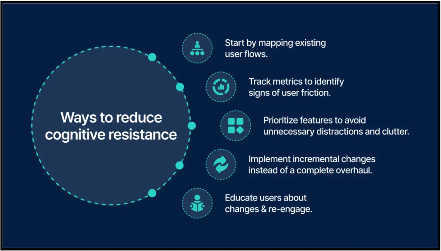
A lot of onboarding improvements come from smaller operational changes rather than full redesigns. Testing shorter flows, adjusting validation timing, or changing when information gets collected is often enough to reduce friction noticeably.
Platforms like POWR.io are commonly used for that kind of iterative form testing inside SaaS onboarding flows.
Frequently Asked Questions
1. What makes onboarding forms effective in SaaS products?
They reduce friction instead of adding unnecessary work. The best ones collect only the information needed for the next step, appear at the right moment, and help users reach value faster instead of slowing them down with administrative setup.
2. Why do users abandon onboarding flows?
Most users do not abandon onboarding because the flow is long. They leave because the sequencing feels wrong. Asking for permissions, configuration decisions, or qualification data before users understand the product creates hesitation early. Poorly designed onboarding forms make that problem worse very quickly, especially on mobile.
3. How many fields should onboarding forms include?
Fewer than most teams initially want. A good rule is simple: if a field does not improve the immediate next step for the user, it probably does not belong in early onboarding. High-performing onboarding forms usually prioritise momentum over collecting complete profile data upfront.
4. Why is mobile optimization important for onboarding?
A large percentage of users first experience SaaS onboarding on their phones. Small usability issues that feel manageable on desktop (unstable layouts, tiny tap targets, delayed validation, overloaded dropdowns) create abandonment much faster on mobile devices.
5. How should SaaS teams measure onboarding performance?
Teams should look beyond completion rates alone. The more useful signals usually come from behavioural patterns inside the flow itself:
- Hesitation points
- Repeated errors
- Abandonment between steps
- Time-to-value
- Which actions correlate with successful activation later
That level of analysis gives onboarding forms real operational value instead of turning them into passive data collection tools.

Author Bio
Jesse is a professional writer whose aim is to make complex concepts easy to understand. He strives to provide quality content that assists people in everyday life.