In the ever-evolving world of eCommerce, where attention spans are fleeting and consumer choices are abundant, the potential of a single email often needs to be recognized.
Welcome emails, a seemingly simple automation, can shape the trajectory of your brand-consumer relationship.
They are the virtual handshakes that set the tone, the gateways to customer loyalty, and the catalysts for engagement.
Successful Welcome Email Examples (plus why they work)
- Huckberry
- Lush
- Ralph Lauren
- Birchbox
- Munk Pack
- Fenty Beauty
- Boll & Branch
- HELM Boots
- Judith Bright
- SurfStitch
Skip to: 9 Tips for Crafting Captivating Welcome Emails
While brands may overlook this crucial touchpoint, the truth is the welcome email is your canvas to craft a masterpiece of connection.
This blog delves into ten high-performing welcome emails from popular brands, dissecting their unique approaches and what sets them apart.
The welcome email is the first glimpse of your brand that subscribers get.
It's a chance to make a lasting impression, introduce your brand's personality, and create anticipation for what's to come.
Let's dive into ten remarkable welcome email examples that demonstrate how to stand out and leave a mark:
1. Huckberry
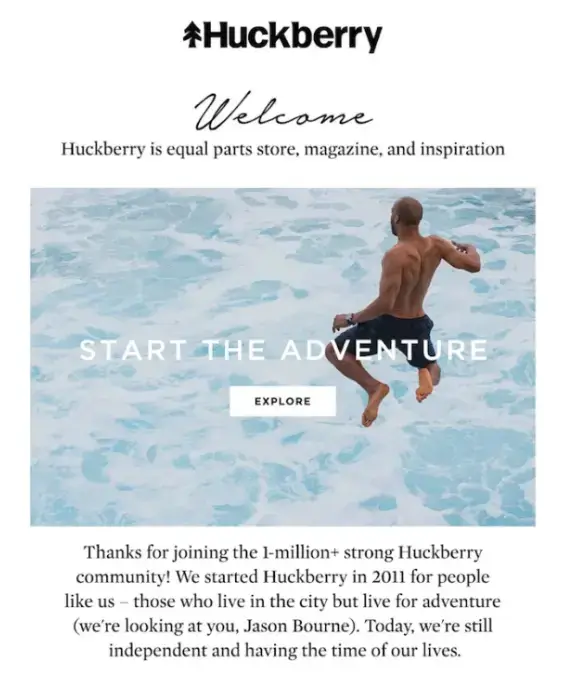
Huckberry, the hub for men's outdoor wear, brings the adventure to your inbox. From the get-go, a vivid image and playful tone immerse you in their dynamic community.
Why it works:
- Community Bond: Mentioning the 1 million+ strong community creates belonging and trust, reassuring subscribers of their choice.
- Visual Storytelling: The hero image isn't just a picture; it's an experience, evoking the thrill of outdoor pursuits.
- Playful Connection: A nod to Jason Bourne adds a fun twist, aligning their brand with excitement and making the email memorable.
2. Lush
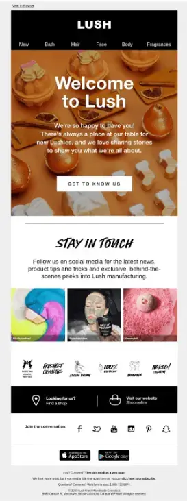
Lush, the cosmetics powerhouse, uses its welcome email to envelop new subscribers in an exclusive, vibrant community vibe.
The welcome email exudes warmth, showcases its best, and encourages immediate action: a blend of spirit and smart marketing.
Why it works:
- Instant Community Feel: The phrase “Always a place on our table for new Lushies” is heartwarming. It's not just about buying products; you're joining a family of enthusiasts.
- Top Product Showcase: Lush smartly directs subscribers to their popular products, offering a smooth introduction and an easy way to dive into their offerings.
- Clear Action Nudge: The three “Buy now” buttons are direct, prompting new members to embark on their Lush journey immediately.
3. Ralph Lauren
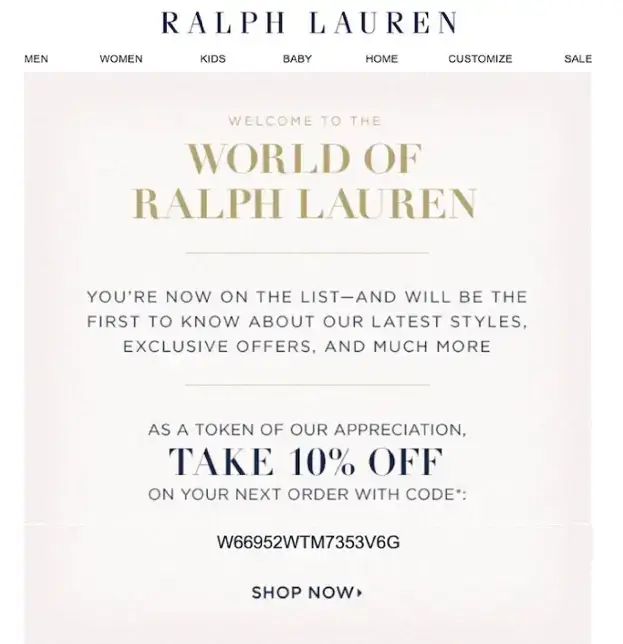
Fashion mogul Ralph Lauren seamlessly merges elegance with efficiency in its welcome email.
In its email, Ralph Lauren effortlessly combines brand ethos with a clear pathway for subscribers to immerse themselves in a luxurious fashion experience.
Why it works:
- Simple Sophistication: No frills or complex visuals. The email's brevity makes it user-friendly, effectively conveying the brand's essence in just a few lines.
- Incentivizing Engagement: Ralph Lauren entices subscribers with unique coupon codes. It celebrates their choice to join and nudges them towards that first purchase.
- Sense of Exclusivity: Through phrases like “You will be first to know” and “Exclusive offers,” Ralph Lauren imparts a VIP aura, making subscribers feel part of an insider circle.
4. Birchbox
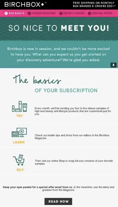
Birchbox, renowned for its monthly subscription service, vividly describes the surprises and treats subscribers can anticipate every month, evoking excitement and curiosity right from the start.
Why it works:
- Immediate Benefits Highlight: Birchbox grabs attention by promoting perks like free shipping on specific orders. This adds value and encourages larger orders.
- Focused Call-to-Action (CTA): With a dominant CTA leading to their magazine, Birchbox ensures new subscribers dive into a rich, engaging brand experience.
- Friendly and Relatable Tone: Casual greetings like “So nice to meet you” make Birchbox feel like a friend, forging a personal connection beyond business.
5. Munk Pack
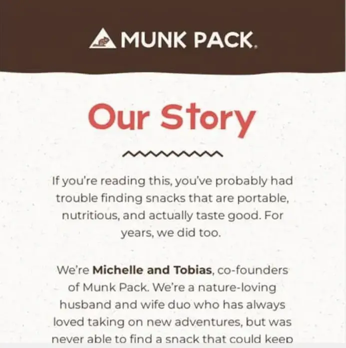
Munk Pack, a healthy snack retailer, stems from the personal journey of its founders, a husband-wife duo.
Their welcome email doesn't just introduce new subscribers to a range of products but also to the heartwarming narrative of its inception.
The couple candidly shares their struggle to find nutritious snacks to keep up with their fast-paced lives, leading them to create Munk Pack.
Why it works:
- Relatable Origin Story: Munk Pack's candid tale connects with readers by sharing their journey and challenges. It addresses a shared challenge—it's not just about snacks; it's about solving a common problem.
- Clear Brand Mission: The email summarizes the company's mission to promote a healthy lifestyle. It signals that Munk Pack is more than a business; it's a movement towards better, healthier living.
- Building a Community: By sharing their story, Munk Pack doesn't just sell; it invites subscribers to a health-conscious community.
6. Fenty Beauty
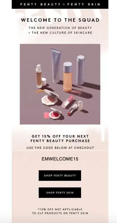
Fenty Beauty, renowned for its inclusivity in cosmetics, ensures its welcome email mirrors its brand essence.
New subscribers are immediately introduced to the brand's best-selling products, each accompanied by genuine customer reviews and ratings, serving as a testament to the brand's popularity and quality.
Source: Fenty Beauty
Why it works:
- Showcasing Best Sellers: By highlighting the most sought-after products, Fenty Beauty cleverly navigates new users toward items that have already garnered a positive response, increasing the chances of a sale.
- Incorporating Social Proof: Integrating genuine customer reviews and ratings in the welcome email not only boosts the credibility of the products but also reinforces trust in the brand.
- Clear Onboarding Path: By displaying their top products, subscribers instantly see what's hot and trending, streamlining their shopping experience.
7. Boll & Branch
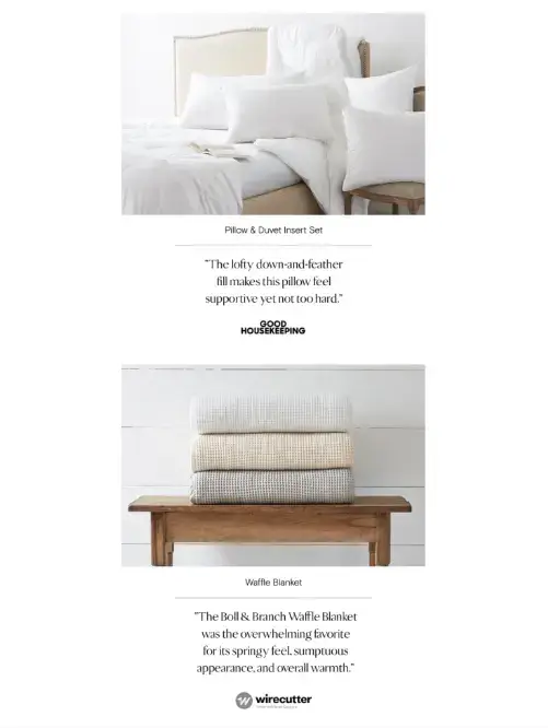
Boll & Branch, a luxury bedding brand, takes a sophisticated approach in their welcome email by infusing it with testimonials from reputable media outlets.
Their welcome email strategy positions them as a market leader while also offering a touch of authenticity.
Why it works:
- Authoritative Testimonials: Incorporating quotes from well-known publications assures readers of quality and credibility, making them more likely to invest in the brand's offerings.
- Product-specific Praise: By tying each testimonial to a particular product, Boll & Branch makes the shopping process easier for new subscribers and induces trust.
8. HELM Boots
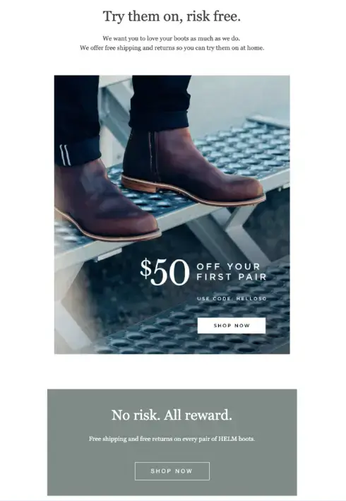
In its welcome email, HELM Boots cleverly addresses potential buyer hesitations by highlighting its hassle-free shipping and returns policy, which is especially vital for online footwear purchases where fit and comfort are paramount.
Why it works:
- Reassurance Upfront: By emphasizing their easy try-on and return policy, HELM Boots immediately puts new subscribers at ease and gears them towards customer satisfaction by ensuring the perfect fit.
- Tackling Potential Objections: By focusing on the flexibility of their returns, HELM Boots reduces the perceived risk associated with buying shoes online.
- High-value Approach: HELM Boots masterfully positions their promise front and center, nudging potential buyers towards making that valuable first purchase.
9. Judith Bright
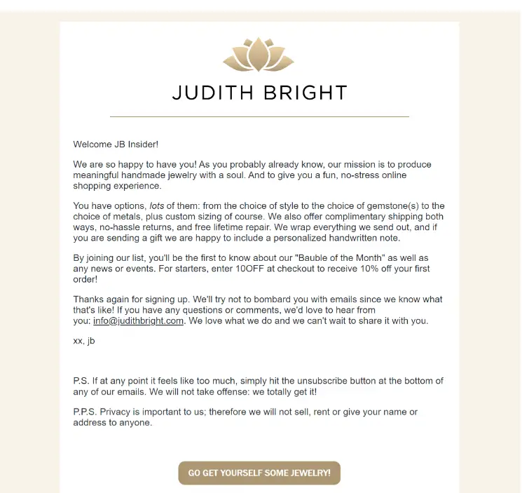
The welcome email from Judith Bright combines minimalist design aesthetics with a focused message, ensuring subscribers instantly connect with the brand's ethos and vision.
Why it works:
- Clean and Direct: The minimalist design and ample white space ensure subscribers aren't overwhelmed and can easily digest the content. This clarity enhances user engagement and compels readers to delve deeper into what the brand offers.
- Clear Brand Vision: Right from the beginning, Judith Bright establishes what they stand for and how they cater to their customers' needs. This immediate positioning sets the tone for the brand-customer relationship.
- Builds Anticipation: The email cleverly stokes interest by describing product choices and sharing essential details like shipping. These insights help potential buyers make informed decisions, nudging them closer to purchasing.
10. SurfStitch
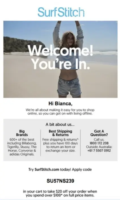
SurfStitch's welcome email immediately immerses subscribers into the brand's vibrant beach and surf culture with a compelling mix of enticing visuals, tailored deals, and clear messaging.
Embodying the essence of the laid-back yet adventurous spirit of the surfing community it ensures that new subscribers know about the products while also feeling the brand's pulse.
Why it clicks:
- Personal Touch: By addressing the subscriber by their first name, SurfStitch establishes an immediate connection.
- Brand Story and Imagery: Through captivating visuals and concise copy, the email paints a picture of what SurfStitch stands for - freedom, adventure, and the thrill of riding the waves. Such imagery is bound to resonate with the brand's target audience.
- Informative Yet Engaging: Beyond just selling, SurfStitch uses its welcome email to inform subscribers about its vast range of brands and products. The way they present this, segmented and precise, ensures it doesn't overwhelm but instead intrigues.
- Builds Trust and Open Communication: The "Got a question?" section encourages new subscribers to reach out, fostering open customer communication and making the brand feel approachable.
9 Tips for Crafting Captivating Welcome Emails
Source: yamm
Making a great first impression with your welcome emails can set the tone for the rest of your relationship with a subscriber.
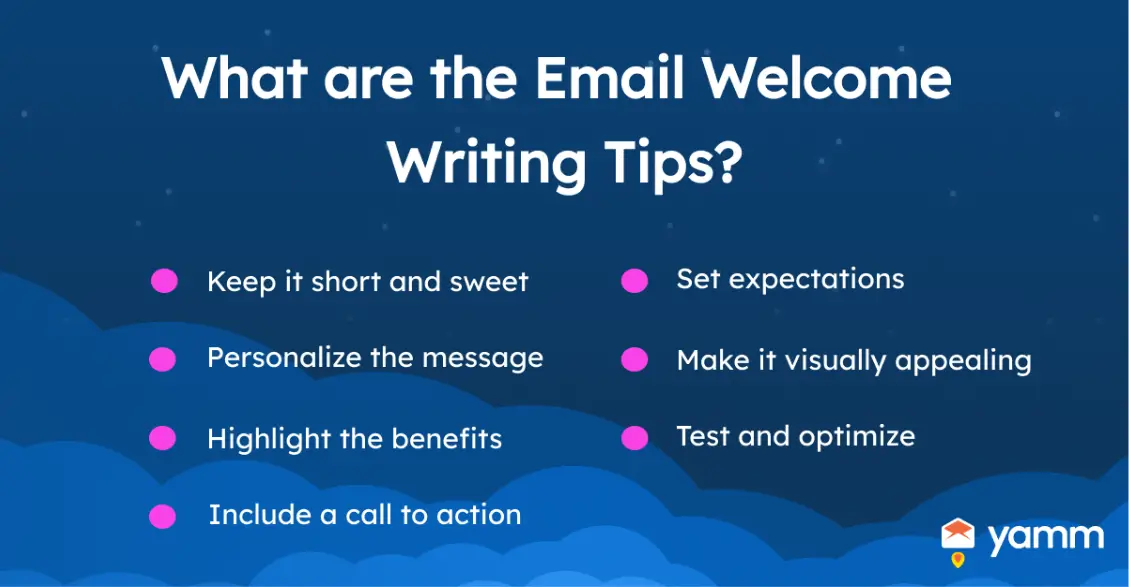
Here are nine tried-and-tested methods to ensure your emails not only get opened but also drive the desired action:
- Captivating Subject Lines: Craft a subject line that's compelling enough to halt users in their email-scrolling tracks. Remember, your subject line is the first thing they see; make it count.
- Keep it Short and Sweet: In a world filled with distractions, brevity is critical. Your welcome email should be concise, delivering your message clearly and succinctly. A few well-chosen words can leave a lasting impact, ensuring your subscribers swiftly grasp your brand's essence.
- Set Clear Expectations: Clarify what subscribers can expect from you, whether it's weekly newsletters, daily deals, or monthly round-ups. It creates a sense of anticipation and helps in managing expectations.
- Include Tailored Messaging: Generic messages rarely resonate. Customize your welcome emails to align with each subscriber's interests or behaviors using data and preferences gathered during the signup process.
- Incorporate Stunning Visual Elements: An attractive email is often an effective one. Incorporate high-quality images, graphics, or animations that complement your message and brand.
- Highlight Benefits: Your subscribers want to know what's in it. Showcase the benefits of being a part of your community—whether it's exclusive discounts, early access to new products, or valuable content. Make them feel excited about the value they'll receive.
- Include Explicit Call-to-Action (CTA): Instead of a vague "Click Here," use specific terms like "Shop Now" or "Discover More." Ensure the CTA stands out and conveys the next step you want the reader to take.
- Accessible Contact Details: Include a phone number subscribers can use for immediate queries in your email signature. Consider adding an electronic business card as it reinforces trust and offers them a direct way to reach out.
- Test and Optimize: Welcome emails aren't set in stone. Use A/B testing and experiment with different subject lines, visuals, and content to discover what resonates best with your audience. Regularly analyze performance metrics and optimize your approach based on the insights gained.
Final Thoughts
Welcome emails aren’t just about saying "Hello." They’re your brand’s initial handshake, a promise of value, and the start of a potentially lucrative journey.
But remember, as with any strategy, it's essential to measure engagement and continually optimize. Dive deep into analytics, understand what's resonating with your subscribers, and refine.
The path to perfecting your welcome email is iterative, but the rewards? Well worth the effort.
Author Bio
Matej Mešár is a copywriter with a journalistic background based in Bratislava, Slovakia. Currently, he has his sights set on the SaaS sphere.
He works for CloudTalk, helping to create compelling messaging supporting the next generation of cloud communication.


