
Running into websites with UI from the early 2000s might cause some of us internal design pain, but this issue is specifically damaging to e-commerce websites.
*Updated 7/22/2024
Old trends in UX can cause customers frustration and lead to users leaving the site, costing sales. High-quality digital storefronts, on the other hand, can increase customer experiences and improve conversions as well as search engine rankings.
This article will explain the best practices to integrate into your e-commerce website to improve its structure and navigation.
Make Navigation Accessible
When creating your website, it is important to include symbols that have a common representation of a specific action. Novice UX designers will try to set their website apart from big brand businesses by changing up the button selection for a navigation bar, which is a big mistake.
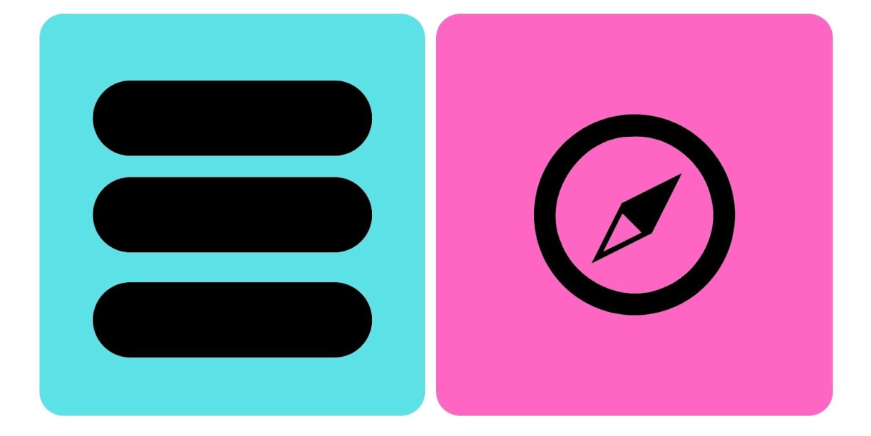
Usually, the page navigation symbol is identified as the classic hamburger (blue), whereas the pink one will typically be used for the search function.
The compass was pulled directly from a website using it as its navigation button. This is a great example of how small changes in common symbols can significantly impact how users interact with your website.
There's also a lot of interesting research being done related to animated UX micro-interactions.
Micro-interactions can improve your user's experience by:
- Promoting user engagement
- Communicating system progress
- Error prevention
- Improved user satisfaction
- Increased conversion rates
Reduce Text
Less is more when it comes to website design, and it acknowledges the fact that most people skim over large areas of text.
Get the message across with as few words as possible - although you may have written a beautiful multi-paragraph article, most people won’t bother to read it. Include images to reduce written content, so you don’t have to describe a product in text.
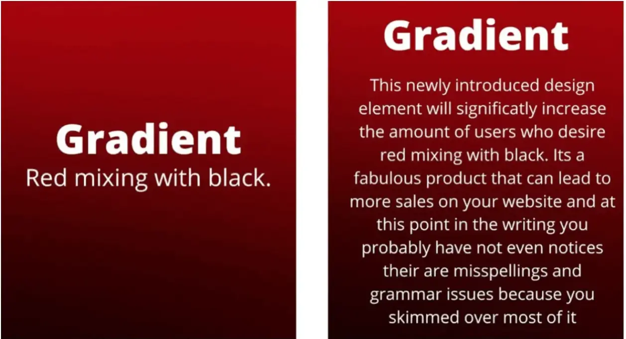
These two images can help explain that idea.
To the left, we have a simple statement. To the right, customers will probably read the first 2-4 lines and zone out from there. Additionally, the right image looks cluttered and doesn’t get the product description out more than the left.
Leave Breathable Space
Similar to reducing text clutter, not filling up all the space on your website can be beneficial.
Don’t fill your page; make it flow. Simple replacements of text, images, and buttons can make browsing your website far easier for your customers.


Small changes from #1 (the original) to #2, such as moving a part of the image to the right and removing some of the triangle elements, can reduce clutter and help the important things stand out.
Also, removing three words and splitting the text into two boxes makes it more digestible.
Improve Website Speed
As attention spans continue to decrease, it is important to take a few steps to cut the load time of your website. It will help reduce users’ frustration and prevent them from clicking away from your store. Here are a few actionable things you can do:
- Reduce image size
- Use GIFs instead of videos
- Choose a better hosting service
- Cache your web pages
- Eliminate unused plugins
- Keep the code clean
- Place JavaScript and CSS in external files
There are many specific coding things you can do to improve speeds that are only applicable if you hire a specialist or know some CSS yourself. The list goes on and on, but those are the main ways to improve load times for your website.
Use CTAs
The e-commerce store you have created exists for a reason - to earn revenue and make a profit. Your website should include clear calls to action to help you make those sales and improve conversions.
Your CTA message could be simple, like “Buy Now!” or “Add to Cart.” If you feel it lacks motivation and core messaging, you can try the common trend of today’s marketers - using the idea of community as the call to action.
Instead of saying, “Join our gym membership today,” a better call to action would say, “Surround yourself with fitness-oriented people today, and become a member of the rise and grind crew!” The idea is the same - get someone to do something - but it is a more motivating way to engage customers than calling to direct action.
Another thing to consider is the placement of the CTA. It should be visible on the top of the page and accessible without a user having to scroll down. The Profit and Loss Statement page of Freshbooks.com is a great example of a direct call to action that is visible as soon as you load the page.
Test Your Website
Before making the final draft of your website live, have your friends and family members navigate it and observe how they interact with each piece. Don’t hold their hand and tell them how to do something; just give them a direct action that needs to be accomplished and track how they try to get there.
If they have trouble navigating the site, don’t help them but record where they started to struggle. Those pain points could be major issues when you have high traffic reaching your website, as they can lead to a reduction in sales.
After identifying the common issues people have when navigating your site, fix them and try again. You should do this at least three times with different groups of people and cover as many issues as reasonably possible.
For more advanced website improvements, there is software that does something called heat mapping. Heat mapping is the process of tracking users’ website interactions and presenting them in an easy-to-understand way. Using this data, you can see how users move on the page and how to improve conversion rate as they click through your website.


Summary
Like an engineer to an architect, UX makes designs functional. A properly engineered website can produce higher conversion rates and lead to higher revenue, which is the goal of every e-commerce store.
Take all the necessary steps needed to increase the success of your store, including making navigation accessible, reducing text, using breathable space, improving loading speeds, and conducting A/B testing.
Each step will improve and streamline a customer’s experience, potentially leading to more sales.
If your customers have trouble navigating the site, don’t help them but record where they started to struggle. Those pain points could be major issues when you have high traffic reaching your website, as they can lead to a reduction in sales.
After this first round of usability testing, aim to recruit members of your target group and have them test your website with a user testing tool, this will uncover issues your actual customers have.
Author Bio
Shanice Jones is a techy nerd and copywriter from Chicago. For the last five years, she has helped over 20 startups building B2C and B2B content strategies that have allowed them to scale their business and help users around the world.
