You’ve probably filled out a contact form to receive a callback from a company, sign up for a newsletter from a reputable brand, or get a handy promo code.
Unfortunately, contact forms can be frustrating.
Some pop up too soon. Others are barely noticeable until you deliberately visit a contact page and press the right buttons to get in touch with the business.
Some contact forms, on the other hand, are designed to engage with web visitors and build lasting relationships.
Whatever the purpose of the contact forms, they’re crucial for nearly all websites—and it matters how they look.
To design a contact form that converts visitors into paying customers, you must adhere to the following rules to ensure your users experience no issues when filling out contact forms, which will encourage them to move forward through your sales pipeline.
How To Design Effective Contact Forms
When you’re planning to create contact forms for your site, always put your target audience in the center of your mind. It’s a fundamental rule you need to embrace.
These questions can help you identify the proper steps to create an effective contact form and deliver an outstanding customer experience.
Let’s take a look at some of the best practices to follow when creating a contact form.
Use The Right Layout
The layout is everything when designing a contact form. So, when building one, make sure that the size of your input fields matches the expected length of the answers.
For instance, most people have ten or fewer letters in their first name. So, ensure your first name input field can support at least ten characters.
Also, make sure you place field labels above the corresponding input fields for quick reference, and never split a contact form into several columns. Keep in mind, that you should only have one question per row.
All these details are crucial. They can help you create a sense of comfort and trust with your target audience and reduce unnecessary confusion.
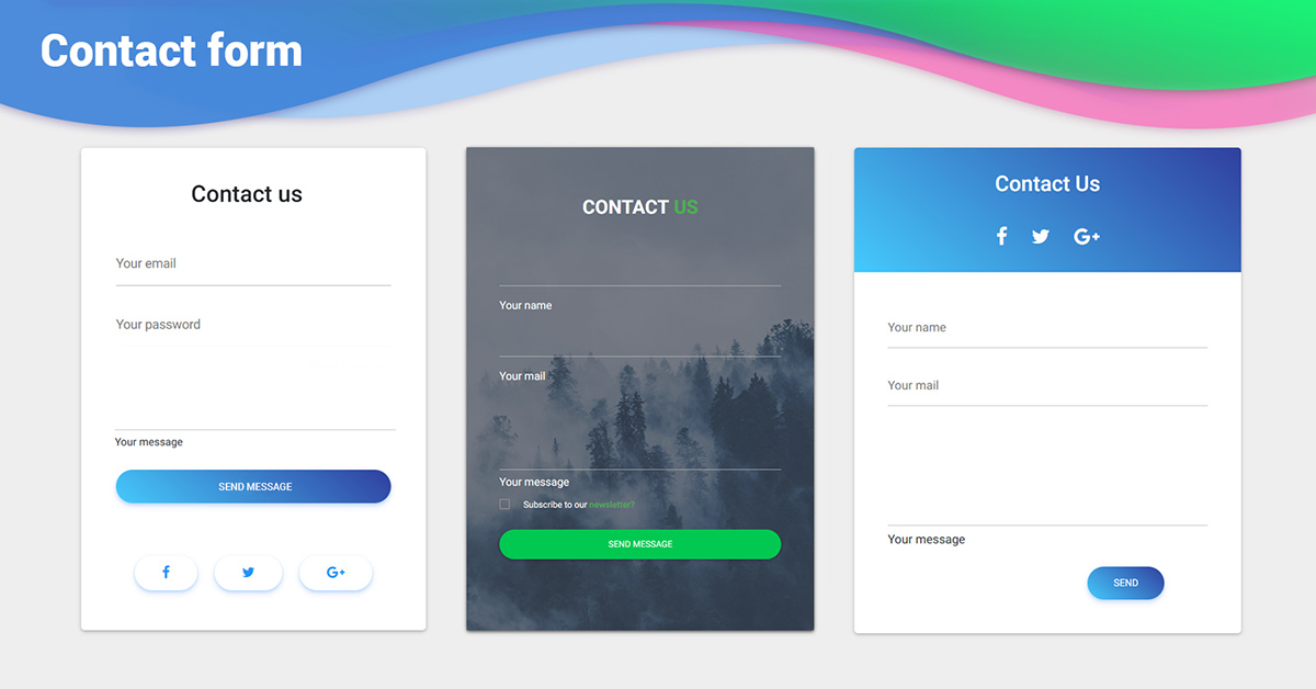
Source: MDB
Use Fewer Contact Fields
You don’t want to lose prospective customers because they get frustrated by an overwhelmingly long list of questions they need to answer in order to get a promo code. If possible, try to limit the contact form to three fields.
That’s because potential customers don’t have the patience or time to fill out forms that require multiple answers.
Go one step at a time to improve your conversion rates.
First, get web visitors to commit by asking them to leave their names and email address. Then, you can follow up using emails to collect all the information you need.
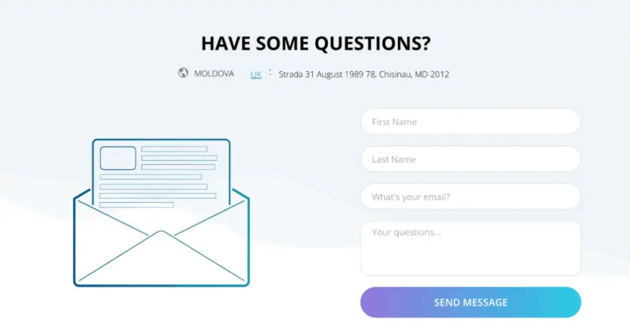
Source: Venture Harbour
Enable Autofill
Most people don’t enjoy filling out similar contact forms. To make things easier for your target audience, allow web browsers to complete some fields on behalf of your potential customers.
In 2011, Google Chrome introduced a new feature that could autofill some areas based on a web visitors’ autofill profile.
In 2014, when Chrome disabled that feature, the rate of form submissions dropped by 25%, showing that many web users will abandon contact forms unless it’s auto-filled.
Because some people fill in multiple forms daily, they don't like to enter the same information repeatedly. Enabling autofill can encourage potential customers to complete contact forms faster, increasing your conversion rates.
Source: Zoho
Indicate Errors In Submissions Clearly
Sometimes, people make mistakes when they fill out contact forms on different sites. It’s inevitable.
So, you must point out those errors clearly and ask them to fix the mistakes to reduce the need for web users to redo the entire form and get even more flustered.
The following tips can help you design an effective error solution:
- The error must be noticeable and easy to understand.
- The contact field with the errors should be easy to locate.
- Customers need not memorize instructions to fix mistakes.
It will help users if you highlight those fields with errors in different colors, such as red, yellow, or orange. Or, they should have an automatic warning above the field indicating the errors.
Choose The Right Color For Call-To-Action Buttons
The color of your call-to-action (CTA) button is crucial, especially if you want to improve your conversion rates.
However, don’t underestimate other colors, such as green or orange. Sometimes, those colors can perform better.
So, ensure you track your CTA buttons as custom events in WordPress. Then you can figure out which colors perform best for your marketing campaigns.
Source: bigDcreative
Final Thoughts
Although creating an effective contact form is tricky, the right design pays off over time. To design a contact form that can help you boost your conversion rates, put yourself in your customer’s shoes, test the web form yourself, and test it with your friends and colleagues.
One crucial thing you need to remember is the simpler the design, the better. Fewer form fields mean fewer distractions.
Also, a comfortable layout, a compelling CTA button, and an autofill feature can work wonders for building your business.
Additionally, don’t risk potential customers’ business by repeatedly asking them to provide personal details again and again. Keep it simple, and make everything clear from the start.
Contact forms designed effectively are crucial for improving conversion, so ensure your customers can fill them out as fast as possible. To learn how to add a contact page on WordPress, click here.
FAQs
1. What is the ideal number of fields for a contact form?
The ideal number is typically 3 fields or fewer, such as name and email. Keeping forms short reduces friction and increases the likelihood that users will complete them.
2. How can I improve my contact form conversion rate?
Focus on simplicity and usability. Use a clean layout, enable autofill, minimize the number of fields, highlight errors clearly, and choose a strong, visually distinct CTA button.
3. Why do users abandon contact forms?
Users often abandon forms because they are too long, confusing, or time-consuming. Lack of autofill, unclear error messages, or poor design can also create frustration and lead to drop-offs.