

Multi-step lead capture forms may feel lighter than single forms (that are very long), but they also give people more chances to leave.
If each step feels slow, confusing, or heavier than expected, people drop. You don’t always notice until you look at the numbers.
That’s what this comes down to.
Not just splitting a form into steps, but making each step feel easy to move through.
We’ll walk through what actually drives completion, where friction shows up, how to structure steps properly, and the small decisions that make the difference between someone finishing or leaving halfway.
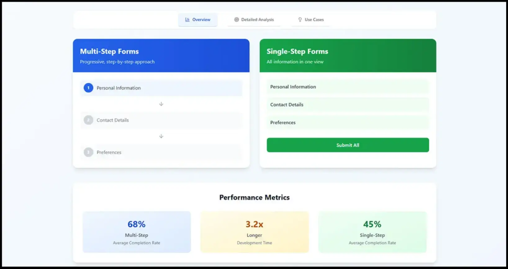
Why Multi-Step Forms Convert (When Done Right)
The theory behind multi-step lead capture forms is straightforward.
Source: fluentForms
People like finishing things they’ve started. The effect is real, you see it every time someone pushes through just to complete a progress bar.
But what matters more in practice is this:
People need to feel like they’re moving forward without getting trapped.
A simple “Step 1 of 4” does more than you’d think. It tells them:
- This won’t take forever
- I can stop anytime
- I’m already making progress
When that’s missing, users hesitate. You can see it when you track how visitors behave in session recordings, when they scroll, pause, sometimes go back, and sometimes leave.
Source: Neil Patel
Inline validation helps too. Baymard shows it improves success rates by 22% by removing that moment of friction where someone hits “Next” and gets blocked.
Fixing errors as they type keeps momentum intact.
In a multi-step lead capture form, even a slight delay between steps is enough to break that sense of progress.
If a step takes a second too long to load, it breaks the flow. Especially on mobile. People don’t wait.
And once momentum is gone, it’s hard to get back.
Where Multi-Step Forms Break (And Why Users Drop Off)
Most issues in a multi-step lead capture form aren’t design problems. They’re small decisions that add up.
A few patterns show up again and again:
- Slow transitions between steps: You click Next, and nothing happens for a beat. That delay is enough for a bounce.
- Navigation that makes people think: If someone has to look for the Next button, you’ve already lost clarity.
- Too many fields per step: Breaking a long form into steps doesn’t help if each step still feels heavy.
- No sense of progress: Users shouldn’t have to guess how long this will take.
- Asking for too much too early: This one matters more than people think.
💡Adrian Iorga, Founder and President of Stairhopper Movers, runs booking flows where customers are often filling out forms mid-decision, comparing quotes, or trying to lock in a time slot quickly.
He says, “When someone is booking a move, they’re trying to get it done before they lose availability. If the next action isn’t obvious, they stop and re-check instead of moving forward.
We’ve seen that even small things like inconsistent button placement or unclear labels cause hesitation, and that hesitation is usually where drop-off starts.”
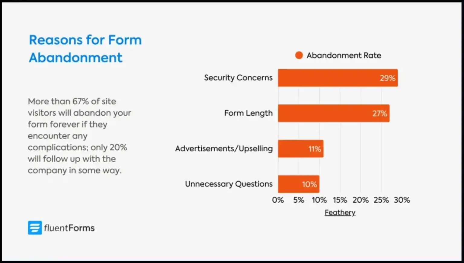
You ask for a phone number in step one, and you can almost predict the drop-off. Same with payment details. Even email, depending on context.
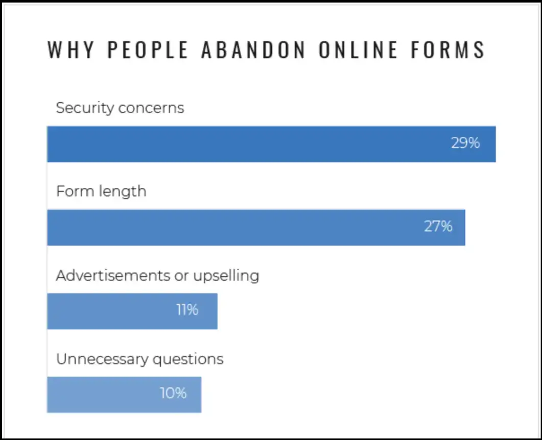
Source: convertica
Trust hasn’t been built yet. You haven’t earned that ask.
Data from tools like Zuko and Baymard consistently shows higher abandonment around these fields.
And when you watch real users, it’s obvious. They pause longer. Sometimes they leave right there.
What Actually Boosts Multi-Step Form Conversions
When a multi-step form is split into steps, the goal is to keeping people moving. There’s a lot you could optimize. Only a few things consistently matter.
Make Navigation Obvious
No styling experiments here. Clear Next. Clear Back. Always visible.
This is where people hesitate more than you’d expect. Not because the form is hard, but because they’re not sure what happens next.
CTA buttons shouldn’t blend in. They shouldn’t move around between steps. And they definitely shouldn’t disappear on mobile.
Source: ThumbVista
If someone has to look for “Next,” you’ve already slowed them down.
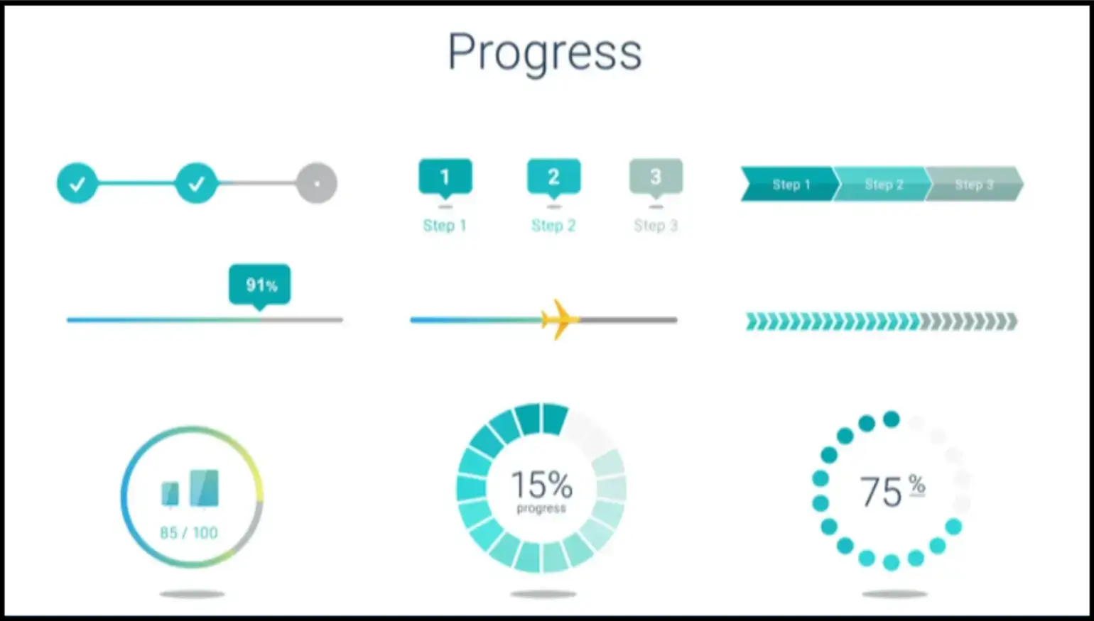
Show Progress Immediately
Don’t wait until step two. Set expectations immediately.
The moment the form opens, people are trying to answer one thing: how long will this take?
If that answer isn’t clear, they start guessing. And when people guess, they often assume the worst.
“Step 1 of 4” fixes that instantly. It makes the effort feel finite. Trackable.
You’re showing progress and removing uncertainty.
Keep the First Step Effortless
Name. One simple question. That’s it.
This step isn’t about data quality. It’s about getting someone to begin.
The mistake is trying to “make the most” of that first screen. Adding extra fields. Trying to qualify early.
That’s where drop-off spikes.
Once someone starts, they’re more likely to continue. Until then, every extra field is a reason not to begin.
Group Questions Logically
If someone feels like they’re answering the same type of question in one place, it flows. If not, it feels messy.
Group preferences, contact details, and context together.
If you mix types, ask for an email, then a detailed explanation, then a checkbox, it breaks rhythm.
💡Sixin Zhou, Marketing Manager at LDShop, works with users moving through multi-step flows tied to purchases, account setup, and product configuration.
He explains, “We’ve tested flows where we asked for contact details, preferences, and detailed inputs all upfront, and completion dropped noticeably.
When we reordered the same questions, basic information first, then context, then more specific inputs later, completion improved without removing anything. The difference wasn’t the fields, it was when we asked for them.”
Users don’t think in terms of your data model. They think in terms of effort.
💡Gavin Yi, CEO and Founder of Yijin Solution, works with engineering and manufacturing workflows where structured inputs directly affect quoting, production planning, and turnaround times.
He notes, “In our systems, when related inputs are grouped correctly, dimensions together, material specs together, tolerances together, people move faster and make fewer errors.
But when those inputs are split across steps or mixed with unrelated questions, users slow down because they have to keep rethinking what they’ve already entered. That break in flow shows up immediately in completion rates.”
Validate Inputs in Real Time
Don’t wait until submission. Fix issues as they happen. The worst moment in a form is hitting “Next” and getting blocked.
Now the user has to stop, scan, figure out what went wrong, and fix it. That interruption is where momentum drops.
Inline validation avoids that completely, as it sends a small error message, a quick correction, and the user moves on without breaking the flow.
Reducing Friction (Where Most Gains Come From)
This is where small changes make a noticeable difference.

Source: nintex
- Use conditional logic properly: If a question doesn’t apply, it shouldn’t exist for that user. When forms adapt like this, they feel shorter, even if they aren’t.
- Sequence matters more than content: Stay easy. Then ask for more. Don’t jump from name to phone number to detailed explanation.
- Give a reason to finish: A small incentive helps. Discount, resource, entry into something. Nothing aggressive.
- Test in real conditions: Open it on your phone. Use slower data. Watch where it feels slow or unclear.
How to Structure a High-Converting Multi-Step Form
You don’t need anything complicated to set up a multi-step lead capture form.
Start with structure:
- 3-5 steps
- Basics → Details → Preferences → Confirm
- The progress bar turned on from the start
Then build it out:
- Step one stays light: Name and one qualifying question.
- Push heavier asks later: Phone numbers, uploads, long text, only after some commitment.
- Use logic to remove irrelevant steps: If a path doesn’t apply, skip it entirely.
- Turn on inline validation: Fix errors as users type, not after.
- Keep it fast: Short labels. No unnecessary scripts. Minimal distractions.
- Connect your tools early: Google Sheets, CRM, email flows. Don’t leave this for later, it affects how you structure the form.
This is also where having a system like contract management software becomes important, especially when submissions need to trigger approvals, link to agreements, or move into structured workflows without someone manually chasing the data afterward.
Test it like a user. Notice where you hesitate, because that is your friction.
Real-World Examples of Multi-Step Form Improvements
You don’t need a full redesign to see impact. Picture a wellness brand that moved from a single-page intake form to a multi-step flow.
- Before: everything upfront. It felt like paperwork.
- After: name and appointment type first. Details later.
Source: IvyForms
What this would lead to is an improvement in completion rates, not because the form changed dramatically, but because it felt easier to start.
Same idea with a B2B product.
Instead of asking everything up front, they gated questions:
- Contact info first
- Product fit next
- Budget and timeline only if the intent was clear
Putting It Into Practice (Quick Implementation Checklist)
Most multi-step lead capture forms fail because something interrupts the flow, usually halfway through, when the user is already deciding whether to continue.
So focus on that. Break it into 3–5 steps. Keep the first step almost effortless. Push anything that feels even slightly demanding further down.
Turn on inline validation. Show progress from the start so people know what they’re committing to.
Then watch how people actually move through it. Look at where they pause, where they go back, and where they leave.
Those moments tell you exactly what’s breaking the flow, and fixing those points will do more than any structural overhaul.
If you want a fast way to test this, POWR’s Form Builder gives you the core pieces out of the box, with multi-step layouts, progress tracking, conditional logic, and integrations, so you can set up quickly and focus on improving what actually impacts completion.
FAQs About Multi-Step Lead Capture Forms
1. How many steps should a multi-step lead capture form have?
Usually 3 to 5. Fewer than that, and it feels like a regular form split awkwardly. More than that, and it starts to feel long, even with a progress bar. If your form needs more steps, it’s often a sign you’re asking too much upfront.
2. What should go in the first step of a lead capture form?
As little as possible. Name and one simple qualifier are enough. The goal isn’t to collect useful data yet, it’s to get someone to start. Once they’ve taken that first step, completion rates improve naturally.
3. When should I ask for sensitive information like phone numbers or payment details?
Later than you think. These fields cause hesitation, especially early on. By the time you ask, the user should already feel invested. If it feels like a big ask, it probably is. Move it further down or explain why you need it.
4. Do progress bars actually make a difference?
Yes, but only if they’re accurate and visible from the start. People want to know what they’re getting into. “Step 1 of 4” works because it sets a clear expectation. Without that, users assume the form might take longer than it actually does.
5. How do I know where people are dropping off?
Look at step-level data, not just overall conversion. Tools like form analytics or session recordings will show you exactly where users pause, go back, or exit. That’s usually where something feels unclear, slow, or too demanding, and where you’ll get the biggest gains from fixing it.

Author Bio
Jesse is a professional writer whose aim is to make complex concepts easy to understand. He strives to provide quality content that assists people in everyday life.