
When it comes to automating your eCommerce business, design is essential to creating an online business since it draws in new consumers, offers a positive user experience, and boosts sales.
*Updated 7/1/2024
According to a select list of e-marketers surveyed, US consumers will spend $709.78 billion on online purchases in 2022. Kommando Tech found that more than 1.3 million businesses utilize eCommerce for B2B transactions in the US in 2022.
We deliver bespoke B2B portals that facilitate commercial relationships between business partners, help vendors and customers find each other, enable effective self-service, and provide comprehensive support to users.
Thus, you must ensure your eCommerce store's responsive front-end design.
As competition increases, your users have more businesses to select from every day. Making websites feel appealing, engaging, and relevant has become that much more important.
In such cases, what are some of the critical elements that contribute to a compelling B2B eCommerce website? This article will cover some of the most popular design tactics for creating a user-friendly B2B eCommerce brand website.
7 Design Tips That Make Your B2B Website User-Friendly
- Quick loading time
- Make your web design simple & easy to use
- Utilize your whitespace
- Have a functional navigation system
- Create a click-worth CTA button
- Highlight your value proposition
- Use engaging visual to draw an audience
1. Quick loading time
Today, all viable companies have a website. While a successful website must have all the essential components—design, theme, user navigation, and relevant content—many people frequently forget about loading speed.
It is critical to recognize that today's target market, customers, and buyers are always online. This implies that people will use their desktops, laptop, tablet, or smartphone to obtain information online.
Additionally, this digital consumer has a short attention span. Websites that are slow to load or unsuitable for mobile devices are not given a second opportunity.
You should pay attention to your website's loading time if you don't want to risk losing half of your target market.
2. Make your web design simple & easy to use
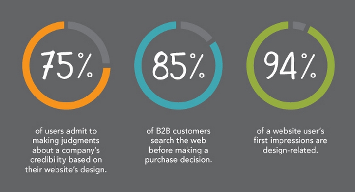
You only have 50 milliseconds, a literal blink of an eye, to establish a positive first impression on someone who visits your website, according to studies.
Despite the work you put into creating excellent text, finding the best items, and offering top-notch customer service, research has shown that more than 90% of first impressions are influenced by design.
And 75% of consumers base their judgment of a company's legitimacy on its website.
Make sure that each page is a standalone page and follow the best practices while designing.
If you don’t believe in these statistics, imagine entering a filthy retail space with showy furnishings and randomly arranged goods.
You would probably be far more inclined to buy the identical thing from a spotless, up-to-date, well-arranged store.
You can understand the significance of web design if you can move between the dirty store and the clean store in 50 milliseconds.
3. Utilize your whitespace
Not all space is wasted space. For your eCommerce website development, it is wise to practice web design that allows your material some breathing room.
Visitors to websites today skim the material. They scan content, scroll swiftly, and are easily distracted by overly crowded layouts.
Simplicity is the key to capturing your visitors' full attention, and using whitespace wisely is one of the most important steps to fulfill that.
To understand how whitespace is important, imagine how challenging it is for your brain to comprehend a complete page of the phone book or white pages to get a sense of the significance of whitespace.
Finding what you are searching for can be complex, with all those columns of tiny text compressed into one incomprehensible lump of information.
While phone books are made to fit as much information as possible into a small amount of space, most print layouts use whitespace to make their designs easier to read.
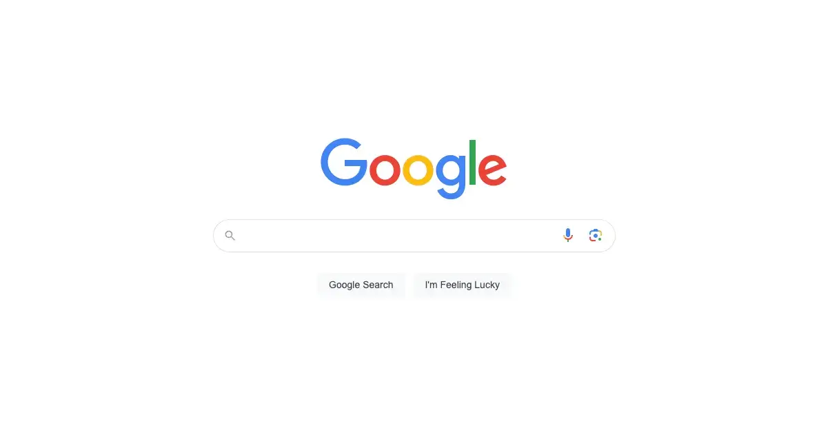
Google is a well-known example of a website that uses whitespace well. White space abounds on their webpage, allowing us to concentrate on what matters most—search.
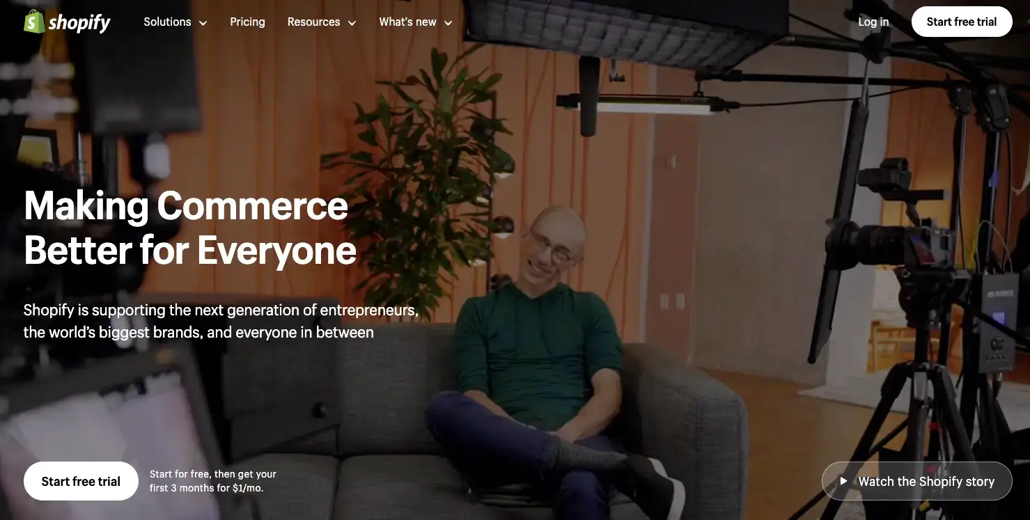
Shopify is yet another excellent example. What exactly is Shopify's goal? To make users sign up for free! And they do just that by leaving a surrounding with a lot of space. So that's the first thing visitors see.
4. Have a functional navigation system
Consider a scenario where you travel on a country road with little to no signs when your Google Maps app starts to act up, sending you down a more prolonged and less convenient route.
The app abruptly stops after several hours of moving toward your destination. You know what you need to do, but you're lost right now. How would you feel in this situation? Unhappy, most certainly.
Similarly, users have a terrible experience when visiting badly designed eCommerce websites. They cannot choose or locate items within an extensive catalog due to uneven or non-existent navigability.
What do these guests do, then? Correct, they do as you predicted.
More often, eCommerce business sites place a huge emphasis on aesthetics rather than usability, considering design as the only means of enhancing the appearance of their website.
According to a study, 42% of visitors would quit a website due to a poor navigation system. Thus companies need to rethink their user experience approach.
Smooth navigation is essential to a positive online experience, particularly for eCommerce sites that are both content-rich and multi-layered.
5. Create a click-worthy CTA button
Non-clicking visitors do not convert. Without those clicks on your call-to-action buttons, you won't gain subscriptions, orders, or attendance to your live events.
Your call to action is the key to improving your website conversion rates. So, how can you do that? Here are some examples of the best CTA that will explain to you better.
The Budgetnista

The Budgetnista is a one-stop personal finance shop run by author and individual finance educator Tiffany Aliche.
She excels at generating engaging CTAs and delivers material that excites her audience.
-
Why does this CTA work?
Visitors are inspired to do the required action through welcoming and inventive language usage.
Additionally, it is a great touch and helps to personalize the contact because it reflects Aliche's personality.
POWR Form Builder
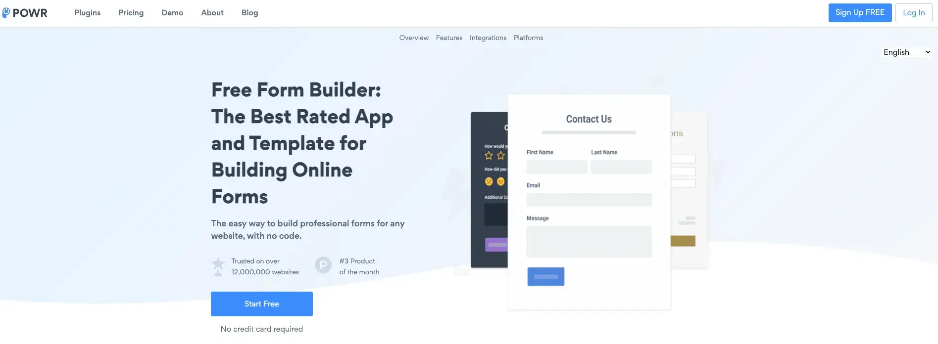
POWR Form Builder is a simple way to design personalized contact forms, quotation forms, retail forms, and more for your website without coding or a steep learning curve.
-
Why does this CTA work?
Why do people feel hesitant to sign up for a service? They are more concerned about hidden charges.
Including the word "free" in your call-to-action button is a non-threatening technique to get your website visitors to join, as seen in this POWR website popup app example.
6. Highlight your value proposition
A value proposition is a promise made by a business to a market or client segment. The proposal is a clear justification for a client to purchase a good or service from that specific company.
It is the most crucial factor determining whether visitors will click the back button or continue with your website.
Visitors must notice your value proposition on your homepage immediately, and it should be clear at all other essential entry points.
Take Evernote, for example.
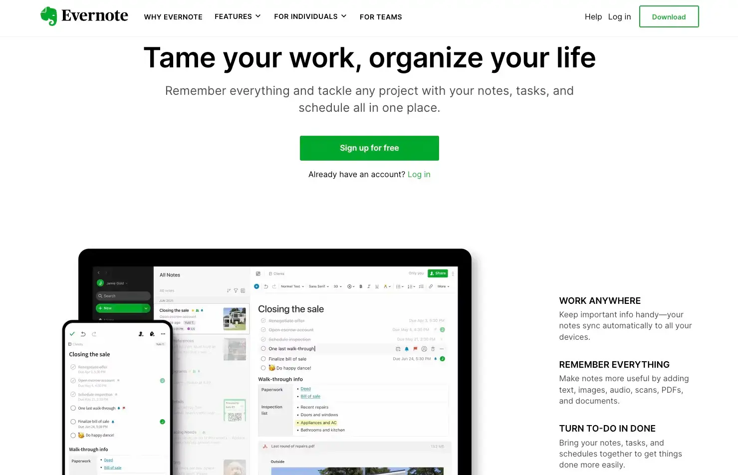
The value proposition of Evernote simultaneously solves two issues. The majority of individuals undoubtedly concur that feeling unorganized is terrible.
Everyone wants to be effective and productive in both their professional and personal life but occasionally finds it difficult to find the time to make the essential decisions.
The ideal option is provided by Evernote: Tame your work, organize your life.
Make your competitive advantage clear if your value is derived from being faster or more effective.
7. Use engaging visuals to draw an audience
Visuals are essential for attracting visitors to your website and encouraging them to interact with the pages.
As 65% of people are visual learners, 90% of information that enters the brain is visual, and visual-aided presentations are 43% more convincing.
It makes sense to select content categories that individuals have an intrinsic psychological resonance with.
The most popular B2B websites can now use AI-generated images to entice visitors. Not only images but also by using an AI logo generator, they can get creative and memorable logos for the website.
On your website, you may employ a variety of graphics, including:
- Videos
- Photos
- Graphics
- Infographics
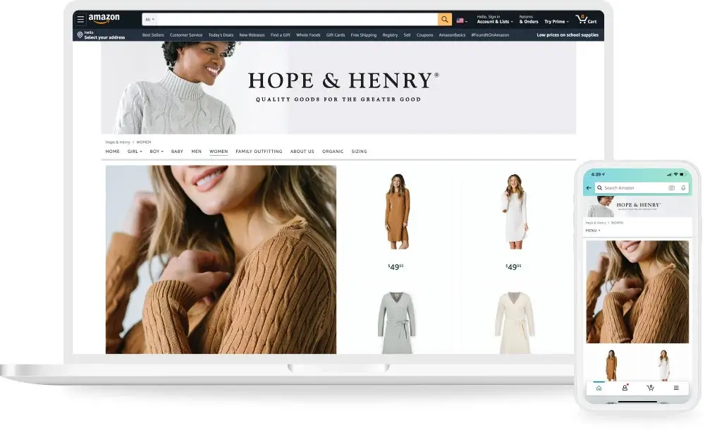
You can also post images of your goods, team, and other things. Use unique rather than stock images to make your site feel more natural and personal.
Wrapping Up
Your B2B website design is essential to helping your business flourish online. A stunning design will make your company stand out from the competition.
WebFX might be of assistance if you are unsure of where to begin when designing a B2B website.
Want to grow your online store? Check out the best tips for automating your eCommerce business. Your decision about a commerce solution is essential.
As all customers desire outstanding shopping experiences, including quick replies, individualized interactions, and brand consistency.
Author Bio

Tuhin Bhatt is one of the co-founders of Intelivita, a digital transformation place to hire dedicated mobile app developers.
Tuhin is regarded in the industry as a powerhouse of unique and best app ideas that shaped award-winning app projects across iOS, Android, web, desktop, and game console platforms.
His write-ups are usually based on Technology, Leadership, and Entrepreneurship. Connect with the Author: @LinkedIn @Twitter @Facebook