Black Friday is not limited to a single day, as many retailers extend promotions through the weekend and into Cyber Monday, another major online shopping event. Let’s review ideas and tactics to make your holiday marketing campaigns shine.

Successful Black Friday campaigns hinge on strategic planning, understanding customer behavior, and leveraging various marketing channels to maximize sales and brand visibility during this annual retail extravaganza.
How do you stand out from others and convert shoppers into customers?
Shortcuts:
- What is Black Friday Marketing?
- Black Friday Marketing Strategy Examples
- Tips to Increase Black Friday Conversions

Black Friday marketing not only involves directing traffic to your website, it also ensures it meets customer needs and lives up to their expectations.
If your site doesn’t meet them, prospects will close the page and go to your competitors. Successful Black Friday marketing can increase your client base and bring you dozens of loyal customers. How?
You should consider everything from product page designs to customer support. Let’s look at the possible ways to boost conversions during Black Friday.
What is Black Friday Marketing?
Black Friday marketing is how businesses promote their biggest sales of the year during the Black Friday shopping period.
It's more than just offering discounts — it's a complete strategy that includes email campaigns, social media posts, text messages, and special promotions to attract holiday shoppers.
For small businesses, Black Friday marketing is your chance to capture holiday spending with targeted deals that compete with bigger retailers.
The key is starting early, choosing the right channels to reach your customers, and creating offers that make sense for your business size and type.

Black Friday was primarily a U.S. tradition but has since spread to many other countries, including Canada, the United Kingdom, Australia, and various European nations.
It is a prelude to the holiday shopping season, with consumers eagerly anticipating the steep discounts and special deals retailers offer.
From a marketing perspective, Black Friday offers businesses a unique opportunity to boost sales, attract new customers, and strengthen brand loyalty.
It is a time when marketers employ various creative strategies and tactics to capture shoppers' attention and encourage them to purchase.
Black Friday Marketing Strategy Examples
- Early Bird Promotions: Retailers often start their Black Friday marketing campaigns early, sometimes days or weeks before the event. This can create a sense of urgency and anticipation among consumers.
- Doorbusters and Limited-Time Offers: Offer limited quantities of deeply discounted products, known as “doorbusters,” to draw crowds to physical stores and generate buzz online.
- Email Marketing: Send out a Black Friday marketing email to subscribers, showcasing exclusive deals and creating a sense of exclusivity.
- Social Media Campaigns: Leverage social media platforms to share teaser posts, countdowns, and interactive content.
- Content Marketing: Create informative content like gift guides, product reviews, and comparison articles to attract consumers seeking guidance during the shopping frenzy.
- Remarketing and Retargeting: Use data from previous interactions to target potential customers with tailored ads and offers.
- Mobile Optimization: Ensure your website has a mobile-friendly user experience to accommodate more smartphone and tablet shoppers.
- In-Store Experiences: For physical retailers, enhance your in-store experience with festive decorations, entertainment, and exceptional customer service to set yourself apart.
- Influencer Marketing & Collaborations: Expand your reach and credibility with influencers or complementary brands.
- Sustainability Initiatives: Incorporate eco-friendly practices and promotions to appeal to environmentally conscious consumers.
Tips to Increase Black Friday Conversions
1. Evaluate your website loading speed
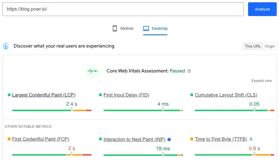
According to data, one in four visitors abandon a website if it loads for four seconds or more. Poor performance increases the risk of losing clients forever.
Potential customers expect your site to load quickly. Prepare your website for Black Friday traffic spikes by compressing images, removing unnecessary plugins, and optimizing your code (CSS, JavaScript, HTML).
Source: Google PageSpeed Insights
Consider building a progressive web application (PWA) for better performance and a smoother user experience.
2. Focus on customer experience
A recent CCW Digital study shows that 65% of enterprises value customer experience more than before the pandemic.
A positive experience keeps people on your site, encourages interactions, and leads to repeat visits and recommendations.
Ensure a mobile-friendly experience
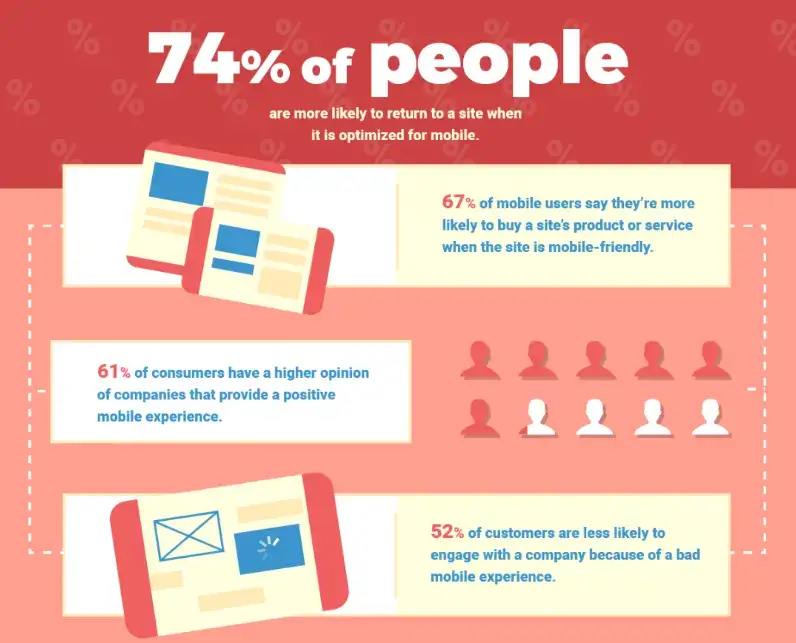
- A mobile-optimized website has a 74% higher chance of returning visitors.
- 67% of mobile users say mobile-friendliness influences their purchase decision.
- 61% of consumers rank companies higher if they offer a positive mobile experience.
- A poor mobile experience may divert 52% of buyers from purchasing.
Source: WebFX
Take UX/UI design into consideration
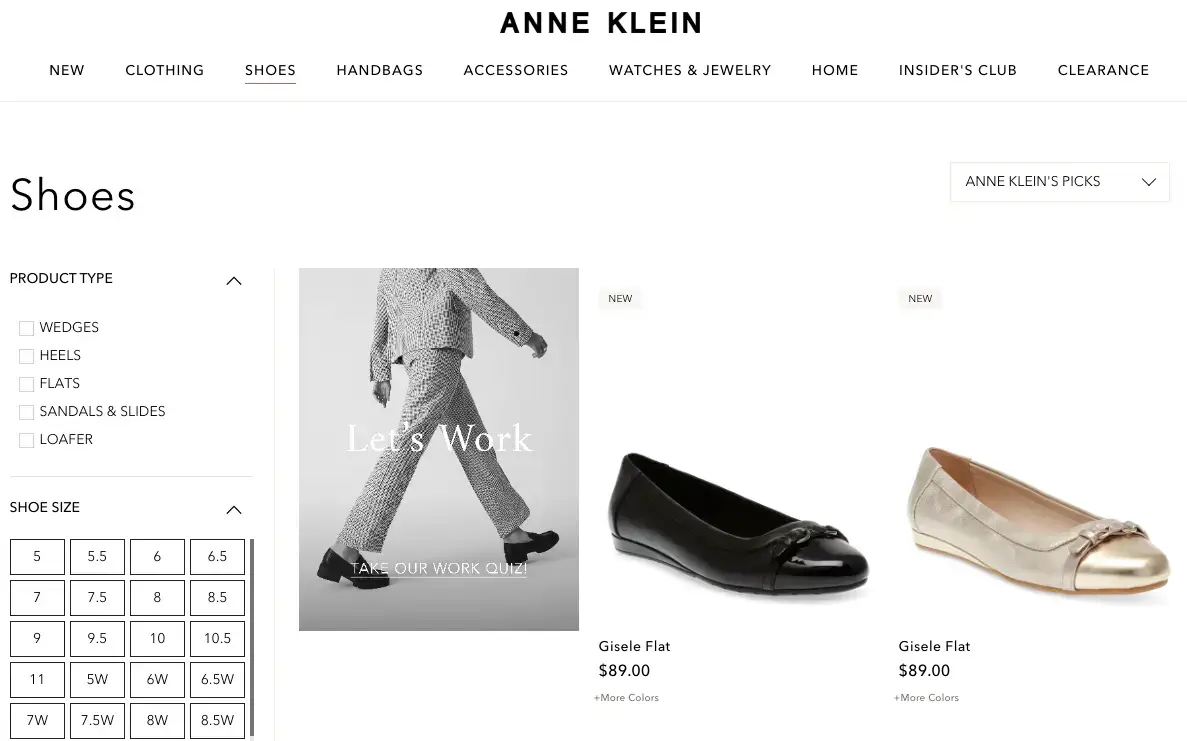
Good eCommerce UX/UI design organizes key elements like navigation, product pages, shopping carts, and checkouts for easy flow.
Provide a personalized touch
Gather customer data to tailor experiences — product recommendations, personalized emails, and custom landing pages can make all the difference.
Source: Anne Klein
3. No time like the present
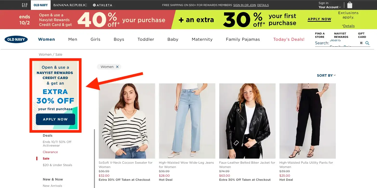
Black Friday’s urgency drives conversions — use it wisely. Show countdowns, stock levels, or active visitor counts to inspire quick decisions.
The free POWR Countdown Timer can help you engage customers and boost conversions.
You can also use the free POWR Popup to highlight limited-time offers, just like Old Navy’s example below.
Source: Old Navy
Final Thoughts
Black Friday is when yearly goals can be met or missed. E-commerce websites must be fully prepared to handle higher traffic and order volumes.
The key step is improving website performance — interruptions or delays can crush your conversions.
Focus on saving your customers’ time:
- Simplify navigation
- Ensure site search works properly
- Streamline checkout fields
Make sure your site is mobile-friendly and elevate the excitement with time-sensitive deals.
Author Bio
Kate Parish is the Chief Marketing Officer at Onilab, a full-service e-commerce agency focused on Magento.
Kate has over eight years of experience creating diverse marketing strategies around SEO, branding, SMM, PPC, and Magento PWA development.

