
In today’s e-commerce landscape, cart abandonment remains one of the most stubborn challenges: according to most studies, upwards of 70% of shoppers leave before completing purchase. Despite all the traffic, product variety, and marketing investment, the leak in the funnel can cost businesses millions.
The good news? By optimizing the checkout flow with smart design and strong trust signals, you can significantly reduce abandonment rates, increase conversion, and improve customer satisfaction.
In this article, we’ll examine how top-performing sites leverage checkout design and trust cues. You’ll learn concrete tactics rooted in UX, psychology, and security best practices to refine your checkout process.
In this article:
- Key Principles of Effective Checkout Design
- Design Tactics to Improve Checkout Flow
- Trust Signals: Why They Matter in Checkout
- Best Practices for Combining Design and Trust
- Measuring and Optimizing Checkout Performance
- Case Studies and Real-World Examples
- Common Checkout Mistakes to Avoid
- Step-by-Step Action Plan
- Future Trends in Checkout Design
Why Shoppers Abandon Carts
Before jumping into ways to reduce cart abandonment, it’s essential to understand what causes people to bail at or before checkout. Common friction points include:
- Unexpected costs (shipping, taxes, fees) showing up at the last minute
- Complex or long forms
- Lack of trust in payment security or site legitimacy
- Poor mobile checkout experience
- Confusing navigation or unclear progress indicators
- Having to create an account before purchasing
- Slow page load times or technical glitches
Solving for these isn’t just about aesthetics. It requires thinking of checkout as a culmination of trust, clarity, speed, and reassurance.
Key Principles of Effective Checkout Design
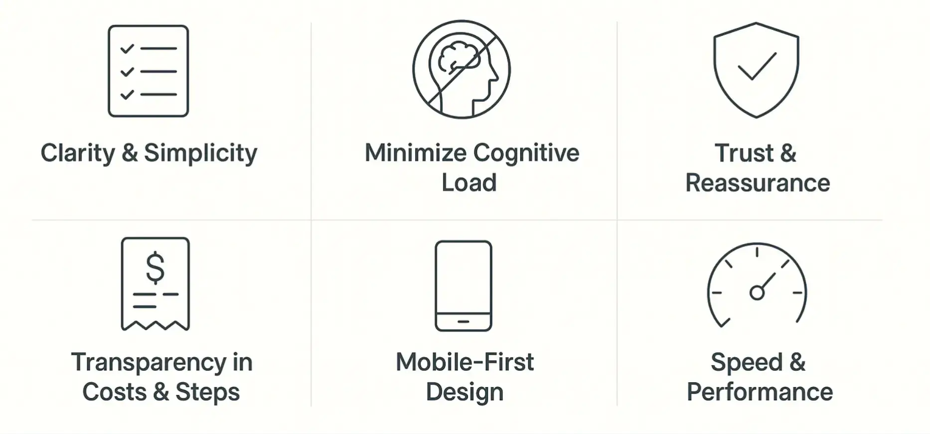
To reduce abandonment, your checkout flow must embody several key principles:
- Clarity & Simplicity Every step should be obvious: what’s required, what comes next, and how long it takes.
- Minimize Cognitive Load Don’t overwhelm with too many options or unnecessary distractions.
- Transparency in Costs & Steps Shoppers hate surprises. All fees, delivery times, and policies should be visible early.
- Trust & Reassurance Security badges, reviews, guarantees, familiar payment options—all of these build confidence.
- Mobile-First Design Given how many shoppers use phones, your mobile checkout must be smooth, responsive, and optimized.
- Speed & Performance Fast loading, minimal redirects, optimized images—small delays equal big drop-offs, which is why your site or app’s system design needs to be reliable.
Design Tactics to Improve Checkout Flow
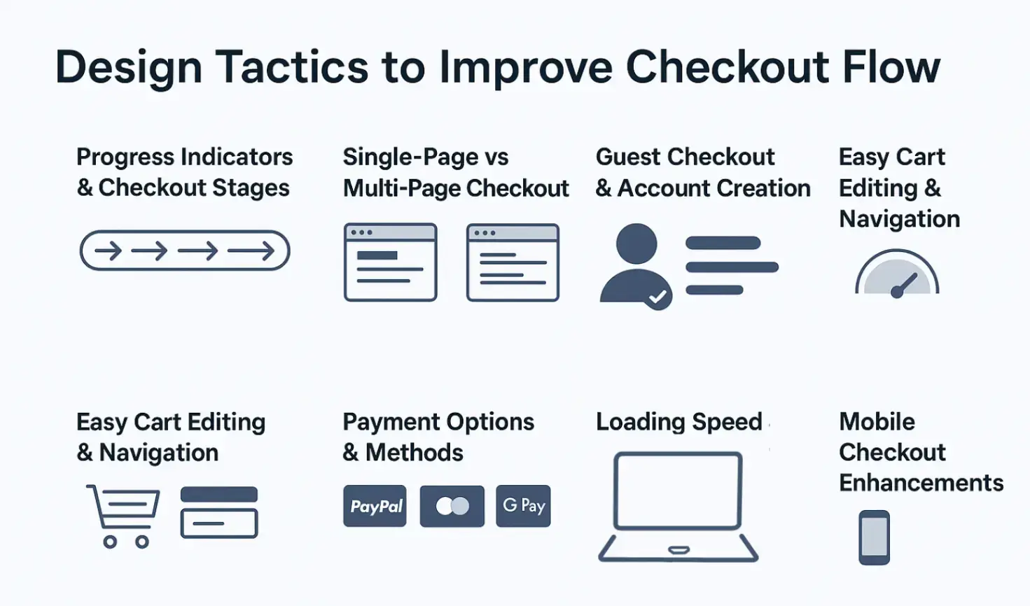
Here are specific design strategies you can adopt while developing ecommerce software, many leading e-commerce and SaaS sites already employ them.
Progress Indicators and Checkout Stages
- Use a clear progress bar (e.g., Cart → Shipping → Payment → Review) so users see how many steps remain.
- Label each stage (e.g., “Shipping address”, “Payment info”) so users know where they are.
Single-Page vs Multi-Page Checkout
- Single-page checkouts can reduce friction by keeping everything in one place; however, they sometimes overwhelm.
- Multi-page checkouts can feel more manageable if each page is simple. Use them when multiple pieces of information are required.
Test which works better for your audience. A/B testing is key.
Form Design and Input Optimization
- Keep forms short; only ask for absolutely necessary fields.
- Use inline validation (show errors immediately rather than after submission).
- Enable auto-fill, use smart defaults, and drop-downs rather than open text where possible.
- For addresses, implement address lookup or validation tools to reduce mistakes.
Guest Checkout vs Account Creation
- Allow guest checkout; don’t force account creation.
- Offer the option to create an account after purchase, or make it optional with benefits (e.g., faster checkout next time, order tracking).
Easy Cart Editing and Navigation
- On the cart or checkout page, let users easily modify quantities or remove items.
- Ensure that returning to product pages or editing the cart is easy and doesn’t lose the user’s place.
Payment Options and Methods
- Offer familiar payment gateways (PayPal, Stripe, credit card, Apple Pay/Google Pay).
- Display all accepted payment icons early in the page.
- Consider alternative payments relevant to your audience (local options, BNPL, etc.).
Loading Speed and Technical Performance
- Optimize images, use lazy loading for non-critical assets on checkout.
- Minimize redirects in the flow.
- Ensure the server and CDN are responsive, especially under high traffic.
Mobile Checkout Enhancements
- Use larger tappable buttons, good spacing, and avoid tiny text or links.
- Use one-click checkout
- Implement mobile-optimized keyboards (e.g., numeric for credit card or phone fields).
- Avoid or minimize pop-ups or overlays that cover the screen inconveniently.
Studies by Nielsen Norman Group show that mobile-friendly checkout design directly correlates with conversion uplift.
Trust Signals: Why They Matter in Checkout
Even a perfect design can’t help if users don’t trust your site. Trust signals are those design and content cues that reassure users. From SSL badges to social proof, these elements tell customers their information is safe and that your brand is reliable.
Integrating the right signals requires not just visual design skills but also a deep understanding of compliance and secure coding. Teams that invest in web application security training can implement stronger, more trustworthy systems that directly reduce cart abandonment.
Here are several trust signal types and how to integrate them effectively:
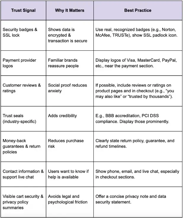
Best Practices for Combining Design and Trust
Combining design optimization with trust signals gives the best results. Below are strategic practices.
1. Early Assurance
From the cart page onward, include cues that build trust: small statements like “Secure payment gateway” and “Encrypted payment.” Use the padlock icon. Display accepted payment types.
2. Security During Payment
When users enter payment information, explicit badges or microcopy reaffirm security, like “Your payment is secured with [provider]” or “We never store your full card details.”
3. Minimize Distractions
During checkout, remove or de-emphasize internal site navigation, upsells, or anything that can distract. The more focus on completion, the better.
4. Transparent Summary and Review Step
Always offer a review page: before final submission, show everything (items, quantities, price, shipping, tax) in a clear summary. Let users edit from that page without starting over.
5. Use FOMO and Reassurance Wisely
- Use small, relevant urgency (e.g., low stock warnings).
- Display “secure payments” logos.
- Remind about the return policy, satisfaction guarantees.
6. Exit-Intent and Follow-Up
- If the user is about to abandon (detect via cursor, inactivity, etc.), show a modal offering help or a coupon.
- After abandonment, follow up via email or remarketing, reminding them what they left behind.
Measuring and Optimizing Checkout Performance
Optimizing is not one-and-done. To achieve real gains, you need continuous measurement and iteration.
Key Metrics to Track
- Cart abandonment rate
- Checkout drop-off rate by step (e.g., after shipping info, after payment info)
- Conversion rate of checkout initiations → completed purchases
- Average time to complete checkout
- Mobile vs desktop performance differences
A/B Testing Ideas
- Test guest vs account-required checkout
- Test single- vs multi-step checkout
- Test different trust badges; position of security seals
- Test different payment methods or display of payment options
- Test different review/ratings placements
Collective Qualitative Feedback
- Use usability testing or session recordings to see where users struggle
- Surveys: “What stopped you from completing checkout?”
- Heatmaps to see form fields or sections where users abandon
Case Studies and Real-World Examples
To understand how this works in practice, consider a couple of anonymised examples (drawn from real e-commerce observations).
- Case A: An online apparel retailer noticed that many users dropped off at the shipping section because shipping costs only appeared at checkout. After introducing free shipping over a threshold, plus showing estimated shipping earlier, abandonment dropped by ~25%.
- Case B: A consumer electronics site implemented guest checkout + moved trust badges into the payment form. They also cut down form fields (removing optional “company name”, etc.). Result: completed checkout rate improved by ~18%, especially on mobile.
- Case C: Using exit-intent modals offering small discounts or reminders (“Your items are waiting!”) recovered about 10-15% of abandoned carts when combined with follow-up emails.
Common Mistakes to Avoid
While optimizing checkout, several pitfalls commonly emerge. Avoiding these will keep improvements stable.
- Overwhelming with Too Many Options or Steps Crisp and simple beats feature-rich checkout if it causes confusion.
- Overly Aggressive Upselling During Checkout Offers are useful, but interrupting the flow can cost more than upsells are worth.
- Hiding Costs Until the Last Moment This always feels deceptive. It erodes trust faster than almost anything.
- Using Untrusted or Obscure Payment Methods If your audience is unfamiliar with a payment provider, showing only that provider can cause drop-off.
- Ignoring Mobile UX Constraints Forms that are fine on desktop often become pain points on mobile if not adjusted.
- Neglecting Performance Under Load High traffic (sales, promos) often brings slower responses. Optimizing performance across devices and conditions is crucial.
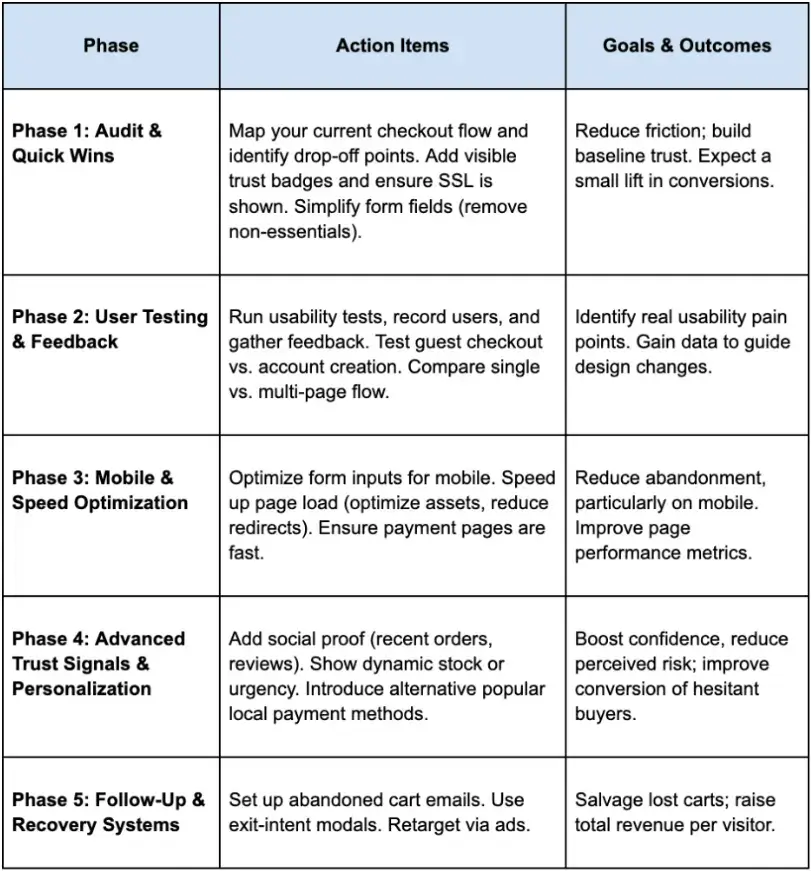
Step-By-Step Action Plan
Here’s a suggested roadmap to implement optimizations in phases.
Future Trends in Checkout Design
As checkout flows keep evolving, these are emerging trends to stay ahead of:
- One-click or Zero-click checkouts (federated login, saved payment methods)
- Biometric or wallet-based payments (Face ID, digital wallets)
- AI-driven personalization in checkout: dynamically adjusting offers or shipping based on user history
- Voice commerce: people speaking their order (especially in smart-home or wearable contexts)
- Augmented reality / virtual try-ons transferring into checkout reassurance (e.g., visualize product before finalizing)
Conclusion: Turning Missed Sales into Conversions
Optimizing checkout flow is not simply about polishing design; it’s about reducing friction, building trust, and respecting users’ time and decisions.
When done well, it transforms missed potential into realized sales, not just for single purchases but for long-term customer relationships.
Start with transparency (costs, steps), design for simplicity (forms, navigation, mobile), reinforce trust (security badges, guarantees, support), and measure everything. Over time, iterate based on what your users actually do, not just what you think they will do.
For developers looking to upskill, interactive computer science learning paths provide hands-on knowledge that helps translate design principles into measurable business results.
By combining these design practices with strong trust signals, you’ll reduce cart abandonment and create a checkout experience your customers appreciate and trust.
Frequently Asked Questions (FAQs)
1. What is the average cart abandonment rate in e-commerce?
According to Baymard Institute, the average documented online cart abandonment rate is around 70%. This means 7 out of 10 shoppers leave before completing their purchase, often due to friction or lack of trust.
2. How do trust signals reduce cart abandonment?
Trust signals, such as SSL certificates, security badges, customer reviews, and clear return policies, help reassure shoppers that their payment details are safe and the business is legitimate. Nielsen Norman Group highlights that visible trust cues directly influence user confidence during checkout.
3. Should I use single-page or multi-step checkout?
There’s no universal answer. Single-page checkout reduces steps but can feel overwhelming. Multi-step checkout organizes the process but adds clicks. The best approach is to A/B test both options with your audience to see which drives higher conversions.
4. Is guest checkout really necessary?
Yes. Forcing account creation is one of the top drivers of abandonment. Allowing guest checkout reduces friction and improves completion rates. You can still offer account creation as an optional step post-purchase for loyalty and tracking benefits.
5. How can mobile checkout be improved?
Mobile optimization is essential. Use large tappable buttons, autofill-enabled fields, digital wallet options (Apple Pay, Google Pay), and responsive layouts. Studies by Nielsen Norman Group show that mobile-friendly design directly correlates with conversion uplift.

Author Bio
Mishayl Hanan is an SEO content writer at Educative.io, where she creates in-depth, search-optimized resources for developers and tech professionals. Focusing on clarity, strategy, and engagement, she helps learners discover content that drives skill growth and career success.