
Mobile optimization has become a critical aspect of success for Software-as-a-Service (SaaS) companies. With the increasing dominance of mobile devices, it is essential for SaaS businesses to ensure their websites and applications are designed to provide an optimal experience on smartphones and tablets.

And responsive design plays a pivotal role in achieving mobile optimization. It involves creating websites and applications that adapt seamlessly to different screen sizes and devices, providing users with a consistent and user-friendly experience.
So in this blog post, we will explore the importance of responsive design for mobile optimization in SaaS marketing and the SaaS industry as a whole.
We will delve into the impact of mobile optimization on user experience and engagement, as well as the SEO benefits of implementing responsive design.
Let’s get into it, shall we?
Understanding Mobile Optimization
Mobile optimization in search engine optimization refers to adapting websites, applications, and online content to provide a seamless and enjoyable experience for mobile device users.
It involves optimizing various aspects such as design, layout, navigation, and functionality to ensure they are tailored specifically for mobile devices, including smartphones and tablets. You can consider partnering with a Saas SEO company that can help you with optimzing your website for mobile, tablet, and other devices simultaneously
Key Concepts of Mobile Optimization
Responsive design
This approach involves designing and developing websites and applications to automatically adjust their layout, images, and content based on the screen size and orientation of the device.
It ensures that users can easily navigate and consume content without excessive scrolling, zooming, or horizontal scrolling.
Mobile-friendly content
Creating content that is easily readable and accessible on smaller screens is essential for mobile optimization.
It includes using clear and legible fonts, concise and scannable paragraphs, and appropriately-sized images that load quickly on mobile devices.
Current Mobile Usage Trends and Statistics
The prevalence of mobile devices has dramatically influenced how people access and consume online content. Consider these current mobile usage trends and statistics:
Mobile Traffic Dominance: Mobile devices now account for most of the internet traffic worldwide. According to Statista, in the first quarter of 2023, mobile devices generated over 58.33% of all website traffic globally.
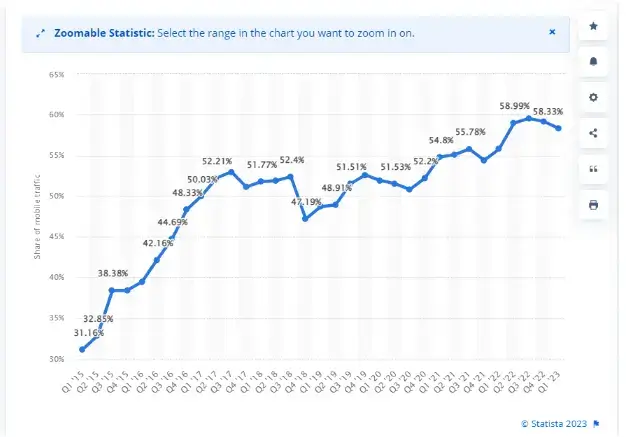
Source: Statista
Mobile Search and Discovery: Mobile devices have become the primary tools for searching and discovering information. Studies show that over 60% of Google’s US searches are performed on mobile devices.
Mobile App Usage: Mobile apps have gained significant popularity, with users spending most of their app usage time on smartphones. According to App Annie, in 2021, global app downloads reached 230 billion, highlighting the significance of mobile usage.
Impact of Mobile Optimization on User Experience and Engagement
Mobile optimization directly impacts user experience and engagement, leading to several benefits for SaaS companies. Here's how:
Enhanced user experience
By offering a responsive design and mobile-friendly content, SaaS businesses can ensure that users can easily navigate, read, and interact with their offerings, resulting in higher satisfaction and increased user retention.
Improved engagement and conversions
This increased engagement can lead to higher conversion rates, whether signing up for a service, making a purchase, or submitting a form.
Lower bounce rates
Mobile users have little patience for slow-loading, non-responsive websites. Optimizing for mobile reduces bounce rates by providing a fast-loading, visually appealing experience that captures and retains user attention.
Take, for instance, Uber. Their mobile app is designed with mobile optimization in mind. It offers a user-friendly interface, seamless navigation, and quick access to essential features like booking a ride and tracking the driver's location.
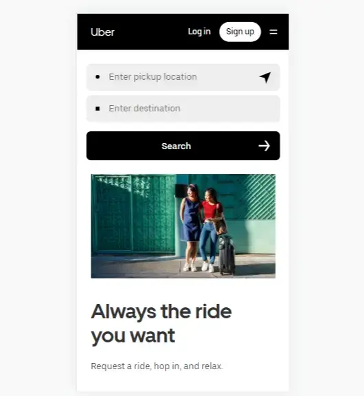
Source: Uber
The Role of Responsive Design in Mobile Optimization
Responsive design is a design approach that aims to create websites and applications that automatically adjust and adapt to various screen sizes and devices.
Benefits of Responsive Design
Consistent user experience (UX)
Responsive design provides a consistent user experience across different devices. It eliminates the need for separate mobile-specific websites, allowing users to seamlessly transition between devices without disruptions.
Mark Valderrama, owner of Aquarium Store Depot, says, “With a responsive design, your goal is to make it easy for your visitors to stay at your site. Regardless of the device they’re using.”
Improved accessibility
By adapting to different screen sizes, responsive design makes websites and applications more accessible to users on various devices.
Cost and time efficiency
“Creating separate designs for desktop and mobile versions can be time-consuming and costly. Responsive design streamlines the process by using a single codebase that can adapt to different devices.” — Alison Lancaster, CEO of Pressat.co.uk
How Responsive Design Adapts to Different Screen Sizes & Devices
Responsive design uses flexible grids, fluid layouts, and media queries to adapt to different screens and devices.
For complex SaaS projects, many companies hire AI engineers to automate these optimizations and ensure high performance across all devices.
Flexible grids
They allow content to be divided into proportional columns and rows that adjust dynamically to screen size.
Fluid layouts
Jeanette Johnson, co-founder at Cool Chicken Breeds, says, “The use of fluid layouts enables elements within a design to resize proportionally as the screen size changes.”
Media queries
Bruce Mohr, Vice-President at Fair Credit, explains, “Media queries are CSS techniques that allow stylesheets to be applied selectively based on certain conditions, such as screen width, resolution, or orientation.”
Importance of Responsive Design for SEO Success
Responsive design plays a crucial role in SEO. Search engines like Google prioritize mobile-friendly sites in search results.
Mobile-friendly ranking factors
Google considers mobile-friendliness a key ranking factor. Websites not optimized for mobile may experience lower visibility and rankings.
Mobile-first indexing
“Google's mobile-first indexing means that the mobile version of a website is the primary basis for how it is indexed and ranked.” — Richard Kennedy, Managing Director at Arken Digital
User engagement metrics
Responsive design influences bounce rates, time on site, and conversions — all vital SEO signals.
What are some SEO factors affected by responsive design?
“Websites and applications not optimized for mobile devices experience a decline in rankings and visibility, leading to missed opportunities for organic traffic and conversions.” — Tom Miller, Director of Marketing at FitnessVolt
BBC News is a great example. Their responsive design ensures that news articles, images, and videos are properly scaled across devices.

Source: BBC
Google’s mobile-first indexing and its implications
Google’s mobile-first indexing means the mobile version of a site determines how it’s ranked.
Paul Gordon, SEO Specialist at Paul Gordon SEO Agency, says, “Having a responsive design that serves the same content across devices simplifies indexing for search engines, avoids duplication, and maintains consistency.”
Shopify has adopted responsive design templates to ensure stores look great across all devices, improving search visibility and conversions.
User behavior metrics and their influence on SEO
Claire Walker, CHRO at View Auckland, said, “Websites not optimized for mobile can lead to higher bounce rates and lower time spent on site, signaling to search engines that the content may not be relevant.”
Conversely, mobile-optimized experiences boost engagement and improve SEO performance. Amazon’s responsive design delivers fast loading, intuitive navigation, and better conversions.
Best Practices for Implementing Responsive Design in SaaS
Take a mobile-first approach
Design for mobile devices first, then scale up to larger screens.
Just as white-hat link building is essential, so is responsive mobile design for SEO visibility.
Make responsive layouts and flexible grids
Benjamin Yost, Founder & CEO at Linkflow.ai, says, “Using fluid grids allows elements to resize proportionally and maintain structure across devices.”
Starbucks’ responsive layouts ensure images, menus, and promotions scale seamlessly across devices.
Optimize page load speed for mobile devices
“Page load speed is crucial for mobile optimization. Mobile users expect fast-loading websites, and search engines consider it a ranking factor.” — Alexandra Cotes Daes, Marketing Director at Toronto Flower Co
User-friendly navigation and intuitive UI/UX design
“User-friendly navigation and intuitive UI/UX design are vital for mobile optimization. SEO begins with great UI/UX — for SaaS or any service business.” — Matthew Smith, SEO Expert at Invicta Environmental
Testing and optimizing across multiple devices and browsers
Testing across mobile devices and browsers ensures consistent performance.
Taylor Reeves, VP of Marketing at Pickleballer, says, “Your responsive design three years ago won’t cut it today. Keep testing and optimizing religiously.”
Partner with a reputable SAAS SEO agency to enhance UX and search performance across devices.
Conclusion
Mobile optimization and responsive design are crucial for SaaS companies aiming for SEO success and a positive user experience.
By adapting websites and apps for different screen sizes, responsive design ensures consistency and accessibility for mobile users.
It requires a mobile-first approach, flexible grids, optimized loading speeds, and intuitive navigation.
Testing across multiple devices is vital for a smooth experience.
To support the process, explore SaaS tools and resources, responsive frameworks, and analytics platforms like Google Analytics for actionable insights.
You’ll be on your way to SEO success.