
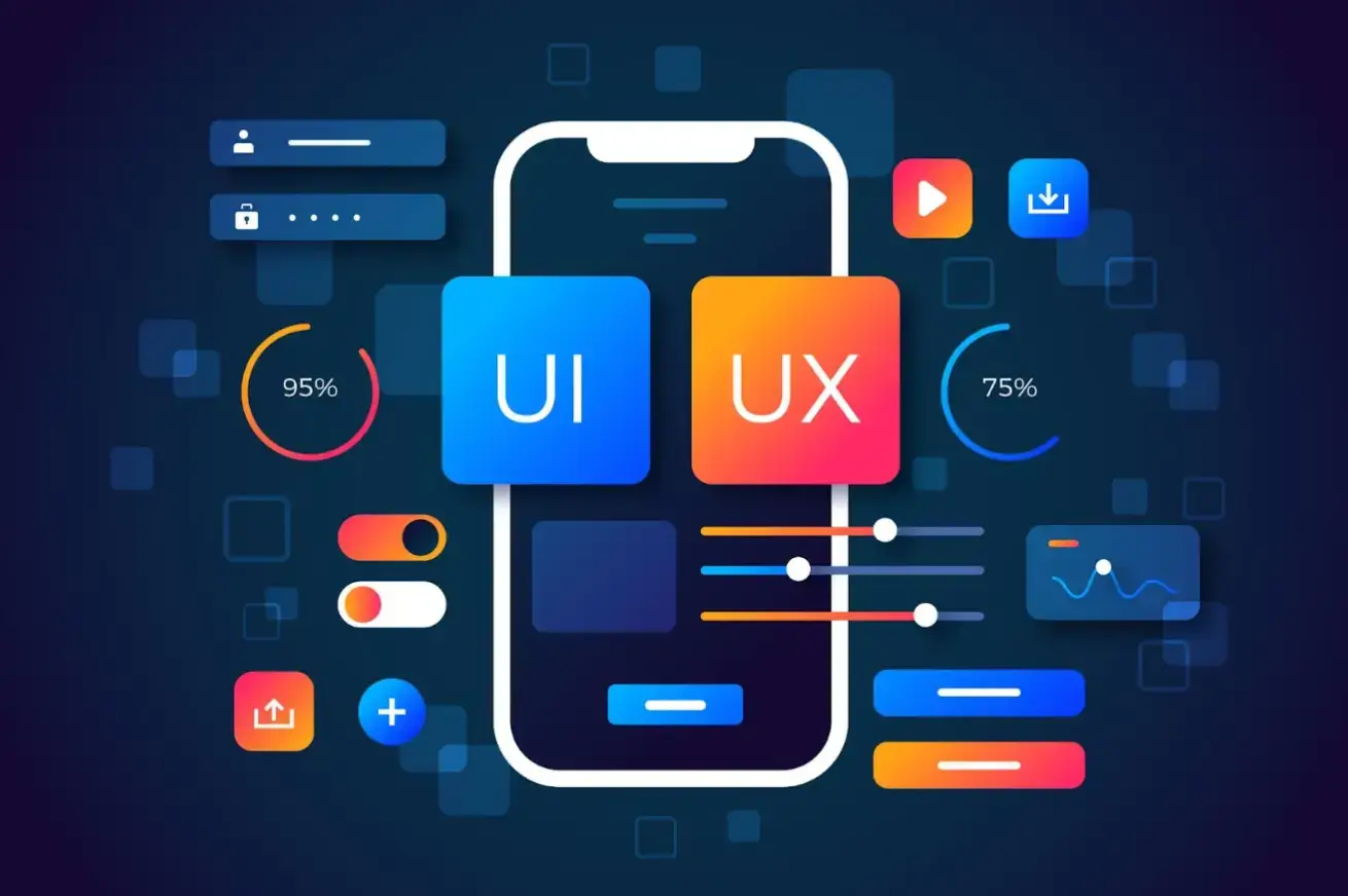
Mobile design is how users access and experience their daily digital worlds.
It is an interface built specifically for how people tap and swipe on a touchscreen, emphasizing speed, simplicity, and flexibility, with fast-loading content and smooth navigation.
Creating Strong Visual Hierarchy on Mobile
Creating a strong visual hierarchy stands as a foundational technique in mobile design, directing user attention through deliberate use of size, contrast, and spacing.
The layout prioritizes large elements, such as headlines paired with leading, toward additional elements accented with color or space, leading the eye downward.
This organization of dense information in layers makes apps and websites more scannable on small screens.
For example, calls to action on a low contrast background are easy to identify and encourage more action.
Mobbin is used by designers as a reference for established hierarchy patterns in existing apps. The hierarchy allows users to access the most important messages within a few seconds.
Subheadings play different roles depending on their weight and break the content into scanable sections. Icons with a few words indicate priority.
Core Principles of Mobile-First Design
Source: Freepik
Mobile-first design works when developing for the smallest screen size and building up. This is different than forcing a desktop site onto a phone. That usually does not work as well.
Touch targets should be at least 44 pixels high. Buttons or links should have sufficient padding for accurate presses.
Color schemes use a 60-30-10 ratio for dominant, secondary, and accent colors. High contrast between text and background improves legibility under varied lighting conditions.
Key Visual Design Trends in Mobile UX
The trend in visual design is moving towards more subtle designs with soft shadows and stacked transparencies.
Glassmorphism trends feature frosted overlay,s which blur the background without losing detail in the foreground.
Micro-animations bring the interface to life, providing concrete feedback with icons that bounce when touched or objects that move smoothly between screens, indicating actions and transitions.
We design custom illustrations to tell stories for brand voices with personality, rather than using stock imagery. They bring scalable vector graphics across devices.
Font usage is mainly sans-serif, with generous line height. Font sizes and attributes adapt to user choices, not to page zoom adjustments.
Mobile Navigation Best Practices
Bottom navigation bars can keep the primary actions close to where the thumb naturally rests, while edge swipes can provide other functions.
Hamburger menus can also expand into full-screen menus of secondary actions on tap. On multiple screens, common icons promote muscle memory and speed up repetitive tasks.
Search may use autocomplete and filters to anticipate user needs and show results incrementally. There may be progress indicators for multi-step tasks.
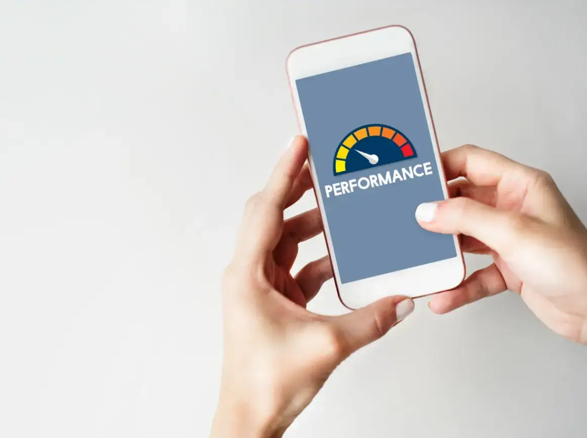
Performance and Speed Optimization for Mobile
Source: Freepik
Fast load times improve retention, with an initial render time under 2 seconds. Image compression and vector icons reduce file size without compromising quality.
Lazy loading loads off-screen assets when needed, while caching stores frequently accessed elements on a device for instant repeat access.
Minified code and font optimization help minimize parsing time. Background syncing occurs infrequently to conserve battery life while on mobile devices.
Real-device testing can reveal hardware delays, such as those caused by older CPUs or variable network speeds.
Tools can measure core web vitals such as largest contentful paint and cumulative layout shift.
Accessibility Fundamentals for Mobile UX
Inclusive design reaches this broader audience by using semantic HTML elements, applying ARIA labels for screen readers, and writing alt text that describes images.
Keyboard accessibility allows voice input devices to highlight the active element.
Reduced motion settings respect users who may be motion sensitive.
Minimum contrast ratios are met, assessed by tools to check how text appears on the background. Text can be resized to 200% without layout changes.
Microinteractions That Increase Engagement

Source: Freepik
Microinteractions improve routine tasks: ripple effects on taps and haptic pulses on swipes unify touch and vibration into a simultaneous experience.
Errors in recovery are indicated by friendly guide pop-ups, and inline suggestion failures are followed by a thumbs-down icon.
When successful, there are short jubilations or confetti. Loading spinners are replaced with skeleton screens while a webpage layout is displayedwhile content is loading.
Building Scalable Mobile Design Systems
Design systems define reusable components such as buttons, cards, and modals.
Atomic design breaks these elements into smaller components for analysis. Tokens define colors, radii, and spacings. Change the tokens, change the theme.
The documentation describes the variants and states for handover from design. Version control tracks changes, and previews provide feedback on responsiveness.
Collaborative libraries maintain consistency from prototypes to production.
User Testing and Iteration

Source: Freepik
Usability sessions perform tasks and identify friction on target devices. Tap patterns are analyzed using heatmaps to inform layout decisions.
Variation performance is measured by completion rates or session length, with qualitative data collected through surveys, on-screen prompts, and polls.
Based on analytics identifying drop-off points, the team prioritizes and iteratively addresses the biggest problems.
Personalization and Adaptive Mobile Experiences
Depending on the context, such as orientation or location, weather widgets may be shown, and user history and most-visited categories are tracked.
Adaptive components resize for foldables and large screens, and preference profiles persist dark mode and font selection.
Privacy is addressed by anonymizing datawhile providing meaningful, personalized recommendations.
Onboarding quizzes set initial profiles, and further preferences are learned over time based on users' behavior.
Cross-Platform Mobile Design Consistency
Unified experiences respect platform idioms (iOS back chevrons, Android material ripples, etc.) and scale across screen densities and layouts.
Tools for prototyping the two ecosystems to catch problems early, thumb zone mapping to maximize primary actions by grip.
Shared codebases with conditional rendering reduce duplication. Beta testing allows for cross-platform feedback before launch.
Future-Proofing Mobile UX Design
Modular architectures allow for additional inputs, such as AR gestures, and voice-first components allow for conversational-style input.
Sustainable optimization keeps data demand low and renders efficiently. Continuous learning routinely optimizes the users' activities.
Such strategies have guided mobile designs towards balancing art with lasting function.
Frequently Asked Questions About Mobile Design
What is mobile-first design and why is it important?
A mobile-first approach prioritizes designing for smaller screens, ensuring fast performance, an intuitive layout, and accessibility on mobile devices before scaling up to larger ones.
How can I improve mobile website performance?
Use image compression, lazy loading, and caching. Optimize code and use vector icons to reduce load times.
What are current mobile UX design trends?
Current trends include soft shadows, glassmorphism, micro-animations, and custom illustrations for brand storytelling.
How do I ensure accessibility in mobile design?
Use high contrast, scalable fonts, semantic HTML, ARIA labels, and respect user settings like reduced motion.
What tools help with mobile UX testing?
Tools like heatmaps, usability sessions, and real-device testing help evaluate performance and identify friction points.