The number of people visiting your website can be difficult to track for small businesses. Don’t you love the excitement of seeing those numbers go up, though?
Until those visitors take action, they don’t have much value because you can’t qualify them. So how do we do that?
With more than half of businesses reporting their biggest challenges in generating and tracking leads, it’s essential that you find a method that works well for your business and target audience.
![]()
Whatever you do, you need to ensure you’re collecting information from your website visitors so that you can follow up with them and nurture them to become loyal buyers!
There are different ways of doing this. It’s worth bearing in mind that in a SalesForce survey of 7,000 consumers, 57% of the respondents said they are willing to share their data in exchange for personalized offers
Further, 53% said they would share for the purpose of personalized product recommendations, and 52% for customized shopping experiences.
Top 8 Ways to Generate More Leads for Your Small Business
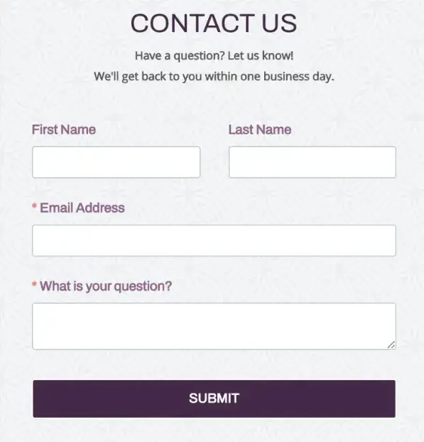
- Add a Contact Form to Your Website
- Keep it Simple, Keep it Speedy
- Pay Attention to Your Form Location and Timing
- Using a Strong Call to Action (CTA)
- Make it Easy to Understand
- Don't Distract Your Visitors
- Can You Prove It?
- Not Sure? Test, Test, Test!
1. Add a Contact Form to Your Website
If you’re not collecting information from your site visitors, you’re missing an opportunity to convert those visitors into customers. Trust me, if we could make an app to read your visitors’ minds, we would.
Until then, POWR Form Builder is the easiest way for you to collect email addresses, feedback, and pretty much anything else you can imagine from your site visitors. Set it up in less than 5 minutes and move on to step 2!

2. Keep it Simple, Keep it Speedy
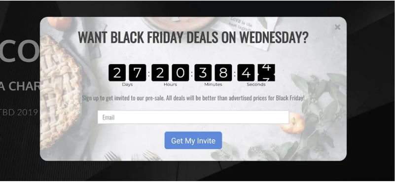
With approximately 2 in 3 customers abandoning their shopping cart before checkout, you’ll want to ensure that you catch their attention before leaving your site. A great way of doing it is with an exit popup.
An exit popup displays as your website visitor navigates to the URL bar for a different site. It's most effective if it has a very enticing offer.
Remember, your customer is already on their way out, so you need to give them an excellent reason to stay.
You'll also need to make it easy to redeem the offer with a code they can copy on click inside your popup. Exit intent popups help reduce cart abandonment and increase sales.
It's important to know what your audience wants and create something they'll want to give you their contact information for.
It needs to be compelling enough for them to hand over their email and phone number, depending on the information you're looking for.
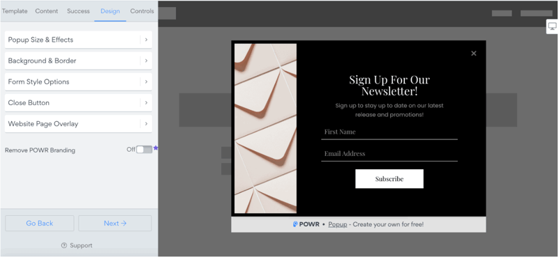
One powerful way to do this is to create an offer on a popup that your visitors can take advantage of. You can collect emails while offering discounts to increase conversions and boost sales.
Another tactic would be offering an eBook or larger content piece, where you generate leads interested in specific products or services. You can even redirect to a page with an embedded PDF document after you gather contact information from your visitor.

3. Pay Attention to Your Form Location and Timing
Don’t hide your form away at the bottom of your page. While playing Sherlock Holmes was fun as a kid, chances are your visitors don’t want to do it on your website.
Add your form to your page as a floating button or tab. They can’t ignore it; it’ll follow them as they scroll. Once they click, your form will pop up, and you’ve scored another lead!

4. Use a Strong Call to Action (CTA)
It’s one thing to ensure your visitors find your form, but getting them to hand over their information is another challenge. Here’s where your button (or ‘call to action’) matters.
Also, integrating a call to action into a QR code helps generate leads. By scanning the QR code, they may get discounts, promotions, and vouchers. You can find free QR code generator tools online.
Choosing the right words in your CTAs can increase conversions by as much as 25%.
Specifics such as “Click now for your free download” outperform generalities such as “Submit” or “Download.” It seems so simple but can make such a big difference.
Consider giving them a special offer or incentive in exchange for their information. Most of all, don't be one of the 70% of SMBs that do not use CTA buttons. Be part of the 30% who do. Your bank account will thank you.

5. Make it Easy to Understand
This should be a no-brainer and is not specific to your forms. Your copy should align with your audience. Do you have visitors around the world?
If yes, consider that not all of them will be native English speakers. Your chosen words should be simple, unambiguous, and easy to follow. Readability Score tools can help ensure you’re hitting the mark.
6. Don’t Distract Your Visitors
Have you ever walked down the cereal aisle in a supermarket, gotten overwhelmed, then left empty-handed? I mean, they ALL look so good! Then you’ve experienced the Paradox of Choice.
It can happen on your website, too, so it’s important to guide visitors to make the decision you want. How? By minimizing distracting elements that compete with your main conversion form.
Negative or white space is a great tool (commonly used by Google) to increase readability and help visitors quickly find your main button or form and convert it into a lead.
Buttons with color contrast are also a good option to consider.
LuckyMag has buttons in the right position with less distraction plus color contrast, making them more likely to be clicked by a higher percentage of visitors.
7. Can You Prove It?
I don’t know about you, but I don’t buy anything on Amazon before scrolling down to the reviews.
In fact, statistics show that 99% of online consumers read reviews.
Your word alone is not enough. Your visitors want tangible evidence of everything you’re claiming. Back it up with numbers.
This could be the number of people who’ve already subscribed, the number of customers who’ve bought a product, reviews from customers, or video testimonials.
Display those numbers or reviews by your form and watch those leads fly in!
8. Not Sure? Test, Test, Test!
The truth is, nobody has all the answers. What works for one site doesn’t necessarily work on another. You must constantly test to see what will get you the most leads through your form.
Here’s a quick checklist of things to try:
- Number of form fields
- Form location
- Button text
- Button color
- Background color
- Offering a reward/deal for completing the form
Conclusion
One of the most difficult tasks for a small business owner is lead generation. It takes consistent effort and constant learning.
The best part is that you can do all these with POWR plugins without knowing how to code, and no engineering or development team is needed.
Now, let's start collecting more leads for your business to smash those goals this year!

