To bring your visitors back to your website, you must convince them that your business is worth their time. So what's the best and most viable way to do that?
*Updated 6/26/2024
You have to create the best products and offer top-notch customer support. But all of these come later in your customer's journey.
Before buying your products, they would start with research to understand your product better and see if it can fulfill their requirements. In doing so, the best place they can find this information is your business website.
Your website may not be just one product. You may have several other products and services to offer. Some might want to focus on one product or service.
Now many marketers get confused between a landing page and a homepage. And it's essential to understand the difference between the two.
The best way to help such users is to create a powerful landing page for your products or services.
So let's start by understanding the difference between landing and home pages. We'll then move ahead to learn how to get more bang for your buck with your landing page.
Landing Page vs. Homepage - What is the Difference?

You're mistaken if you think a landing page is the same as a homepage. There are differences between the two.
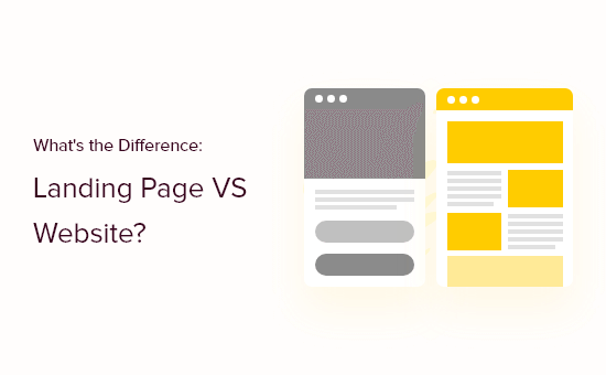
A home page is the main page of a website. On the other hand, a landing page is a standalone page designed for a specific goal or purpose.
Users can use the homepage of a website to navigate to other pages of the site using hyperlinks.
You are encouraged to take specific action on a landing page. These actions can be making a purchase, signing up for something, or anything related to that business's goal.
So the main motive behind creating a homepage is to provide information to your users about your business.
On the other hand, a landing page is designed to boost your conversions by encouraging the visitors to do something you want them to do.
But how do you do that? Well, if you know how to create a well-optimized landing page, boosting your conversions with it isn't that difficult. So let's create a landing page to help you get more bang for your buck.
5 Steps to Building a Landing Page That Converts
1. Focus your headline on key benefits

Your headline is the first thing visitors will notice about your landing page. It can either retain your visitors or chase them away for good. I am sure you don't want the latter to happen.
So what do you do? You use your headline to convey the value you're offering.
This offering will make your headline more powerful and compel your visitors to explore your landing page further. Or you can skip the hassle and create a stunning website in just 10 seconds with Brizy, the cutting-edge AI Website Builder.
Using an AI website-building tool automates the process of designing your landing and other pages, saving you time and effort.
2. Use high-quality images to make it stand out
I bet you’ve heard it before, but I will repeat it. One image is worth a thousand words.
The product's image makes your landing page stand out no matter how good you're with your content. Your image will help convey a feeling and make the landing page more engaging.
So always make sure to use a high-quality image on your landing page. You can also split-test your images if you aren't sure which one will work best for you.
To make the image stand out even more, you can consider removing the background and using a transparent PNG. This will help the image stand out without taking away from the other elements on the page.
3. Add the lead form above the fold
The critical point to remember is to add the lead form above the fold. That way, you make it readily accessible to visitors if they want to use it.
When you put your lead form above the fold, visitors don't have to scroll down the page to find the form. They can see it the moment they enter the landing page. It's an excellent way to encourage them to take action on the site.
4. Make it distraction-free
Often, marketers and designers add too many elements to their landing pages. But this can only confuse your visitors and distract them from your main goal.
The best landing pages will always be simple and clean and directly show what they offer. A beautiful landing page layout helps visitors stay focused without being distracted.
As a result, the chances of converting them increase too.
5. Add a clear CTA
The main objective behind creating a landing page is to boost your conversions.
And for your visitors to take action on your website, you need to add a CTA. Your CTA is like the door through which they can achieve what you're offering.
So adding a powerful CTA is extremely important to make your landing page more effective. Not adding it can only confuse your users and make them feel frustrated. So make sure to add a prominent CTA to all landing pages.
Over to You
To attract more leads to your website and convert them into customers, you must create stunning landing pages that convince your visitors to convert.
But for that, you need to understand what makes a good landing page. Considering the above points, you can create a beautiful landing page and get more bang for your buck.


