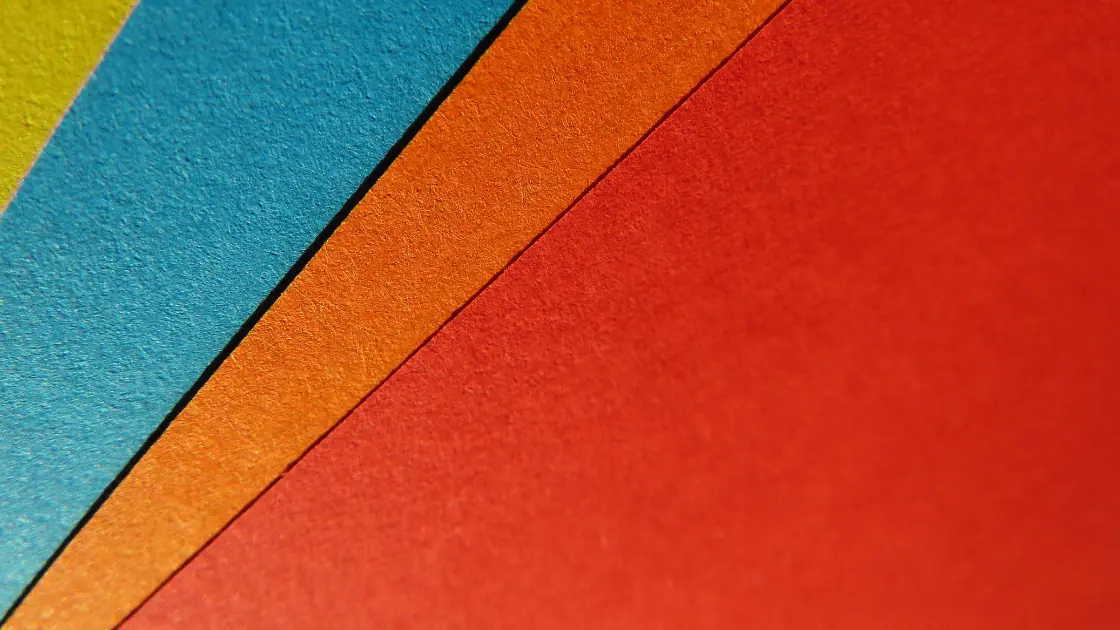
A wide range of colors surrounds us. We have choices when it comes to designs. Some colors are well-received and popular, and others…not so much. The perception of colors differs from person to person and even place-to-place.
Nonetheless, we define different colors with different emotional states. We associate blue with confidence and calmness; yellow is a color we relate to happiness and positivity, while red connects with love and passion.
When it comes to business, colors are a main driver in how our brand is perceived. You need to understand the psychology behind colors to properly communicate your company values and what your company stands for.
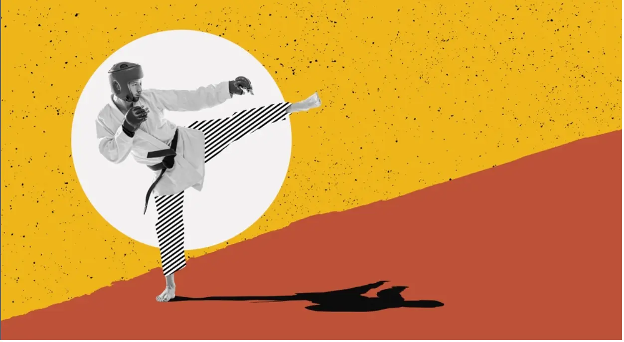
It’s how we think, but that’s not always true. Take a website design, for example. If a designer wants to reflect a confident look on an e-commerce website, they may choose red to express a confident look instead of blue.
This write-up will focus on leveraging color psychology to create authentic and innovative designs. But before that, let’s dig into what color psychology is.
What is Color Psychology?
Color psychology studies how color impacts human thought, emotion, behavior, and decision-making. The perception we develop about different colors isn’t something innate. That’s why we have our own color choices for other objects.
For example, if you visit any online apparel store to buy a dress, you always ensure that your chosen dress is of your preferred color before purchasing.
You look at other factors like price, quality, etc., before purchase, but color also carries weight in your purchase.
13 Ways to Use Color Psychology in Creative Designs
- The fundamentals
- Audience targeting
- Attention-grabbing color
- Readability
- Brand inspiration
- Tactful deployment
- Color consistency
- Develop a brand color palette
- A color's meaning
- Cultural context
- Color testing
- Correct color combinations
- Color personalities
You must understand and follow specific rules and regulations to employ color psychology. And it’s a cakewalk to understand them.
Let’s examine the dos and don’ts of using color psychology in creative and authentic designs.
1. Pick up color psychology fundamentals
Introducing yourself to the basics of color psychology is the first step before applying it to your design.
What we mean by basic is that you should know the effect of different colors on human emotion and behavior upfront.
Only then will you be able to employ colors appropriately in your creative designs. Sometimes, you may even require color combinations to make your design imaginative and authentic.
So, no way to brush aside the basics and essentials!
2. Comprehend your target audience
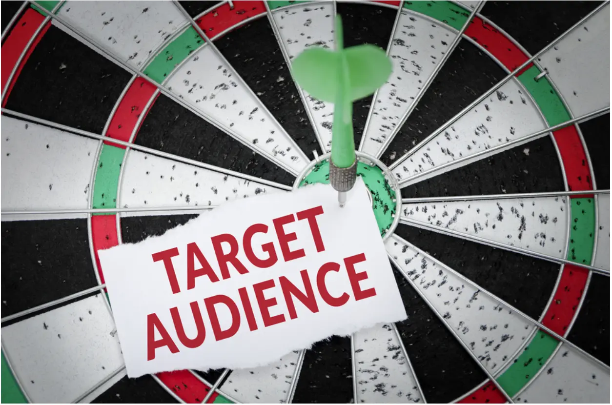
Understanding the target audience is vital in applying colors to creative designs.
If your target audience is eCommerce businesses, leveraging colors won’t be identical if your target audience is real estate agencies. E-commerce businesses will always think about their website designs from a marketing perspective.
They would seek colors that bring simplicity and cleanliness to their websites. However, real estate agencies always look for bold and confident website colors.
3. Leverage color to grab attention

Color is a fantastic medium for slashing monotony and passivity, streamlining attention spans.
As per studies, when designers deploy colors to stress a specific feature or a piece of content on the screen, the attention level of visitors mounts. Warm colors notch up this goal best.
Red, in particular, when used meticulously, stands out and draws attention instantly, stimulating the visual sense and assisting learners in recalling facts and figures.
4. Streamline and boost readability with color
Color can scale up clarity and readability in the text by as much as 40 percent. But for that, your color usage must be tactical.
Strategic use of colors on every screen to improve the clarity of content aids reasoning and memory.
Secondly, color has the magical prowess to make the content more readable. It works best in designing eLearning course screens that demand contrasting chromatic colors in the text and background. (You can use a color wheel to find contrasting colors).
5. Get inspired by other brands
There isn’t a better way to improve understanding of the psychology of color than to take a closer look at the ads, websites, and marketing materials of global brands.
For example, Bloomscape, an e-commerce plant website, targets Millennial and Gen-Z consumers with a pleasant cream base and light peach accents — a warm revision of Millennial pink.
6. Deploy intense colors tactfully
In specific designs, employing intense colors is pivotal.
For example, eLearning designers should use solid and bold colors or place them over neutral background tones. It prevents colors from becoming too intense and distracting.
7. Maintain color consistency in your branding
A study by SEO company Reboot found that 78% of participants could remember a logo's primary color, while only 43% could recall the company name.
Maintaining color consistency is essential; the most successful brands recognize this.
For inspiration, see Envato's rebranding journey.
8. Develop a design color palette
You aspire to keep the colors in your design consistent, and you don’t want people to forget you.
Use a Color Palette Generator to create a scheme that allows variety while setting standards.
- A few common types of color palettes
- Analogous: Colors sitting next to each other on the color wheel.
- Complementary: Opposite colors create high contrast.
- Monochromatic: Various shades or tones of the same primary color.
9. Stress colors based on their meanings
Every color has a distinct meaning, and visitors will consider this significance consciously or subconsciously.
Meanings of colors vary with culture, so designers should adapt tones to their primary audience.
In Western society, red signals danger or importance, black is negative, and white implies purity.
10. Don’t ignore cultural context
MIT researchers found that words used to discuss color vary by language.
Some communities only have three color categories, while others have up to 12. This proves color psychology is variable by culture.
11. Run an A/B test with different colors
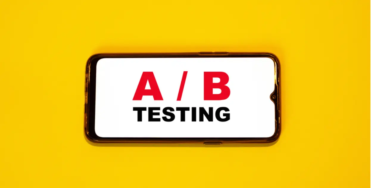
You can’t always foresee how your audience will respond to a particular color. That’s where A/B testing comes in.
For example, try two different color backgrounds in your ads or buttons on your website and observe which your audience prefers.
12. Don’t neglect to choose the right color combinations

The color wheel showcases which colors are harmonious and complementary, ensuring designers avoid straining visitors’ eyes.
It typically consists of red, yellow, green, blue, orange, and purple. Opposite, triangular, or rectangular arrangements help ensure balanced palettes.
13. Different color attributes and personalities
Red – Power, passion, energy, fearlessness. Used by Coca-Cola, Netflix, Levis, Canon.
Blue – Trust, loyalty, dependability, logic. Used by Facebook, Ford, PayPal, American Express.
Yellow – Optimism, warmth, happiness, creativity. Used by CAT, McDonald’s, Best Buy, DHL.
Green – Health, freshness, prosperity, growth. Used by Android, Starbucks, BP.
Black – Sophistication, power, elegance, authority. Used by Nike, Chanel, Apple.
White – Purity, simplicity, innocence, cleanliness. Used by Adidas, Tesla, Sony.
Magenta – Imagination, passion, creativity, innovation. Used by T-Mobile, Barbie, Cosmopolitan.
Ready to Apply Color Psychology?
As a designer, it’s essential to understand color psychology. Without it, your designs may work by chance but often fail to connect emotionally.
By understanding the concept of color psychology, you can refine your creative designs, maintain consistency, and comprehend how your audience responds to color combinations.