Wondering how to create and customize online forms to capture leads and increase conversion rates?
You’re in the right place. Dive in to find out our top five tips and tricks to boost form submissions.
Skip to:
- Be Strategic about Form Placement
- Leverage Plug-ins to Capture Data
- Reduce Cognitive Load
- Create CTAs that Communicate Value
- Use Heat Maps to Highlight Your Value Proposition/Social Proof
Be Strategic about Form Placement
Imagine this: Your skin has recently started to break out, and you don’t know why. You obviously want to find more information, so you go to two skincare websites, and here’s what you see:
- Website A has a custom form that takes your unique skincare concerns into consideration and provides you with a customized skincare routine.
- Website B has a form that unlocks an ebook — this ebook is on the topic of “Skincare Concerns and Solutions You Can Try.”
Now, if you had to fill out only one form, which would you fill out?
If your answer is the form of Website A, you now understand why form placement and its subsequent content(s) are just as important as what it leads to.
This is because when you collect customer information, they (customers) want to get something in return that’s of essential value in their buying journey that would justify hiccups (like form-filling).
A real-life example of a company being strategic and value-driven with its form placement is FormHealth.
It offers a quiz to determine whether users are eligible for their weight loss programs with Wegovy, Mounjaro, or other medications, as shown below.

Leverage Plug-ins to Capture Data
When users are on your website, they often need answers, and they need them fast.
On average, websites with a 1-second load speed have 3x conversion rates compared to websites with a 3-second load speed. Conversion comes down to how fast users can access information.
That’s where form plug-ins can help bridge the gap. They don’t correlate with loading speed, but they help access information quickly and in real-time, which eventually helps capture data and increase conversion rates.
For example, form builder tools like POWR can provide your users with:
- Dynamic pricing
- Product pop-ups
- Countdowns
- Engagement
- And much more

Reduce Cognitive Load
Another tip to increase conversion rates and lead captures with the help of forms is to structure them optimally so that there’s no cognitive load in terms of content, design, or any other aspect(s).
Why do we say this? Because too much information at once doesn’t allow your customers to focus on the important elements and text.
For reference, here’s what a form with extra cognitive load vs. low cognitive load looks like:
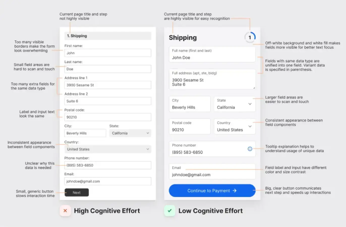
On that note, here are a few things you can do to reduce cognitive load:
- Use a poll-type structure and limit the options to 3–4 choices.
- Don’t clutter your forms with design elements. Use a clean structure that highlights the value proposition.
- Write with easy-to-understand words (avoid jargon).
- Optimize fonts, colors, and font sizes so the text is clearly legible (consider increasing the text size of the form title).
- Ask answers to only the most important questions (you can also try getting user information over time by asking for different information during different interactions).
- Consider running A/B tests to see how users interact with your forms and which form fields and elements deserve improvement.
Also, consider the audience’s buyer journey before creating the forms and running A/B tests.
For example, if you’re a brand new startup, you can consider adding testimonials to your forms to increase trust in your brand/products.
- Use between 45–75 characters when communicating when asking a question.

These are just a few tips we can recommend. If you can, try to get in touch with a UI/UX expert who can guide you through the entire process of form creation while keeping your individual needs in mind.
Create CTAs that Communicate Value
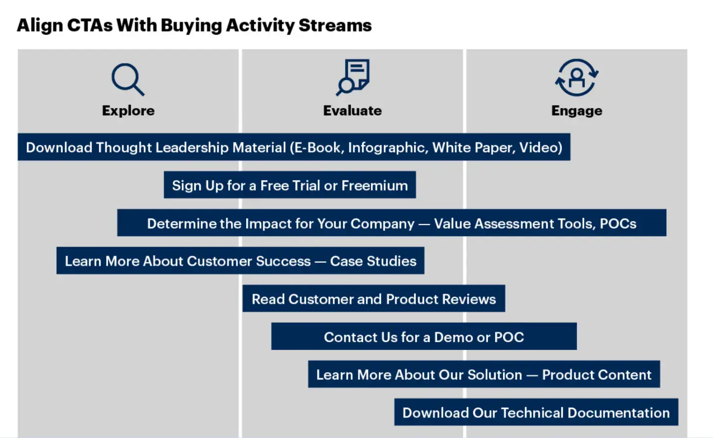
Using generic CTAs like “Submit Form” provides little motivation or validation for filling out the form. They don’t communicate the value or benefit of completing the task.
Experts (and studies) have often recommended changing CTAs to highlight the task's importance.
For example, a study conducted by Moz revealed that specific CTAs like “FREE 5 Min Demo Video” had a 738% increase in conversion rates as opposed to generic CTAs like “Schedule a Demo Today!”

This isn't a one-time incident, either. Another independent study conducted by Gartner had the same results. So, if you wish to increase conversion rates with your forms, use CTAs that communicate the value of filling out the form.
Use Heat Maps to Highlight Your Value Proposition/Social Proof
Your value proposition is something along the lines of your unique selling point (USP), which shows how you help your customers. For example, here’s what a value proposition can look like:

Social proof, on the other hand, can be testimonials, ratings, reviews, awards, and endorsements.
If you’re creating a form (especially a traditional one), you’ll benefit from highlighting your value propositions/social proof, which will ultimately motivate your customers to complete your forms.
Here’s an example of PandaDoc doing the same (i.e., highlighting social proof).
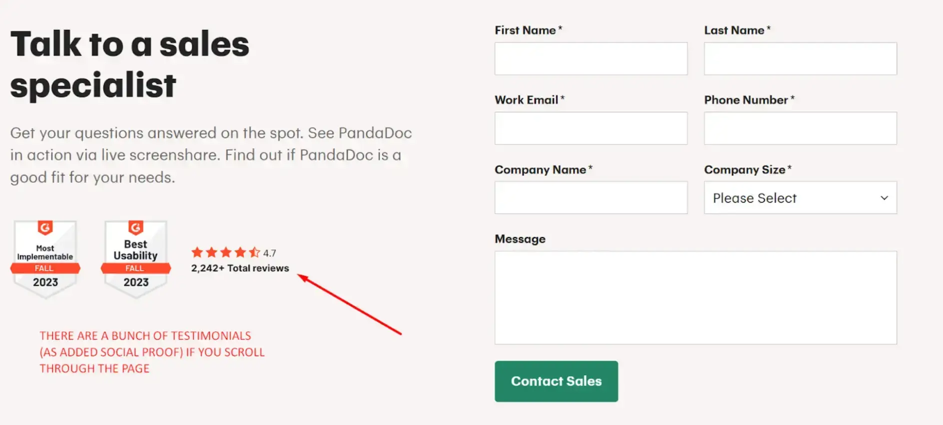
Leveraging heat maps, in this instance, allows you to understand at which places your customers’ eye stops and the places they’re likely to consume content.
You can then use this data to showcase social proof and value propositions, increase motivation, and improve conversion rates.
Conclusion
We know we’ve discussed several tips and tricks on how to build powerful forms. And if there’s one tool that can help you implement all of these, it’s POWR - your go-to free online form builder.
Our advanced features can help you create and customize forms according to your unique requirements (read: choose from a variety of field types and types of forms). But that’s not all. It can also help you:
- Save time with proven form templates that work
- Interact with your customers (in real-time)
- Increase conversion rates
- Engage with them
- Capture leads
- Improve trust
To access the benefits of POWR, sign up for free! Say goodbye to juggling a million Google Forms and hello to professional-looking forms to turn leads into customers.
Author Bio

Jeremy is co-founder & CEO at uSERP, a digital PR and SEO agency working with brands like Monday, ActiveCampaign, Hotjar, and more. He also buys and builds SaaS companies like Wordable.io and writes for publications like Entrepreneur and Search Engine Journal.

