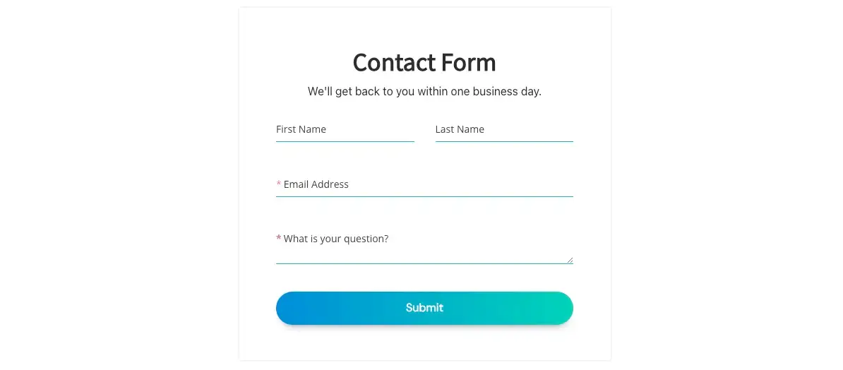
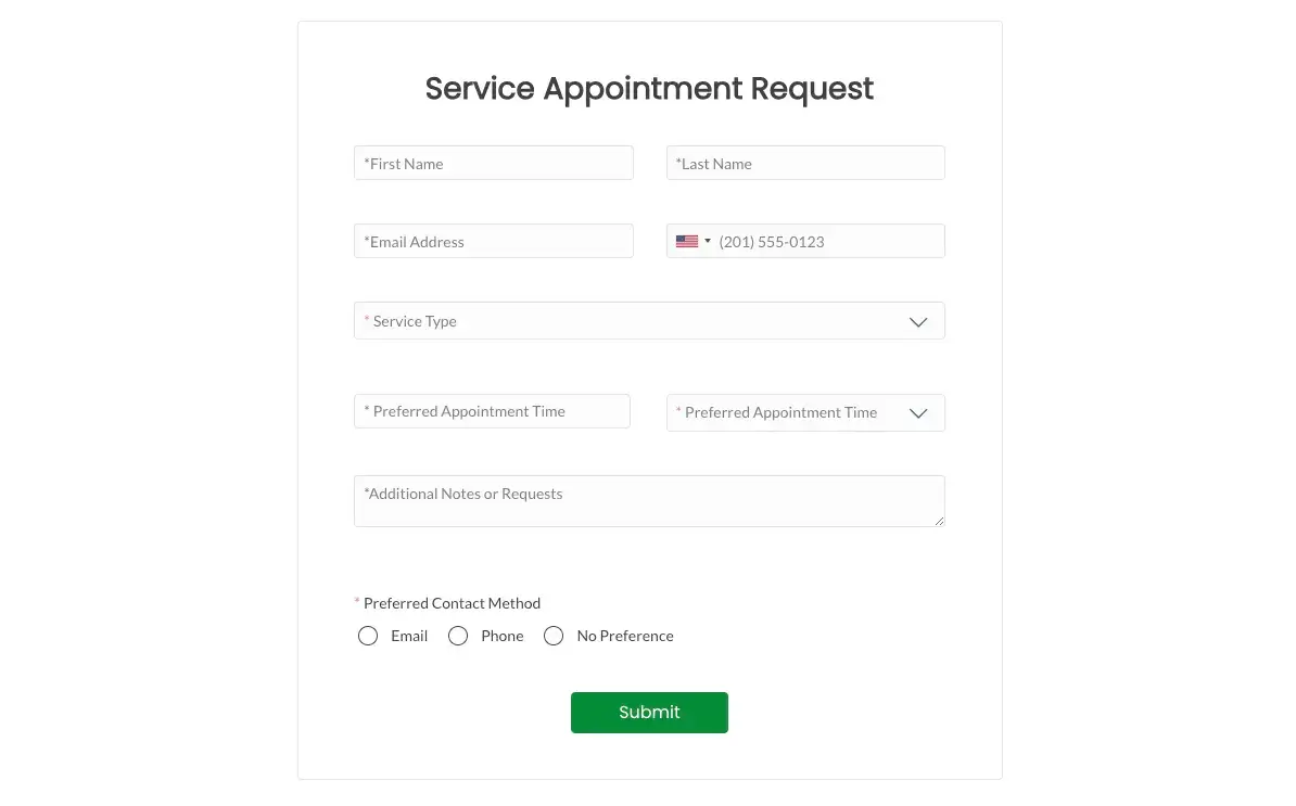
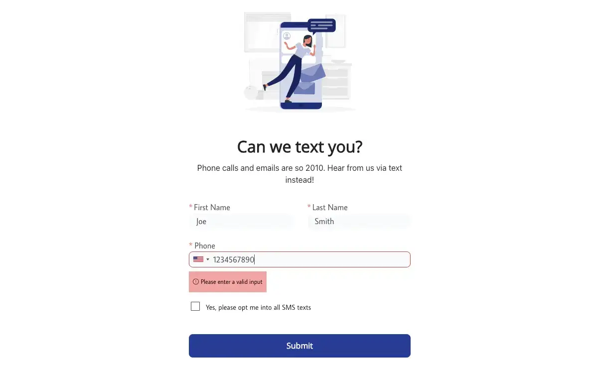
Some usability guidelines need to be adhered to for online forms to be effective and fit for purpose.
*Updated 8/4/2024
These guidelines are designed to allow users to quickly and easily complete forms without any obstacles, resulting in more conversions and the collection of more valuable data.
This article will walk readers through these guidelines to help improve online forms for better-performing websites.
We will also discuss the advantages of dedicated form builders, which allow developers to develop responsive forms that capture and store data quickly and safely.
Shortcuts:

Why Effective Online Forms Are Needed
Online forms are more important than ever, allowing businesses to connect with customers while gathering valuable data.
Regardless of its purpose, any website needs an effective communication channel, with online forms the preferred contact method for most internet users.
Effective forms enable high-level customer service, increase sales and conversions, and help build lasting relationships with customers.
Optimizing online forms to provide a quick and straightforward way to get in touch can greatly improve customer satisfaction.
Likewise, having a set of tried and tested templates can help with data management, new product launches, even during WordPress migrations, and website reworks. Think of it as a ready-made part of the funnel.
However, this must be combined with fast and relevant responses that provide the necessary answers and information.
What are online forms used for?
Online forms can be used in many ways, such as data collection or communication for users to submit queries and contact customer support.
Below is a list of common use cases for online forms.
- Data collection to optimize sales and marketing campaigns
- Gathering feedback to help improve the user experience of websites
- Submitting data such as financial details during checkout on eCommerce websites
- Surveys to gain insight into customer satisfaction
- Raising customer support tickets
- Requesting more information about a product or service
- Onboarding new employees or customers to register them on a system
- Building email lists for future marketing campaigns
7 Crucially Important Online Form Usability Guidelines
I’m often surprised how little people think about customizing their online forms. The result? Forms that are too long, confusing, or don’t make good sense.
They do not gather enough information or forms that do not provide relevant options for the customer’s question.
Another common issue is that many web pages with an online form need to provide more context, with fewer sections and elements other than the form itself.
It confuses users and leaves them wondering if they are using the correct form.
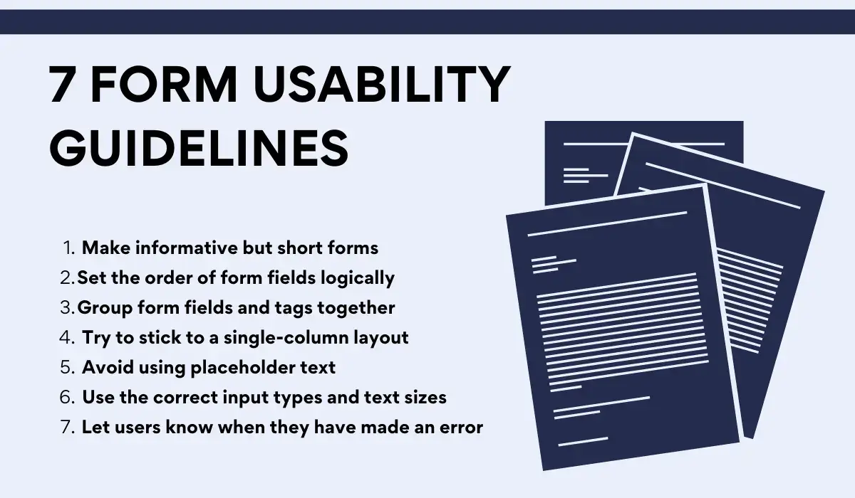
To help businesses create effective online forms, I have compiled these 7 crucial usability guidelines focusing on best practices and tips for optimal results.
1. Make informative but short forms
Overly long forms can be off-putting, especially in the modern digital climate, where web and app users expect maximum speed and convenience.
When creating an online form, it is important to remove any unnecessary fields to ensure that filling out the form is quick and easy.
I also recommend avoiding asking for too many details, including text boxes with a minimum number of characters or asking users to submit multiple contact details.
Email and phone number fields often contribute to online form dropouts, with respective abandonment rates of 6.4% (email) and 6.3% (phone number).
According to recent surveys, over 30% of marketers claim they see the highest conversion rates from online forms that contain just four fields.
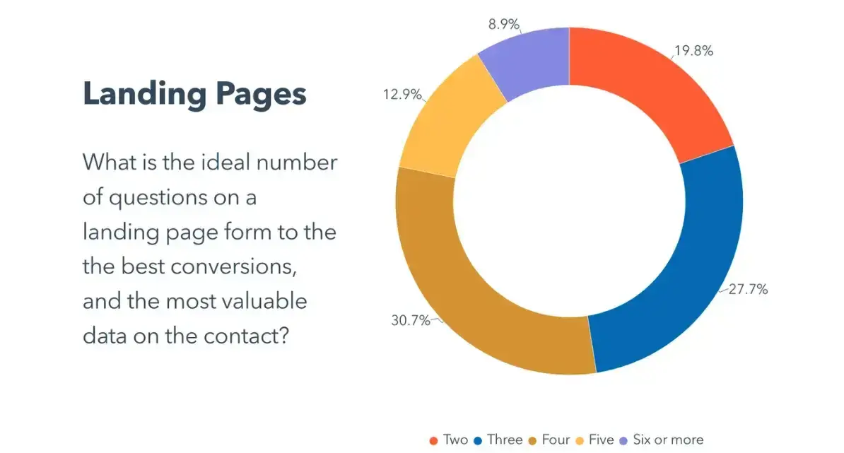
Source: HubSpot
To reduce the length of forms, consider removing fields that request data you can collect by alternative means or ask for later in the user journey.
2. Set the order of form fields logically
Order form fields in a logical sequence that makes sense to the user. For example, the credit card number should be at the top when users submit their credit card details for checkout forms.
Then, follow it with security codes and the expiration date. Similarly, the fields should follow the standardized address format for shipping forms.
Be mindful of how frequently certain field values are submitted across the website, and if possible, include these field options at the top of the form.
A/B testing could also be conducted to determine which form sequences and layouts receive the most engagement.
3. Group form fields and tags together
Although this best practice is common sense, many businesses and eCommerce websites must be more careful when including tag attributes.
Always ensure tags are close to the fields they represent, and design your layouts according to the user’s device.
For example, the tags should be placed directly above the field for short online forms or forms displayed on mobile devices.
Meanwhile, longer online forms, such as those viewed on a desktop, should have tags next to the field. You should always specify precise spacing so there are no inconsistencies that could make the form look messy or unprofessional.
Some users may also use screen-reading software. Therefore, it is good practice to divide the form into two sets of fields with relevant labels for screen readers.
4. Try to stick to a single-column layout
Single-column layouts, with separated rows for each field, are clean and user-friendly.
Online forms with multiple columns can appear convoluted and lack flow, forcing users to navigate across the screen rather than simply scrolling.
Even if an online form contains many fields, we recommend displaying it in a single-column format.
Statistics show that users complete single-column forms 15.4 seconds faster (on average) than multi-column forms.
5. Avoid using placeholder text
Placeholder text is often used to reduce the amount of visual clutter on an online form.
However, placeholders can also be mistaken for clickable elements, which impairs the user experience. That’s why they should be avoided and clear, descriptive tags used instead.
Regarding clutter, although interactivity in forms may seem like a novel idea, you should consider whether it adds any value to the user.
If you allow users to upload documents, such as multi-page contracts, your form should convert them to the correct format automatically, ensuring users won’t be required to rearrange PDF pages within the form itself.
6. Use the correct input types and text sizes
Radio buttons make much more sense if a field only has two or three input options than a drop-down menu.
Only use drop-down menus when there are four or more options or when the number of radio buttons exceeds a single row.
Similarly, text fields should always be the same size as the expected input. If they are not, then online forms can become more susceptible to errors, and users may not be able to see what they previously entered.
7. Let users know when they have made an error
Few things are more frustrating than filling out a long form only to discover that a simple error prevented it from being submitted.
It becomes much more annoying when the error is unclear and informs users how to correct it and quickly move to the next page.
To further boost the user experience, create your online forms so that you save user inputs should they encounter an error so they do not have to enter the same details again.
Conclusion
Online forms are valuable tools for businesses, particularly those in the eCommerce sector.
They enable the submission of critical data and give customers a simple method to contact customer service should they have an issue.
Thus, online forms remain the preferred means of communication when shopping online.
I have outlined these seven crucial online form usability guidelines to deliver the best possible user experience and avoid issues such as eCommerce customers abandoning their cart at checkout.
Author Bio
Shanice Jones is a techy nerd and copywriter from Chicago. For the last five years, she has helped over 20 startups building B2C and B2B content strategies that have allowed them to scale their business and help users around the world.


