Collecting data from your website visitors is essential for growing your business. Web forms are the way to go, whether you're gathering email addresses for a newsletter, getting feedback through surveys, or taking orders.
But creating customized forms that look good and work seamlessly with your site can be tricky, especially if you're not a tech whiz.
POWR is a tool that makes this whole process way easier. It lets you build all sorts of forms without needing to know how to code, and you can tweak them to match your website's style perfectly.
So, in this guide, we'll help you find how POWR can simplify your data collection efforts and help you create web forms that actually boost sales.
Shortcuts:
- Are POWR Form Widgets Best?
- 5 Step Guide to Create a Web Form
- Best Practices for Effective Web Forms
- 3 Real-World Case Studies
Are POWR Form Widgets Best?
If you've ever tried to create a web form from scratch, you know it can quickly become a headache. Coding, design tweaks, and ensuring it works on all devices can be a real hassle.
This is where POWR swoops in to save the day.
Eran Mizrahi, CEO of Ingredient Brothers, adds, “POWR is a tool that makes building and customizing web forms a breeze, even if you don't have any technical skills.”
Let’s discuss why you should choose this tool.
-
Easy as Drag and Drop
Remember building blocks as a kid? POWR's interface is kind of like that. You don't need to know any coding or fancy tech terms.
You simply drag and drop elements to build your form, then customize it to your heart's content. It's so intuitive that you can have a professional-looking form up and running in minutes, not hours.
And the best part? POWR has a patent for its Live Editor technology.
It allows you to make form edits on your live site in real time! A claim no other widget provider can claim.
-
A Form for Every Occasion
Need a simple contact form? Check. A multi-page survey? Got it. A poll to gather opinions? Easy peasy.
POWR offers a range of form templates to suit all kinds of needs. Whether you're trying to build your email list, get customer feedback, or collect registrations for an event, POWR has you covered.
-
Make it Your Own
Matt Grammer, Founder & CEO of Kentucky Counseling Center, adds, “The best part about POWR is the level of customization you have.”
Matt continues, “You can easily change your form's colors, fonts, and overall layout to match your website's look and feel. It means your forms will seamlessly integrate into your site — creating a smooth and consistent experience for your visitors.”
-
Connect the Dots
POWR doesn't just create forms — it helps you automate your workflow. It integrates with popular email marketing platforms like Mailchimp and Constant Contact, automatically adding new signups to your list.
Ali Nahhas, Owner of Aladdins Houston, explains, “You can connect POWR with CRMs (customer relationship management software) like Salesforce or HubSpot to streamline your lead management process.”
-
Mobile-Friendly Forms
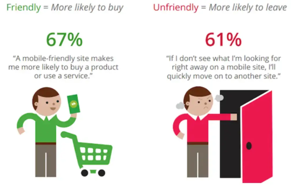
Image Source: Search Engine Watch
Let's face it: most people browse the web on their phones. If you don’t optimize your web form for mobile, you're missing out on a huge chunk of potential leads.
As you can see in the above image, a mobile-friendly website increases the likelihood of customers buying products by 67%. And POWR takes care of this for you.
Kevin King, Founder & CEO at Anytime Baseball Supply, explains,
“All POWR forms are designed to be mobile-responsive, meaning they automatically adjust to look great on any screen size.”
He goes on to say, “This ensures a seamless experience for your mobile users, leading to more signups and conversions.”
5 Step Guide to Creating a POWR Form
Let's walk through it together, step by step. Don't worry, it's much easier than it sounds!
1. Sign up for POWR
First, go to the POWR website and create a free account. This will give you access to the entire library of form templates and customization options.
“They even have a free form that lets you get started without spending a dime,” adds Khashayar Shahnazari, Chief Executive Officer at FinlyWealth.
2. Choose Your Form Type
Image Source: Budibase
Once you're logged in, you'll see a bunch of different form types to choose from. Here are some of the most popular ones for businesses:
- Contact Form: This is your classic ‘get in touch’ form, perfect for collecting inquiries or feedback from visitors.
- Signup Form: Want to grow your email list? This is the form for you. David Martinez, VP Enterprise & OEM Accounts at Cybernet Manufacturing, says, “Offer a discount or freebie to encourage people to sign up.”
- Survey: Want to get feedback from your customers? Create a survey to learn more about their preferences and opinions.
- Poll: If you want a quick pulse check on a specific question, a poll is a great option.
- Event Registration Form: Planning an event? Use a dedicated registration form to make it easy for people to sign up.
- Order Form: If you're selling products or services, an order form makes it easy for customers to place online orders.
Michael Hess, Tech Expert at Code Signing Store, shares, “Always choose the template that best fits your needs, and get ready to customize it.”
3. Customize Your Form
This is where the fun begins! POWR's editor is super easy to use. You can click on any element of the form to change it.
Want to add more fields? No problem! Do you want to change the colors or fonts? Go for it!
Here are some things you can customize.
- Form Fields: Add, remove, or rearrange fields to get the information you need. You can even make specific fields required.
- Design: Change the colors, fonts, and background image to match your brand.
- Text: Edit the text to make it more personal and persuasive.
- Button: Customize the look of your CTA button and make it stand out.
Saba Mobebpour, CEO at DropGenius, shares, “POWR offers tons of customization options, so you can really make your form unique.”
4. Add Advanced Features
Once you have the basics, you can explore some of POWR's more advanced features. These include.
- Conditional Logic: This lets you create dynamic forms that change based on how someone answers a question.
- File Uploads: Allow people to upload files like resumes or photos through your form.
- Payment Integrations: “If you're selling products, you can connect your form to a payment gateway like PayPal or Stripe,” adds William Westerlund, Marketing Manager at Suptask
5. Embed Your Form
Once you're happy with your form, it's time to add it to your website. POWR makes this easy with a simple embed code.
You can copy and paste the code into your website's HTML. Martin Seeley, CEO of Mattress Next Day, explains, “With POWR, you can create stunning, customized forms in no time. So go ahead and try it — you might be surprised at how easy and fun it is!”
Best Practices for Effective Web Forms
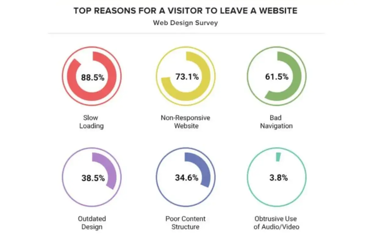
Image Source: HubSpot
Creating a web form is just the start. To get results, you need to optimize it for maximum engagement and conversions.
Danny Jay, Marketing Director at SOLVED Consulting, shares,
“A well-designed form makes it easy and enjoyable for people to share their information, while a poorly designed one can turn them away in seconds.”
The above image shows why people leave websites. Therefore, investing in good web forms is necessary.
-
Keep it Short and Sweet
No one wants to fill out a form that feels like a never-ending survey. Alex Taylor, Head of Marketing at Digital Signage NYC, says,
“People are busy, and their attention spans are short, especially online. So, get to the point! Ask for only the information you absolutely need.”
This might be their name and email address for a newsletter signup or a few more details for an order form.
Alison Lancaster, CEO of Pressat.co.uk, adds that “sticking to 5-7 fields for most forms is a good rule of thumb.”
-
Clear Call to Action (CTA)
Your CTA button is the big finale of your form. It's where you want people to click!
So, make it stand out with bright colors and clear words that tell people exactly what will happen when they click.
Instead of a plain ‘Submit,’ try something like:
- ‘Get My Discount’
- ‘Sign Up Now’
- ‘Download My Free Guide’
“People should know exactly what they're getting by clicking,” adds Chase Hughes, Founder of ProAI.
-
Thank You Page
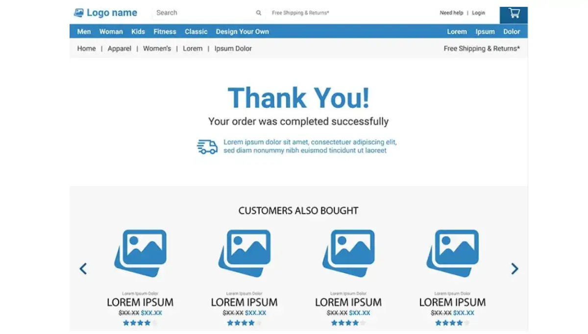
Image Source: Paradox Marketing
Indie Basi, Director of WadeSupplies, adds,
“Don't leave your visitors hanging after they hit submit! Take them to a thank-you page to let them know their form went through.”
Indie continues, “It’s also a great opportunity to tell them what to expect next (like a confirmation email) or offer them something extra, like a discount code or a link to your latest blog post.”
A simple thank-you page shows appreciation and keeps them interested in your brand.
-
Test and Optimize
Don't assume your first form design is perfect. Experiment with different versions to see what works best.
“You can change the headline, the colors, the button text, or even the order of the questions,” shares Nojan Rahimi, Director at Blutin Finance.
“Most form builders have A/B testing tools that let you try different variations and see which one gets more submissions.
This is how you find out what your audience really responds to,” shares Sumeer Kaur, Founder of Salwar Kameez.
-
Data Collection & Analysis
Each time someone fills out your form, they give you valuable information. Track how many people see your form, how many start filling it out, and how many actually complete it.
“This data can tell you a lot about what's working and what's not,” adds Kris Kraze Mullins, Chief Marketing Officer at Capital Max.
Your form may be too long, or your CTA may not be clear enough. By analyzing this data, you can continuously improve your forms and get more out of them.
3 Real-World Case Studies
Here are three real-world case studies from satisfied POWR form users.
Case Study 1: MARRIN COSTELLO® Jewelry Streamlines Data Collection with POWR Widgets

Image Source: MARRIN COSTELLO
-
The Challenge
Marrin Costello experienced good growth after launching its online store in 2012. However, as their brand expanded and reached a global audience, they faced the challenge of efficiently collecting customer data and feedback to enhance their website's functionality and user experience.
-
The Strategy
Marrin Costello opted to integrate POWR widgets into their website to simplify data collection. These customizable widgets allowed them to create engaging web forms seamlessly blending with the brand's aesthetic.
The POWR Form Builder enabled them to design forms tailored to specific purposes, such as collecting email addresses for newsletters, gathering feedback on new collections, or conducting surveys.
-
The Results
Here are some benefits they got.
-
- The visually appealing and user-friendly forms encouraged visitors to interact with the website, increasing engagement and time spent on site.
- The customized forms enabled Marrin Costello to collect valuable customer data, such as email addresses, preferences, and feedback, which they could use to personalize their marketing campaigns and improve their product offerings.
- The POWR widgets allowed Marrin Costello to showcase each collection's press features and visual storyboards in real-time, adding to the website's overall functionality and aesthetic appeal.
Case Study 2: EhubNepal Enhances Website Functionality and Engagement with POWR Plugins
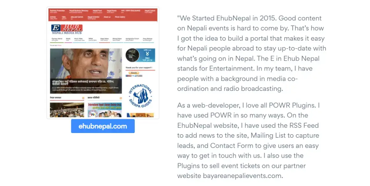
Image Source: POWR
-
The Challenge
EhubNepal, an online platform for Nepali events and news, sought to improve user engagement and expand its reach to the Nepali diaspora.
They needed tools to streamline content updates, capture leads, facilitate communication, and sell event tickets on their partner website.
-
The Strategy
EhubNepal integrated various POWR plugins into their website to address these challenges.
This plugin enabled automatic updates of news content from various sources, keeping the website fresh and informative for users.
-
- The mailing list plugin allowed EhubNepal to collect email addresses and build a subscriber base for newsletters and promotions.
- This plugin made it easy for users to contact EhubNepal with inquiries or feedback, enhancing communication and customer service.
- POWR plugins were also implemented on EhubNepal's partner website, bayareanepalievents.com, to facilitate online ticket sales for various events.
-
The Results
EhubNepal successfully automated news updates and built a substantial subscriber base for targeted communication and enhanced user communication.
Plus, they streamlined ticket sales on their partner website, ultimately increasing event attendance and revenue.
Case Study 3: Big Boy Websites Improves Client Acquisition with POWR
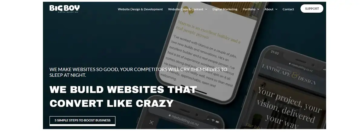
Image Source: Big Boy Digital Marketing
-
The Challenge
Big Boy Websites, a web design firm specializing in affordable solutions for small businesses, sought to attract more clients and streamline their sales process.
They needed a way to showcase their unique offering and collect leads effectively.
-
The Strategy
POWR's Form Builder allowed Big Boy Websites to create customized contact and lead capture forms seamlessly integrated with their website design.
They also implemented a POWR popup to highlight their "no upfront costs" offer and encourage visitors to sign up for a free consultation.
-
The Results
By using POWR, Big Boy Websites attracted more potential clients and turned more website visitors into leads. The tools also made managing and connecting with leads easier, leading to more sales.
Make More Effective Web Forms with POWR
POWR forms are a simple way to make your website work harder. They're not just about looking good (although they definitely can!).
They're about collecting valuable information from your visitors and turning them into leads or customers.
If you've been struggling with complicated form builders or worrying about coding, POWR is your new best friend.
It takes the hassle out of creating forms, allowing you to focus on what really matters—building your business. Give it a try, and see how easy it is to gather the data you need to grow your business.
About the author
Hey, it's Mick and I'm the Growth Marketing Manager at POWR. My marketing career spans two decades, primarily in growth marketing in the healthcare space, with stints in broadcast television, advertising and copy editing. I've also owned 3 small businesses in the past, and sold them all for a profit.
I went to the College of Journalism at the University of Louisiana - Monroe and a storyteller at my core. My wife Elizabeth, son Gavin, and pup Jolene currently call Lafayette, Louisiana home.
Follow me on LinkedIn.


