Whether you’re a business, wellness, or life coach doesn't matter. If you’re a coach, you need a website. A website doesn’t just showcase your values and expertise.
It also helps you expand your online presence to reach ideal clients who can grow your business. Want to set up your site but need help figuring out where to start?
Read on! This article will teach you how to create a coaching website that works and offer ideas you can use for inspiration.
In this article:

How to Create a Good Coaching Website
Creating a good coaching website is easier said than done. Fortunately, if you follow these best practices, you can design one that can help you achieve your business goals.
Choose a design that appeals to your audience
For almost half of Internet users, web design is a key factor in assessing a business's credibility. That’s why you need one that resonates with your target audience.
If your web design isn’t appealing in their eyes, they’ll likely leave without bothering to read your site copy.
Some web designs naturally appeal to specific audiences. For instance, a simple and clean layout like this one typically resonates with corporate clients:

Source: Zestfor
That makes sense, since the simple design allows them to focus on the copy.
Meanwhile, websites with more complex layouts and many colors typically resonate more with individual clients.

Source: Mary Blalock
The goal of such a catchy web design is to appeal more to the emotions of the website visitor than get them to focus on the site copy.
However, this general information may not always apply. If you want to ensure your website design resonates with your target visitors, conduct research.
Why not send surveys that ask them about everything from their color preferences to layout preferences? The more detailed your surveys, the better.
When you deeply understand your target audience, you can make an informed choice. Ultimately, you can rest assured your final website design will be something they’ll love.
Create a compelling copy with a strong CTA
While your website design captures your visitors’ attention, your copy keeps them engaged and encourages them to stay. That’s why you need to focus just as much on creating this.
You can start by highlighting your coaching philosophy. Emphasize your unique value proposition in your copy.
- How exactly do you stand out?
- Do you have a coaching certification?
- Do you offer one-on-one coaching sessions as needed?
Make sure you articulate these in concise, simple terms.
In your copy, you’ll also want to highlight the specific benefits your website visitors can get if they avail themselves of your services. These benefits may be the final nudge they need to take your desired action.
Glenn Taylor, founder of Skybound Coaching and Training, for instance, tells visitors they can “harness sky-high potential” from the get-go:

Source: Skybound Coaching and Training
Instead of merely enumerating these benefits, you can incorporate storytelling elements to guide potential clients on a narrative journey.
Don’t forget to include a strong call to action. Opt for action verbs such as ‘Book,’ ‘Sign Up,’ or ‘Schedule.’
The specific action you want your website visitors to take should be clear from your CTA. It should not be subject to multiple interpretations, such as “Go” and “Start.”
Whether you want visitors to sign up for your newsletter, book an appointment, or download your free e-book, you must ensure your CTA is strategically placed.
Don’t bury it between pieces of text. Ensure your CTA color button also contrasts with your page background so it stands out.
Add professional photos of yourself
Make sure you put a face to your name on your coaching website – literally. This gives your site credibility. It lets website visitors know you’re an actual person.
At the same time, it allows you to connect with your target audience on a personal level. Of course, this assumes you use high-quality photos of yourself.
If your images are pixelated and hard to see, your strategy to boost credibility and relatability will backfire. Your target audience will likely see your photos as reflecting a need for greater professionalism.
Check out this excellent example of a professional photo on a coaching website:

Source: Kimberly Buchanan
Notice good lighting and editing?
Don’t forget to include your contact information on your coaching website. Give them more than just your email address.
Include your social media icons, relevant links, and a phone number. You want to give your potential customers multiple options to reach you.
Include testimonials and success stories
Client testimonials and success stories can prove the effectiveness of your coaching services. That’s why they should also be strategically placed on your coaching website.
You could include them on your homepage. Mark Strong, for instance, uses client testimonials as his primary coaching website copy:
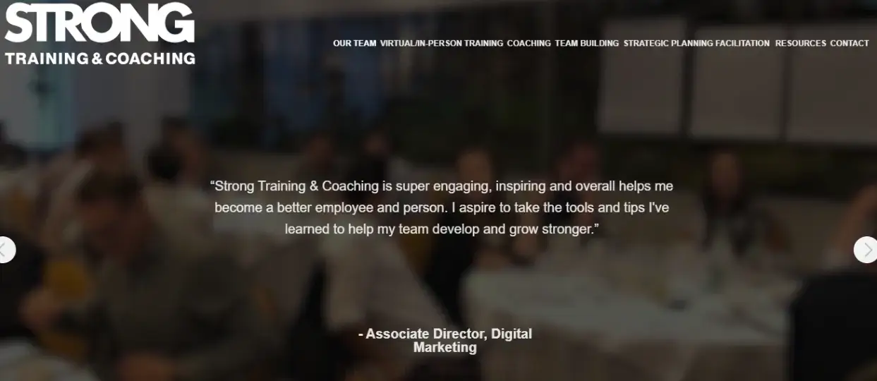
Source: Strong Training and Coaching
Another option is to create a separate section for this type of social proof.
You can approach your satisfied clients directly and request testimonials. Make sure it's easy for them to give these to you.
Instead of asking to meet in person for a quote, you could ask them to email you a quote. You can also use tools like Trustmary to streamline the gathering of testimonials.
Regarding your customer success stories, you will need to write them yourself. The good news is that you can already use AI templates to fast-track your content creation.
Offer free resources
You establish your coaching expertise by offering free resources on your coaching website.
At the same time, you increase the likelihood that visitors stay on your website longer and ultimately take the desired action. After all, you’re giving them additional value.
This valuable content can come in different forms – from blog posts, e-books, and templates to online courses and worksheets.
You can also offer some of these as a lead magnet in exchange for your potential coaching clients’ email addresses.
Once they provide their email addresses, you can send them marketing emails to nurture relationships. Use a reputable email marketing service, such as GetResponse, to capture and segment your email list.
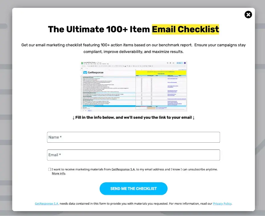
An example of a simple pop-up we used to promote a checklist that got a 6% email signup rate
This way, you can ensure your emails are relevant to your subscribers and, ultimately, persuade them to convert.
Optimize for SEO
To ensure your coaching website’s visibility, optimize it for SEO.
Start by conducting keyword research. The goal is to identify the coaching-related terms prospective clients use when searching the Internet for relevant resources and services.
You can use tools such as Ahrefs and Semrush to do this. Alternatively, just Google a relevant keyword–coaching services, for example–to get a list of terms.
You’ll find these in the People Also Search For section. Here’s what I get when I Google that keyword:

Once you have your list, incorporate these into your site content. Include them in your headings, meta descriptions, and image alt text to improve search rankings.
Also, compress your images to improve load times. Sites that load faster are more likely to rank higher in SERPs.
Make your site mobile-friendly as well. Mobile-friendliness is also a ranking factor. That means, in addition to using responsive web design, you need to use large font sizes and avoid long blocks of text. Space out your links and use large CTA buttons.
Professional Coaching Websites to Inspire You
Ready to create a coaching website that brings in clients? Here are some examples to inspire you:
Kathy Caprino
Kathy Caprino is a well-known leadership coach. Her coaching business has helped more than 20,000 professionals across six continents build rewarding careers.
Her website is an excellent example of how to boost credibility effectively.

Source: Kathy Caprino
Kathy puts a face to her name on the homepage. In her picture, she already exudes the confidence expected of a leadership coach.
Scrolling down, you’ll find an entire section dedicated to her accomplishments. The copy states that she has helped “over 20,000 professional women” and lists the brands she has worked with.

There’s also a section dedicated to client testimonials:

Each one includes the client’s full name and photo.
Jason Treu
Jason Treu is an executive coach based in Dallas, Texas. His website effectively showcases his expertise, with screenshots of his best-selling book and client testimonials throughout. It also provides visitors with significant value.
He offers free Cards Against Humanity playing cards for team-building activities in exchange for email addresses:
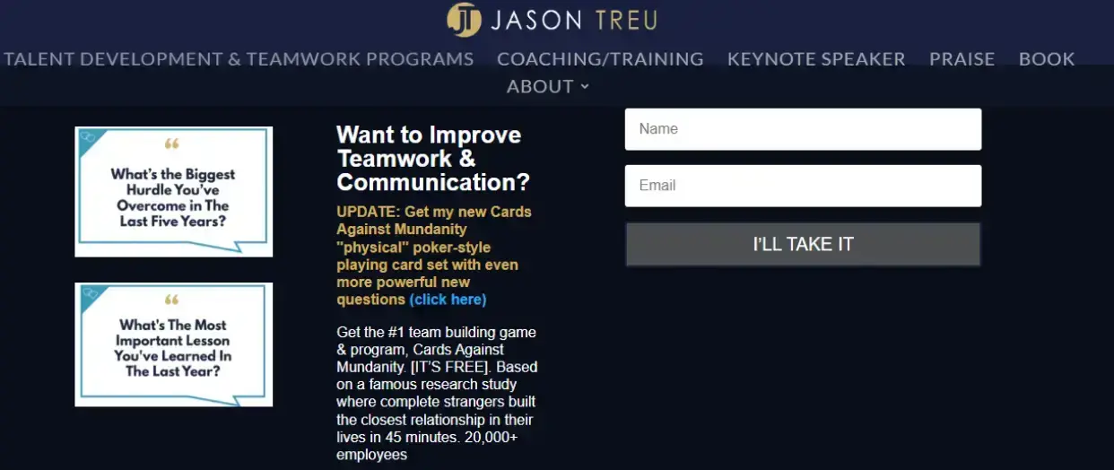
Source: Jason Treu
You’ll even find a video of one of his TED talks on the homepage:

Not the type who likes to watch videos?
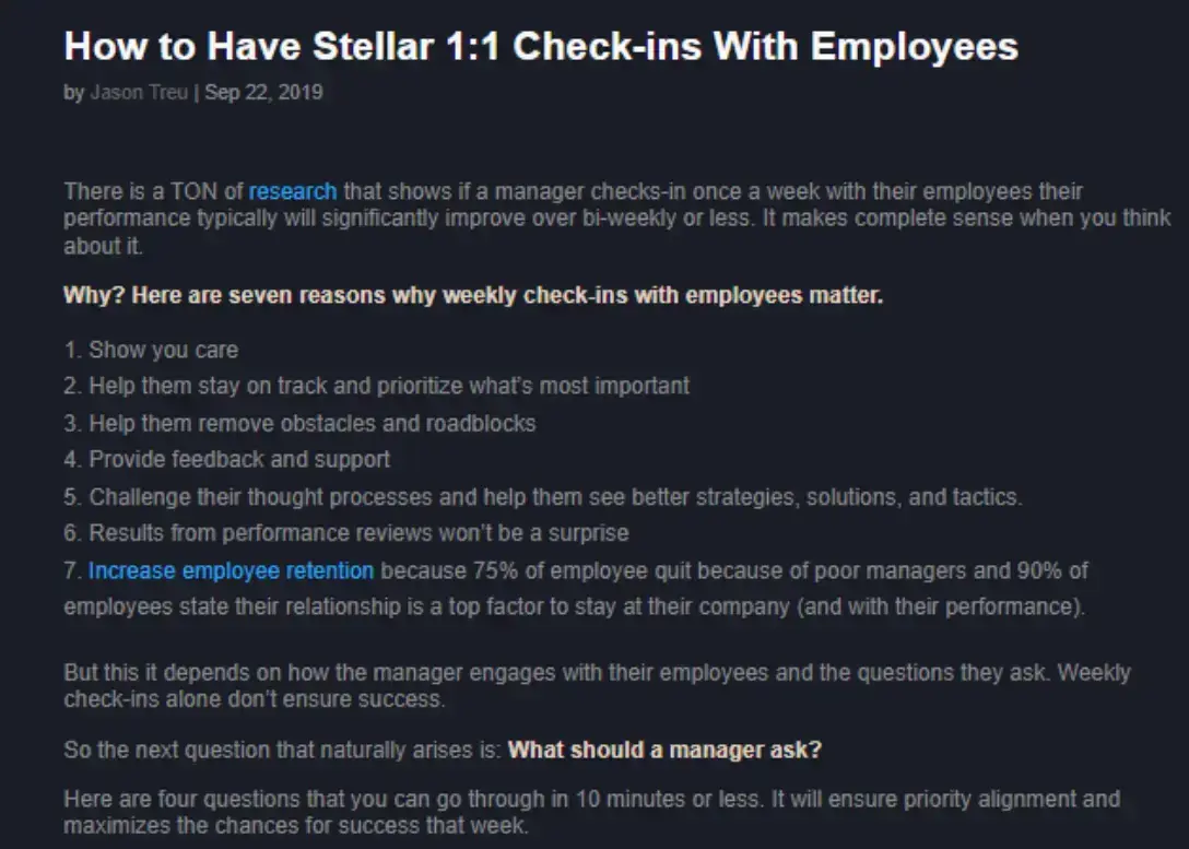
Try reading his informative blog posts, such as the one above, instead.
Daniel Mangena
Daniel Mangena is a wealth coach who regularly appears on well-known media outlets such as Fox and ABC.
You can learn a lot about crafting compelling copy by visiting Daniel’s coaching website.

Source: Dream with Dan
Instead of enumerating the benefits target clients can get from his coaching services, he leverages storytelling to engage them and keep them hooked throughout.
He also peppers his copy with strong calls to action.

The CTAs are straightforward as well.

Potential coaching clients know precisely what will happen if they click.
Conclusion: Design a Dynamic Coaching Website
Creating a coaching website is more than just putting together copy and visuals. You need to follow best practices to ensure the best results.
You learned those best practices from this article. Choose a design that resonates with your target audience, create compelling copy, and add professional images of yourself.
Also include testimonials and success stories as social proof. To provide more value, offer free resources. Lastly, optimize for SEO.
Follow these tips and be inspired by the beautiful coaching websites I shared. In no time, you should have your own coaching site that showcases your personal brand and attracts coaching clients!
FAQ: Coaching Website Ideas
1. Do coaches need a website?
Yes, coaches need a website to showcase their brand identity. It’s also where potential clients can learn more about their services and strategies, and reach out to request them.
2. How do I create a coaching website?
To create a coaching website, follow these tips:
- Choose a design that appeals to your audience
- Create a compelling copy with a strong CTA
- Add professional photos of yourself
- Include testimonials
- Offer free resources
- Optimize for SEO
You can hire a qualified web builder or designer to build your site’s overall structure.
3. Should my coaching website be my name?
That’s entirely up to you. Some coaches say that using your name can help you get more clients, since a personal brand—as opposed to a corporate entity — can help you connect better with people.

Author Bio
Meet Michal Leszczynski, Head of Content Marketing and Partnerships at GetResponse. With 10+ years of experience, Michal is a seasoned expert in all things online marketing.
He’s a prolific writer, skilled webinar host, and engaging public speaker. Outside business hours, Michal shares his expertise as an Email Marketing lecturer at Kozminski University in Warsaw.
You can connect with Michal on LinkedIn.


