
People are visual creatures. Studies have shown that we remember 80% of what we see compared to 20% of what we read.
So, the math is clear: if you want to capture your audience’s attention and make a memorable first impression, your website needs lots of images and videos.
But not just any images and videos—adding visuals just for the sake of it will be counterproductive. Such an approach risks cluttering your website and diluting your message.
In this article:
- Leverage UGC for added authenticity
- Build a consistent visual style
- Opt for high-quality visuals
- Declutter your design
- Add captions to your explainer videos

Source: depositphotos.com
Instead, choose every image and video intentionally and strategically to enhance your content and create a seamless and engaging browsing experience.
Here are some tips for making smart choices that will wow your visitors and turn them into customers.
1. Leverage UGC for added authenticity
Imagine strolling through a busy marketplace. While perfectly curated displays might initially impress, they often lack the warmth and authenticity of a vendor’s personal touch.
The same principle applies to your website. Although professional visuals are non-negotiable, they often seem too perfect, staged, and somewhat impersonal.
As a result, your branded content—the videos and images you create—won’t be perceived as trustworthy or relatable by your audience.
Luckily, you can improve your authenticity score with a simple and affordable tactic: user-generated content (UGC).
Sharing photos and videos of your happy customers enjoying your products is far more convincing than polished content.
Encourage or even incentivize your existing customers to share snaps and videos in their reviews, and don’t worry if these visuals aren’t top-notch — that’s their charm.
You can additionally capitalize on UGC by sharing it on your social media channels and amplifying your reach.
Take Infraredi’s Red Light Therapy Mask product page, for example. It’s packed with glowing customer reviews, some of which feature photos.
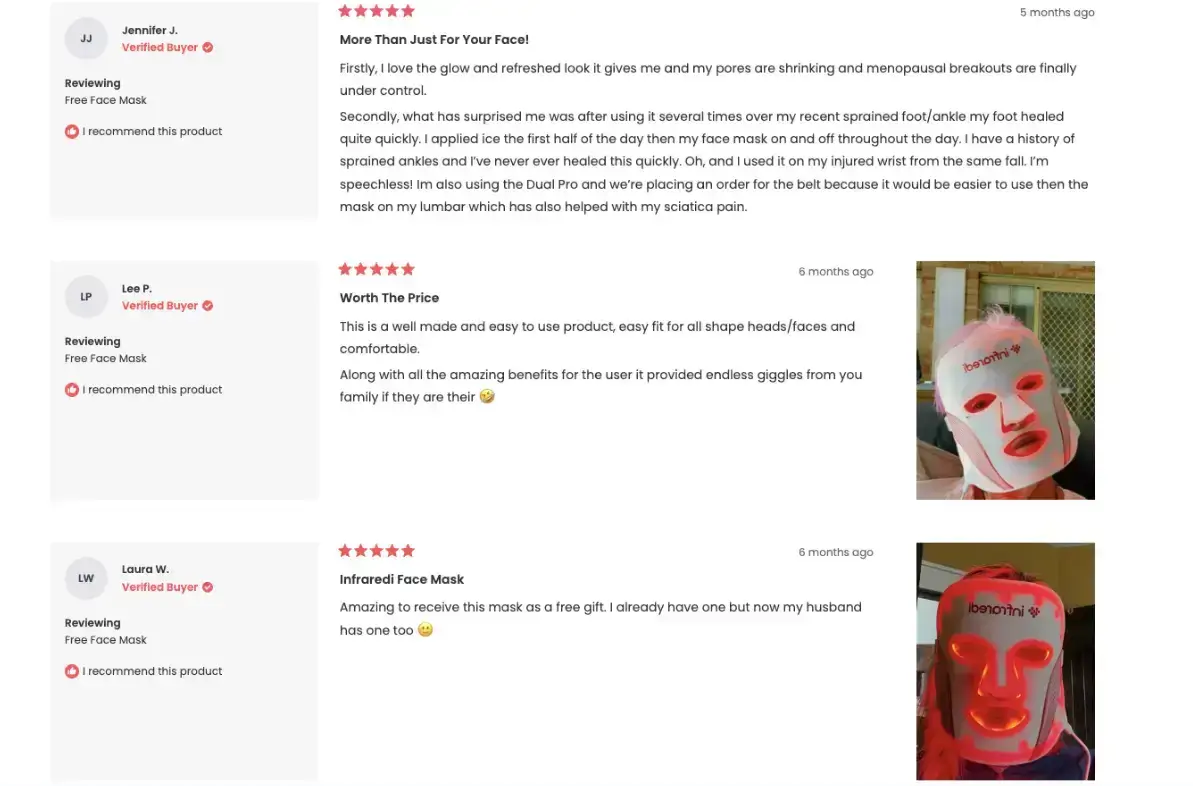
Besides providing additional context and helping potential buyers see how the product will fit into their daily routines, these visuals serve as powerful social proof.
Combined with high-quality 360-degree product images, UGC strikes the right balance between professional and authentic.
2. Build a consistent visual style
Think of your website as someone you’re meeting for the first time. You notice their clothes, hairstyles, and mannerisms. All these details create an impression and give off a certain vibe.
Your website’s visuals do the same for your brand—they’re not just eye candy; they reflect your online personality.
Now imagine if that person kept changing their look and attitude every day.
One day, they’re formal and elegant, and the next day, they're laid back and casual. Confusing, right?
The same goes for your website. A consistent visual style helps visitors recognize your brand instantly. It builds trust and familiarity, making them more likely to stick around and explore.
Consistency doesn’t mean every image has to be identical; it means they should share a common thread and style.
Here’s how to build a consistent visual vibe:
- Pick your color palette. Colors evoke emotions and create associations. Choose a palette that aligns with your brand personality.
- Select the right fonts. Pick fonts that complement your brand and remain easy to read. Limit yourself to two or three fonts.
- Determine visual themes. Establish recurring visual elements, such as photography style, filters, illustration techniques, or patterns.
Shay & Blue’s Vanilla Perfumes collection page uses a vibrant color palette that matches the brand’s energetic and fun vibe.
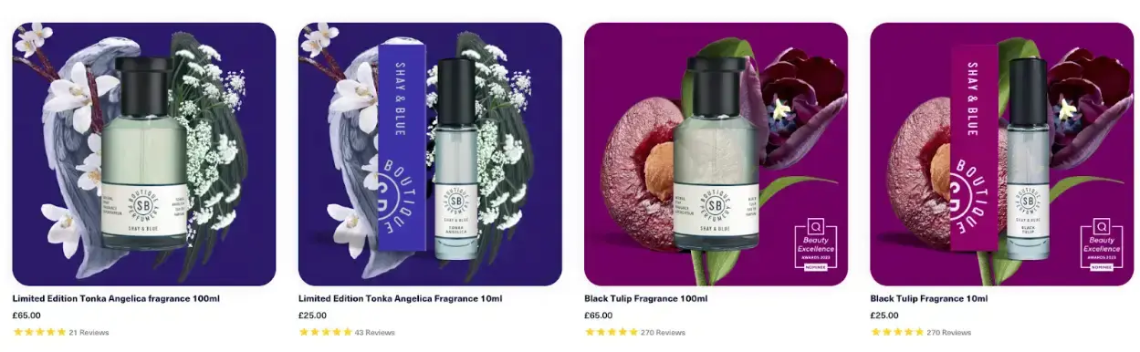
Each visual follows a similar pattern and style, with the perfume bottle set against a background that illustrates the fragrance’s top note.
This visual consistency is reinforced by a text overlay effect spelling out the main accords on hover.
3. Opt for high-quality visuals
Your website’s images are often the first point of contact with potential customers. They create an immediate impression and significantly influence how visitors perceive your brand.
According to research, 94% of first impressions are design-related, meaning visitors judge your website's credibility based on its look, not its content.
Another study found that users form an opinion about your website in just 50 milliseconds.
At first glance, this might seem superficial, but ask yourself: would you feel confident sharing your credit card information with a site featuring blurry, poorly lit visuals?
High-quality visuals:
- Convey credibility and professionalism
- Showcase your products clearly
- Enhance user experience
To achieve this, consider:
- Resolution. Use high-resolution images that remain sharp on large screens.
- Lighting. Proper lighting highlights important details.
- Composition. Apply techniques like the rule of thirds or leading lines.
- Editing. Adjust contrast, brightness, and color balance to polish your images.
- File size & format. Optimize for web use with WebP, JPEG, or PNG. Smaller sizes = faster loads, better UX, and improved SEO.
See how Raintree Nursery's Peach Trees product page uses beautiful, high-quality visuals:
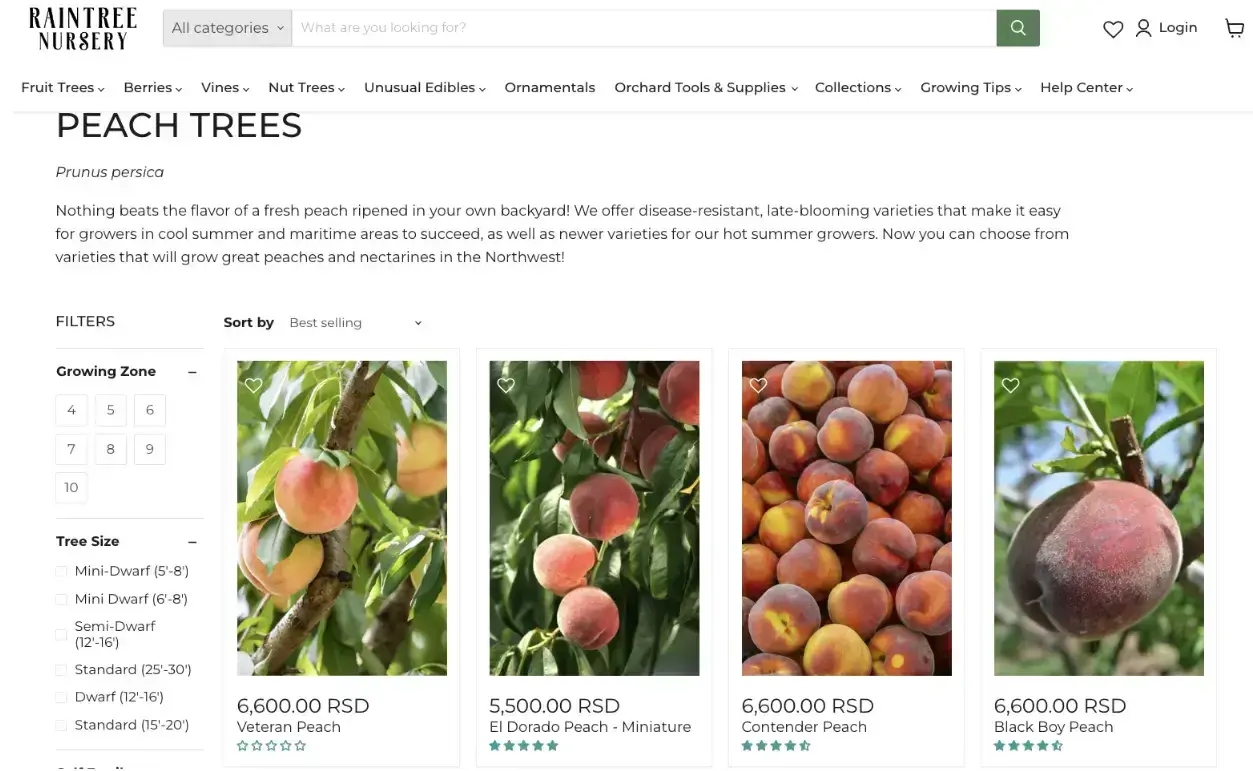
Sharp, detailed product photos help buyers understand the differences between varieties—and yes, you can even see the peach fuzz.
4. Declutter your design
Just like dense walls of text can overwhelm readers, too many visuals can overwhelm website visitors.
Give your website design room to breathe. This is where negative space—or the empty area around elements—comes in.
Negative space:
- Reduces cognitive load
- Improves visual focus
- Helps strategic elements (CTAs, images) stand out
Vitamart’s collagen supplements collection page shows this perfectly.
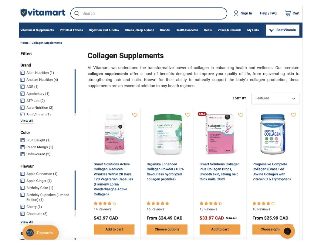
Each product gets its spotlight with ample breathing room. The layout is clean, easy to navigate, and the “Add to Cart” buttons stand out thanks to generous spacing.
Zara’s homepage also uses negative space effectively—but in a dynamic, video-driven way.
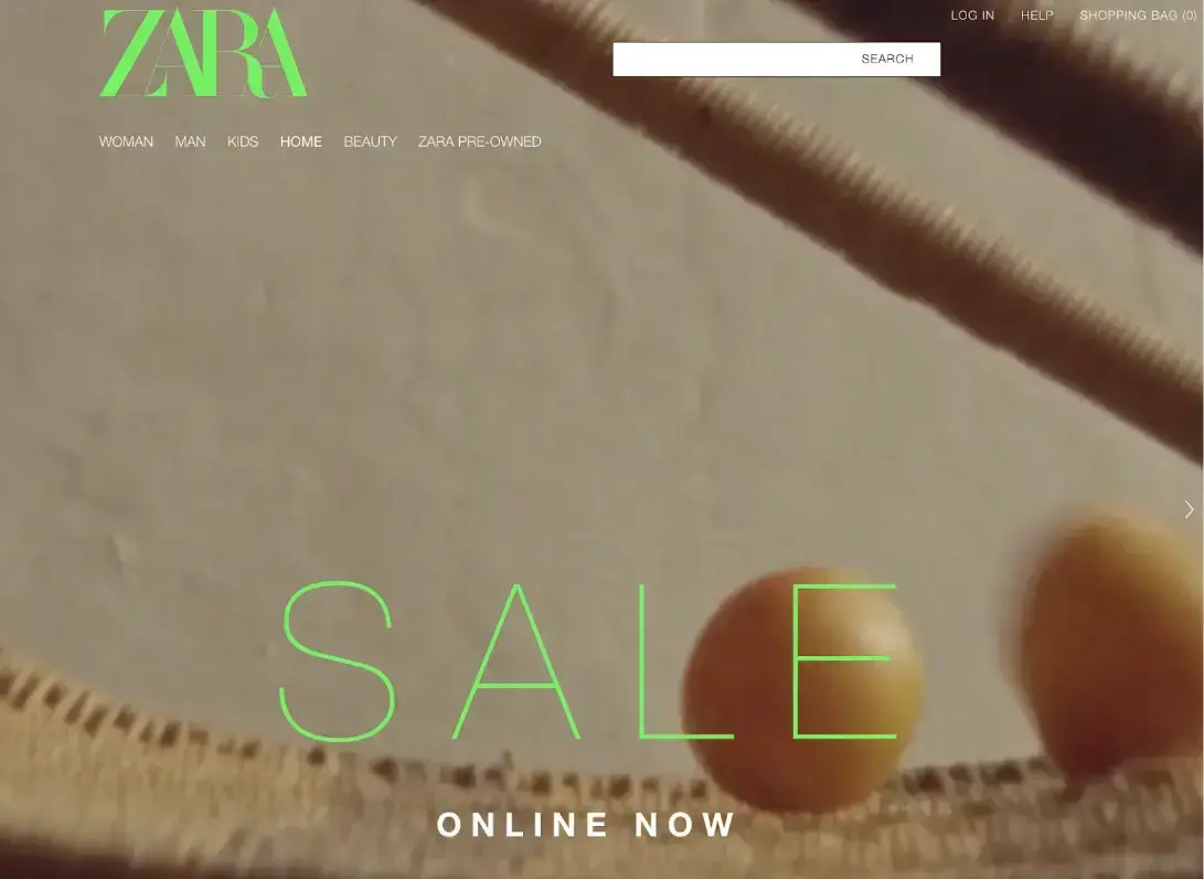
If you want to replicate this dynamic style, try POWR’s free multi-slider app.
5. Add captions to your explainer videos
Ever scroll through social media during your commute, open a video, and realize it has no captions? You probably don’t unmute it—and neither will your audience.
People frequently consume content in places where sound isn’t an option. Adding closed captions ensures your message gets across even when audio is off.
Captions:
- Improve accessibility
- Cater to silent viewers
- Boost SEO (search engines can read captions, not audio)
Slack’s homepage uses captioned customer stories.

They even provide subtitles in multiple languages—critical for global reach.
Wrapping Up
Remember, the visuals you choose are powerful tools for conveying your brand story and values. Select and optimize them thoughtfully to enhance your website’s performance.
These simple tips will help you create a visually captivating online presence that leaves a lasting impression.

Author Bio
Natasha Lane is a content marketer and long-time geek. For over a decade, she's worked with clients and companies of all sizes.
Natasha specializes in creating compelling content about design, branding, digital marketing, and business growth. She’s happily addicted to art in all its forms—and grilled tofu.