The checkout process entails the specific procedures that a customer must perform while making an online transaction. It is the stage at which the prospective customer finalizes product selections, picks any add-ons, confirms delivery options, and then provides payment.
Your checkout process should be the simplest and smoothest part of your customer's purchasing journey. You might even have to shell out a few extra bucks (not much) on the total cost of creating an ecommerce website. Regardless, consider it as a critical necessity, not an option.
Cart abandonment rates vary from business to business. It also depends on the product you sell. According to the Baymard Institute, the average rate of cart abandonment is 69.82 percent. Here are the five top reasons for cart abandonment:
- Customers do not get their preferred mode of payment.
- They are forced to create an account before they can complete their transaction.
- They face additional charges, such as shipping, tax, and other fees.
- The checkout procedure is either lengthy or difficult.
- If they have no prior experience or awareness of your brand, they may be hesitant to provide credit card information online and complete their transaction.
You can boost conversion rates on your checkout page by assisting your customer in making an informed, confident decision. This article provides tips and ideas for optimizing your checkout process and lowering abandoned cart rates.
1. Option to checkout as a guest
The number of online accounts in your customers' names is growing in tandem with the number of eCommerce stores springing up. The sign-up process is never simple, and remembering the passwords for each platform is often exhausting.
Although it is critical to increasing your recurring customers and the lifetime value of each customer, not providing a guest checkout option will turn off many prospective first-time consumers.
Provide a guest checkout system so that your users have a more pleasant experience. Instead of filling out registration forms, users can submit their billing information. It will allow your customers to shop without having to create an account.
A simple checkbox option at the end of the guest checkout process will allow customers to opt-in to receive email marketing from your company. It will assist you in growing your mailing list while maintaining the best possible customer experience.
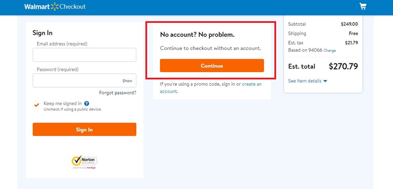
With the guest checkout option, you can certainly increase your conversion rate. Walmart allows customers to create an account, sign in to their account, or continue shopping as a guest.
2. Simplify the checkout process
Conversational Commerce is changing the retail shopping experience. People will abandon their carts if your checkout process is complicated or time-consuming.
An outstanding customer experience should be quick and easy. A well-thought-out design for the checkout page would make the process easier and more likely to entice customers to make a purchase.
Some websites have multiple payment methods for users to choose from. This can be confusing at times. In order to keep things clear, you can have a detailed guide on your self-service knowledge base on how to set up each payment method.
Distractions such as last-minute deals alert, advertisement pop-ups, product recommendations, and unappealing images.. enhance the likelihood of abandoning the shopping basket before completing the checkout process.
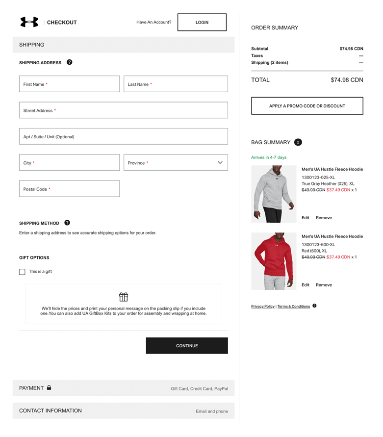
Remove any large buttons or pop-ups that may divert the customer's attention away from completing their purchase. Under Armor makes good use of white space to direct a user's attention to important sections and lead them to CTAs.
Remove the typical header, footer, and menu options from the checkout page and replace them with a blinker for the process. Make a one-page checkout to boost the process and save the customers' time.
"Your checkout page should only be concerned with helping customers fill out all of the forms to finalize their transactions. Concentrate on what is important and emphasize it," said Farnam Elyasof, Founder of Flex Suits.
3. Show product summary
It is common practice to keep your consumer informed of their order summary at all stages of the eCommerce checkout procedure. Customers want to know about the return policy, how long it will take to receive the product, whether it comes with extra bonuses, and other details.
Summarize what the user has contributed to the cart and present a clear next step that only includes required custom fields. Just before completing checkout, send them an order review summary that includes:
- Each product's name and image.
- The product's characteristics, such as size, color, variant, and price.
- Shipping fees, discounts, coupons, gift cards, taxes, and other cost-related elements.
- The entire payment amount.
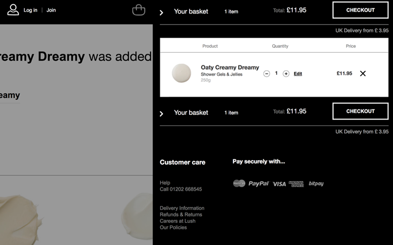
Lush's product page is streamlined, with a sleek product summary box, an add to wishlist button, and a larger add to basket button. More product specifications, ingredients, user reviews, and tutorials are available by scrolling down.
4. Make checkout mobile-friendly
Online buyers, particularly those using mobile devices, have a relatively short attention span. It comes as no surprise that mobile commerce has the highest cart abandonment rate, with 85.65% of shoppers abandoning the cart.
You must optimize your mobile cart and checkout process. Check to see if your page has been optimized for mobile users; otherwise, you could be losing a lot of sales.
To make the checkout page more mobile-friendly, implement the following changes:
- Check that your mobile checkout is operational.
- Do not make a long checkout page. Instead, divide the task into smaller parts.
- Make sure your page loads swiftly and quickly.
- Add CTAs that are bold and stand out from the rest of the page.
- Make use of auto-complete.
- Provide mobile payment options.
- To improve readability, keep the font and form fields large.
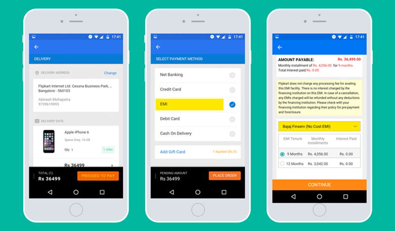
If you want to look at a well-designed and optimized mobile checkout page, examine Flipkart. Their mobile checkout page is clean, concise, and efficient. It loads within milliseconds as well.
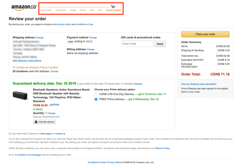
5. Display progress bars on the checkout page
For an optimized checkout experience, progress bars are essential. A prolonged checkout procedure might irritate users, especially if they have no clue how long it will take.
Progress bars are prominently shown at the top of the page to inform users how long the procedure will take, offering a strong indication that the checkout process will be brief. It reduces cart abandonment as it informs the shoppers about how close they are to purchasing their items.
Instead of using a checkout progress indicator, you may even simplify your eCommerce checkout procedure by showing customers what stage they are in. It will tell them how many more steps they need to take. You can accomplish this by numbering the steps like: step 1 of 4, step 2 of 4, etc.
A progress bar must have the following visual characteristics:
- It must appear at the top of the page (located below the header).
- Each stage must be a clickable element.
- The progress bar should be visually altered to indicate progress as the consumer proceeds through the checkout.
- When a step is finished, provide visual validation messages to alert the consumer that the system has captured all of the information and that it has been entered correctly.
Amazon has kept it basic and 'on-brand' with a trolley traversing the progress bar. Mulberry takes a somewhat different approach. All three components are displayed from the beginning of the checkout process and expand as you progress through it. If required, you can also click to change a completed section.
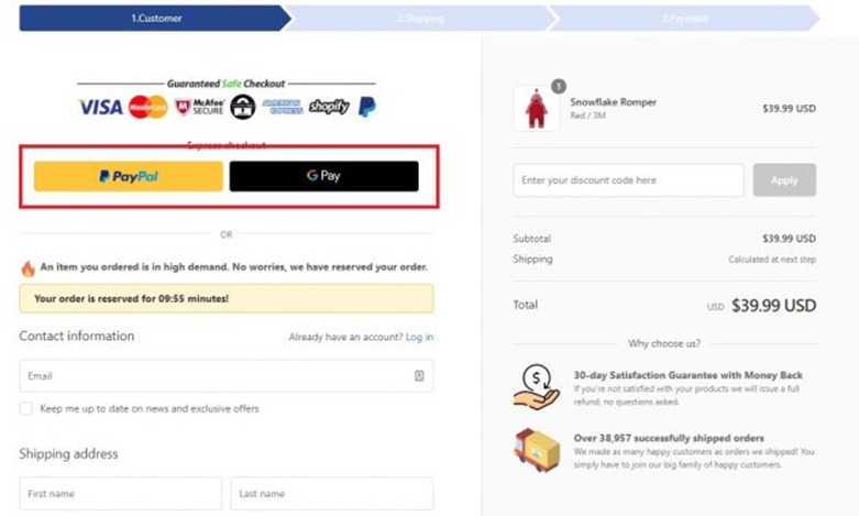
6. Include different payment options
Payment gateways play a principal role in why your shoppers may be abandoning your checkout. Losing potential consumers owing to insufficient payment options affects your company's revenue significantly in the long run.
Offering account to account payments as an option can help reduce abandonment by providing a seamless and secure transaction method for customers.
Each customer has a different preferred payment method. Some people prefer digital wallets for internet payments, while others prefer credit card transactions. Having different payment options allows customers to pay with whatever is convenient for them.
Design a simple and direct, user-friendly payment procedure that allows customers to pay using various modes, including their digital wallets. Cover the basics and accept payment by online banking, debit cards, and major credit cards, including Mastercard, Visa, AMEX, and Maestro.
Examine your target audience to determine which payment options to prioritize. Payment options such as PayPal, Klarna, Amazon Pay, Shop Pay, Apple, and Google Pay should be included.
Eloise and Lolo provide an excellent example when it comes to payment options. Its checkout is rapid and accepts major credit cards and popular wallets and platforms like PayPal and Google Pay.
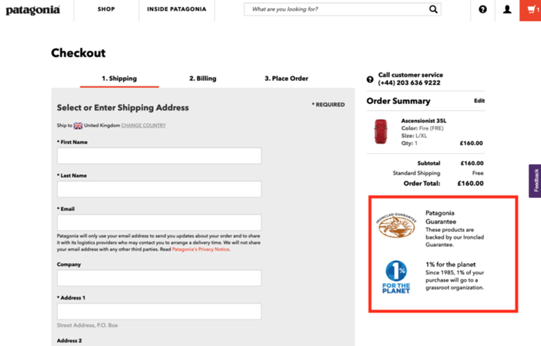
7. Display trust signals
To increase conversion rates, it is essential that consumers feel safe. Use security badges and trust seals on the checkout page.
You need to show that your website is trustworthy to handle the user’s sensitive information while selling an affordable auto insurance or anything you can use different ways to show that your website is trustworthy:
- Use Secure Sockets Layer (SSL) seals to show the site is secure.
- Set and display your refund and return policies.
- Include trust seals that show the business is trustworthy.
- Display social proof on your website in the form of original photographs taken by actual customers.
- Use symbols – like padlocks – to denote security.
- Work with a competent copywriter to ensure that your messages to your customers are clear.
Patagonia provides a great example of how to utilize trust badges. In addition, Patagonia includes its shipping and returns policy to give even more clarity to customers.
Conclusion
Modern clients have unpredictable preferences and much higher expectations. Brands will need to find a cost-effective approach to nurture and engage them at every stage of their journey.
The good news is that there is a huge potential to retrieve some of those abandoned carts. You may recover some of those possibly lost sales while also gaining new, loyal customers by following these suggestions.