Let’s say you’re on a website with a well-structured navigation menu, clear and concise headings, and compelling calls to action. Every element, from the copy to the layout, appears to be carefully optimized.
However, you start noticing inconsistencies in the color scheme. The headline text is excessively bright, causing eye strain. Or maybe the hero sections on various pages follow a random, uncoordinated color palette.
This lack of consistency in color usage makes the site feel disjointed and less professional, which can disrupt a good user experience.
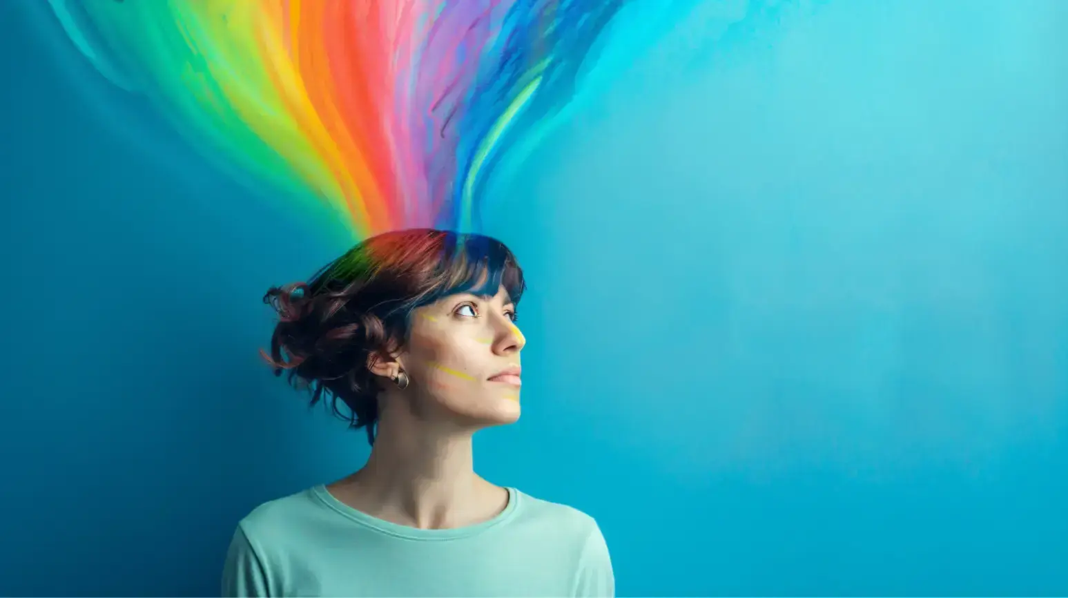
Did you know that 85% of consumers say color is one of the primary factors that influence their purchase decisions? This is why a good website visitor experience cannot be achieved without applying the basic principles of color psychology to web design.
What is the Science Behind the Psychology of Colors in Web Design?
Color psychology studies how colors affect human behavior and emotions. It’s based on the idea that different colors evoke different psychological responses.
Research shows that colors can significantly impact mood, perception, and even physical reactions in web design.
Understanding the psychology behind color associations, designers can strategically select colors that evoke specific emotional responses, enhancing the overall user experience.
6 Ways You Can Use Color Psychology in Web Design
Colors have a conscious and subconscious impact on how a user perceives your brand.
1. Website Background
When users first land on your homepage, the background color helps them form a subconscious impression about your site by setting the tone of the website.
In fact, 42% of online users base their approval of a website solely on its overall design, which can impact the readability of text, the visibility of icons, and the prominence of buttons.
Based on your industry, business objectives, and competitor website analysis, you should be able to discern which background color will help your site provide the best user experience and elicit the emotions you want from visitors.
Impact of Background Color Choices on Different Industries
Different industries choose particular colors to interact with their customers. Here’s why:
Healthcare and Finance
Industries like healthcare and finance have to visually communicate stability and trust, and cool tones like blue, green, and gray are top options.
Blue is often associated with security and stability, inspiring confidence in customers and reassuring users of reliability.
Scientists speculate that its psychological impact might have something to do with how blue light is known to reduce the production of melatonin, which can help people feel more awake and alert.
This physiological response makes blue an effective color for maintaining attention and focus, which is essential in settings requiring careful attention to detail.
Green is associated with growth and success, making it a common option for financial institutions. It helps encourage optimism in branding, and because it is the center of the visible light spectrum, it is perceived as the most restful color by the human eye.
This ease of visual processing can help reduce fatigue and improve comfort, which is beneficial in settings that require prolonged focus and concentration.
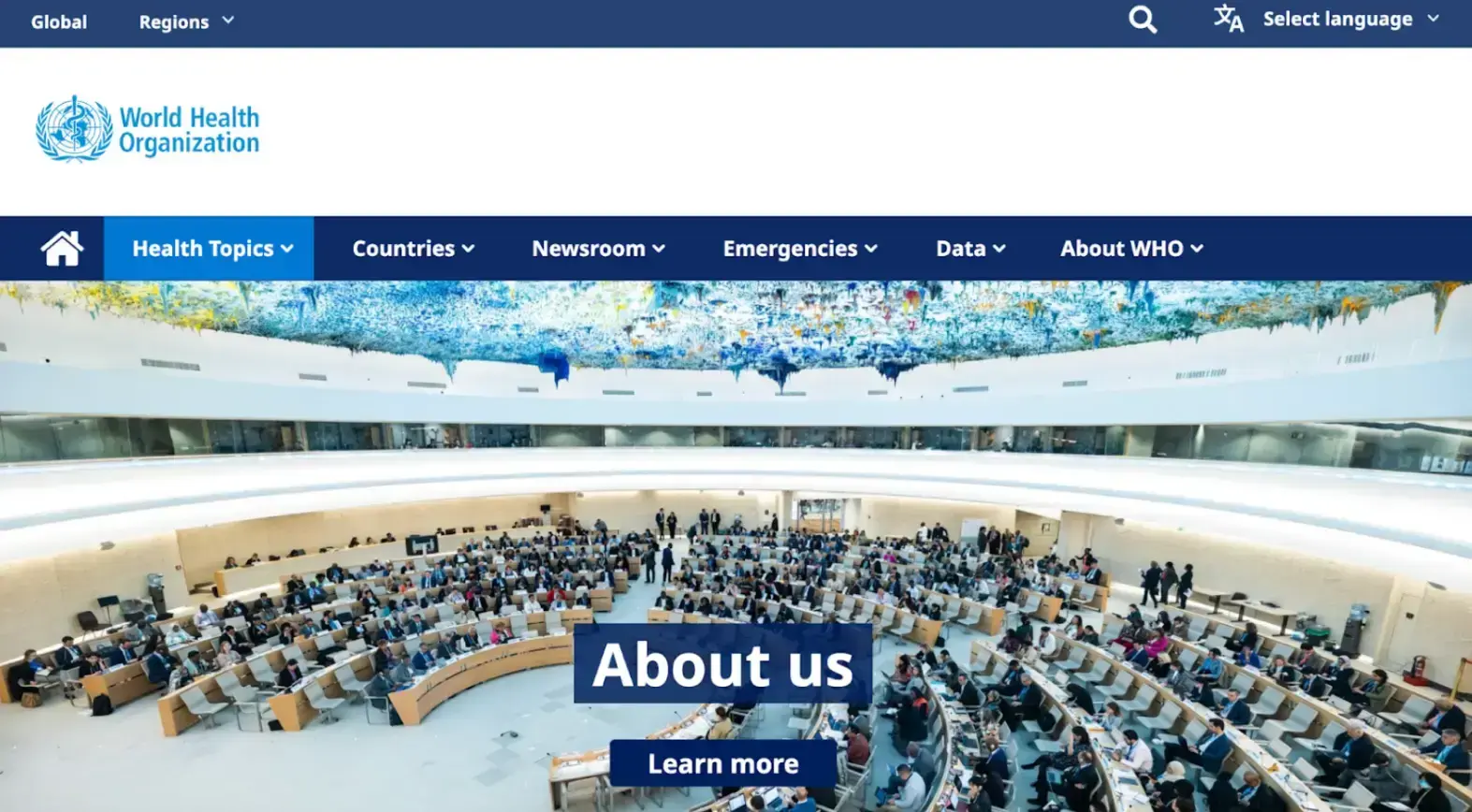
Source: WHO
Luxury Brands and High-End Fashion
Even outside of web design, black has long been associated with luxury and is culturally tied to authority, power, and control. It also helps create a visual focal point that commands attention.
In web design, black creates a strong visual impact and helps enhance the legibility of other important elements on the site, such as copy and hero images.
White is another option, frequently used by brands that want to emphasize understated simplicity and a modern aesthetic.
More striking hues, like gold and purple, are also used. Both are historically associated with luxury but are often used as accents.
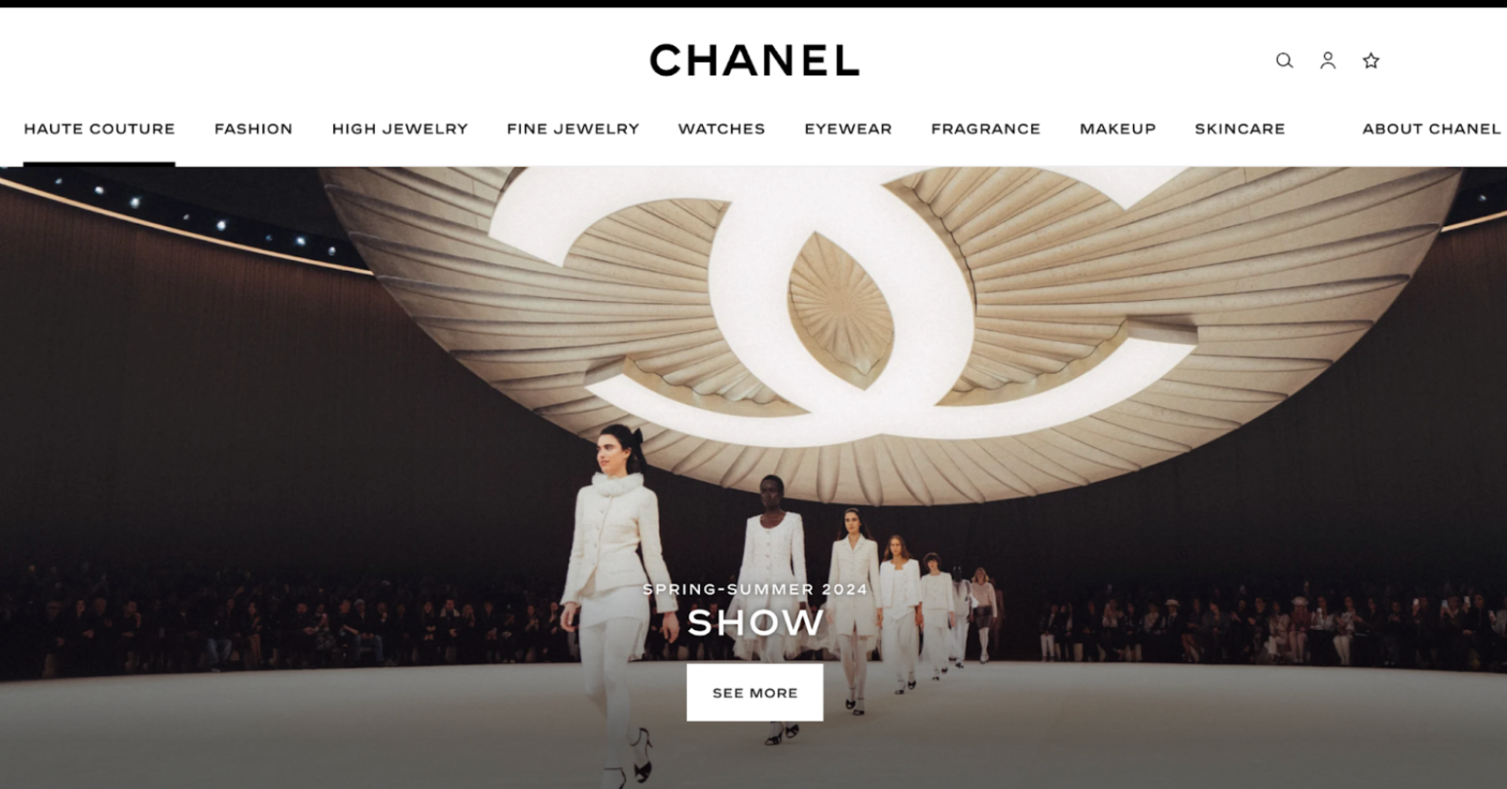
Source: Chanel
Music and Entertainment
Visuals are important in this industry, so it’s common to see solid, contrasting colors on many music and entertainment sites. Bright colors have been known to increase heart rate, which is why they’re so effective in capturing attention and evoking excitement.
For example, Last.fm uses a dark background to make album covers and other visual elements on their site stand out.
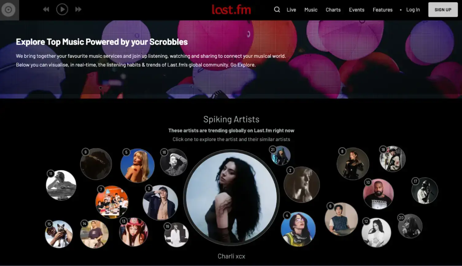
Source: last.fm
Bright colors like pink, orange, and red are popular choices.
Pink is a powerful color that evokes energy and excitement. Purple communicates creativity and mystery, and yellow communicates energy, vibrance, and positivity.
Home Design and Improvement
White is common on home interior and design sites. It tends to emphasize a clean, minimalist, yet versatile look that makes it easier for users to imagine themselves in these spaces.
At the same time, keeping the website background simple draws attention to the site's elements, such as the products, without overwhelming the user.
This visual strategy often becomes one of the main reasons for website redesign, as businesses aim to refresh their online presence with cleaner layouts, improved usability, and a more modern aesthetic that enhances user experience and product visibility.
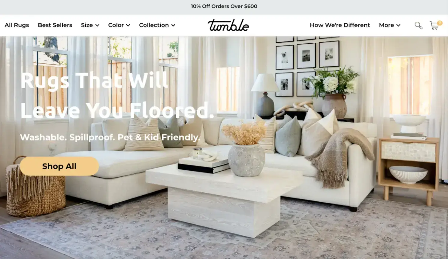
Source: Tumble
Technology and SaaS
Given the complex nature of the industry, technology and SaaS companies often simplify their visual branding by opting for a more minimalist aesthetic.
White is a common choice to impart a clean, modern, and uncluttered visual vibe.
For instance, Dropbox emphasizes simplicity and ease of use with a white background. Gray is another popular color that communicates sleekness and professionalism, best illustrated in Apple’s website.
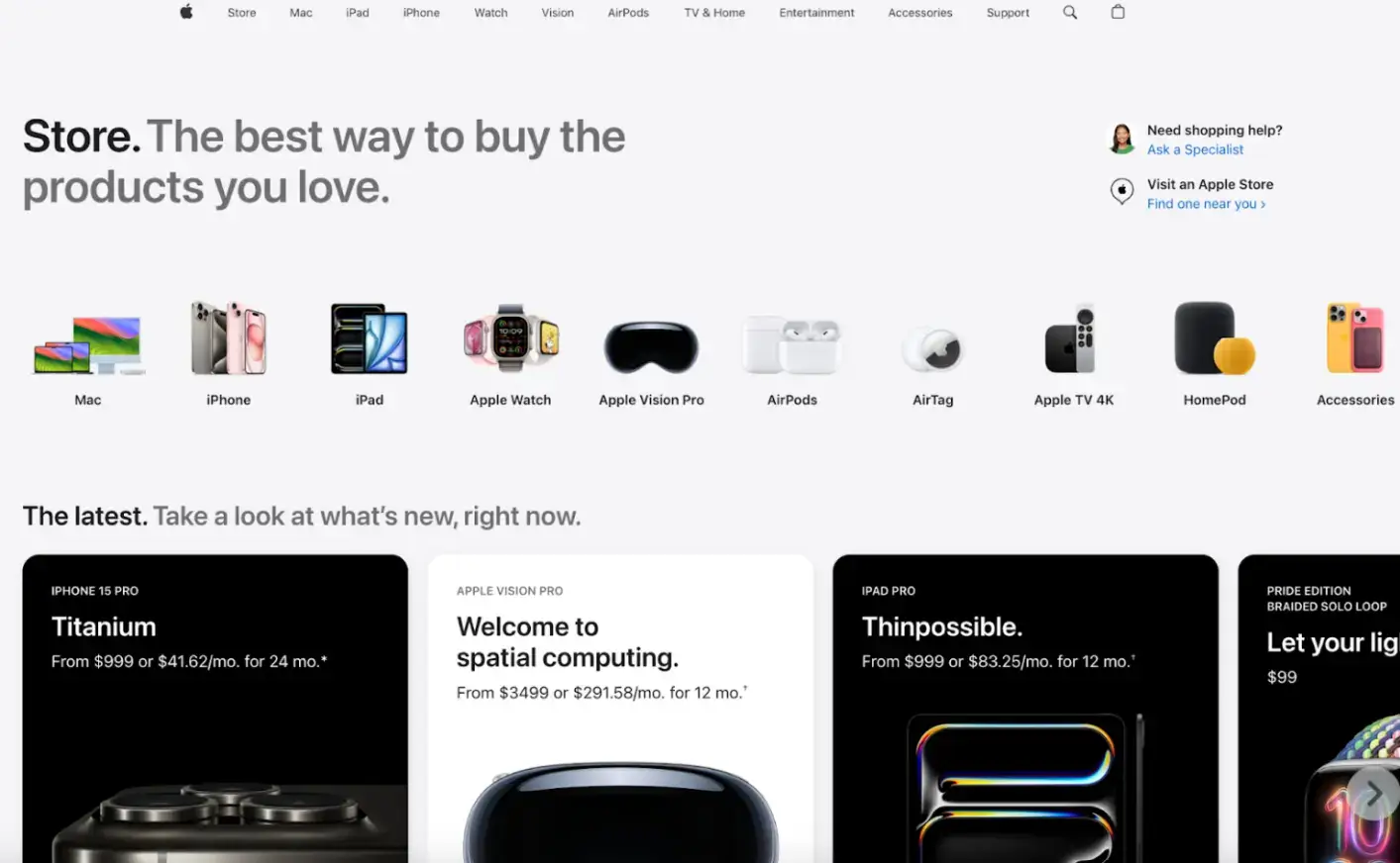
Source: Apple
Food and Beverage
Generally, bright colors tend to boost engagement, so if your goal is to get users to click on a button or draw attention, red is often a popular choice.
The food and beverage industry also uses a lot of red and orange, which help stimulate appetite and excite the senses. Yellow is another bright hue that helps evoke feelings of happiness and hunger while conveying cheerfulness and warmth.
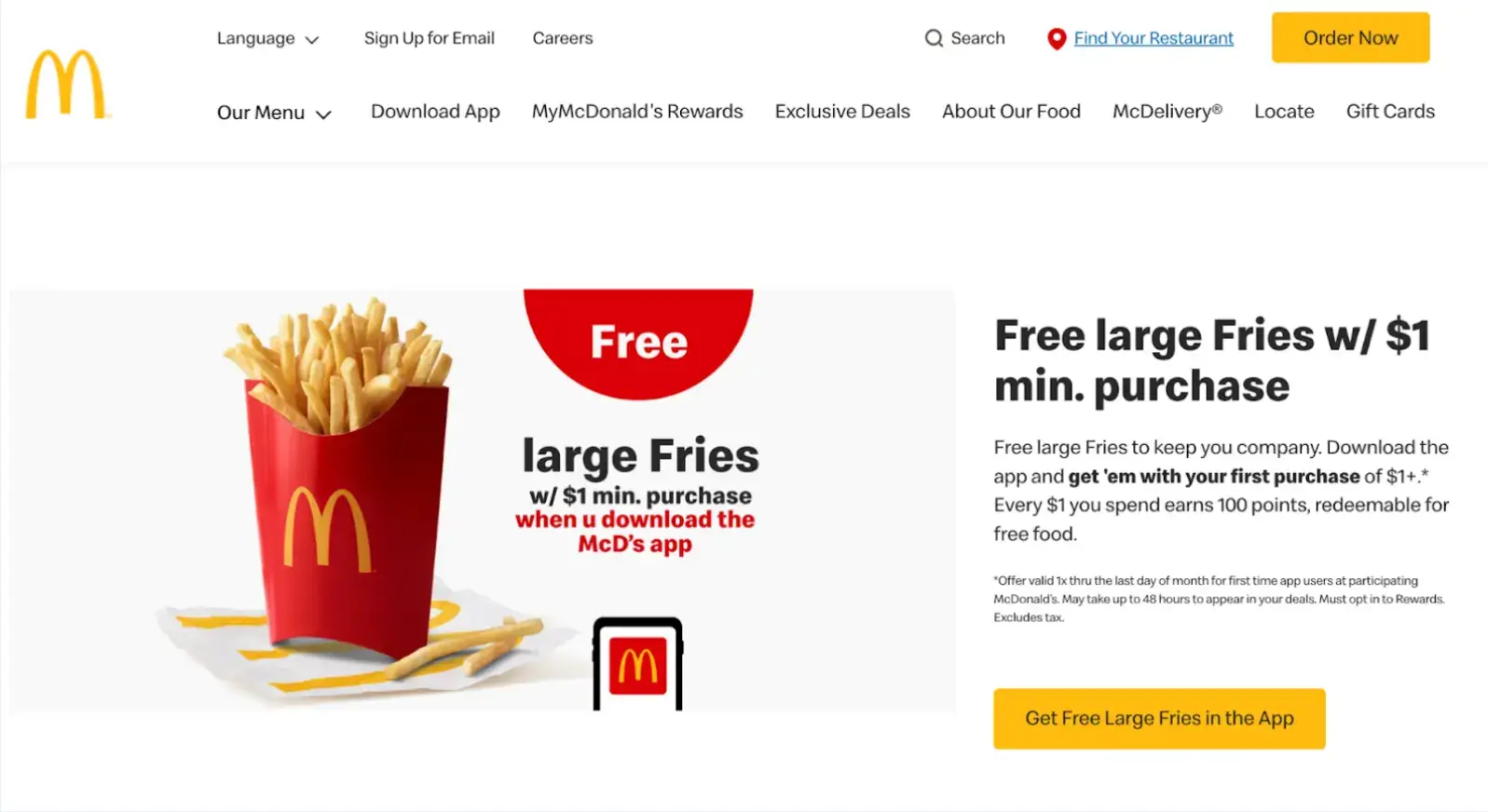
Source: McDonald's
2. Website Headlines
When selecting headline colors, consider how they will be perceived in the specific context of your website.
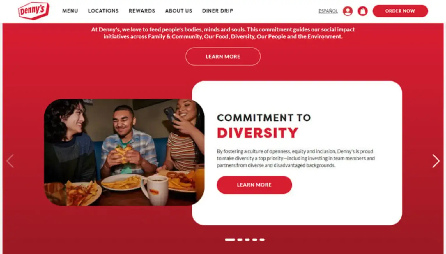
Red: Urgency and Excitement
According to the Institute for Color Research, red can increase attention and is effective in situations requiring a quick response. It is also known to increase heart rates and create a sense of urgency.
Denny’s use of red on this page is twofold. Red is a color known to stimulate appetite, ideal for the food industry. However, in this case, it also communicates urgency and excitement for a social issue they are promoting.
Blue: Trust and Reliability
If you're a service-oriented website, you want to evoke reliability, stability, security, and calmness in visitors. Financial and healthcare institutions favor blue, and many companies that intend to invoke trust in their services use this color as well.
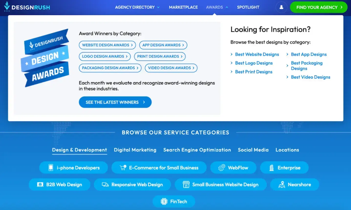
DesignRush uses blue to create a clear visual hierarchy and draw user attention to its awards program. This strategy taps into the color’s psychological associations, which can make users feel confident about the brand.
Green: Health, Financial Growth, Sustainability
Green encompasses a wide range of psychological associations, including wellness and health, financial growth, and environmental sustainability.
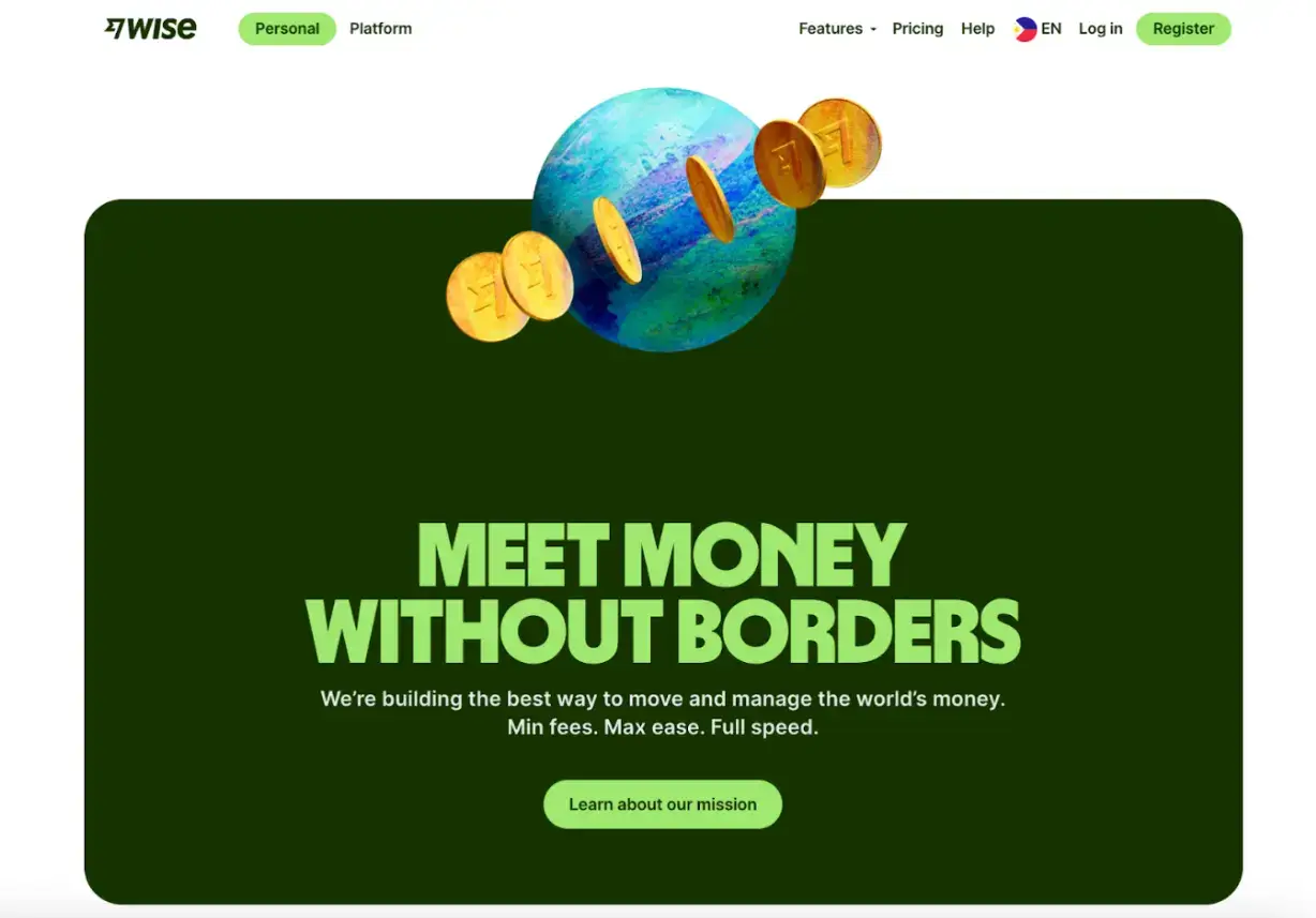
Wise, an online banking platform, reinforces the message of financial health and growth.
Their use of green in headlines about paperless transactions highlights their eco-friendliness and sustainability, subtly communicating their commitment to ethical practices that align with the values of environmentally conscious users.
Yellow: Optimism and Attention
Yellow is effective in evoking positive emotions and putting the spotlight on important information.
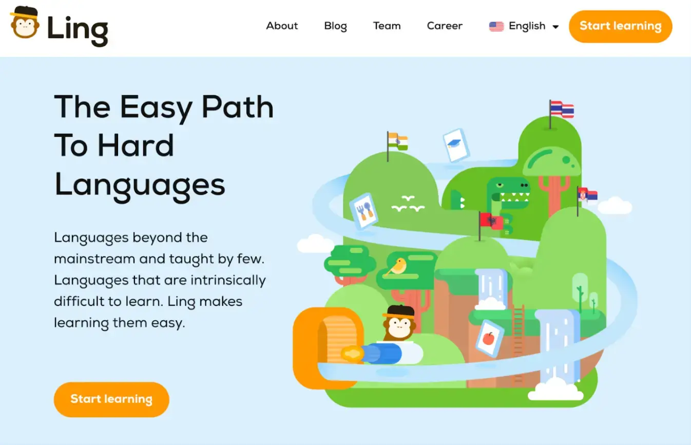
Psychologically, yellow inspires positive associations of happiness, positivity, and energy. Language learning platform Ling uses yellow as part of its overall branding color scheme and to draw focus to its call to action.
Black: Sophistication and Elegance
Black can convey authority and elegance. Luxury brands that want to appeal to visitors' demand for sophistication often use black to capitalize on this feeling.
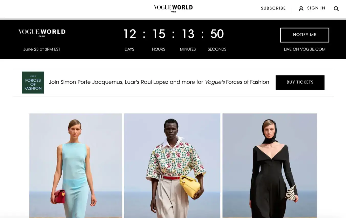
Vogue uses black to maintain its reputation as a luxury fashion authority. To promote its exclusive event, Vogue World 2024: Paris, it uses a black-and-white headline with a countdown to emphasize visual appeal and grab attention.
3. Website Hero Image
Color plays a critical role in the effectiveness of hero images. Using bold, contrasting colors in the hero image can draw attention to your primary message or product.
Different Styles of Using Color in Hero Images
High Contrast: High-contrast hero images enhance the text’s readability and the design’s visual appeal.
Nike uses high-contrast, energetic images with bold green accents. This choice of colors helps their hero images convey excitement and athleticism.
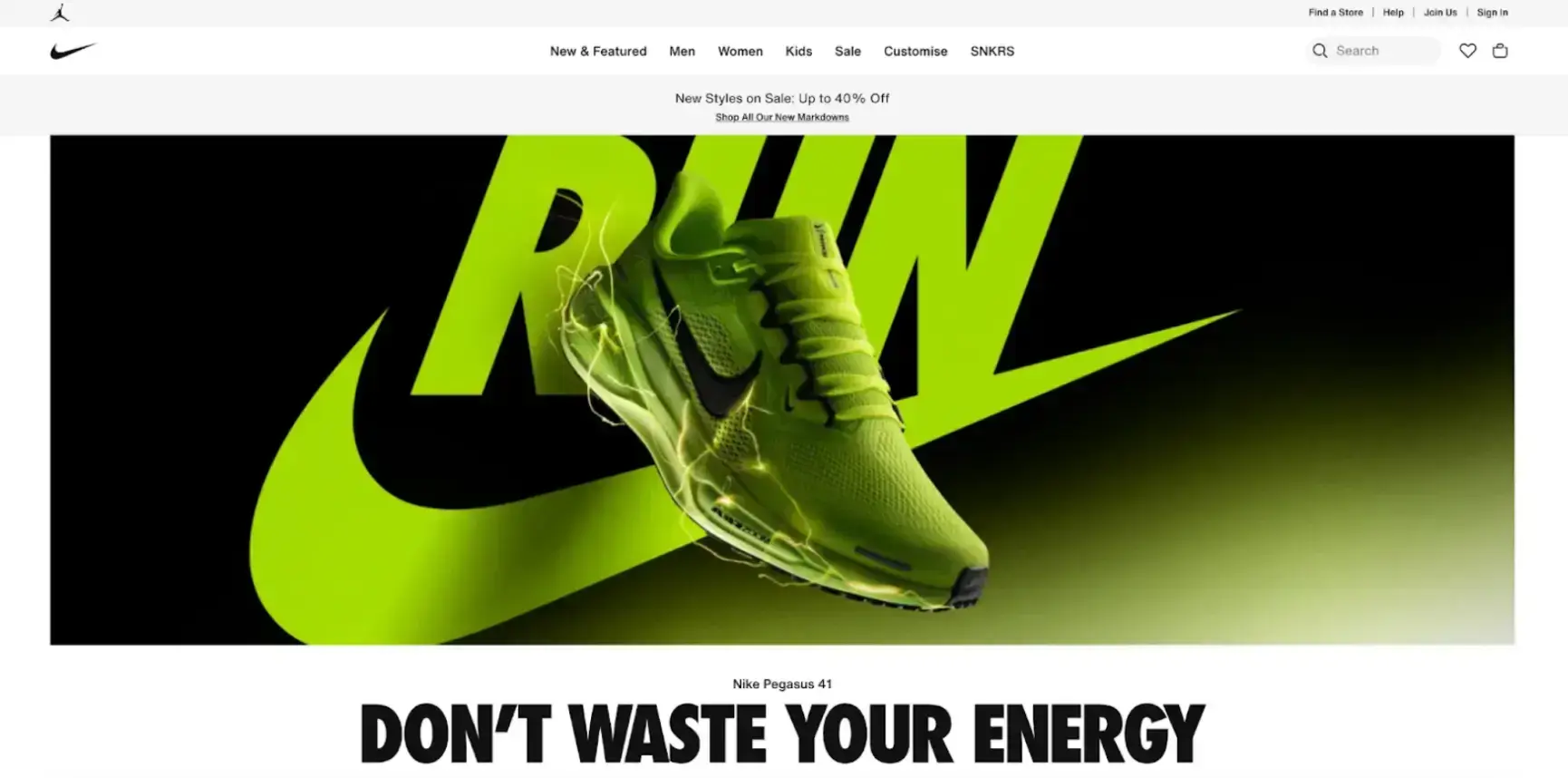
Nike's dynamic hero image for the Pegasus 41 features bold green accents against a black backdrop, emphasizing energy and performance.
Brand Alignment: Hero image colors that align with your overall brand color palette add towards web design consistency and reinforce brand identity.
Airbnb uses hero images with a warm brown overlay. This brown evokes comfort and security, which aligns with their brand message of providing safe and comfortable stays.
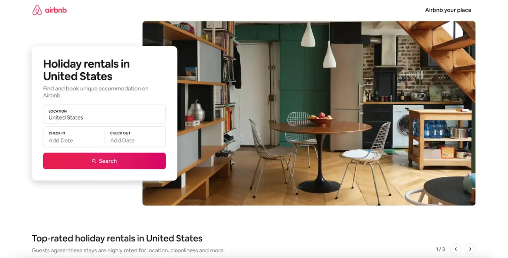
Airbnb's hero image features a cozy and inviting kitchen interior with a slight brown overlay.
User-Centric Design: Use A/B testing to determine the best color schemes for your site. This can help you connect with your audience.
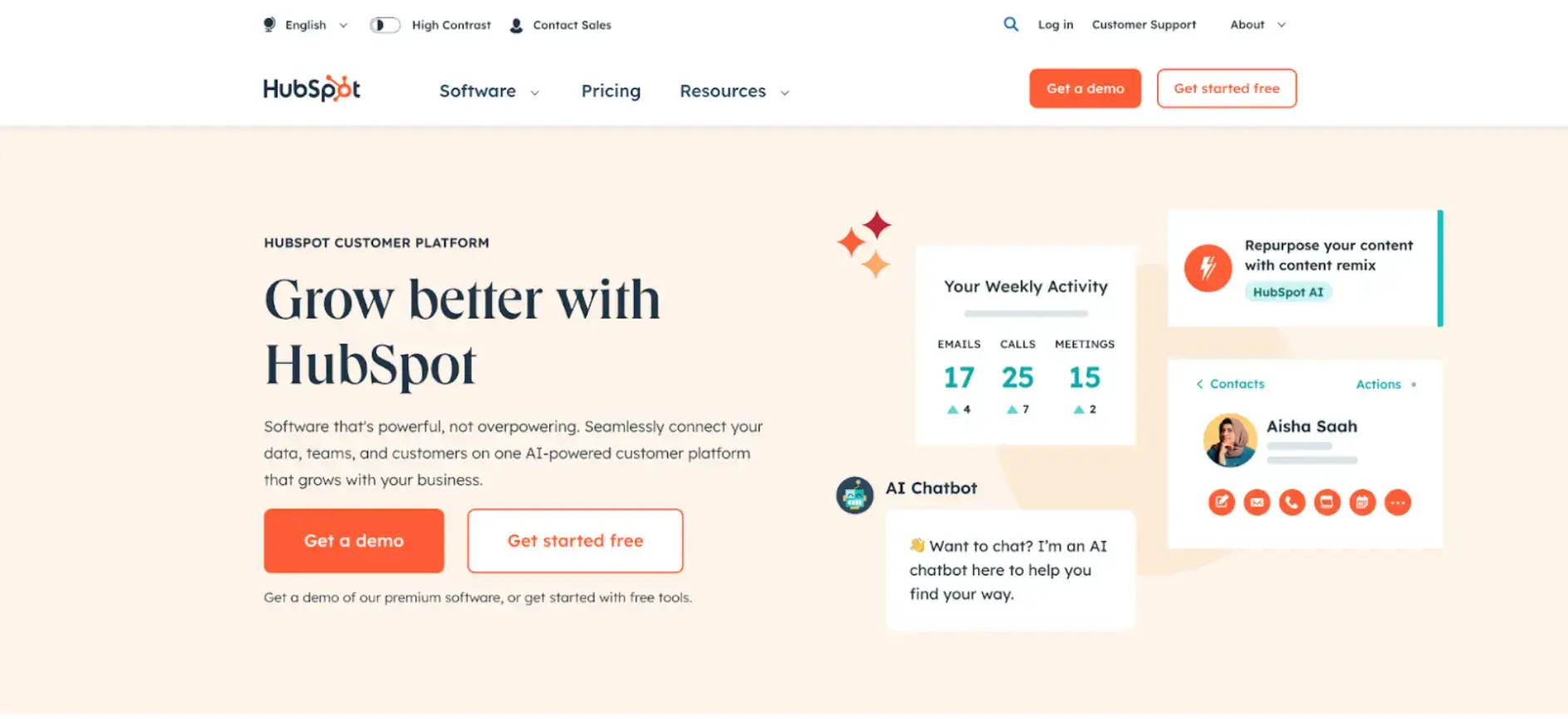
HubSpot A/B tested their hero image to determine what would get the best user engagement. In one variant, they added vibrant images and colorful texts and shapes. In another, they added color, movement, and animated images on the side. The first variant, which had colorful texts and shapes, succeeded in getting them 375 more sign-ups monthly.
4. Call to Action Buttons
Your website is also meant to drive user actions, such as signing up for a trial, subscribing to a newsletter, or making a purchase. The color of your call-to-action buttons plays a role in achieving this.
CTA buttons need to stand out and be immediately noticeable, but they should still align with your brand’s overall aesthetic.
CTA Buttons: Colors & Style
Color: To ensure the CTA button stands out, choose a color that contrasts sharply with your website's background.

SEOProfy’s homepage uses a bright yellow "Book a Free consultation" button that stands out against the white background, making it immediately noticeable.
Branding: While the CTA button should stand out, it should also align with your brand’s color palette to maintain consistency and reinforce your brand identity.

Dropbox uses a blue "Try for free" button that aligns with its brand color palette.
Size and Shape: The size of the CTA button should be large enough to be easily noticeable but not so large that it overwhelms other elements on the page. Rounded edges often work well because they draw the eye inward, focusing attention on the button’s text.
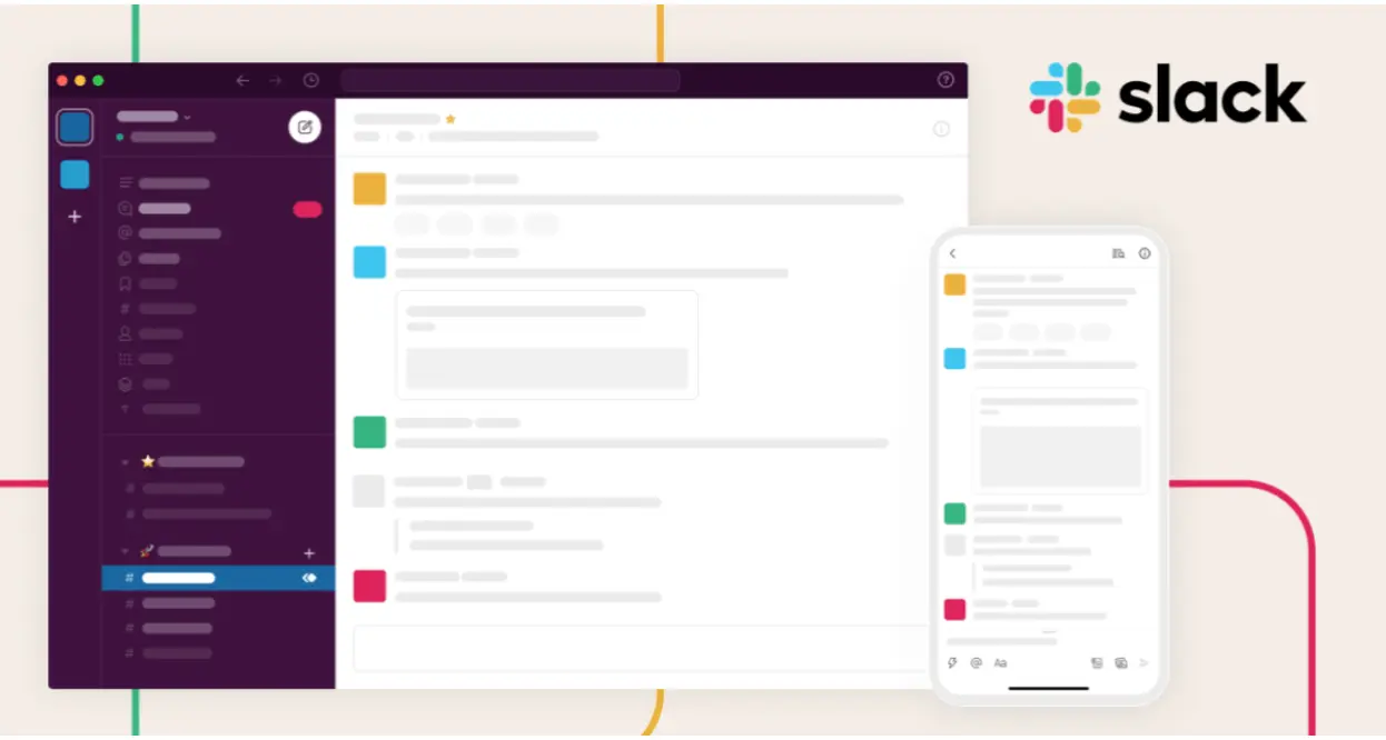
On its homepage, Slack features a deep purple "Get Started" button that contrasts well with the white background and other page elements.
5. Website Pop-Ups
Pop-ups on sites engage visitors with special offers, sign-up prompts, or important announcements. This color needs to look consistent with your brand identity to avoid being mistaken for an ad.
Choosing Colors for Pop-Up Backgrounds and Text
Using Brand Color in Pop-Ups: Incorporate your primary brand colors into your pop-ups to maintain visual consistency and reinforce brand recognition.

6. Website Navbar
Your navigation bar is one of the first elements users see when they land on your website, so the color you use sets the tone for the browsing experience.
Choose colors that complement your overall design, but also make sure the navigation links remain highly legible. Contrasting text colors on a solid background are generally the most effective.

In Summary
Color psychology plays a vital role in shaping user experience, guiding emotions, and influencing purchase decisions in web design.
From background colors that set the tone to CTA buttons that drive conversions, every choice of color communicates something about your brand. Applying these principles strategically helps you create a consistent, engaging, and trustworthy website.
Whether you’re aiming for excitement with red, trust with blue, sophistication with black, or energy with yellow, thoughtful color design will help you build stronger connections with your audience.
Start experimenting with colors across backgrounds, headlines, hero images, CTAs, pop-ups, and navigation bars — and you’ll see how subtle shifts can have a big impact on conversions and user satisfaction.