
Does it feel like your website isn’t pulling its weight? Many business owners struggle to turn visitors into customers. But here’s the secret: it’s all about having the right elements in your landing pages.Landing pages are standalone web pages designed for a specific purpose – usually to convert visitors into leads or customers. Your homepage is usually the first landing page people see.
This article will walk you through five must-have landing page elements that’ll supercharge your website’s performance. We’ll also show you real-world examples that nail it so you’ll see precisely what works.
By the end of this guide, you’ll know:
- Which landing page elements your site needs
- How to make landing pages work harder for you
- What the pros are doing (and how you can do it, too)
Let’s jump right in and give your online presence the boost it deserves.
1. Include a Captivating Hero Image
A large, eye-catching image at the top of the page can grab attention and set the tone for your brand. It can instantly engage visitors, convey your brand’s message, and encourage users to explore further.
Hero images are powerful because they combine visual appeal with an immediate representation of your product or service.
People process images faster than text, so a striking image can quickly communicate your business's purpose and importance.
This visual engagement can increase visitors' time on your site, reduce bounce rates, and ultimately drive more conversions.
Here’s how to use hero images:
- Ensure your hero image is high-resolution and professionally shot. Blurry or pixelated images can harm your credibility.
- The image should clearly represent your product or service, resonate with your target audience, and reflect your brand’s identity.
- Pair your hero image with a compelling headline and a clear CTA. This will guide visitors to what to do next, whether it’s signing up, learning more, or making a purchase.
- Use image optimization tools to keep loading times fast without sacrificing quality.
Ovaeda, a company specializing in outdoor living spaces, does this brilliantly. Their landing page features a stunning image of a beautifully constructed front yard, showcasing the full range of their products.
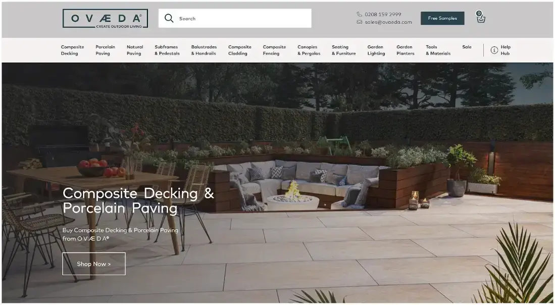
This image grabs attention and gives visitors a clear idea of what Ovaeda offers and how their products can transform an outdoor space.
It’s a practical visual summary of the brand’s niche and value, making it easier for potential customers to envision their outdoor projects.
2. Use Clear CTAs
Have you ever been to a website and felt lost about what to do next? That’s where clear calls to action come in.
They’re like friendly signposts guiding your visitors to take the next step, whether making a purchase, signing up for a newsletter, or requesting more info.
Clear CTAs reduce friction in the user journey. When visitors know exactly what to do, they’re likelier to do it. These buttons boost engagement, increase conversions, and improve overall user experience.
Here’s how to nail your CTAs:
- Use action-oriented language like “Get Started,” “Learn More,” or “Shop Now.”
- Make them stand out visually with contrasting colors or buttons.
- Keep the text short and sweet – aim for 2-5 words.
- Place CTAs strategically where users are most likely to take action.
- Use different CTAs for different stages of the buyer’s journey.
- A/B test your CTAs to find what works best for your audience.
- One primary CTA per section is usually enough. If you need multiple CTAs, prioritize them visually.
Mannequin Mall, a fashion mannequin retailer, owns its CTA game. Its homepage features two clear CTAs right in the header: “Shop Mannequins” and “Shop Dress Forms.”
This works well because it immediately shows visitors their main options. The CTAs stand out without being overwhelming and cater to different customer needs (e.g., mannequins vs. dress forms).
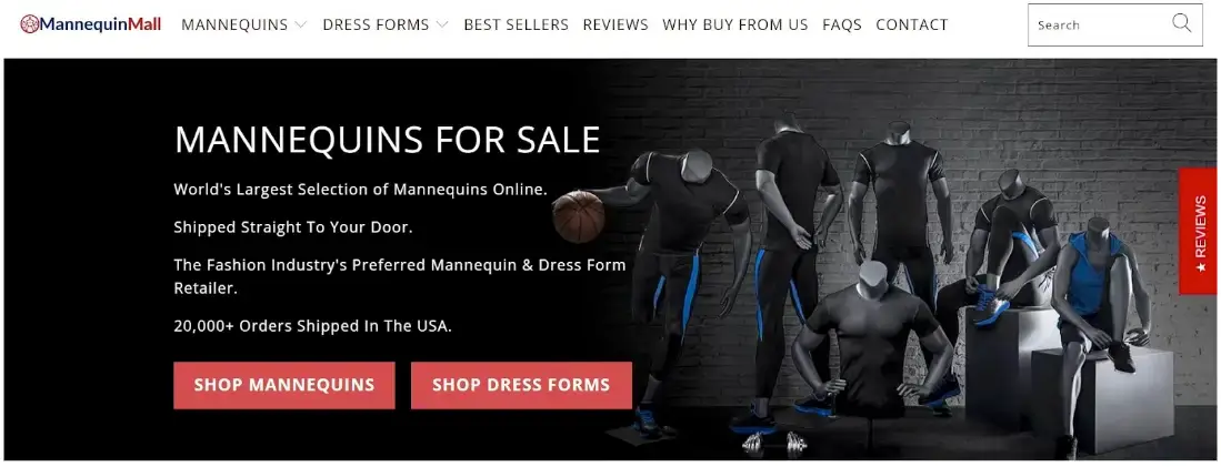
Using this approach, Mannequin Mall makes it easy for visitors to find what they’re looking for. It’s a great example of how clear CTAs can streamline the user experience and boost conversions.
3. Add a Lead Capture Element
Not everyone’s ready to buy on their first visit. That’s where lead capture comes in. It’s a way to snag contact info from interested visitors so that you can nurture them into customers later.
By capturing leads, you’re building a pipeline of potential customers. You can stay in touch, share valuable content, and gently guide them towards a purchase.
Here’s how to do lead capture right:
- Offer something valuable in exchange for contact info (discount, ebook, newsletter, etc.).
- Keep your form short – usually, just an email address is enough.
- Use a clear, compelling CTA for your offer.
- Place your lead capture where it’s visible but not intrusive.
- Test different offers and placements to see what works best.
- Be transparent about how you’ll use their info.
- Follow up promptly with your promised offer.
Hydro Flask, a brand selling sustainable water bottles, uses a smart lead capture strategy. When you visit their site, a popup offers a tempting 15% off your first order.
It works great because the discount is attractive to first-time buyers and creates a sense of urgency. Also, the popup is well-timed (not too soon or too late), stating they’ll use your email for marketing purposes.
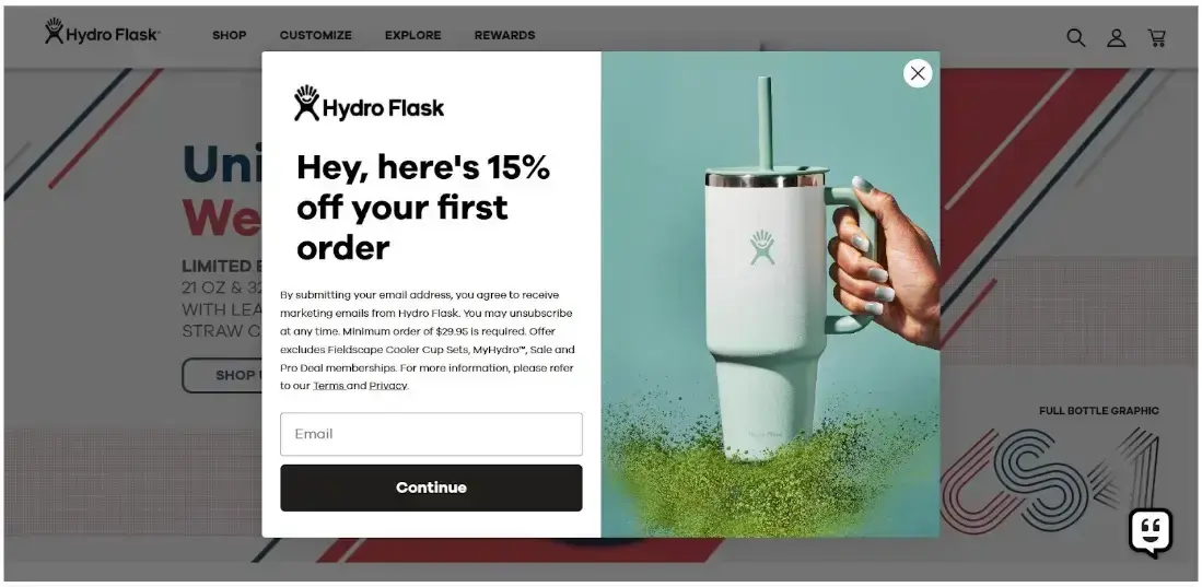
By using this approach, Hydro Flask turns casual browsers into potential customers. Even if visitors don’t buy immediately, they’ve opened a line of communication for future marketing.
It’s a great example of how a well-executed lead capture can boost immediate sales and long-term customer relationships.
4. Leverage Social Proof
Do you feel more confident buying something after seeing others rave about it? That’s social proof in action.
Social proof is a powerful way to build trust and credibility with potential customers. People value others’ opinions so much that they read about ten online reviews before deciding on a purchase.
This strategy is effective because it taps into our natural tendency to follow the crowd. When we see others having a great experience with a product or service, we’re more likely to try it ourselves.
Here’s how to use social proof effectively:
- Showcase customer reviews and ratings prominently.
- Use testimonials from actual customers (with photos if possible).
- Display trust badges or certifications.
- Highlight any media mentions or awards.
- Show real-time stats (for example, “50 people bought this today”).
- Feature user-generated content like photos or videos.
- Include case studies for more complex products or services.
Sugar Me Smooth, a company selling sugar wax and body care products does this brilliantly. Their landing page features a smart social proof section that really hits the mark.
They provide visual indicators of product quality by displaying customer testimonials, product photos, and star ratings. Seeing the products in use helps potential customers envision using them.
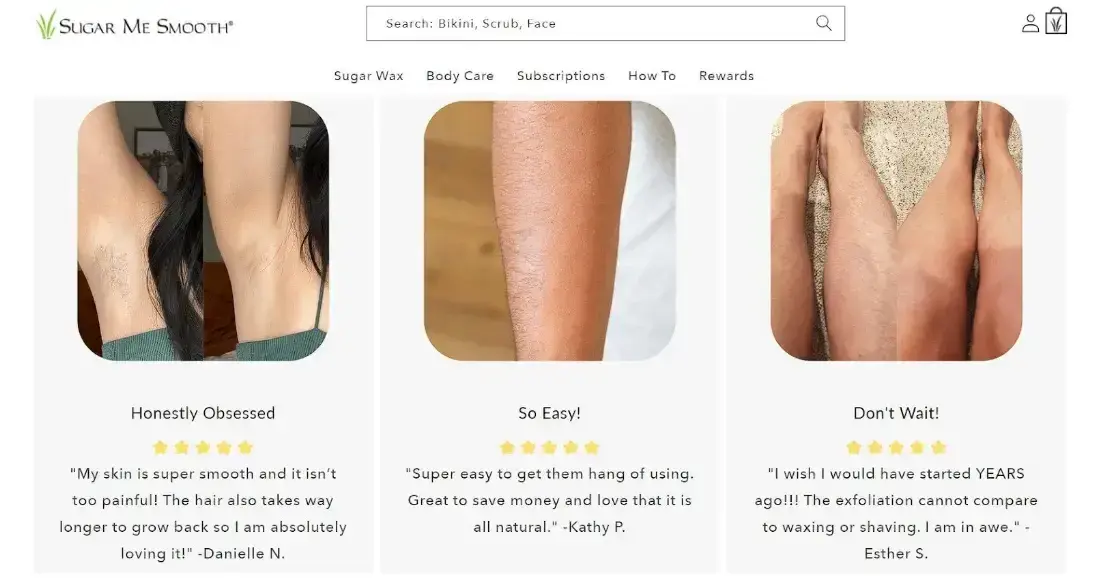
This combination of text, images, and ratings creates a compelling narrative. By leveraging social proof this way, Sugar Me Smooth builds trust and shows potential customers that their products deliver results.
It is an excellent example of how effective social proof can turn hesitant browsers into confident buyers.
5. Enhance Long-Form Content with Video
Adding video to your long-form content is like offering a shortcut to understanding. It’s not only convenient – it’s what people want.
Videos can boost engagement, keep visitors on your page longer, and even improve your SEO. They make a powerful combo because they cater to different learning styles.
Some customers love to read, while others prefer to watch. By offering both, you’re ensuring everyone gets the information they need the way they want it.
Plus, video can explain complex topics quickly and visually, making your content more accessible and memorable.
Here’s how to implement video the right way:
- Keep videos short and focused – aim for 2-5 minutes.
- Use the video to summarize or highlight key points from your text.
- Place the video near the top of your page for easy access.
- Include a transcript for accessibility and SEO benefits.
- Ensure your video adds value – don’t repeat the text verbatim.
- Use attention-grabbing thumbnails to encourage clicks.
- Optimize your video for mobile viewing.
A great example of this strategy is Breaking Eighty, a go-to resource for golfers. On its best golf launch monitors page, it has it all figured out.
They provide in-depth written content for detail-oriented readers but also include a video that offers a quick, visual overview for those short on time. The video complements the text, making the content more digestible.

By using this strategy, Breaking Eighty makes its content accessible to all types of learners and browsers.
Whether you’re a golfer who likes to dive deep into specs or just want a quick rundown, they’ve got you covered. It’s a hole-in-one approach to content that keeps visitors engaged and informed.
Final Thoughts
These five landing page elements aren’t just nice-to-haves – they’re game-changers. From eye-catching hero images to engaging videos, each strategy is designed to turn visitors into customers.
Remember, great landing pages don’t happen by accident. They’re crafted with care, tested, and refined.
So, why not pick one tactic and implement it today? Start small, measure your results, and allow your conversions to grow.
Author Bio
Natasha Lane is a content marketer and one hell of a geek. For more than a decade, she's worked with individual clients and companies of all sizes.
Natasha specializes in crafting compelling content about design, branding, digital marketing, and business growth. She's happily addicted to art in all its forms and grilled tofu.