These days, having a professional-looking website isn’t enough to capture your target market’s attention.
If you want to drive more traffic to your site, generate more leads, and close more customers, you need to get a bit more creative and think outside of the box.
And sometimes, the most effective website hacks to increase your conversions are the simplest. Perhaps that’s why they’re often overlooked.
Here are ten of them.
Best Ways of Using Website Hacks to Increase Conversion
- Listen to Hick
- Make your website compatible with mobile-first indexing
- Follow the Rule of Thirds
- Practice your copywriting skills
- Don't forget your site's technical SEO
- Choose your visual elements carefully
- Tell a story on your "About Us" page
- Add white space
- Observe the F-shape layout
- Follow the "ABC" principle
1. Listen to Hick
British psychologists William Edmund Hick and Ray Hyman developed Hick’s Law in 1952. This law essentially states that the more options you provide potential customers, the longer it takes them to make a decision.
So, if you want to increase conversions on your site’s pricing page, give your potential customers as few options as possible. That way, you reduce the time they’ll spend deciding.
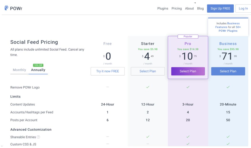
POWR.io’s pricing page is an excellent example:

By highlighting two of the four pricing options, Powr.io is limiting the options of those viewing their pricing page.
2. Make your website compatible with mobile-first indexing
Since 2016, more than half of people worldwide are using their mobile devices to browse the internet. This prompted Google to shift to mobile-first indexing, where it ranks your website based on its mobile version.
For your site to rank on the first page of Google, you’ve got to make sure that it’s easy to navigate on mobile and your desktop.
Running your website through Google's Mobile-Friendly Test tool will let you know whether or not your site’s mobile-friendly. It also points out areas on your website that you can fix to enhance further and improve your ranking.
The second way is by reducing the width of your internet browser on your computer by half. If you got a responsive theme, it would begin adjusting itself to fit the width of your browser.
Here’s an example of how my website looks when my internet browser is almost filling up the whole screen of my laptop:

And here’s how it looks like after reducing the browser’s width by half:

Another thing to check is your website’s speed. Your website should only take 1-3 seconds to load on a mobile device.
Otherwise, your visitors would go elsewhere. You can check the speed of your website loading speed using Google’s PageSpeed Insights tool.
Just like its Mobile-Friendly tool, the Page Insights tool gives you a breakdown of how fast your site’s loading on a mobile device and what you can do to improve its speed.
If your website’s still not yet mobile-friendly, get your web developer to update the critical files on your website. Not only will this ensure that it complies with Google’s mobile-first indexing guidelines, but it also guarantees your website works the way you expect.
If you’re not a techie person, and you can’t afford to hire a web development company, you can opt to purchase a responsive theme online.
3. Follow the Rule of Thirds
The Rule of Thirds is a principle taught in photography that says you need to divide an image into thirds horizontally and vertically. This gives you a grid with four intersecting points.

These points, according to this principle, are where you need to place the most critical parts of your image. Take, for example, the homepage of John Lee Dumas’ Entrepreneur on Fire.

Source: OptinMonster
Notice that the essential element, which is the call-to-action button to purchase his latest book, is located on one of these intersecting points. The image of the book he is promoting and its title are located slightly below two other intersecting points.
To do this, take a screenshot of your homepage and then divide the image into nine equal sections. You can then adjust the different elements of your website's homepage so that the most critical components are in the strategic areas.
4. Practice your copywriting skills
Having excellent copywriting skills ensures you provide your visitors with the facts they want to know in a way that’ll keep their attention and, eventually, convince them to take action
One way to ensure your web copy resonates with your readers is through social listening.
By monitoring online conversations potential and existing customers have about your brand and products, you’ll learn what words and phrases they’d commonly use. You can then incorporate these in your copy to make it resonate more with your target market.
Many businesses also rely on customer communication platforms like Emitrr to capture conversations and feedback across channels, helping them better understand how customers talk about their products and services.
Developing a habit of reading books on copywriting is another way to improve your copywriting skills.
It expands your vocabulary and gives you ideas on how to construct your statements. At the same time, you get to learn other effective copywriting strategies to try.
5. Don’t forget your site’s technical SEO
When it comes to search engine optimization, most marketers will focus on applying on-site SEO techniques.
These include sprinkling the targeted keyword phrase throughout the content of your web pages and adding meta descriptions and title tags.
However, this is only one of the fundamental SEO techniques to use to increase search rankings and improve conversion rates.
You’ll also need to make sure to apply basic technical SEO best practices. These include making sure that your website’s domain has got an SSL certificate and adding an XML sitemap on the backend of your site.
Whether it be a regular site or an eCommerce website, customer conversions are necessary. To bring more customers, you need to provide assurance to them.
To do so, you need a budget-friendly SSL cert like discounted single domain, cheap wildcard SSL certificate, multi-domain SSL, or any other SSL validations that may suit your website's requirement.
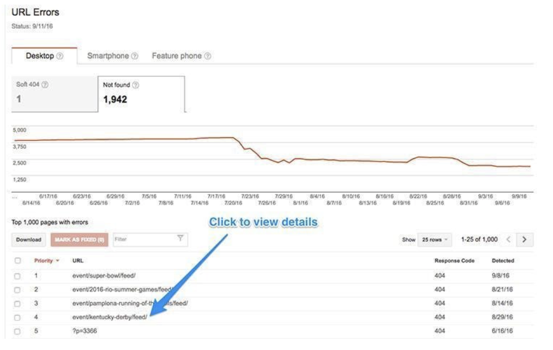
Running your website in Google’s Search Console will help you identify not just what technical SEO aspects are missing, but also if there are any errors present on your site.

You can then fix these errors so that you can improve both your search rankings and conversion rates.
6. Choose your visual elements carefully
Studies show that the different visual elements you use on your website play a significant role in increasing your conversion rates. One of the most critical visual elements is your website design.
A well-designed website not only gives your visitors a great first impression but also improves their overall user experience. When you make it easy for your visitors to land on your product features and pricing pages, you can give them.
7. Tell a story on your "About Us" page
Many businesses assume that they need to be very formal when writing the About Us page on their websites to increase their credibility and win their customer’s trust. On the contrary, this approach makes your brand appear stiff and distant from your customers.
If you want to win their trust and increase your conversions, write your "About Us" page as if you're telling a story to a friend. This approach will make your "About Us" page sound like a real human being wrote it.
According to a report published by Psychology Today, customers are twice as likely to buy from a business with whom they share common values and principles, especially if it’s presented in the form of a story. That’s because storytelling allows you to connect with your readers on an emotional level.
8. Add white space
Adding some white space around your web content makes your site cleaner and prevents your visitors from getting overwhelmed when they see it.
White space also helps you to divert your visitors' attention so that they zero in on what you want them to focus on.
Apple’s website is perhaps one of the best examples when it comes to incorporating white space into its website design.

Source: Apple
The design is simple and straight to the point. Yet, it's so effective that this has now become a layout followed by other brands.
Using short paragraphs and sentences also help add white space to your content, especially when your readers browse your website on their mobile device.
That's because these short paragraphs appear longer. After all, the screens on mobile devices are smaller than your laptop or desktop.
9. Observe the F-shape layout
According to a study published by the Nielsen Norman Group, people don’t read online content. What they do is scan the content following a pattern resembling the letter “F.”

Source: Nielsen Norman Group
So if you want to increase conversions on your website, it's essential to make sure that you craft your blog posts’ headlines and subheadings so that they’re eye-catching. This will help you keep their attention so that they keep reading until the end.
Also, make sure that your calls-to-action are positioned in areas on your web page where your visitors tend to look first.

Source: Heap
Heap can help you view the life of a virtual event to pinpoint these areas as well as which calls-to-action buttons and links get the most clicks.
It also shows you which pages and blog posts have the lowest conversion rates so you can tweak these and get more leads and customers.
10. Follow the “ABC” principle
For people in sales, “ABC” stands for “Always Be Closing.”
This is the mindset you must have when it comes to your website. A way to do this is to add a call-to-action on every page and article you publish on your website. Otherwise, you’ll have potential customers leaking through the cracks.
In addition to your homepage and blog posts, there are other areas where you can add calls-to-action like your About page:

Source: Anthropologie
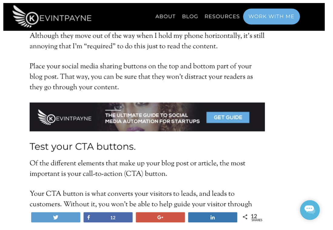
and within your blog post:

Source: KevinTPayne
Wrap Up
Applying these simple hacks to your website will help increase your conversion rates. Take one of the tips suggested here and use it on your website. Start by adding an image slider to your website. Then, monitor the progress before going to the next.

Author Bio
Kevin Payne is a content marketing consultant that helps software companies build marketing funnels and implement content marketing campaigns to increase their inbound leads.


