Every website needs a Contact Us page. But how can you make sure yours ticks all the boxes (no pun intended) without being so boring that customers just want to bounce?
Answer: The right design and custom forms. In this article, we’ll offer some helpful tips on designing a contact page for your website and discuss what elements will impress and bring value to your visitors.
What is a Contact Us Page?
A Contact Us page is a part of your website that contains your company's contact information. This information might include the company email address, telephone number, physical address, and link to the LinkedIn profile.
There are two versions of contact pages.
- You display all contact details directly on a page of your website.
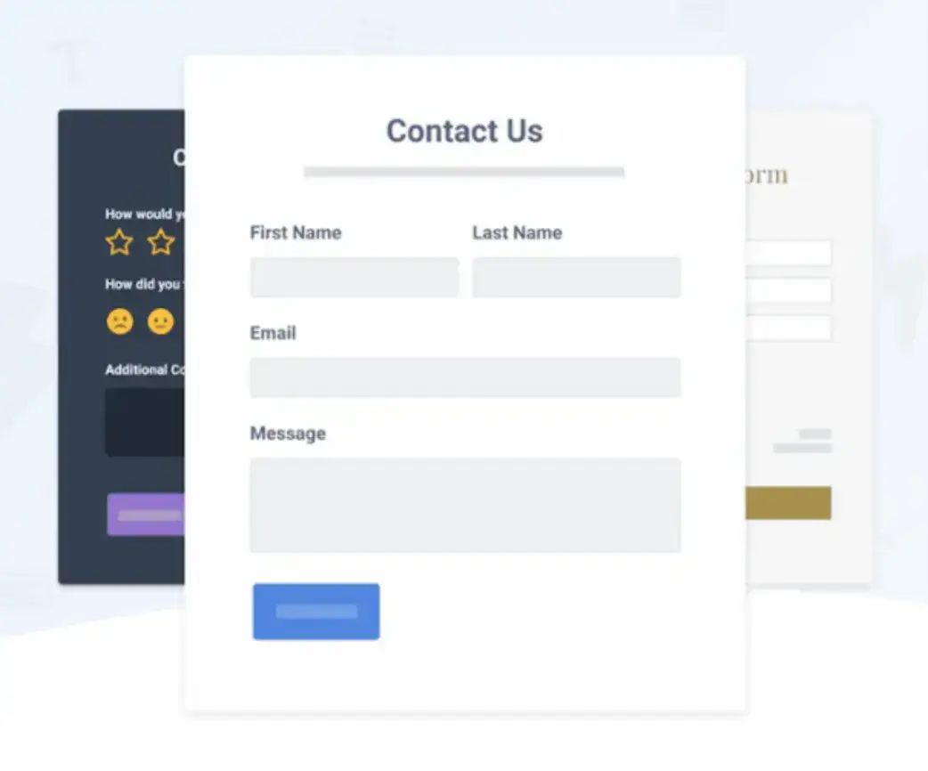
- You display a contact form on your website and let your visitors fill it out with their contact information. Once they submit their information, you contact them at their email address or website account.
You can also combine these two options and set up a contact form on your website while displaying your company’s contact information. Offering both options will give users a choice and instantly improve their customer experience.

Source: POWR
Importance of a Contact Us Page
Your website is your main platform for interacting with your customers. It provides a central location where visitors can find information about your company, services, and products.
They can read reviews, find your physical location, and more. Your website is your digital storefront.
Meeting with potential customers in person to discuss your business's benefits can be challenging. However, online interactions are quick and convenient, and customers value this convenience—one in five retail purchases happens online.
For this reason, you must efficiently and effectively provide potential customers with the most essential information about your business.
A Contact Us page is an integral part of your online marketing efforts. It provides customers with fundamental contact details and allows them to get in touch with you without any obstacles.
The Contact Us page also helps create a sense of inclusivity for your website users. Prospects who become qualified leads tend to contact the businesses they research.
It's natural to have questions about a company before becoming a customer.
Providing a webpage that allows them to contact you creates a connection between your company and interested parties. It makes your business look real and reliable.
Anyone who visits your website wants to see what they are looking for; otherwise, they’ll move on to the next available option.
Research shows that most website visitors are likely to leave the site within the first ten seconds if they don’t find what they’re looking for. For example, someone might visit your site looking for your phone number or email address. If they experience difficulty finding it, they’ll leave the site almost immediately.
So, when you design your site, ensure your Contact Us page is visible and accessible.
Translating your website can also be an essential part of its accessibility strategy. This ensures that visitors from different linguistic backgrounds can easily find and understand your contact information.
How to Design a Contact Us Page
A good Contact Us page should be easy to find and allow visitors to get in touch with you.
Don’t hide your Contact Us page at the bottom of your website.
Very few visitors have the luxury of time to scroll down the page to find it. If possible, put it at the top of the home page so that it’s among the first things visitors see when they open your website.
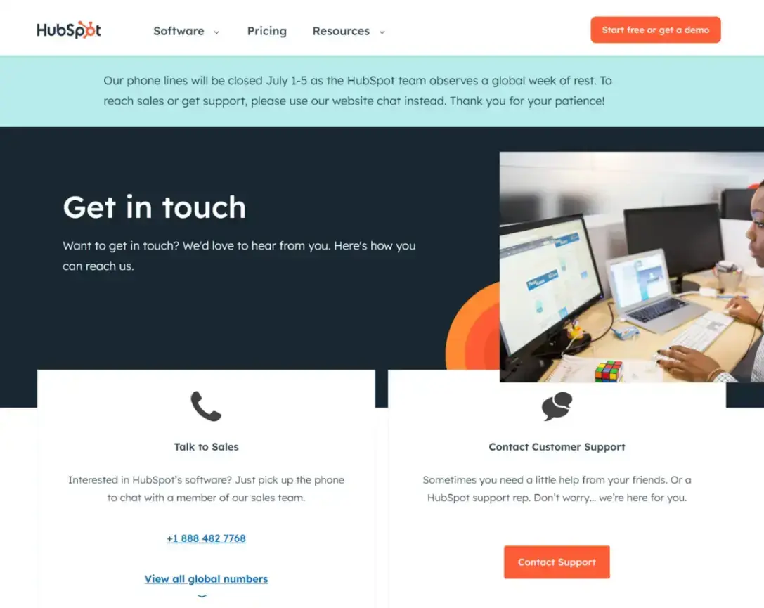
Hubspot’s Contact Us page is an excellent example of minimalistic design. It makes good use of white space, ensuring the text is easy to read and the page isn’t cluttered. All the essential information is there, front and center.

Source: Hubspot
Make sure your Contact Us page has all the necessary contact details, such as your business’s phone numbers, emails, physical addresses, and social media links.
Make the social media buttons clickable so your visitors can easily access your social media pages. You should also include other helpful links, such as additional resources, and arrange these details and links for ease of use.
If you add a contact form to your Contact Us page, include the necessary usability guidelines to help visitors use the form correctly. Remember to keep a clean layout and that simple contact forms usually work best.
Including a contact form on your Contact Us page is as simple as using a plugin from POWR. Just choose the fields you want to include, and you’ll be off to the races. They even have HIPAA-compliant forms coming soon!
3 Features of a Well-Designed Contact Us Page
1. Clear purpose
Your Contact Us page needs to show your contact information and explain in what cases website visitors can reach out to you. It should also include simpler contact options, such as a live chat feature or chatbot.
A submit button at the end of the contact form should be easy to find. Remember, the purpose of a Contact Us page is to lead to higher customer satisfaction rates.
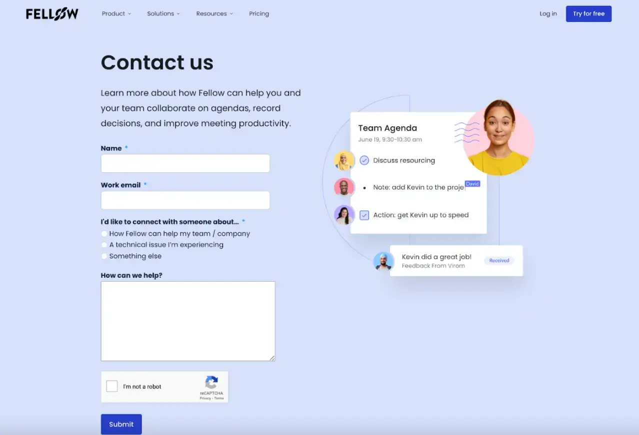
Let’s look at the example of Fellow, an AI meeting minutes tool. Their website showcases a great design on each page.
Fellow’s Contact Us page features the primary sections of a form. It also has a special section to define the reason for the message. Visitors can then categorize their messages into three options:
- How Fellow can help my team/company
- A technical issue I’m experiencing
- Something else

Source: Fellow
These options also allow Fellow to identify who is sending the message. Sometimes, a company may be interested in their AI meeting notes, or an existing client might have some complications with the product.
The provided options allow Fellow to send the query to the appropriate department.
2. Adding value
Include a concise description of how your company’s offers are helpful to its potential customers. Encourage them to explore other website pages that might answer their questions without contacting you and waiting for your response.
Remember to genuinely offer your help and expertise if customers consider contacting you as their best option. You can also mention your business hours to help customers predict what time of day they should expect a response.
3. Creativity
Make your contact page design positive and memorable. You can keep things simple and straightforward while maintaining your brand style.
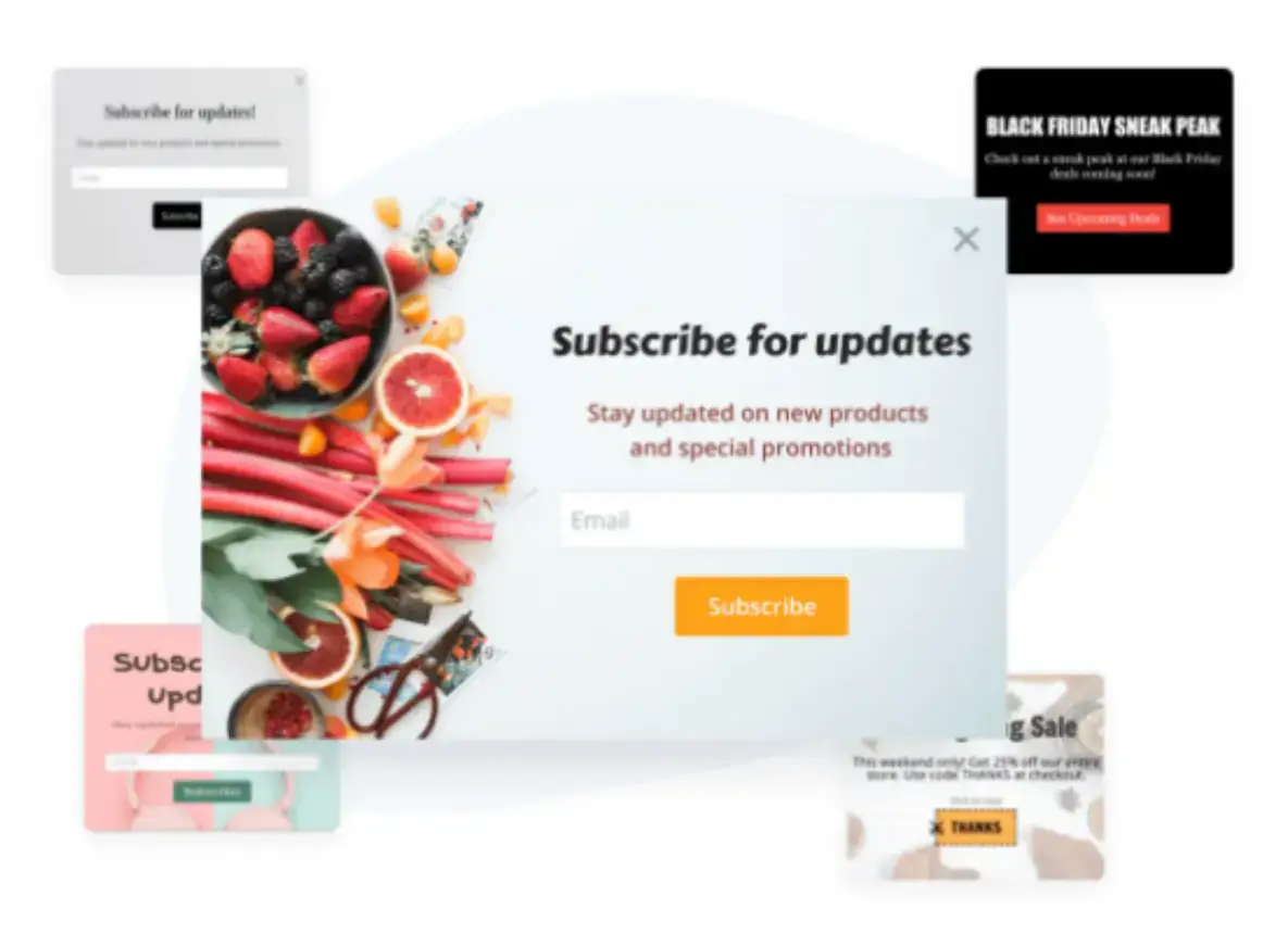
To ensure the best customer experience, improve the page's visual appeal and use illustrations, images, and popups. POWR’s popup app is the perfect solution for adding interest in a simple, effective way.

Source: POWR
Conclusion
Your Contact Us page communicates with your website visitors. Ideally, that communication is clear, friendly, helpful, and encourages the beginning of a long-term relationship with your brand.
A well-designed Contact Us page should make an exceptional impression, be clean, and contribute to building your reputation as a reliable business. It’s essential to have all the necessary contact details on the page.
Adding an easy-to-use contact form with POWR can make potential customers love visiting your website. Showing the effort you put into making your company accessible guarantees a great customer experience for each visitor.
Try POWR for free and see what a difference a well-designed Contact Us page with a simple contact form can make!
Author Bio
Sofiko is a content writer who specializes in SEO and digital marketing. She enjoys conducting in-depth research on topics she writes about and sharing her authentic experiences with readers. Originally from beautiful Georgia, she currently resides in its capital, Tbilisi. In her free time, you can find her exploring new cafes in the city or having a picnic with friends in a park.


