When you are designing a website, you have to plan the entire layout, ensuring that every element of the site goes to the right place.
Every website consists of several pages that carry important details about the owner.
Among these pages is the “Contact Us” page, which showcases the contact details of the owner, including emails, telephone numbers, and postal addresses. But what should a contact page look like?
This article offers you some useful contact page ideas for a website that you can use to design your site.
Importance of a Contact Page
A website offers you a platform to interact with your customers.
But unlike having a sit-down with potential customers to discuss the benefits of your business and learn about their interests, online interactions only take a few seconds.
For this reason, you have to provide potential customers with the most essential information about your business in the easiest and most effective ways possible.
A contact page is an important part of your online marketing efforts because it provides customers with fundamental contact details, allowing them to get in touch with you as quickly as possible.
Since the Yellow Pages have become redundant in terms of locating businesses and finding business contacts, instant gratification has become crucial. Anyone who visits your website wants to find what they are looking for instantly, or else they will move on to the next available option.
Research has shown that most website visitors are likely to leave the site within the first ten seconds if they don’t find what they’re looking for. For example, if someone visits your site looking for your phone number or email and they experience the slightest difficulty in finding it, they’ll leave the site almost immediately.
So, when you are designing your site, make sure your contact page is clearly visible and easily accessible. Fortunately, you can now work with an online form builder to help you edit and customize your contact page.

Source
How to Design a Contact Us Page
A good contact page should be easy to find, allowing visitors to get in touch with you quickly.
Don’t hide your contact page at the bottom of your website because very few visitors have the luxury of time to scroll down looking for your contact page. If possible, put it at the top of the home page so that it’s among the first things a visitor sees when they open your website.
Additionally, make sure that your contact page has all the necessary contact details, including your business’s phone numbers, emails, physical addresses, and social media links.
Include all your active social media pages and make them clickable so that your visitors can be taken to your social media pages at the click of a button. These details should be arranged neatly for quick scanning.
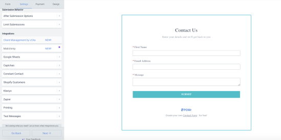
You should also include a short, simple form where visitors can enter their details to help you know who’s contacting you.
Make sure you include the necessary form usability guidelines to help your visitors use the form properly. Don’t clutter your contact page with unnecessary fields and texts because they will mess up the page.
In summary, a contact page is a simple form of communication that helps to improve your relationship with people who visit your website.
Therefore, it should be clearly visible and accessible to save your visitors time. When designing your contact page, don’t mess it up with a lot of unnecessary details.
Just include all the important contact details through which your customers can get in touch with you quickly.

