
The world today is experiencing a rapid increase in smartphone usage, creating a strong mobile ecosystem that fuels the growth of websites and mobile applications.
According to Statista, global mobile phone usage has reached approximately 7.1 billion users, and is expected to grow to 7.49 billion by 2025.
In this article:
- What is Mobile Web Testing?
- Why Do We Need Mobile Web Testing?
- How to Perform Mobile Website Testing Effectively?
- Limitations of Mobile Web Testing

Source: Statista
So, keeping your website mobile-friendly has become more important than ever.
In today’s mobile-first world, developers also need to test websites across different devices and resolutions — something made much easier with mobile web testing tools.
Let’s explore the details.
What is Mobile Web Testing?

Source: SmartBear
Mobile web testing is the process developers use to ensure a website displays and behaves correctly across various smartphones and screen sizes.
This testing is also known as responsive website testing, as it evaluates whether a website adapts well to different resolutions.
Benefits include:
- Browser compatibility
- OS compatibility
- User-friendly design
- SEO advantages
- Enhanced visibility
Moreover, browser compatibility is a major benefit of conducting web testing since it ensures that a website works seamlessly in existing mobile web browsers such as Safari, Brave, and Google Chrome.
Mobile web testing also improves visibility and encourages users to browse more confidently.
Why Do We Need Mobile Web Testing?
Mobile web testing ensures users enjoy responsive, seamless browsing from their smartphones.
Since mobile usage continues to rise, developers must prioritize responsive design to ensure websites remain usable across all devices in the long term.
Key reasons include:
Mobile-first indexing

Source: Stock Image
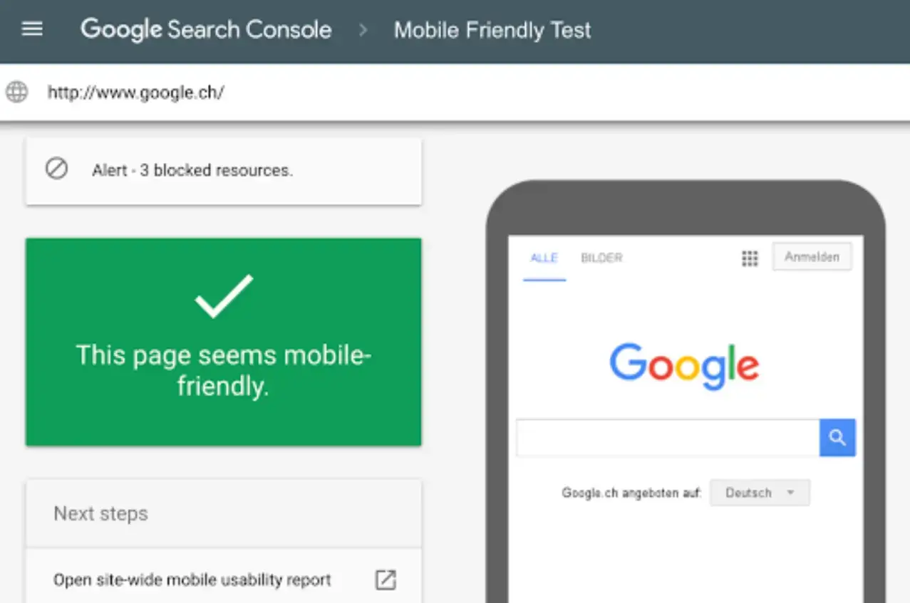
Search engines prioritize mobile-responsive websites. If your website isn’t mobile-friendly, it's less likely to rank on the first page of Google.
Speed and accuracy
Users increasingly prefer smartphones over laptops due to convenience.
Automated testing services like Rainforest QA allow developers to test functionality and performance across real devices, improving speed, accuracy, and device coverage.
Exceptional user experience
Designing a website impacts customer loyalty and referrals. A strong user experience is determined by user feedback on functionality, performance, and ease of use.
Mobile device compatibility
Testing isn’t about checking every phone model.
Instead, developers focus on the most commonly used devices and ensure strong performance on those. This helps deliver a consistent, exceptional experience across popular mobile models.
How to Perform Mobile Website Testing Effectively?
Testing your website on real devices is not scalable due to the countless device types and resolutions.
To build an efficient mobile web testing strategy, consider the following steps.
Before starting, understand your product features and the mobile devices your audience commonly uses.
Here are recommended approaches for effective testing:
Validation of HTML and CSS code
One of the strongest tools for mobile web testing is the W3C mobileOK Checker — an automated method many developers prefer over manual testing.
It helps detect and remove HTML/CSS errors to ensure your website meets responsive design requirements.

Source: W3C mobileOK Checker
Because it is widely recommended for testing mobile responsiveness, it provides clear reports detailing failures that affect usability.
Chrome DevTools
Chrome DevTools is another essential tool for checking and fixing issues in your HTML and CSS.
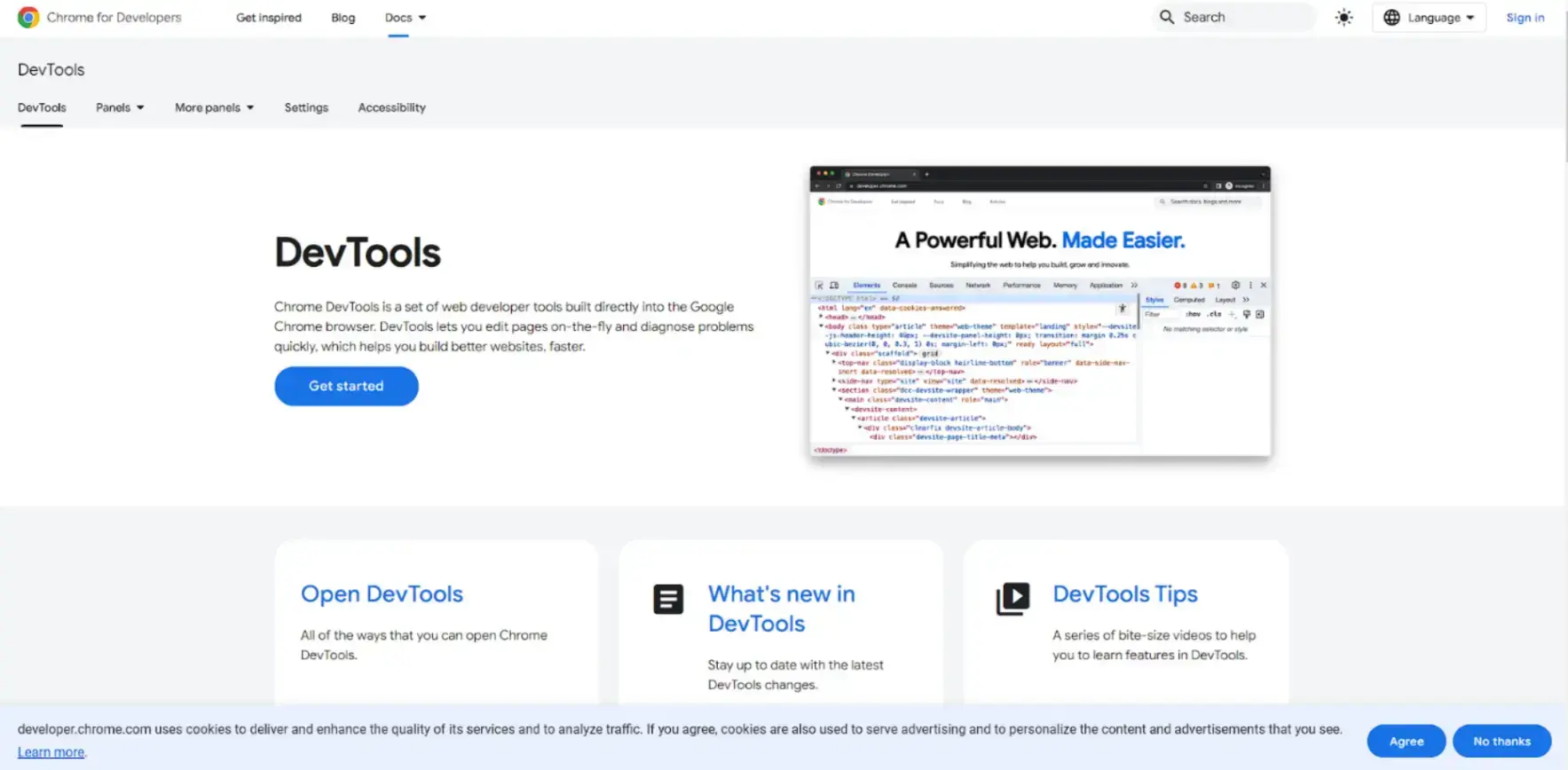
Source: Chrome DevTools
Its advantages include insights into Core Web Vitals and the ability to test responsiveness under varying network conditions.
Mobile-friendliness testing
When evaluating mobile friendliness, CrossBrowserTesting is an excellent tool, offering access to more than 2,050 mobile browsers.
Using this platform, you can check whether a website is compatible with different browsers and meets their technical specifications.
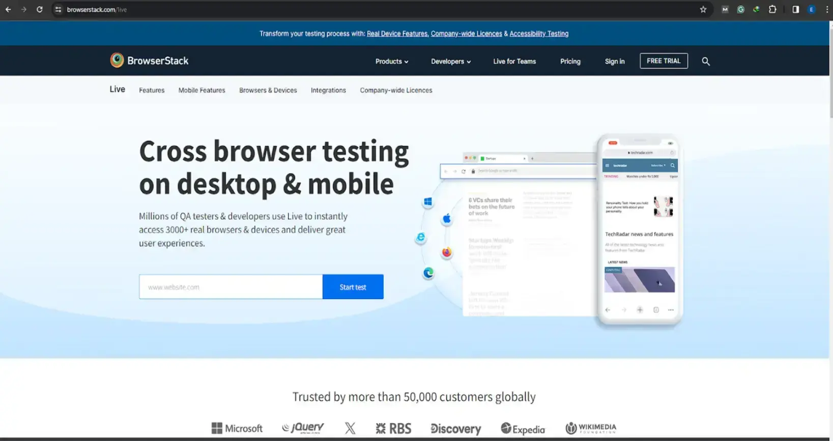
Source: BrowserStack
Notable features include:
- Selenium-based automated testing
- Live responsive testing
- Secure, real device testing environments
These tools help ensure your website performs optimally across devices without lag.
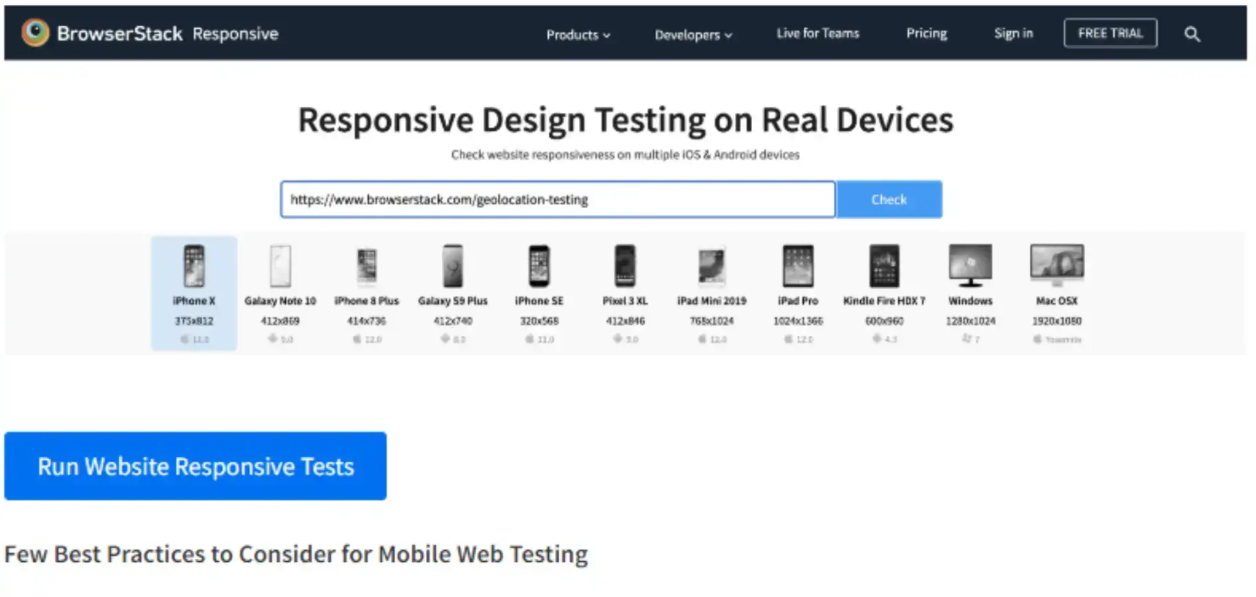
Using BrowserStack’s responsive checker tool
The internet contains countless device types and browser versions. Because of this fragmentation, every business today must have a responsive website.
BrowserStack’s Responsive Checker allows users to instantly preview their website across popular devices like the iPad Pro, iPhone X, and Galaxy Note 10.
This makes it easy to identify layout inconsistencies and rendering problems.
How it works:
- Enter your website URL
- Click the Check button
- View your website across various screen sizes
Source: BrowserStack Guide
In addition, you can use mobile emulators or perform cloud-based testing on real devices.
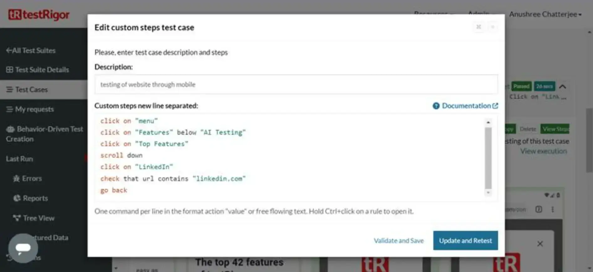
Source: testRigor
testRigor provides AI-powered mobile testing, enabling developers to write test cases in plain English. It supports iOS and Android, integrates with CI/CD pipelines, and reduces test maintenance.
Test your website across different regions
To ensure a consistent user experience globally, you should also test your website from multiple locations.
Using residential proxies helps simulate browsing from specific countries, exposing:
- Localization issues
- Content restrictions
- Regional performance differences
If budget is a concern, you can start with a cheap proxy that still provides reliable IP rotation.
You may also use mobile proxies to mimic real mobile device IPs, enabling tests of mobile-only content.
An anti-detect browser helps rotate profiles and locations for comprehensive responsive testing.
Limitations of Mobile Web Testing
Mobile web testing is essential, but it also has limitations. Fortunately, many of these can be mitigated by combining automated tools with occasional real-device testing.
Limited environment
A major challenge is the variation in operating system versions and network conditions. These differences can affect how accurately tests simulate real-world performance.
Performance variations
Smartphones vary widely in hardware and capability. This can cause inconsistent user experiences, and emulators may not accurately reflect the behavior of real devices.
Dynamic content
Emulators often struggle with real-time interactions or dynamic content. Slow page loads may cause users to abandon a site — something an emulator may not fully reveal.
Network conditions
Simulating unpredictable real-world network issues is difficult. Slow or unstable connections can yield inconsistent test results, making it difficult to validate performance reliably.
FAQs on How to Test a Website on Mobile Devices
1. What are the best testing tools for mobile web testing?
Popular tools include Katalon, BrowserStack Platform, Cypress, and Selenium. Katalon Platform is especially useful because it provides a unified workspace for web testing tasks.
2. What is the best advantage of conducting mobile web testing?
The biggest advantage is that it’s time- and cost-efficient, allowing developers to test at scale without owning physical devices.
3. What challenges might occur during mobile web testing?
Challenges include:
- A steep learning curve
- Additional investment for large-scale projects
- The need to continuously check for bugs and errors alongside new code
4. How do you build an effective mobile website testing strategy?
An effective strategy involves testing at multiple development stages, including:
- Web application pentesting
- Dynamic Application Security Testing
(DAST) - Static code analysis
These help identify vulnerabilities early.
Conclusion
Testing mobile websites has become an essential part of modern design, development, and optimization.
This article explored the top tools for cross-browser testing, responsive design testing, and automated mobile testing.
While automated tools and emulators offer speed and efficiency, real-device testing remains important for accuracy.
Once you have your testing blueprint and priorities in place, selecting the right approach for large-scale testing is the next key step.
Let me know in the comments — which tool will you use for mobile testing?