
As a digital marketer, are you creating effective landing pages that facilitate the highest sales and conversion rates possible? Do you pay critical attention to your headlines, value propositions, and CTAs? Is your sales page design catchy enough, and have you included quality multimedia content in the form of images and videos?
There are different post-click landing pages designed to receive traffic from various sources, including ad clicks and organic searches. However, a sales page is unique because it only has one goal – convert visitors to leads or customers.
6 Steps to Optimizing a Sales Page
- Determine your target audience
- Create an effective value proposition
- Decide on page length
- Eliminate distractions
- Write a compelling headline
- Add carefully-constructed CTAs
In this quick read, we'll explore some exciting examples of high-converting sales landing pages that attract and retain customers to boost conversions.

1. Determine your target audience
Many well-designed landing pages fail to make an impact simply because their content and design don’t align with their target audience.
Think about it. How will your online course, drop shipping, or SaaS marketing plan work if you don’t know who your target audience is? You won’t.
Therefore, understand that your audience type directly affects your page design, so you should start by determining your target audience first.
We’ll elaborate with a sales page example below from the meal-prep service, Freshly.
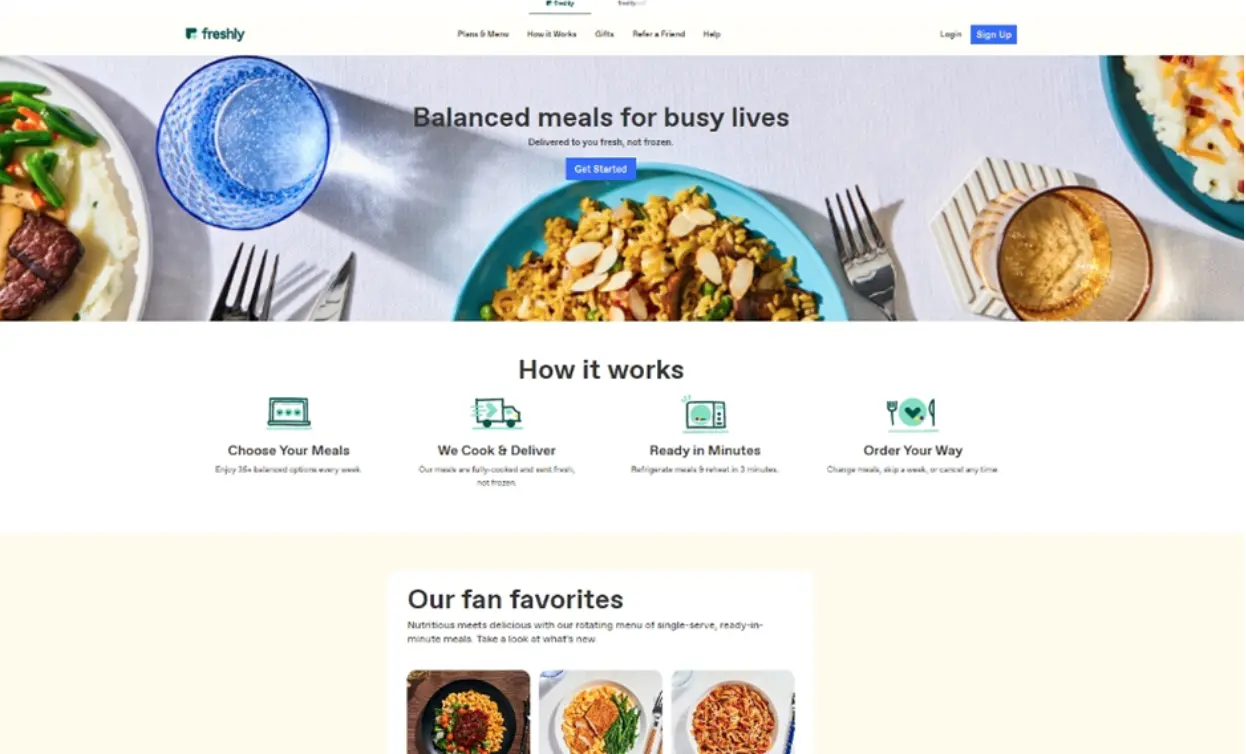
Freshly is explicitly targeting “meal preppers” who prefer healthy, organic, low-cost meals and quick-to-make meals due to their busy lives. There is a clear headline, “Balanced meals for busy lives,” while a unique value proposition provides more context in the “How it works” section.
The photography on Freshly’s sales page is excellent, complementing the product copy and the value proposition of healthy meal preps that look good.
Knowing your target audience is critical when designing a sales page. So, how can your marketing team understand your target audience or how they look? Here are a few tips to help you out:
- Create a buyer persona – a buyer persona is a detailed description of your ideal buyer, including their likes, needs, pain points, and other demographic data such as age, gender, location, and income.
- Get insights from your sales funnel software. It’ll help you understand what types of prospects are converting the most and how you can better increase conversions.
- View insights from your Google Analytics (GA4) Dashboard, specifically on audience insights. It’ll provide detailed stats on your audience demographics, such as age, gender, and location.
- Use social media analytics tools such as Facebook Audience Insights to know who interacts with your content and social media profile.
Not only does creating a buyer persona help in creating your sales page mockups, but it also helps with customer retention in the long term.
2. Create an effective value proposition
Your unique value proposition should instantly be recognizable once a prospect lands on your sales page. This value proposition clarifies what the target customer gets from using your product.
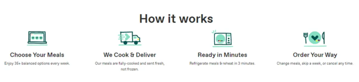
The Freshly example in the first image shows a clear value proposition, expanded in the snippet below.
The service is pegged on the customer choosing their meal packs, having their meals sent in fresh and not frozen, and quick preparation times, amongst others.
Landingi shows us another excellent example of an effective sales page. Landingi is a SaaS tool that helps businesses build high-converting landing pages.
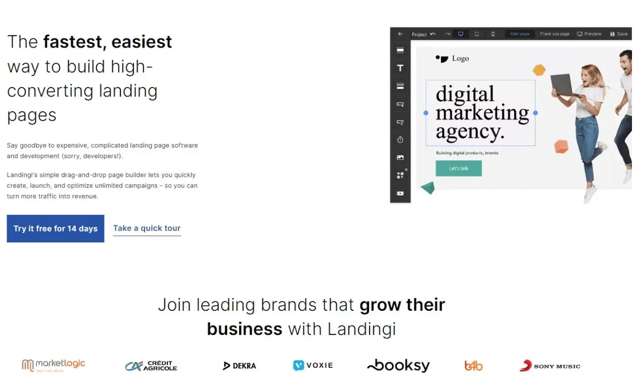
Landingi has a great value proposition - customers can say goodbye to expensive and complicated landing page development. A simple drag-and-drop mechanism allows one to build custom landing pages fast.
Like Landingi, your unique value proposition should ideally convey your product's benefits or the unique problem that your product solves. Landingi keeps it concise and directly relates it to a mass customer problem, i.e., building landing pages quickly without getting too costly or technical.
You can also incorporate keywords and descriptions aligned to your key product features within your unique value proposition.
3. Decide on the right length
The length of a sales page depends on your product type, your client’s awareness level, and your overall page design. In particular, you should consider the time or “coaching platform” necessary to convince the potential customer to close the sale.
A short-form sales page with anything from 500 - 1,000 words will suffice for specific and highly visual products. For products that need a bit more Aarying product types, long-form sales page copy with 2,500-5,000 words is encouraged.
For example, if you create online course content and are planning to promote this using a sales page, you may need long-form sales copy to elaborate on the course’s benefits and outline.
Short-form sales pages work best with high product awareness and low risk or commitment. Long-form content is best for elaborate products, those with a high value attached, and those that need detailed explanations.
Let us examine different portions of the same long-form landing page from Alison, a company that provides online course content.
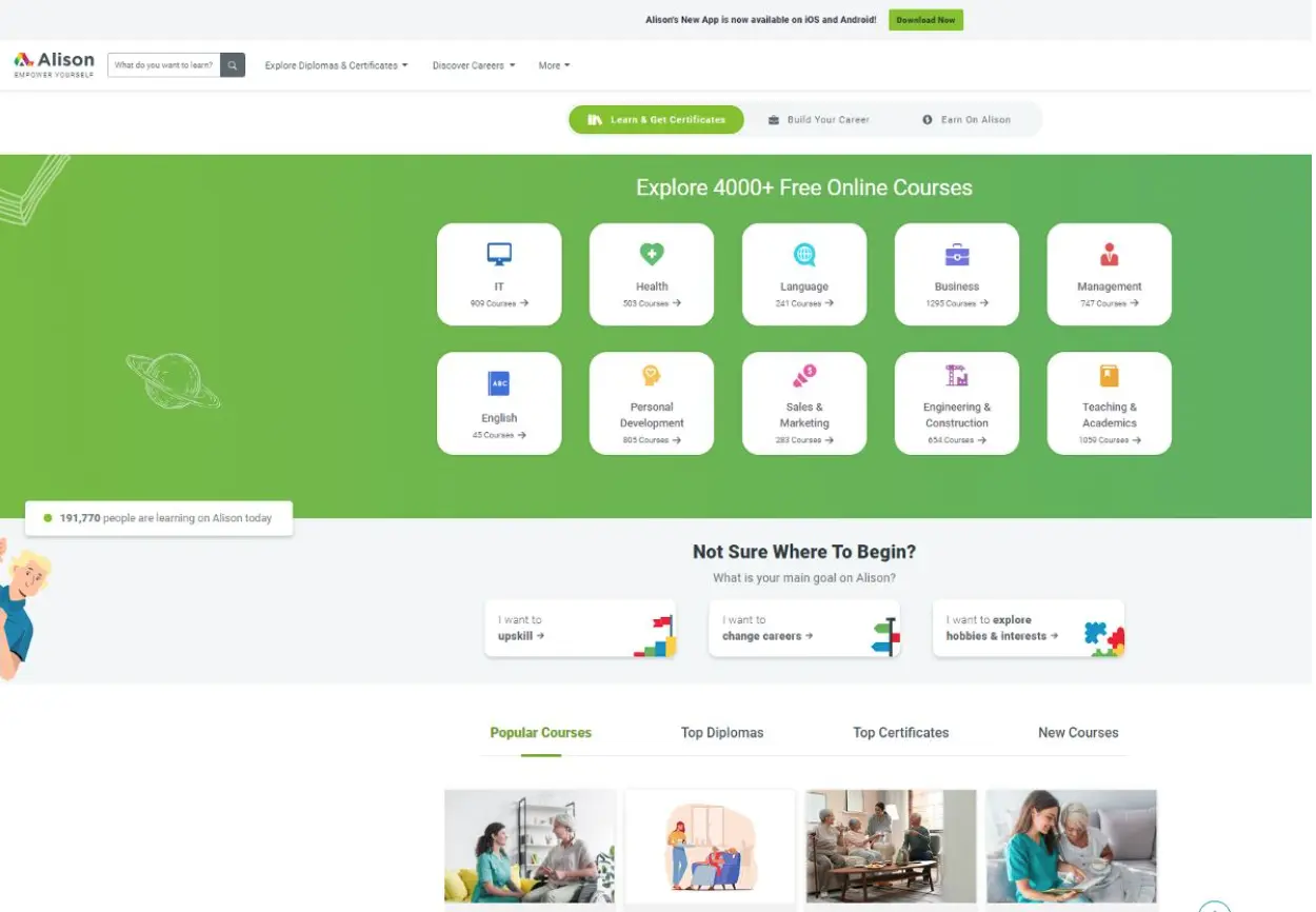
We can see why Alison chose the long-form approach to their sales page here. In Alison’s course content, the product or service spans a wide variety of areas, so it’s impossible to pack it all in a small page snippet.
Here is the next segment of Alison’s sales page;
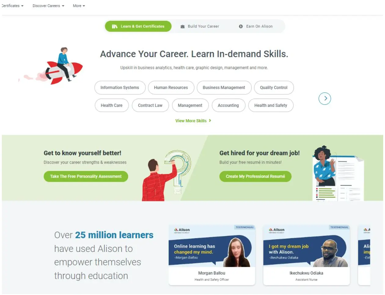
On this part of the page, we see Alison giving the reader a summary or unique value proposition of the service.
There are two prominent CTA buttons in the middle part of the page with the green highlight. Alison also throws in a bit of social proof at the end of the page.
4. Eliminate distractions
First impressions matter a lot, even for sales pages. It is, therefore, important for your sales page to be clear, concise, and without unnecessary fluff. All the design elements, from the hero image to the product copy and white space, should blend effortlessly together.
Here is an example of a no-frills but effective sales page from Stratasys, a 3D printing company.
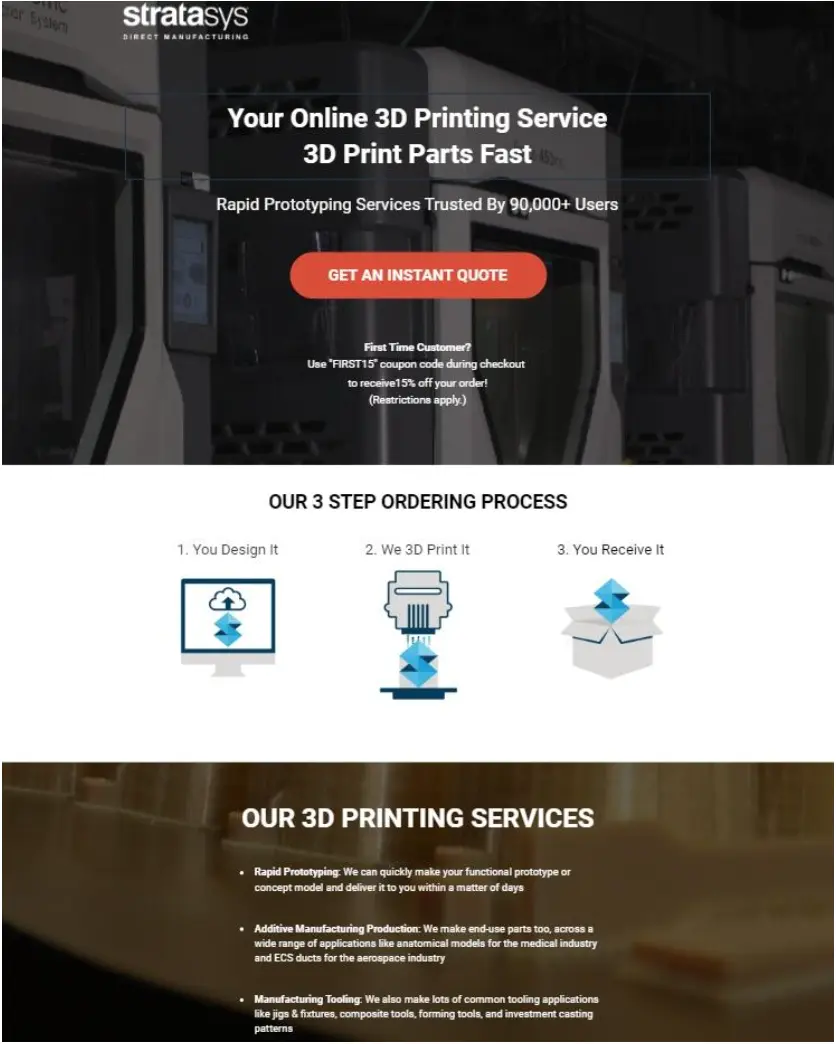
It’s about as minimalist as a sales page can get. There’s a “quick” sales copy, meaning you don’t have to guess what the business is about.
The white font color chosen contrasts effortlessly with the HD picture background. There is a big, bold CTA button that instantly entices you with “Get an Instant Quote.”
As you design your sales page, it is vital to strike the right balance between creativity and user experience. Avoid too many CTAs, unrelated stock photos, and navigation menus that aren’t well positioned.
5. Write a compelling headline
Your headline is the first thing prospective customers see in search results, so ensure it's catchy and exciting to increase traffic to your landing page. You must create a clear, catchy, short headline supporting your unique value proposition.
Here is an example of a simple-yet-effective headline from Preply, a language tutoring app.
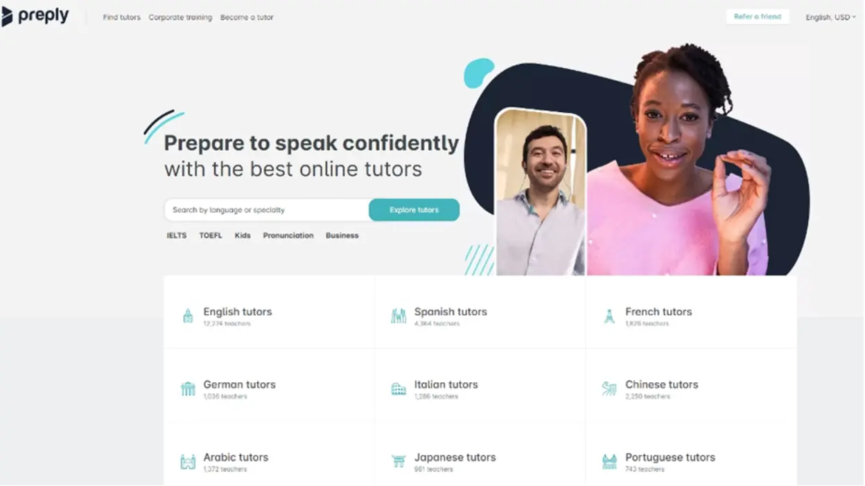
“Prepare to speak more confidently with the best online tutors.” That’s a compelling sales pitch that is simple and without any fluff. As you craft your headline, keep in mind these simple golden rules:
- Your headline directly draws from and leads to your unique value proposition and product features.
- Avoid sensationalized and clickbait headlines containing terms such as “You’ll never believe…” or “Make $1 Million by reading this….”
- Keep it short, preferably ten words or less.
The theme of your sales page should match right, along with the placement of your headline. For example, you can use background colors that match your company’s branding style with a brightly contrasted headline.
6. Add multiple CTAs
An important thing to note about CTAs is that they signify a critical point in the buyer’s journey - conversion. Therefore, you must make it easy and convenient for prospects to find your CTAs.
That means you might need to have two or more CTAs on your sales landing page, depending on the page's size and the page objective.
For example, you can have multiple CTAs on the same sales page for different purposes if you have other conversion goals. For example, you may have a CTA that asks users to buy your product or service and another that requests them to sign up for a demo.
Remember that these CTAs should cooperate and support each other’s conversion goals. Multiple CTAs that are unrelated can end up hurting your conversion rate.
The other thing about CTA buttons is their placement and design matter a lot. The button should be large enough to be seen without any effort. The primary CTA button should also be placed above the fold, while other CTA buttons can go wherever it makes sense for you and is most convenient for conversions.
You can also optimize your CTAs by running A/B tests. Test different CTA copies, designs, and placements to find the perfect combination that delivers the best results.
In Closing
We’ve covered some of the essential elements of high-converting sales pages and how to optimize them. Before creating any sales page, defining your target audience should be the main priority. It’ll ensure your sales page reaches the right folks and conversions happen.
Afterward, you can focus on page design elements such as prominent CTA buttons (there can be several on a single page) and a minimalist, focused design. This minimalist design should include creative elements such as white space, font background contrasts, and high-quality hero images.
Finally, we’ve emphasized the importance of compelling product copy for your sales page. It’ll include using an intriguing headline, clever copywriting with varying lengths of the sales copy, and enough product details to close the sale.
With these tips, you’ll be able to create a sales page that instantly draws your audience’s attention and boosts conversions.
Author Bio
Nico is the founder of Crunch Marketing. The company works with enterprise SaaS clients, helping them scale lead generation globally across EMEA, APAC, and other regions.