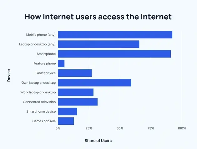
Did you know that in 2023, mobile platforms will continue to dominate the internet landscape? According to recent statistics from Statista, there will be an estimated 7.3 billion unique mobile users, and 5.3 billion internet users worldwide.
Additionally, about 72% of active internet users will access it from their mobile phones. These numbers highlight the undeniable importance of optimizing your online presence for mobile devices.
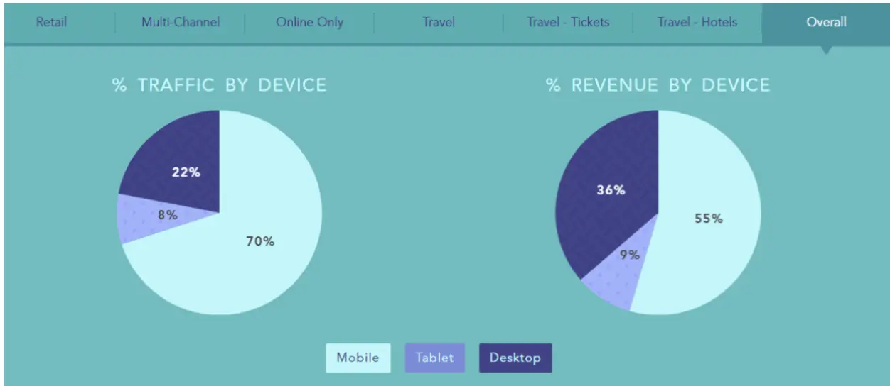
There are also significant trends when looking at eCommerce figures from mobile devices.
- 70% of traffic for online purchases comes from mobile devices
- 55% of revenue comes from mobile devices, while desktop revenue still forms the primary purchase platform.
 Source: Wolfgang Digital
Your mobile site can be a game-changer for your business. It’s essential to make your mobile site easy to use and responsive.
There is likely an audience out there interested in your business, but they won’t hang around if your mobile site isn’t up to par.
You can get more traffic and conversions on your mobile site by making it user-friendly. With effective strategies, you can get visitors to your site and engage with them.
7 Ways to Boost Mobile Conversions
-
Add live chat on your mobile site
Although mobile phones are convenient, getting information from sites can be challenging. Mobile screens have limited space, and entering data is usually error-prone.
So, when visitors want to contact you, minimizing the discomfort they experience is best. Usually, when a visitor wants to get in touch, they can send an email, fill out a form or call you.
However, they don’t know when to expect a reply to their emails.
It’s uncertain whether the email will satisfy their query. Follow-up questions and answers take even more time. It’s no surprise that users aren’t engaging with businesses very much.
Phone calls can also be challenging. Copying and dialing the number, waiting and listening to a recorded message, or being put on hold can be annoying.
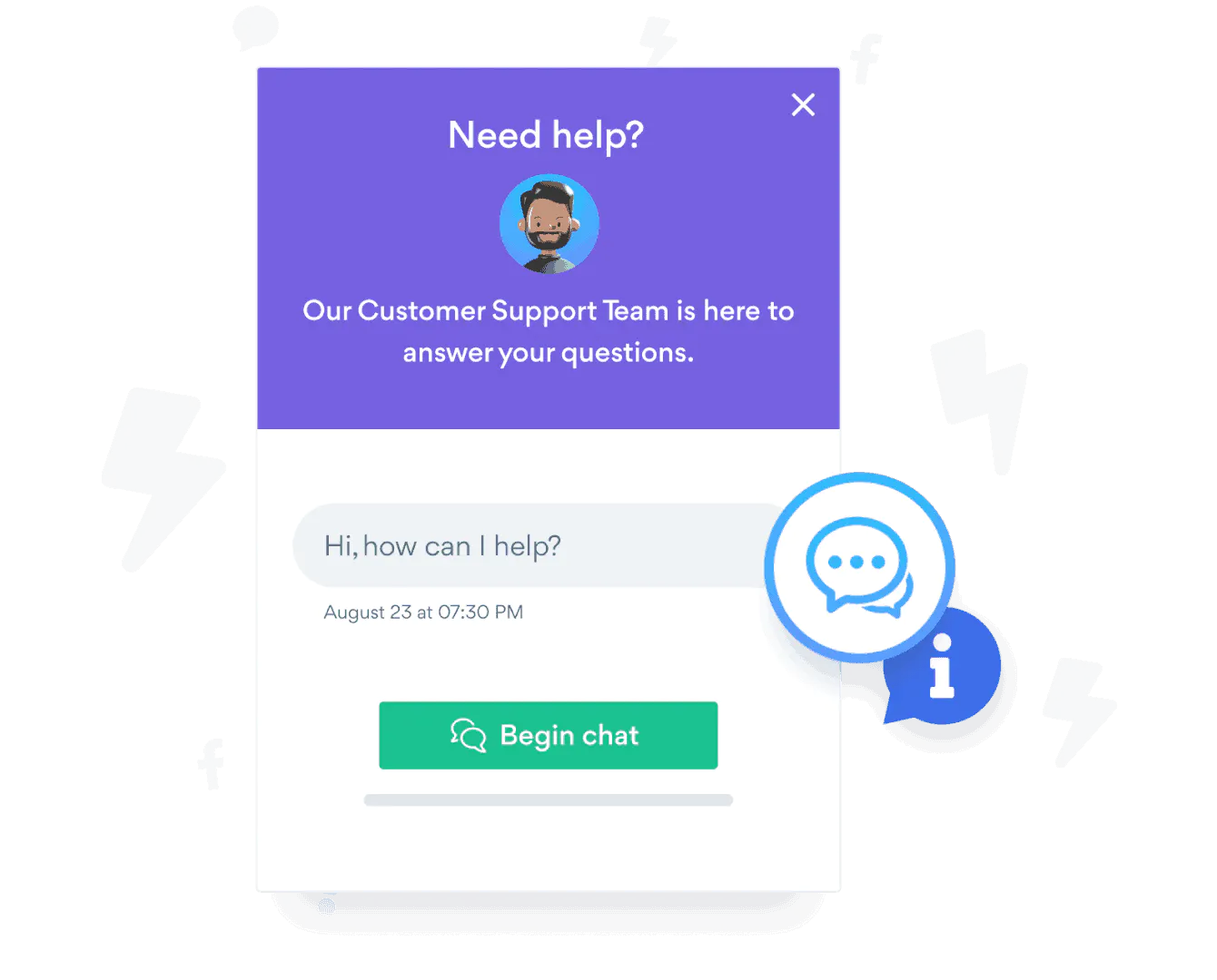
Adding live chat to your mobile site can make things easier for your users. Live chat is faster than email and phone calls. Your users can ask follow-up questions. There’s also barely any waiting involved.
Providing critical information right away can sway the decision to buy. Adding a personal and human touch to your communication with customers can build a sense of security. Customers know that they can reach out to you and that you will listen and help them.

-
Use mobile popups on your site
Pop-ups work really well to create conversions on websites. They help you get your users’ attention. You can use popups to offer users discounts and coupons. They are great for increasing the number of subscribers to your blog site.
Using mobile popups will also help increase conversions. You can do this with a tool like OptinMonster, which lets you create mobile responsive pop-ups.
It enables you to automate when the pop-up appears based on time delay triggers, location parameters, and more. You can even create an exit-intent popup to get emails before people leave.

You can use pop-ups to capture users’ information just before they leave. By offering them the chance to get valuable information, you will get them to give you their email.
You can use pop-ups as lead magnets. This is where you give something of value to mobile site visitors for free. It can be an ebook, a checklist, a guide, a cheat sheet, and many other things.
Just make sure that it’s relevant and helpful. A lead magnet will give them the free item when users sign up with their email.
Pop-ups are great for creating an email list. This is important because email marketing is the most effective way to drive conversions. Use pop-ups on your mobile site to support activities like registrations and list building.
-
Re-evaluate your pricing strategy
For a buyer, the price of a product is a crucial piece of information. Their decision to buy from your business can depend entirely on your pricing strategy.
It can be the difference between whether your business grows or remains stagnant. Creating a good pricing strategy can help you get mobile conversions.
Here are some pricing strategies for you to consider:
- Be open and list your prices clearly on your website. Asking them to contact your business personally for price information creates more steps. It also creates a delay that can put users off. Users want to know the price of a service or product immediately. Make sure you state it plainly on your mobile site to give them all the necessary information.
- Use a psychological strategy like anchoring to guide people to buy. People’ anchor’ their perception of a product’s value based on the first price they see. When you present an expensive option first, the next option seems more reasonable. This creates a favorable impression which can lead to sales.
- Highlight the most helpful plan. You can design different pricing packages to highlight the most popular plan. This makes it easier for users to decide which option is the most useful.
- Use logos that indicate payment security, money-back guarantee, and other information. This tells users that buying from your business is safe and secure.
Using good pricing strategies on mobile plays a vital role in driving conversions.
Make it easy for users to choose a package without weighing too many options. Clear information about pricing packages and how you present them will powerfully affect your sales.
You can also use membership site software so that when people sign up for a specific pricing package, they can access content for that level only. This creates value for your content and protects it as well.
-
Use social proof to gain trust
Social proof on your mobile site is a powerful way to drive conversions.
What impression do you get when you see a long queue outside a cafe? Even if you’ve never been there, you’re quite positive that it serves great food. You’re even likely to get in line.
Social proof shows people that your business and product are validated by other buyers and active users on the site. People are far more likely to buy from you when they see that others are also buying.
There are many ways to show social proof. You can display product reviews and ratings. Another way is to showcase testimonials from clients. You can also use a social proof app to automatically display notifications to users on your mobile site.
A useful tool to create social proof notifications on your mobile site is TrustPulse. It shows users a tiny notification in the corner of the screen. It displays purchases that are taking place in real-time. It can also notify users about the best-selling product at the moment.
Featuring a best-selling product can indicate scarcity as the product is fast-moving. It also creates a sense of urgency, and users may feel compelled to buy.
A social proof tool is a very effective way to automate social proof notifications on your mobile site.
Another way to create social proof is to display digital badges that are relevant to your industry. You can also display logos of payment merchants to show that your site is secure.
-
Improve your mobile site speed
Most mobile pages take about 15 seconds to load, but 53% of site visits leave a page if it takes longer than 3 seconds. Even though more than half of all web traffic comes from mobile, mobile sites are well below desktop sites regarding conversions.
This strongly indicates that faster loading of mobile sites will lead to more mobile conversions.
Mobile sites that load in 5 seconds or less generate 2x the revenue from mobile ads than those which take longer. This makes it evident that your mobile site has to load quickly to create conversions.
So, what can you do to improve website speed? Let’s take a look at what you can do:
- Compress images and text on your site
- Reduce the ‘weight’ or size of your mobile pages. Google suggests that the smaller the size, the better, with the best size being less than 500KB.
- Reduce the number of server requests. Run diagnostics to understand which files use up the most bytes. Your ad setup or analytics can also contribute to lower site speeds.
Using a tool to measure your mobile site performance is also helpful. You can use Google’s Think with Google tool to get a mobile site speed report.
-
Improve navigation
Users can get frustrated and lost on your mobile site without good navigation. Reducing anything that forces users to carry out more steps than necessary is important.
Having a mobile site that is easy to navigate will impact your conversion rates. Good mobile navigation delivers a great user experience. It certainly impacts the conversion rate on mobile sites.
Here are some mobile navigation best practices:
- Make your navigation touch-friendly. It is impossible to select items on mobile screens with the precision of a mouse pointer on a desktop. Google suggests a touch target size of around 48 pixels. Any smaller users are likely to leave in frustration.
- Use contrast colors and fonts thoughtfully. You can make your navigation stand out with contrasting colors for text and background colors. Always ensure you use mobile-friendly fonts that make text easy to read. Avoid using elaborate and cursive-style fonts.
- Prioritize your content. Even though you may have more pages, it’s important to feature between four to eight pages in your mobile site navigation menu. Select your website's most popular and important pages and have them in the navigation menu.
- Create a great search bar. Users should be able to use the search bar to explore different pages and categories easily. Using the search bar to assist navigation is helpful when it’s not possible to prioritize multiple pages on a mobile screen.
-
Focus on mobile SEO
Improving your mobile site SEO is a sure way to create conversions.
Google now carries out mobile-first indexing. This means it will first crawl your mobile site and then your desktop site. It’s evident that a good mobile site is important for SEO.
Your mobile site can impact your business’s online visibility. This is why it’s important to have a mobile site and to ensure it has a mobile-friendly and responsive theme.
Ensure that you have good navigation in place and that you have the same content on your desktop site and the mobile site. Also, use relevant keywords in your content title and body.
Another way to improve your SEO is to link to credible and authoritative sources. You can also do internal linking, i.e., linking to different pages on your own site. This helps search engines index your site.
If you’re using WordPress as your site platform, you can improve your WordPress SEO with plugins. You can use many tools and techniques to get your site to rank higher.
Mobile Sites are the Next Frontier of Digital Marketing
More than half of all online traffic comes from mobile phones. Not only that, but Google has made it plain and clear that it prioritizes mobile-friendly websites and mobile SEO efforts.
With just a few changes to your mobile site, you can make it convenient for users to get information. You can also increase sales by increasing your site speed and making the shopping process user-friendly.
There is a lot of potential for your business to grow. Take advantage of the increasing number of mobile users to increase conversions.
Author Bio
Syed Balkhi is the founder of WPBeginner, the largest free WordPress resource site. With over 10 years of experience, he’s the leading WordPress expert in the industry. You can learn more about Syed and his portfolio of companies by following him on his social media networks.


