Adding well-designed visuals to a landing page can directly impact conversion optimization. They can help your audience see faster if you provide what they look for in a way that showcases your brand identity at a glance.
Also, visuals can guide users through your landing page, drawing their attention and getting them closer to taking action. Always leverage visual content at every opportunity.
7 Visual Design Ideas for Landing Pages That Convert
1. Provide emphasis and create a visual hierarchy
Providing emphasis is one of the most used techniques to catch visitors' attention and boost conversions. Knowing what to highlight is key to avoiding emphasizing too many elements on your landing page.
See how this Basecamp's landing page emphasizes the headline, even without using a different color, by using bolder and larger fonts.
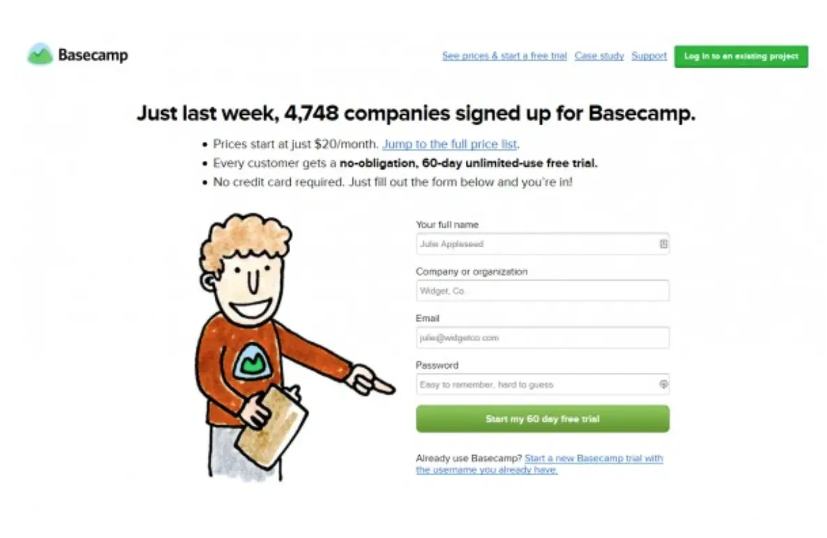
Source: Basecamp
Although this landing page also highlights the CTA by using other visual assets such as color, illustration, and directional clue, the key element to this page is the headline that provides social proof.
This combination creates a visual hierarchy that draws attention to critical information.
2. Create interactive landing pages
If users can try a digital product before signing up or interact with visual elements on your landing page, they tend to stay longer and engage more with your content. Take Moo’s landing page as an example:
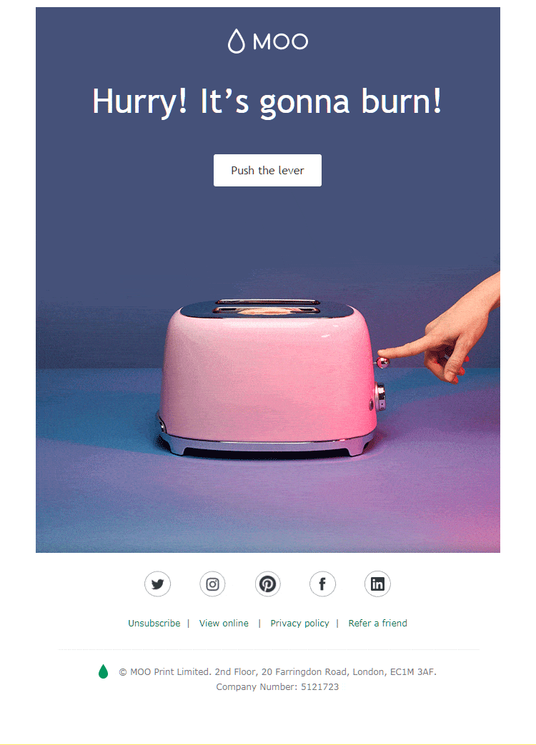
Source: Moo
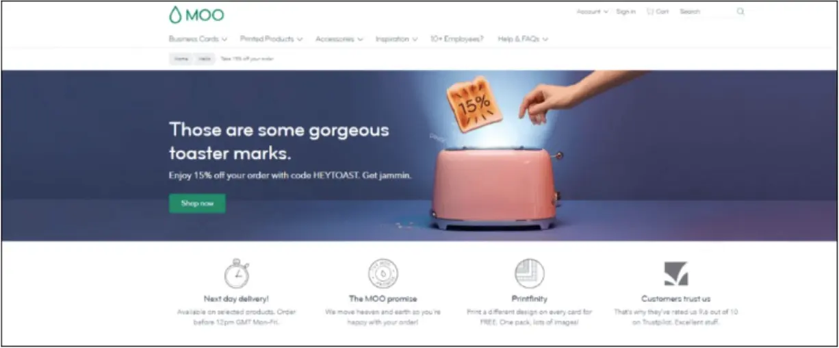
This landing page asks visitors to push the lever in a toaster image. Once the visitor clicks the CTA, a new landing page with a 15% discount offer is displayed, as you can see:
- Let visitors try your product
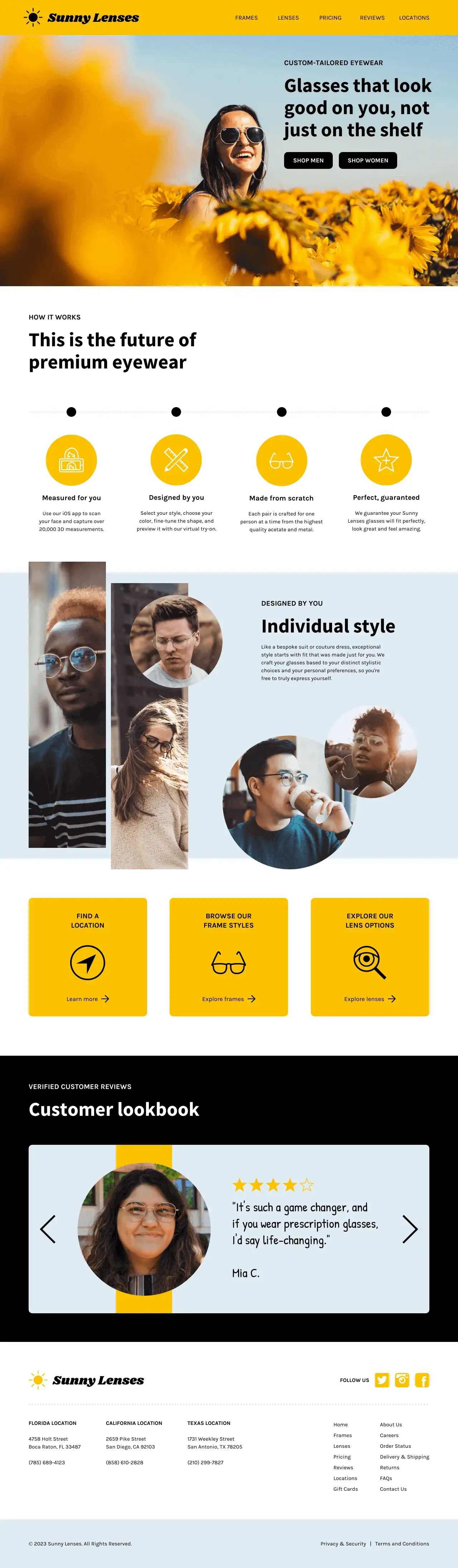
If users can try a product before buying, help them interact with your site to compare options. Take Ray-Ban’s landing page, for example.
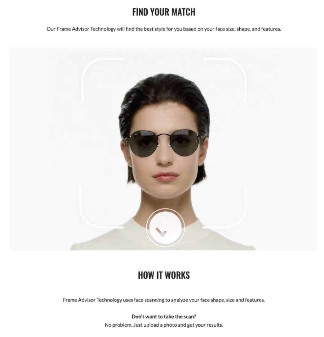
Source: RayBan
This landing page shows visitors how they look with different glasses and suggests the best style according to the buyer's face. Visitors can use the scan tool or upload a photo to see what they can expect before buying.
3. Invest in custom visuals and data storytelling
Illustrations can also help you communicate your message and give a personalized touch instead of adding stock illustrations to your product pages.
Well-designed imagery keeps visitors engaged with your landing page, while stock imagery looks boring nowadays because we've had enough of it.
Custom visuals, such as illustrations, memes, GIFs, icons, charts, and infographic template, create storytelling opportunities. Take the Icons8 landing page as an example:
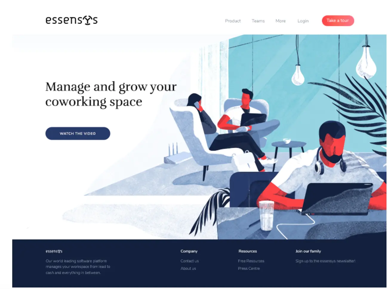
The illustration reinforces the concept of coworking space presented in the text. But they also tell a story, giving more details about the environment they want to offer.
4. Add visuals to reinforce your message
Visuals are also great tools when communicating a concept at sight.
The audience quickly understands the importance conveyed in imagery, and often no text is necessary, while, in some cases, the icon’s meaning complements or reinforces the text.
A background remover can help make these icons or images stand out more clearly by eliminating unnecessary visual noise.
Look at this landing page template to see how using a chat reinforces the idea of investing and making money:
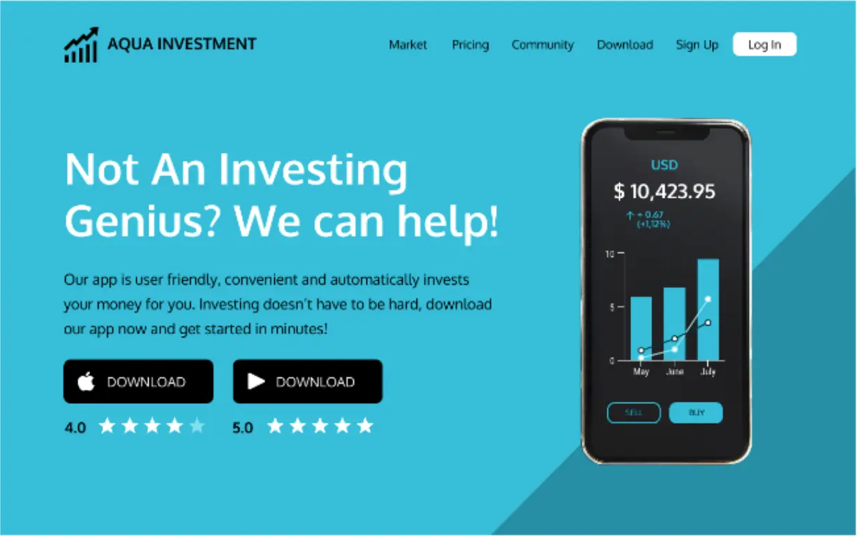
This landing page also has the advantage of presenting the app as something tangible by showing the visitor what the app looks like.
Also, rely on especially an infographic maker to combine diverse visual assets to explain at a glance how your product or service works, like this landing page template:
5. Pick colors to highlight your CTA
Everything on your landing page should help you drive attention toward a CTA. And the best way to make your CTA buttons pop is by using colors that contrast with the other elements on the page.
This landing page from HubSpot is a good example of how to use colors on landing pages:

Source: HubSpot
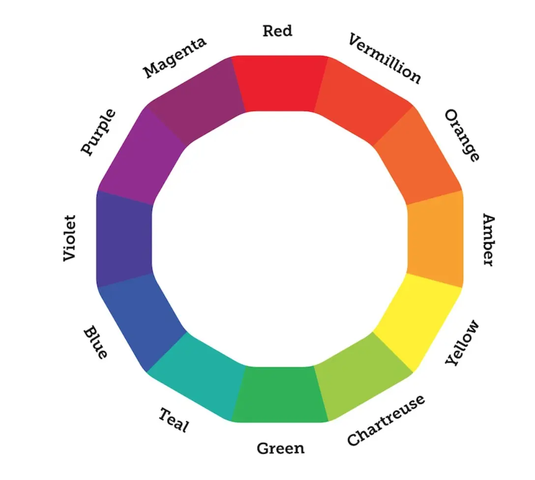
To make this task easier and create a more pleasant effect, use a color wheel and pick a color next to the opposite color of the dominant color of your landing page.
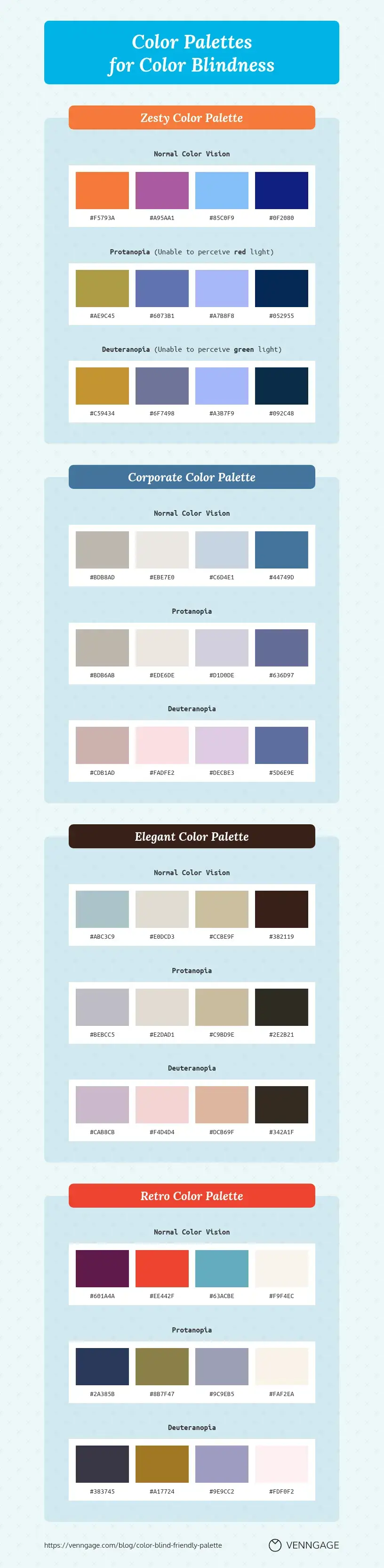
Another thing to take into account is accessibility. Color plays a significant role in your landing page, and for people affected by color blindness, colors are critical to making visuals more accessible and inclusive.
6. Use images that offer directional cues
Directional cues help to indicate where the user should pay attention and take action. You can use:
- White-space cues
- Eye-direction cues
- Arrows/Linear Cues
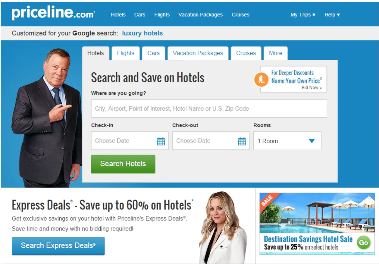
Or even a picture of a person pointing directly at your CTA, like the example below:
7. Keep it clean and direct
Colors, illustrations, and copy are critical aspects of a landing page but remember to keep it clean and minimal, so your visitors don't feel overwhelmed by too many elements. This is also true when it comes to their data.
Creating user-friendly forms and asking for as little information as possible will increase your chances of getting more downloads and subscribers. See 360learning's landing page, for example.
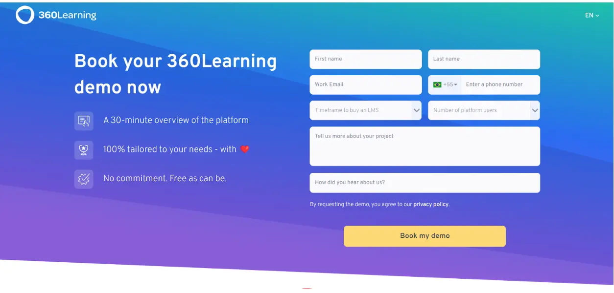
Source: 360learning
Bonus: Leverage UGC
Reviews and user-generated content are known for boosting confidence in brands and helping build brand reputation. The more social proof you offer right away, the more likely customers will convert and make a final purchasing decision.
So consider including testimonials and other ways to highlight UGC on your landing pages. You can incorporate user-generated content into certain areas on your landing page, with various product categories displaying reviews or authentic lifestyle photos of your products.
Wrapping Up
Use landing pages to impress your visitors and attractively present your product. Visuals should nudge them to click your CTAs and fill out your forms.
To achieve high-converting landing pages, you will need to run A/B tests to understand the visual tactics that work for your audience.
Add inclusive design practices, optimizing your website further to make it possible for any user to have a great experience with your page. We hope these 7 web design tips will help!