Knowing the tricks to minimize bounce rates is essential for site owners or content marketers. This means almost half of potential consumers visit your site and click off it before making a meaningful impact, causing you to lose potential customers.
*Updated 7/25/2024
Instead of working blind trying to figure out how to retain your target audience for longer, there are ways to learn how to reduce bounce rate. Let’s explore some of the top industry-recommended tips to help you get started.
Skip to: 11 Ways to Reduce Bounce Rates - The Most Effective Tips
What Causes High Bounce Rates?
An alarming bounce rate is one of the giant conversion killers across most industries. When looking at your metrics, it’s essential to consider what’s making users abandon your site within the first few minutes.
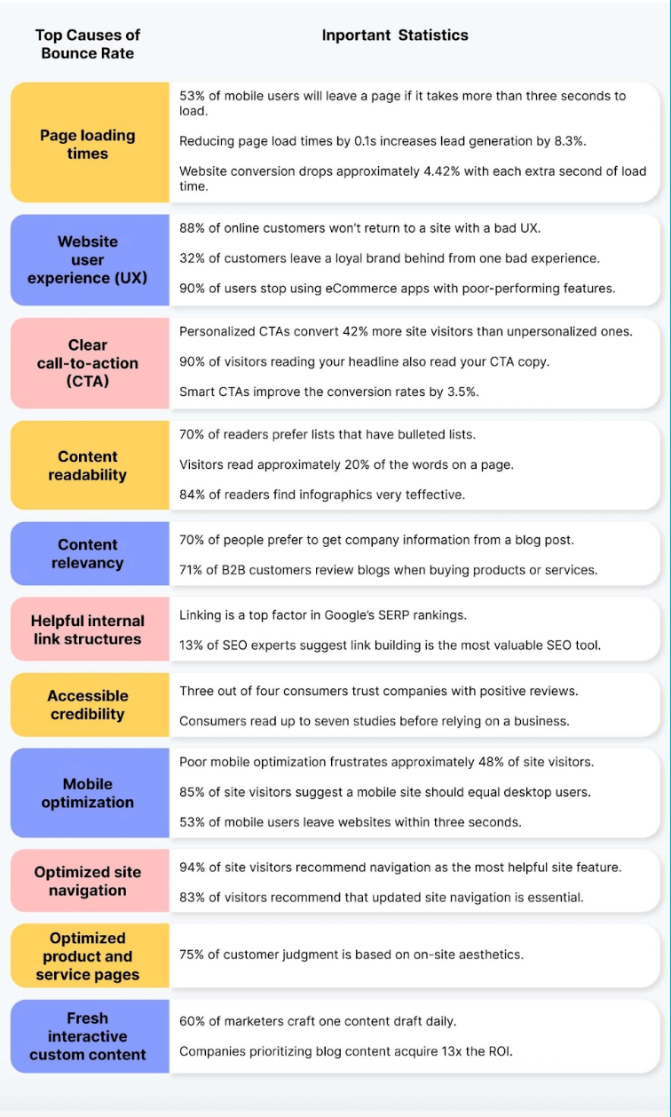 Image source: Rankwisely.com
11 Ways To Reduce Bounce Rates: The Most Effective Tips
The tips below can help you transform an ordinary internet user into a customer or subscriber.
- Reduce Page Loading Times
- Improve Your Website UX
- Rethink Your Call-To-Action Strategy
- Enhance Your Content Readability
- Account for the Relevancy of Your Content
- Create Helpful Internal Link Structures
- Optimize Your Site to be Mobile-Friendly
- Streamline Site Navigation
- Refresh Products and Services Pages
- Develop a Fresh Content Strategy
1. Reduce Page Loading Times
When learning how to reduce website bounce rate, the best tip is to consider page loading times. As an internet user, there’s nothing more frustrating than waiting for a website to load.
The longer a page appears on the screen, the more likely users will click off and visit a competitor’s site. When you spend a ton of time optimizing your site for mobile browsing, your page load times are also critical.
According to Google, the probability of bounce rates increase by 90% when page load times reach more than one second.
This point is significant for mobile users, as they are looking for split-second information in a fraction of the time as a standard desktop.
You’ll find page load times are the most important for eCommerce sites. Without a fast-loading site, the likelihood of cart abandonment skyrockets.
Waiting for high-quality images to load on the screen can also cause considerable frustration among shoppers.
According to this Search Engine Journal infographic, approximately 21% of shoppers abandon their carts if checkout takes too long.
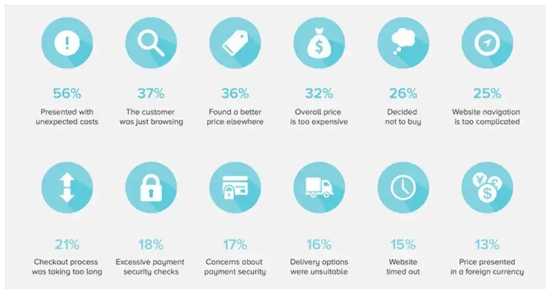
Source: Search Engine Journal
Instead of losing these potential sales, boosting your loading speeds to under five seconds can make a massive difference.
2. Improve Your Website UX
UX, also known as user experience, is another fundamental part of learning how to reduce bounce rate. Apart from sites not loading quickly enough, internet users are far less likely to visit places that are challenging to navigate.
Good UI/UX design services use methods like UX research, usability testing, wireframing, etc. to ensure that websites are optimized for maximum user satisfaction and hence minimum bounce rate.
Companies that improve their site's user experience have higher KPIs of over 80%.
Positive user experience is one of the first things to discuss when building your site. No one wants to spend several minutes getting too specific pages, such as the "Contact Us" page or product pages.
You'll want to ensure all pertinent information is easily accessible and quickly found.
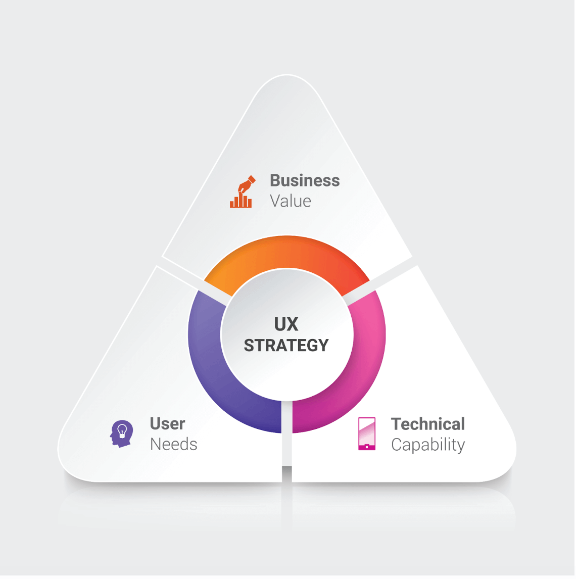 Source: Synergy Way
It’s a great idea to watch your metrics to understand the accessibility of your site better. You can see which pages customers visit when browsing your site through your metrics.
Keeping an eye on these behaviors can help you know which pages have the highest average bounce rate and most visited.
From there, you can adjust the design of your site to offer a much better user experience. Without a positive user experience, you’ll be one of the companies that allow 90% of their users to leave the site because of its poor design.
3. Rethink Your Call-To-Action Strategy
Do you have a call-to-action strategy, or do you just wing it? One of the best ways to reduce bounce rates is to add a clear call-to-action. Every site needs one, because you must get visitors to perform a specific action.
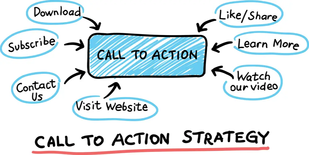
For example, it will prompt visitors to sign up for your newsletter or purchase your products and services.
Regardless of your industry, you'll want a clear call to action to lead your site visitors through your sales funnel.
Even though it might be tempting, it’s best not to clutter your pages with several CTAs. Too many CTAs confuse site users, making them less likely to continue through the funnel.
Another essential aspect of optimizing your call-to-action is to decide where you want it placed. The fruitful advice is to put it on the most popular landing page to reduce the bounce rate.
You’ll want site visitors to read the CTA within seconds of landing on the page.
It should be straight to the point and in clear views, such as at the top of the landing page. With this minor adjustment, you can capture the attention of nearly 90% of site visitors.
4. Enhance Your Content Readability
When someone visits a site, the last thing they want to do is read a giant chunk of text. This is an essential tip for informational sites to consider.
The larger the block of text on your site, the less likely people will be to read them. They’ll be more likely to visit another easily digestible blog.
Fortunately, there are plenty of ways to enhance the readability of your high-quality content, including:
-
Adding images
Adding graphics is indeed a content upgrade and boosts content appeal ten-fold. When you have a lot of information to convey, adding images to a content layout can make it easier to read.
You can consider using a flowchart maker to show statistics or infographics to deliver information entertainingly and engagingly.
-
Use smaller paragraphs
Even though you might want to use massive paragraphs to prove a point, format content into bite-size pieces instead. This makes content easier to read, and it can also reduce content fatigue.
By considering users' browsing activities, you can reformat your entire content.
-
Add bullet points
Bullet points are a phenomenal way to convey text with every user in mind. They add dimension to a body of text and make it easier for essential points to stand out.
Source: Skillroads
Adding bullet points helps improve reading speed and reduces eye fatigue by breaking up streams of paragraphs into smaller more summarized content that's easier to digest and understand. It also helps with Google search indexing and increase the likelihood of reaching the coveted position zero, or featured snippets.
5. Account for the Relevancy of Your Content
Site relevance is essential to consider, especially regarding your site’s ranking. When you work with a specific keyword and rank highly for it, your number of visitors will increase drastically.
Your content must revolve around that keyword, delivering the information your site visitors want.
Source: Design Lab
Let’s take the keyword “Reduce bounce rate” as an example. With this keyword, your site visitors will likely want information about optimizing their sites for better bounce rates.
Ensuring your site revolves around this subject can considerably reduce bounce rates by offering relevant content. It can be disastrous if you don't consider the relevance of your content based on the relevant keywords you are ranking for.
Site visitors will click off your site in seconds and will be less likely to return. Instead, they will opt to visit competitors’ sites, dropping the relevance and ranking of your site even more.
6. Create Helpful Internal Link Structures
It’s a common myth that adding as many internal and external links as possible is a great way to learn how to reduce website bounce rates. What’s more important is ensuring your internal links serve a purpose to site visitors.
Undoubtedly, internal links can help diversify page visits across your site. However, visitors won’t want to sift through dozens of links that don’t serve any purpose.
Not to mention it takes away from the professionalism of your content and is quite transparent to potential customers.
The more links you add to a single block of text, the lower your readability score will be for your content. Again, you’ll want to think about relevance and how it can reduce bounce rate.
Offering highly actionable internal links that feel useful to readers will make a larger impact than a cluster of links. It can also be a fantastic idea to rely on SEO tools to rank the quality score of your content.
Using these tools, you can quickly optimize your internal linking structure to achieve the highest possible readability score.
It can also reduce the likelihood of your content being ranked as clickbait or just for SEO purposes. You can also consider a technical SEO audit to help improve the experience.
7. Display Your Credibility
When learning how to reduce bounce rate, it’s important to put yourself in the shoes of your site visitors.
As a customer looking to make a purchase, are you going to buy from a trustworthy source or an untrustworthy one?
Displaying credentials and statistics that speak to your company’s legitimacy can greatly improve your trust signals. There are a number of ways to display your credibility on your site page.
Showcase testimonials, certifications, awards, quality scores, and affiliations with leaders in your industry.
Having plenty of followers on social media is also a great idea, especially if you’re drawing traffic from social media.
Source: Baymard
Buyers want to see that a vendor is reputable and popular on all channels. A lot of top brands today boast millions of followers on TikTok, Twitter, and Instagram.
You, too, should work out strategies to grow Instagram followers. It’s also a fantastic idea to showcase safety seals, especially on Checkout pages and anywhere customers will be inputting their personal information.
A few quick ways to build credibility through your site could include:
-
- Display icons to valuable resources like reviews
- Build a higher level of trust through testimonials
- Provide informative articles about company accomplishments
- Build a massive list of associated organizations
8. Optimize Your Site to be Mobile-Friendly
We briefly touched on mobile users when we discussed the importance of quick loading pages. Every website should be optimized for mobile users, as 54.8% of web traffic sources are mobile traffic.
Source: Finances Online
Mobile optimization is particularly important for eCommerce, as six out of ten shoppers note mobile shopping is a must-have for online businesses. It revolves around making your site easy to use from different devices.
You’ll want to consider smartphone optimization and tablet optimization, capturing the majority of mobile users.
Although it can be challenging to develop a mobile-friendly site on your own, hiring a site designer for a seamless user experience is well worth the investment.
You will want to ensure your pages display properly on mobile and load quickly. With the help of a professional designer, you can have the best of both worlds, offering a high-quality mobile site with fast loading times.
Some user-friendly tips to help optimize your site for mobile users include:
-
- Use Google’s Mobile-Friendly Test Tool
- Make it easy to enter credit card information
- Add descriptions for search users
- Focus on an ideal user experience
- Fix any broken links and add image links
- Improves landing pages load times
- Add a contact button and other easy navigable buttons
9. Streamline Site Navigation
Aside from improving the user experience of your site’s front, its general navigability is essential to learn how to reduce website bounce rate.
When we discuss navigation, we mean much more than having a search bar at the top. You’ll need to ensure all of the most important information is easily accessible in common areas on your site.
For example, if you have product pages, an About Us page, and store information, it should be located at the top of every site page.
This navigation menu is a commonality across all sites, and your visitors will know where to look to find what they want.
On-page navigability is another essential feature to consider as well. You’ll want to make sure any important links are easily accessible and not hidden in inaccessible menus outside of landing pages.
At this point, it can be a great option to add drop-down menus with clear headers.
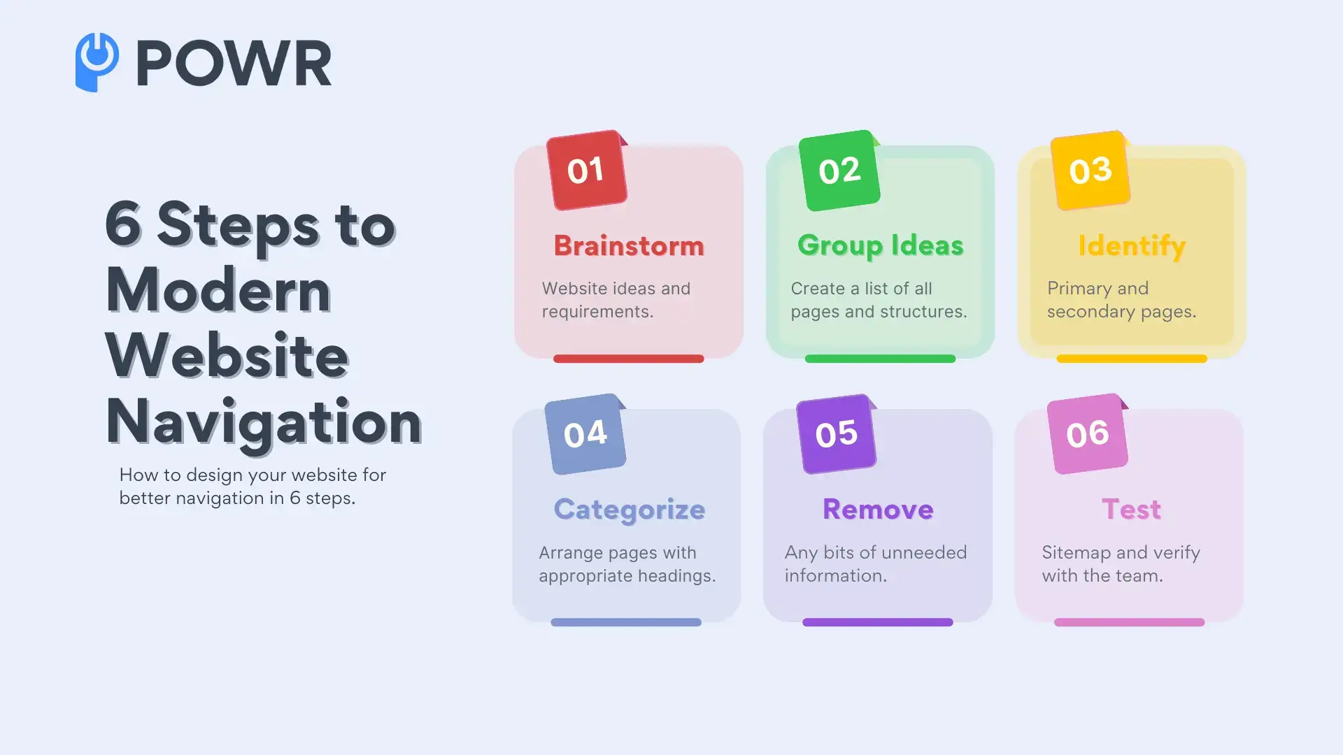
Source: POWR.io
Improving the navigation of your site is simple with these sure-fire tips:
-
- Reduce lengthy articles
- Optimize your current menu navigation
- Use concise blog post headings
- Limit your number of menu items
- Add separate landing pages
- Offer a detailed guide for browsing
- Add keywords into descriptions
10. Refresh Products and Services Pages
There’s no doubt that some product pages can have a high bounce rate because of product and service prices. However, it is also common for visitors to leave a page simply because it doesn’t provide useful information.
Source: Shiprocket
When looking to buy a product online, you need plenty of information to help you make the purchase. For example, you’ll need to know what the product is, how it can help, what it looks like, and how much it costs.
Each product page should contain all the information your customers need to ensure they’re buying the right item. This step alone can help reduce bounce rate and increase your total number of sales.
Take a look at your services and products from your consumers’ viewpoint. Determine if any key details are missing. You might find that anything from your return policy to product reviews could cause a high bounce rate.
Some other great tips to keep your blog fresh and optimized include:
- Adding royalty-free images
- Enhancing creative elements to meet business goals
- Using Google’s Mobile-Friendly Test tool
- Create in-depth and powerful content
- Implement high-value keywords
Some elements on the website may cause changes in your bounce rate. E.g. If your website uses a cookie banner to obtain consent for cookies, you may see an increase in visitor bounce rate.
If the users do not give consent to analytics or statistics cookies, your analytics tool will not register any bounces from the users. However, obtaining consent for such cookies is a best practice for privacy compliance.
11. Develop a Fresh Content Strategy
The content strategy for your site is one of the best ways to learn how to reduce bounce rates. It is informative but can also be very engaging for site visitors.
Keeping your type of content fresh and relevant is of the

