
A mobile landing page serves as a critical touchpoint between your brand and potential customers.
These pages are designed to link users from an ad campaign to a specific purchase or product page, maximizing conversion rates. For example, clicking on a social media ad might direct users to a specialized mobile landing page with detailed information about the product, encouraging immediate action.
Given their pivotal role, mobile landing pages are essential for successful digital marketing. Here’s how to optimize your mobile landing page for maximum effectiveness:
Skip to: 10 tips for a compelling mobile landing page design
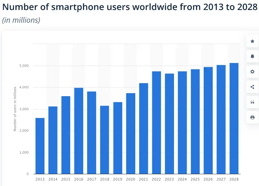
Image sourced from Statista
10 Tips for a Compelling Mobile Landing Page Design
- Speed
- Simple, sleek visuals
- Responsive elements
- Economical copy
- Minimize typing
- Avoid intrusive pop-ups
- Single columns are best
- Clickable CTAs
- Testing
- Create for mobile
1. Speed
Ensuring your mobile landing page loads quickly is crucial, as mobile users are often on the move.
Regularly test your site speed to avoid bounce rates caused by slow loading. Optimize large files, including high-resolution images and PDFs, to enhance loading times and provide a seamless user experience.
2. Simple, sleek visuals
A successful mobile landing page features clean, on-brand visuals. Due to limited screen space, prioritize key design elements that reinforce your message.
Use minimal but impactful imagery to capture attention and guide users toward your primary goal.
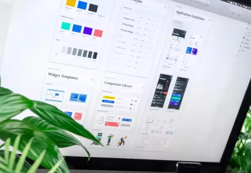
Free to use image from Unsplash
3. Responsive elements
Design your mobile landing page with responsive elements to ensure a smooth transition from desktop to mobile. Pay attention to:
- Page width
- Image stacking and placement
- Effective use of whitespace
- Intuitive navigation
- Copy wrapping
These elements are essential for maintaining readability and usability on mobile devices.
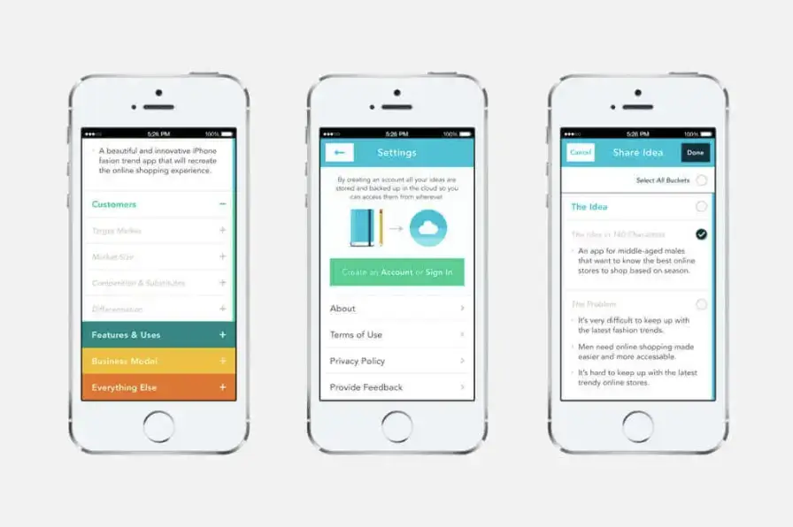
Image sourced from fireart.studio
4. Economical copy
Your copy is your chance to show your customers what your brand and products are all about. It can be tempting to go copy-heavy on a landing page, particularly if you’re promoting an exciting new product.
However, too much copy on a mobile landing page can make for a long scroll that puts users off learning more about your product.
To avoid this, be economical with your copy. Only include the information that’s crucial, and leave your site’s visitors wanting more.
For example, consider the difference between these two pieces of copy on VNC server Android advice:
Longer Copy: VNC servers are compatible with any device, including Android devices. They ensure secure remote access via a VNC Reader, featuring robust end-to-end encryption, multi-factor authentication, and granular permission controls. Additionally, VNC servers allow you to record sessions and share files in real-time, regardless of your location.
Shorter Copy: For secure remote access on Android devices, VNC servers offer:
- End-to-end encryption
- Multi-factor authentication
- Session recording
- Real-time file sharing
This streamlined version provides key benefits in bullet points, making it easy to read and ideal for mobile devices.
5. Minimize typing

Free to use image from Unsplash
Reduce user frustration by minimizing the need for typing. Simplify navigation to avoid the search bar and make forms responsive and straightforward.
Utilize short-form answers, checkboxes, and buttons to make interactions quick and easy.
6. Avoid intrusive pop-ups
Plenty of websites use pop-ups to positive effect. Used correctly, they can drive sales and encourage customers to make an inquiry or take a desired action.
However, on mobile, pop-ups can come across as intrusive and annoying. Mobile users tend to be browsing on the go or generally looking to browse your site in a time-effective way.
Having to close pop-up windows can make the page itself and their session slower, ruining their customer experience and making it more likely that they will exit prematurely.
If you’re planning to use pop-ups on your mobile landing page, give your customers time to digest the page’s information first. Your pop-up should also encourage the same action as the rest of the landing page - whether that be getting in touch or making a purchase.
7. Single columns are best
A single-column layout is ideal for mobile optimization. This branding approach keeps content organized and avoids overwhelming users.
A streamlined, single-column format helps maintain focus and clarity on smaller screens.
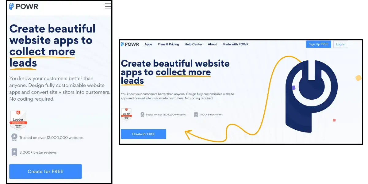
Screenshots from powr.io
8. Clickable CTAs
On mobile devices, everything needs to be clickable to meet user expectations for interactive experiences. Mobile users anticipate clear, actionable buttons that guide them smoothly to their next step.
Incorporating effective CTAs into your mobile landing page demonstrates your understanding of these needs. For instance, you can create a custom CTA button that connects directly to a VoIP caller or dialing system. This feature allows users to make inquiries or contact your business instantly from the landing page.
By integrating such CTAs, you streamline the user experience, eliminate extra steps, and shorten the conversion funnel. This not only enhances user satisfaction but also increases the likelihood of conversions.
9. Testing
Testing your mobile landing page design is essential to ensure it performs well across different devices and configurations. To optimize your page, assess the following aspects:
- Loading Speed
- Visuals: This includes image stacking and asset quality
- Copy and Text Wrapping
- Pop-ups and Embedded Forms
- Messaging and Customer Journey
Conduct tests throughout the development process to spot issues before your page goes live. Utilize tools like image annotation and collaborative commenting software to streamline the testing process and involve relevant team members.
For a comprehensive evaluation, consider using mobile proxies. These proxies allow you to test how your site loads and appears from various locations worldwide. To find reliable options, refer to Blackdown's best mobile proxies list, which provides top recommendations for efficient and effective testing.
10. Create for mobile
While optimizing your desktop landing page for mobile users is a good start, the most effective approach is to create a mobile-specific landing page. This allows you to maintain all crucial elements of your branding and messaging without compromising on mobile-friendliness.
Building a dedicated mobile landing page involves additional effort but significantly enhances the user experience for a substantial portion of your audience.

Screenshot of mobile landing page from babbel.com
This strategy is especially important for e-commerce businesses, where mobile traffic, despite being a smaller segment of online purchases, requires a tailored approach to boost sales. Ensuring that your mobile landing page delivers an optimal experience is key to driving conversions and maximizing sales on mobile devices.
Designing for Mobile
As mobile usage continues to rise, prioritizing mobile design is crucial for developing high-quality landing pages—key strategies for lead generation.
When designing for mobile, it’s essential to address viewers’ expectations, such as page loading times, screen size, reading contexts, and anticipated actions.
By focusing on these factors, you can create mobile-optimized landing pages that effectively capture leads and drive sales.