If you’re a creator with many things to offer—books, courses, merch, a podcast, a web series, a newsletter, and more—you should create a unique website where your audience can find all that information about your brand.
However, you can’t cram all your offerings into your website header.
That’s why you need a well-designed website footer. You can add more information about your brand to your footer to solidify your brand identity and make your site memorable for visitors.
Website footers are more than just navigation elements—they can drive conversions, capture leads, and reinforce brand identity by guiding users toward important actions.
In this article:
- 10 Well-Designed Website Footer Examples
Read on to find out what a website footer is, what to include, and some examples of well-designed footers that’ll inspire your website.
What is a Website Footer?
A website footer is a section at the bottom of a website that includes basic information about the brand, a logo, social media icons, and copyright information, among other elements.
Since footers serve informational and navigational purposes for your visitors, it only makes sense to make the most of this real estate. Depending on what you include in your website footer, this section can help users:
- Navigate your website better.
- Learn more about your brand through your logo, tagline, and links to important pages.
- Find other social media channels where you maintain an active presence.
- Subscribe to your email list and/or make a purchase.
For creator websites, footers can also function as conversion points, helping capture emails, promote content, or drive traffic to important pages.
Why Website Footers Are Important
Website footers contribute to both user experience and business performance.
Improve navigation
Footers provide quick access to important pages such as:
- contact pages
- FAQs
- product pages
- legal information
Increase conversions
Footers can include:
- email signup forms
- call-to-action buttons
- promotional links
These elements help convert visitors who reach the bottom of a page.
Build trust
Including contact details, social links, and policies helps establish credibility.
7 Links to Always Include in a Website Footer
- Copyright Information
- Contact Information
- Sitemap
- Privacy policy link
- Logo
- Social media icons
- Email sign-up form
There’s no specific recipe for designing a website footer. What you include in your footer depends on your website’s purpose and your visitors' needs.
However, there are standard elements most creators include in their footers.
1. Copyright information
The copyright notice is one of the most common parts of a footer.
It aims to show that your website design is protected by copyright and that you are the copyright owner.
It ensures the law will support you if another business copies your website design—including animations, images, and content—without your express permission.
Conversely, safeguarding your own site involves using an image copyright checker to verify that all third-party visuals are properly licensed.
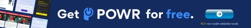
Adding a copyright notice to your footer is easy. You only need the copyright symbol (©) or the word “Copyright,” the year of the website’s publication or update, the name of the copyright owner, and the words “All rights reserved.”
That’s enough of a word problem solver for you at this point. Here’s an example from the POWR homepage:
2. Contact information
As a business, you want prospects to find it easy to contact you. Put your contact button, details, or form in your website footer to remind them to reach out when they get to the bottom.
3. Sitemap
A site visitor reaching the footer of your website doesn’t always mean they’ve stopped browsing.
If they can’t find where to go after reaching your footer, they’ll have to scroll back to the top every time to continue browsing—which can be a hassle.
However, you can add links to other valuable pages, such as the contact form, terms and conditions for purchases and returns, disclaimer, etc.
Note: You can also add a link to your XML sitemap—a file that contains URLs and information of your most important pages—in your website footer. It helps search engine bots crawl and index your site better.
4. Privacy policy link
If you’re collecting personal data from visitors, such as their email addresses, home addresses, or banking information, the law requires you to have a privacy policy agreement on your website.
This page explains the data you collect from visitors, how it’s stored, and how you might use it. Most businesses place links to their privacy policies in their footers because it makes them easy to find.
5. Logo
Some creators include logos in their footers to create a lasting impression and remind visitors what their brand stands for.
You can take things up by presenting your logo differently with a logo maker for brand purposes—by increasing the size, using additional graphics, or adding your mission statement/brand values underneath the logo.
Additionally, you can create a logo that embodies your brand's essence and values to ensure a more impactful representation.
6. Social media icons
If you maintain an active presence on other social media platforms, you can refer your site visitors to your profiles by adding social media icons in your footer.
In fact, including social media icons in a site footer is so effective that 72% of websites do it.
7. Email sign-up form
If you have a newsletter or are building an email list, include an email sign-up form in your site footer. It makes it easy for visitors to sign up who want to receive more of your content.
10 Well-Designed Website Footer Examples
- Marie Forleo
- A Cup of Jo
- David Lubofsky
- Jackie Aina
- Binging with Babish
- Huda Beauty
- Amanda Cerny
- Doctor Mike Varshavski
- Leap With Me
- House & Garden
There’s no right or wrong way to design a website footer so long as it reflects your brand identity and gives your audience access to the most critical parts of your business.
Below are 10 examples of websites with well-designed footers:
1. Marie Forleo
Source: Marie Forleo
Marie Forleo is an entrepreneur popularly known for her YouTube web series (MarieTV), online business program (B-school), and advice books Everything is Figureoutable and Make Every Man Want You.
What they’re doing well: Marie’s website footer takes a sleek color contrast approach, as the solid black background makes every piece of text in the footer stand out.
There’s a lot of content on the footer, but the focal point is the opt-in email form with the tagline, “Become an MF insider.” The mauve-colored CTA jumps out at visitors and urges them to sign up. Next to the form are links to important pages on the website, including the About, Press & Media, and Jobs pages.
There’s also information about Marie’s podcast, web series, business program, and books, which make it easy for visitors to learn all about Marie and her brand.
Takeaway: Use a dark background and a light-colored font (or a light-colored background and a dark font) to make the content of your footer pop.
2. A Cup of Jo
Source: A Cup of Jo
Created by Joanna Goddard, A Cup of Jo is a lifestyle website covering everything from fashion to recipes to relationship advice for women.
What they’re doing well: The primary colors on the website are off-white and yellow, with a sprinkle of blue. Making the footer’s background a solid blue shade creates a great contrast with the rest of the site and draws visitors’ attention.
The first thing on the footer is a brief statement on what A Cup of Jo is about. It reminds visitors why they should continue browsing and what the brand offers.
There’s also a simple email opt-in form that invites visitors to sign up for the newsletter, and social media icons underneath that link to Joanna’s social media profiles.
In the middle, A Cup of Jo highlights its main categories, which makes it easier for visitors to find topics that interest them. And there’s a complete disclosure statement detailing how A Cup of Jo makes money through sponsored posts and affiliate marketing.
One more lifestyle website by Joanna Goddard is SLS Lifestyle—it's got an awesome footer too!
Takeaway: Make your brand memorable by briefly summarizing your site in the footer. If your site covers many topics, add the links to your major categories to make navigation easier.
And if you do affiliate marketing and/or write sponsored posts like Joanna, a disclosure statement helps you be transparent about it, which your visitors will appreciate.
3. David Lubofsky
Source: David Lubofsky
David Lubofsky is a web designer who focuses on “helping nice people build nice products.”
On the website, David outlines his experience helping leaders build mentally-healthy environments for their teams, crafting a new digital strategy that gives a brand a unique personality, and designing a custom online store and plan for a company’s health-focused activity kits.
What they’re doing well: David’s feel-good website is animated and follows a consistent black-and-yellow theme, with black as the background color.
With the footer, however, David switched things up and made the background yellow, which works because it contrasts nicely with the dark font.
In true fashion, David features an animated dog on his footer, creating a fun navigation experience for his target audience.
David uses the footer space to remind his audience of his mission, “Putting the human back into humankind,” and shares the date when he’ll be available to take on new projects.
Takeaway: Use your footer space to let your audience know what your brand mission is. And if you run a service-based business like David, you can also add your next available date to your footer.
4. Jackie Aina
Source: Jackie Aina
Jackie Aina is a professional makeup artist and YouTube influencer who uses her channel to teach people of color how to do makeup and build their confidence.
What they’re doing well: One look at Jackie’s website footer, and you’ll know how serious the brand is about being transparent with visitors.
Since Jackie makes money through affiliate marketing and sponsored posts, her website’s footer includes disclaimers about her business, including the privacy policy, terms & conditions, and a GDPR agreement.
There are also links to the About Us and Contact pages, which help visitors learn more about Jackie and contact Jackie’s support team. Finally, Jackie’s footer logo is a shortened but memorable version of the primary logo—and includes links to Jackie’s social profiles.
Takeaway: Stylize your logo in your footer to reinforce your brand identity. If you’re an affiliate marketer, put your privacy policy and other disclaimers in your footer. And if you want to emulate Jackie, use a dark background to make your copyright notice stand out.
5. Binging with Babish
Source: Binging with Babish
Founded by Brooklyn-based chef and YouTube personality Andrew Rea, Binging with Babish is a cooking show where Andrew experiments and makes foods straight out of fiction.
What they’re doing well: Andrew uses his footer space to give his audience more insight into his life and career. He does this by sharing pictures from his personal life, a still from a video he did with GQ, and photos of the sumptuous foods he makes.
Underneath the images are a slew of social media icons that link to profiles where Andrew posts content, including his podcast and cooking videos.
Takeaway: If you run a visual-based business, use your footer space to share pictures representing your brand. Visuals are more effective than text at piquing people’s interests and getting them to engage with you.
6. Huda Beauty
Source: Huda Beauty
Founded by makeup guru and YouTube superstar Huda Kattan, Huda Beauty is a makeup brand that sells foundations, concealers, lipsticks, and eyeshadows.
What they’re doing well: Huda Beauty takes the white background-black font approach with this simplistic footer.
First, there’s a simple email opt-in form with the tagline, “Stay in the know, sign up now.” Below the email sign-up form are essential links divided into four categories, which help visitors quickly find what they’re looking for.
Like information about their accounts and orders, information about the company, how to reach the customer support team, or policies about how the site will use their data.
Takeaway: To improve user experience, opt for a minimalistic footer with lots of whitespace. You can offer a discount or a free product to incentivize people to sign up for your newsletter (and make a purchase). And if you’re adding many links to your footer, break them into categories to ease navigation.
7. Amanda Cerny
Source: Amanda Cerny
Amanda Cerny, a content creator, actress, and model, shares feel-good and fitness content with her 35+ million followers across her social media profiles.
What they’re doing well: Amanda’s website mainly promotes her other social media profiles.
But on the footer, her newsletter sign-up form takes up the most space.
The tagline, “Join #TEAMCERNY,” provides a sense of community that can convince visitors to fill out the form and sign up to get “personal messages and updates” from Amanda. Underneath the form are social media icons linking to Amanda’s social profiles, where visitors can find more of her content.
Takeaway: As you promote your newsletter on your website footer, try to create a hashtag or slogan that’ll cultivate a sense of community amongst your audience.
8. Doctor Mike Varshavski
Source: Doctor Mike Varshavski
Dr. Mike Varshavski is a family medicine doctor who came onto the online scene in 2014, publishing videos teaching people how to care for their health.
Now, he has over 23M followers across his primary social media profiles, has been featured in The New York Times and Men’s Health, and has been highlighted by the American Medical Association.
What they’re doing well: The designer did a great job using light blue against a white background to highlight what visitors should pay attention to. The focal point of the footer is the newsletter opt-in form.
Takeaway: Don’t be afraid to go for a minimalistic all-white website footer, as long as you include actions and links to direct your audience’s attention to the next steps.
9. Leap With Me
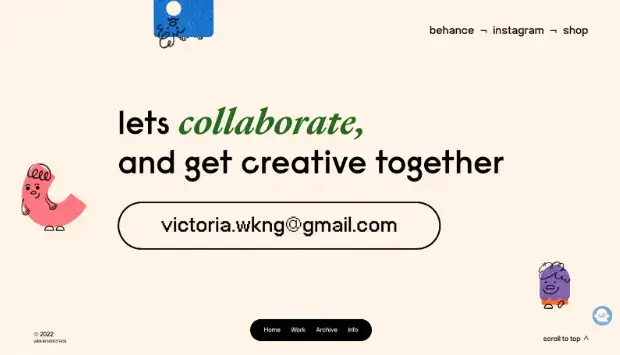
Source: Leap With Me
Founded by Berlin-based illustrator and designer Victoria Ng, Leap With Me is a colorfully animated website that shows Victoria’s portfolio, articles, and live streams.
This showcases how graphical interface platforms can elevate design elements, creating visually appealing and functional footers.
What they’re doing well: Victoria’s footer is a large peach-colored section with links to her Behance profile, Instagram profile, and Etsy store. However, what stands out is her contact button, which occupies most of the footer.
Sure, a sticky bar at the bottom allows visitors to peruse Victoria’s work and learn more about her, no matter how far they scroll. Still, the footer aims to generate leads for Victoria’s design business.
Takeaway: While it’s okay to put links to several pages in your footer, you may get more conversions if you make your contact form (or details) the focal point of your footer.
10. House & Garden
Source: House & Garden
House & Garden is a luxury lifestyle and interior design magazine brand under Condé Nast Britain, focused on high-end home décor, gardening, and upscale living.
Their website extends the authority of their print publication in interior design, offering inspiration and advice for sophisticated home styling, garden design, and luxury lifestyle content.
What they're doing well: Their footer effectively balances simplicity with comprehensive information through:
- Clear Section Organization: They've divided content into logical groups - "MORE FROM HOUSE & GARDEN" and "CONTACT" - making it easy for users to find what they need.
- Strategic Social Media Integration: All major social platforms (Facebook, Instagram, Pinterest, X/Twitter, YouTube, and TikTok) are prominently displayed with consistent icon styling, showing their strong digital presence.
- Essential Legal Links: They've included all necessary legal information (Privacy Notice, Cookie Statement, Terms & Conditions) in an unobtrusive yet accessible way at the bottom.
- Clean Design: The use of a dark background with white text and icons creates excellent contrast and readability while maintaining the sophistication that matches their brand.
Takeaway: The most important lesson from this footer is its effective hierarchy of information - from social engagement at the top, to practical links in the middle, to legal requirements at the bottom. This layered approach ensures site visitors can quickly find what they're looking for while maintaining a clean, uncluttered design that aligns with a luxury lifestyle brand's aesthetic.
Website Footer Design Best Practices
Keep it organized
Use columns or sections to structure content clearly.
Prioritize important links
Highlight the most valuable pages or actions.
Maintain consistent branding
Use brand colors, fonts, and styles.
Optimize for mobile
Ensure the footer is easy to navigate on smaller screens.
In Closing: Design Your Footer to Fit Your Brand Identity
While it may seem like people pay attention only to content above the fold, some visitors scroll to the end of a site before leaving.
Track your visitors, figure out the page(s) they visit the most, and include them in your footer. Because you’re providing the content they’re looking for, they’ll continue browsing rather than exit.
If you’re looking to build fully functional and practical forms, image galleries, and social media icons for your website footer, POWR can help you.
POWR enables you to create customizable website apps that’ll help you collect information, engage visitors, get more followers, support customers, and boost conversions.
Frequently Asked Questions
1. What should a website footer include?
A website footer typically includes navigation links, contact information, social media links, and legal pages.
2. Are website footers important for SEO?
Yes. Footers improve internal linking and help search engines understand website structure.
3. Can footers increase conversions?
Yes. Footers can include email signup forms, CTAs, and other elements that encourage user actions.
4. How do you design a good website footer?
A good footer is organized, easy to navigate, mobile-friendly, and aligned with the website’s branding.