
A customer is sitting in a parking lot with your store's mobile page open and a notification that says her pickup order is ready. The website calls the shop Maple & Main Goods. The sign over the door says M&M Goods Co.
The map pin landed on the back of the building; the entrance she can see has no pickup cue on it anywhere, and the promotion in the site banner isn't posted on any window.
Nothing here is broken, exactly. The site works, the store is open, the order exists. But the customer is now doing detective work in a parked car, and every minute of it was avoidable.
To be clear about what you're reading: that store is a staged composite, assembled from failures every local retailer will recognize.
The method for finding them in your own operation, though, is real and takes about five minutes: drive to your store the way a customer would, open your own website from the lot on a phone, photograph what disagrees, ask the counter one question, and leave with an evidence sheet instead of a vague feeling that things are "mostly consistent."
That's the whole article. No omnichannel lecture is coming.
What Can a Parking-Lot Website Test Reveal?
It reveals where your website, local listing, physical location, and store operation give a customer different answers at the exact moment those answers decide a task. That's a different exercise from a brand review. Nobody in the parking lot cares whether your Instagram grid matches your palette.
The questions out here are blunter. Right business? Right location and door? Are the hours real, is the offer still on, will pickup or a return actually work? And when something fails, who does she ask?
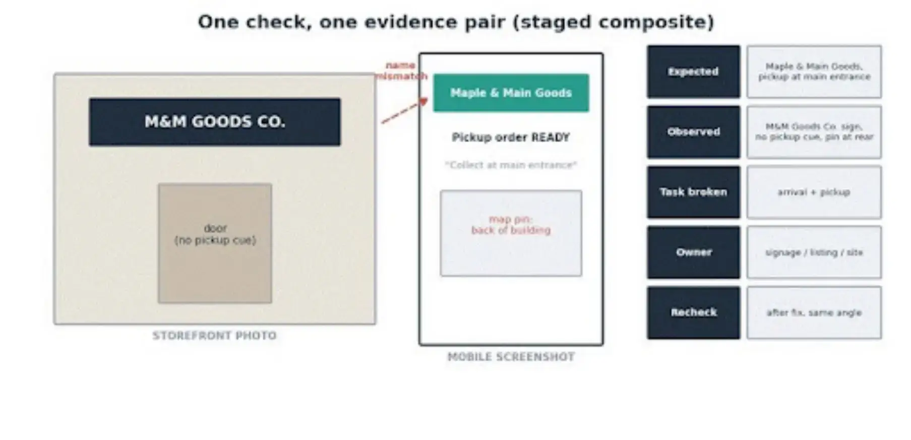
The audit's basic unit: a storefront photo paired with a mobile screenshot, with the first contradiction marked and its evidence row filled in. Staged composite example.
Each check produces one evidence row. Pair the photo with the screenshot.
Note what the website led you to expect against what you actually saw, plus the task it breaks. Then attach an owner for the fix and a date to check again.
Note the conditions too, since they're part of the evidence: date, time, light, device, connection, whether you were logged in, and whether you arrived from search or a saved link.
One honest limitation, stated up front so nobody oversells the result internally: a single dated walkthrough finds failure modes. It doesn't measure how often customers hit them, and it proves nothing about revenue.
Can a Customer Tell They Have Found the Right Store?
Only if the name, logo, location image, and address agree between the phone and the building before she has to start investigating.
Begin the audit the way customers actually arrive: search your store's name in Google or Maps, note which page wins, and follow it. Then stand in the lot and compare.
This is also where Google has an opinion. Its Business Profile representation guidelines expect the name on the profile to match the real-world name your storefront and website already use, and they expect a storefront listing to have clear, fixed signage behind it.
So consistency is doing double duty. It serves the customer, and it keeps the listing itself in good standing.
Identity starts at the building. Clear custom business signs should carry the same name and visual cues the customer just saw on her phone; the mobile page then covers the practical arrival details no sign can.
When the two disagree, decide which one is right and change the other, because the customer in the lot can't tell a rebrand-in-progress from the wrong address.
Can the Website Guide Someone From the Lot to the Right Door?
What does the mobile location page owe the visitor? The correct address and current hours. A phone number that rings this location rather than a call center.
Entrance or pickup instructions she doesn't have to reconstruct herself. And test the map pin separately from the written directions, because they fail on their own schedules; a street address can be perfectly correct while the pin drops on the loading-dock side of a shared building.
Call the listed number from the lot and see where it actually rings. Check whether this week's special hours made it past the whiteboard in the back office.
If your store runs pickup, the arrival story extends to the pickup point, and it's worth hearing how retail researchers frame it.
A website that promises pickup while the store offers no pickup sign at all is my favorite version of this failure, because both halves are true and the customer still loses.
A short technical note belongs here and nowhere more prominent: LocalBusiness structured data can describe your address and hours to Google, and it cannot repair visible content that's wrong.
Fix the human-readable page first. And keep the arrival details living on the site itself; a website map embed handles directions, contact details, and nearest-location behavior on the page the customer is already holding.
Do the Website and Store Promise the Same Offer?
Price, promotion, stock claim, pickup timing, eligibility, and return terms should survive the trip from product page to counter without a new condition appearing en route.
Shopify's tooling has made the plumbing side of this dramatically better, and the Spring '26 Edition keeps pushing store and online closer together.
The platform can route pickup orders to the right location, track inventory per location, and process online returns at the counter through POS.
What no platform can do is verify that the shelf, the window poster, and the person behind the counter agree with the configuration.
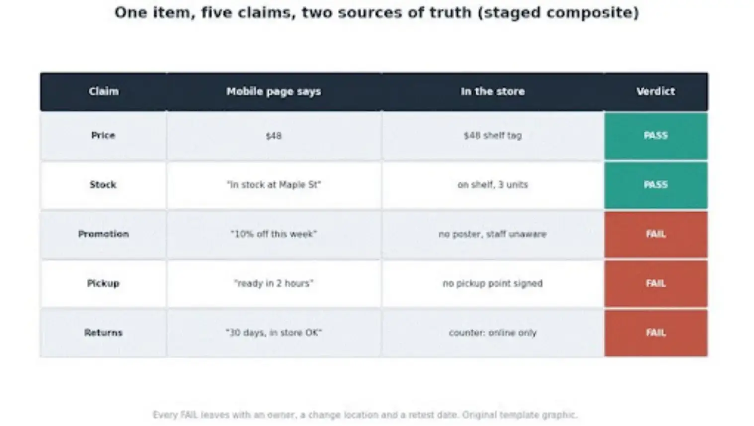
One item audited across five claims: price, stock, promotion, pickup, and returns, each compared between the mobile page and the store. Staged composite example.
So audit one real item end to end.
Screenshot the product page with its price and availability claim, the pickup promise with its timing, the current promotion with its conditions, and the return language. Then walk in and compare: is the item on the shelf, is the posted offer the same offer, does anything on the wall contradict the return terms?
A "10% off this week" banner online with no trace in-store isn't a design inconsistency. It's a conversation your staff will lose at the register.
Does the Mobile Page Work Where Customers Actually Stand?
The details that matter at arrival have to be readable and tappable on a small screen, outdoors, in glare, on a cellular connection, possibly one-handed. That's the situation the page exists for, and it's tested least.
In the lot, check whether the first screen surfaces arrival information or a newsletter popup; whether text survives sunlight and zoom; whether the phone and directions links are big enough to hit on the first try; whether any sticky banner is squatting on the hours.
Treat this as a situational screen, not a certification. The W3C's mobile accessibility guidance and its target-size recommendations are the real reference points, and a full accessibility audit is its own project.
What the five-minute version tells you is simpler: whether the page serves the customer in the exact conditions where she needs it most, and while you're at it, whether the location photos on the site show the building as it looks today.
Can Store Staff Honor What the Website Says?
If the site is right and the employee can't act on it, the audit still fails, because the customer experiences the handoff, not the CMS.
Record the answer, never the person. You're diagnosing a system, and a surprised employee is information about training and rollout. That's all.
The diagnosis usually lands with one of a handful of owners. Maybe the website copy is wrong. Maybe inventory lagged, or a location was misconfigured in the ecommerce stack. Maybe the promotion went live online before anyone told the floor, or the posted policy never matched the practice, or nobody trained the new hire yet.
The customer saw one failure; you're looking at six different fixes. That's why a failed check gets a named owner rather than a general vow to be more consistent.
The staff-facing details, hours, phone, and support paths deserve the same one-source treatment on the site itself; a proper contact page prevents half these calls before they happen.
Fix the Blockers Before the Bruises
Fix what blocks the task before what bruises the brand. Blockers first: a wrong address, a closed location shown open, pickup promised at a store that doesn't offer it, directions that strand people.
Then sale risks: wrong stock claims, expired offers, hidden conditions, a return promise the counter can't process.
Then trust friction: the name, logo, photo, and phone inconsistencies that make customers double-check.
Cosmetic differences come last, and honestly, some never need to come at all. This ordering is most of what separates the audit from the broader omnichannel project: you're not harmonizing everything; you're repairing the specific seams a customer actually crossed.
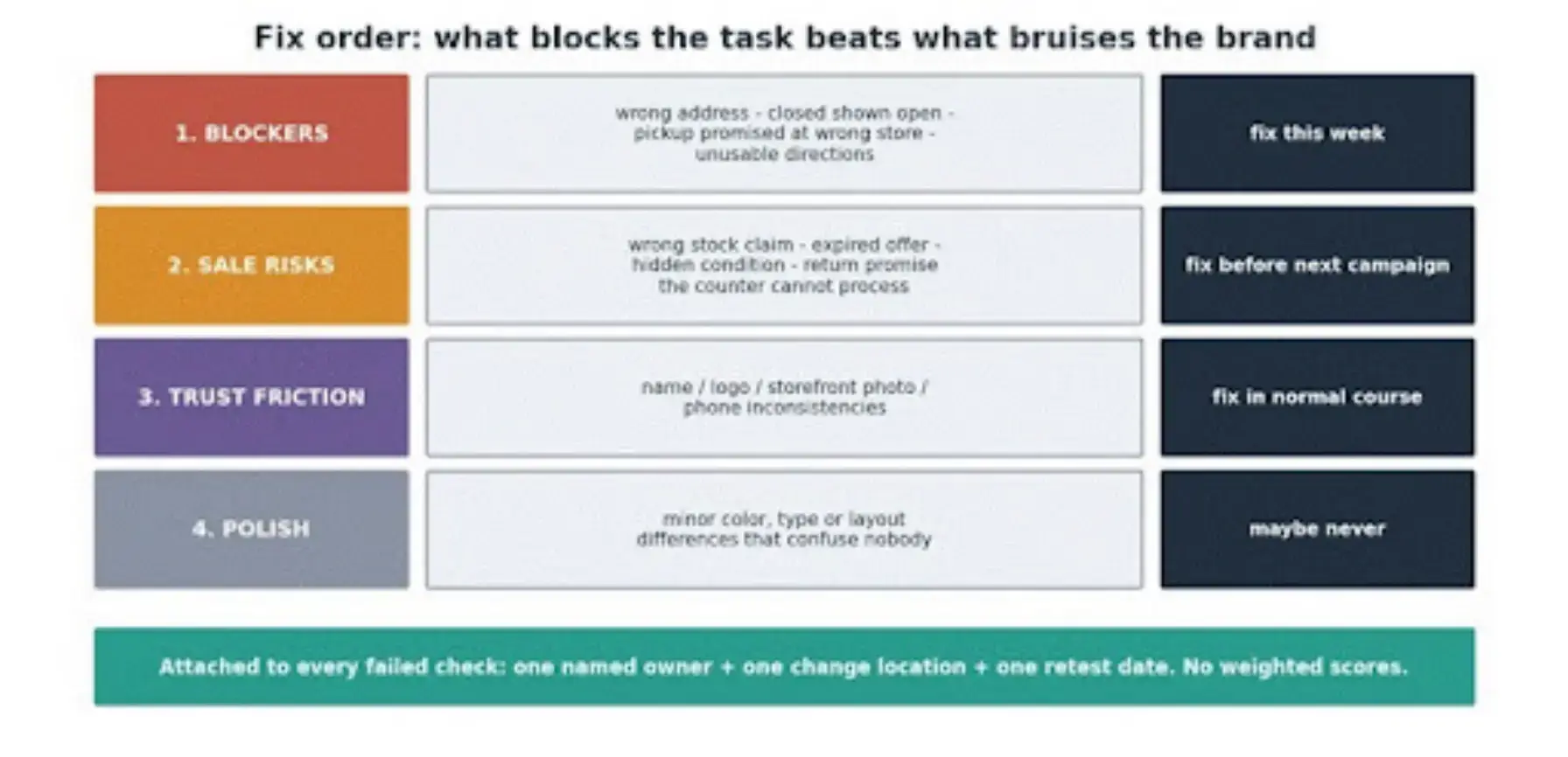
The triage card: blockers, sale risks, trust friction, and polish, each failed check carrying an owner, a change location, and a retest date.
Every failed item leaves with three things attached: one owner, one place the change happens, one retest date. Resist the urge to build a weighted scoring model; a walkthrough with seven photos doesn't need decimal places.
Run the Test Again Before the Next Promotion
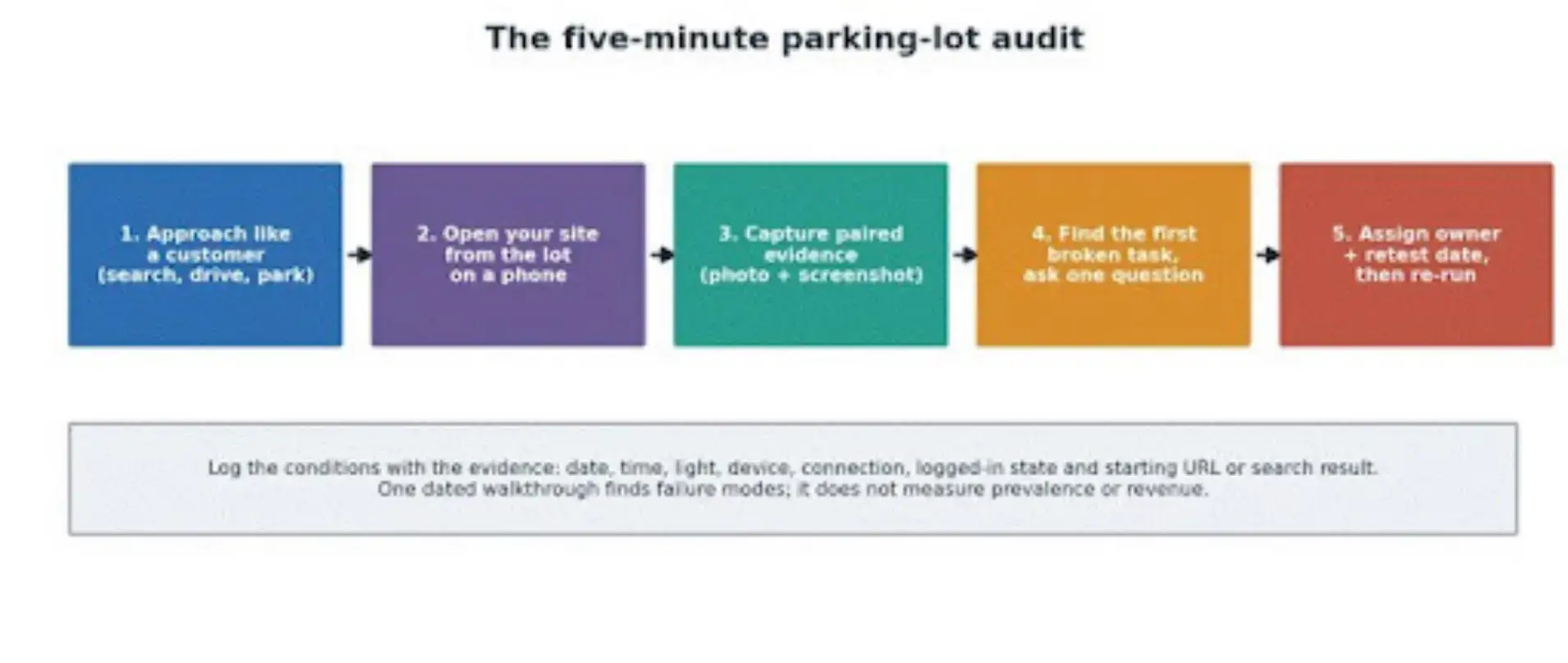
The whole method on one card: approach like a customer, capture paired evidence, find the first broken task, assign the owner, retest on a date.
The audit decays because the store changes underneath it.
Re-run it whenever something structural moves: a new location, seasonal hours, a pickup or returns tweak, a promotion, a rebrand, storefront work.
Keep the photo angles and the starting search identical each time. That way version three sits next to version one and shows progress instead of vibes.
The closing standard is modest on purpose. Your website and your storefront don't need to match in every pixel, and chasing that is how audits die. They need to agree on who the business is, where the customer should go, what's available, and what happens next.
Put the arrival details where the customer already is, on the mobile page, with a POWR Map keeping directions and location details current, then go stand in your own parking lot and open your own website. Five minutes. Bring your phone and a little humility.

Author Bio
Magnus Eriksen is a copywriter and ecommerce SEO specialist with a degree in Marketing and Brand Management. Before embarking on his copywriting career, he was a content writer for digital marketing agencies such as Synlighet AS and Omega Media, where he mastered on-page and technical SEO.