Picture this: You’ve set up an online business, your web design is on point, and the site is running smoothly. Your marketing efforts are paying off, and many interested would-be customers are visiting your website.
There’s only one problem — the actual payment process is a hassle. Think about how you would react in that situation.
After all, simple payment processes are the norm nowadays, and apart from the tangible benefits of streamlining transactions, they also signal trustworthiness and reliability.

In this article:
- Why is UX so Important for eCommerce Websites?
- Streamlining Payments with a Dedicated Button
The fact of the matter is that a dedicated button is a crucial element of user experience nowadays.
Creating a seamless user experience not only increases sales but also boosts your search rankings, as Google rewards sites that are easy to use and navigate.

Why is UX so Important for eCommerce Websites?
UX is important for every website, but it’s especially essential for eCommerce websites. Any flaw or friction point can influence whether a user makes a purchase.
A site with confusing navigation or poor visuals can seem untrustworthy. Good UX helps to build trust, and without that trust, users will hesitate to spend.

Photo by Zyro on Unsplash
Delivering great UX ensures your eCommerce website is easy to use, encouraging customers to complete their purchases and resulting in more sales.
If your site is simple to use and sells products people want, they’re likely to return again and again, favoring your brand over competitors.
The Key Elements of Good UX
When designing an eCommerce website, there are several must-have UX features. Missing these could undermine your entire store, no matter how great your products or brand strategy are.
1. Easy to navigate
If users can’t quickly find the product they want, they’ll likely exit after a few clicks. Poor navigation and slow loading times are leading causes of high bounce rates.
Arrange products into relevant categories and use subcategories for better organization. Include tags and filters so users can search by color, size, brand, and more.
2. Simple, fast, secure transactions
Modern internet users expect lightning-fast transactions.
For new customers, make the checkout process as frictionless as possible. Ideally, the journey from “buy product” to completion should take no more than four pages.
3. Straightforward communication
UX also involves language, content clarity, and how information is presented. All product content should describe the products effectively and give users what they need fast.
It’s also easy to convert HTML to PDF using tools like API Template, allowing users to download or share website content in a convenient format.
Customers should also be able to reach you easily. AI-powered chatbots are now standard for online stores.
Finally, ensure compliance with data protection and privacy laws. It’s best to host your site on PCI-compliant servers to avoid costly legal and security risks.
Streamlining Payments with a Dedicated Button
Streamlined payments are vital for encouraging first-time purchases and repeat sales.
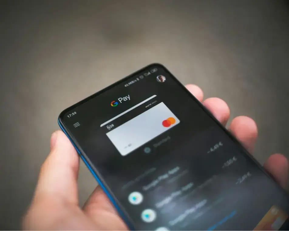
A seamless payment flow eliminates barriers that might otherwise deter customers from buying again. For existing users, a dedicated payment button lets them check out with a single click.
If the customer is logged in, has saved payment details, and enables one-click payments, they can complete a purchase in seconds—creating the perfect buying experience.

Photo by picjumbo.com on Pexels
From the seller’s perspective, one-click payments also reduce cart abandonment. Many shoppers change their minds mid-checkout; a simplified flow minimizes that risk.
The key is transparency—make sure users know single-click purchases are enabled. Always let them opt in rather than make it default.
The Key Benefits of a Dedicated Payment Button
Now that we’ve covered the basics, here are the main advantages of adding a dedicated payment button to your eCommerce store:
- Adding one-click checkouts provides the fastest possible buying experience.
- Customers don’t need to re-enter details for every purchase, reducing errors like incorrect addresses or payment info.
- It leads to fewer abandoned carts since users spend less time reconsidering.
- Encourages smaller, more frequent transactions (like household restocks).
- Acts as a branding advantage by promoting convenience and trust.
- Offers the same level of security as standard payment methods.

Photo by Zyro on Unsplash
Customizing Your Dedicated Payment Button
Even if you’re not a developer, adding and customizing payment buttons is easy, especially with major website builders.
For instance, if you’re using WordPress with WooCommerce or Shopify, setup is simple.
WordPress has over 60,000 available plugins, many focused on payment solutions. Website builders like Wix and Squarespace also make payment button integration effortless.
Conclusion
Speed and convenience are paramount for eCommerce websites.
The hallmark of a smooth online buying experience is a dedicated payment button—allowing customers to complete purchases with a single click, without re-entering details or navigating multiple confirmation screens.
This feature is quickly becoming the norm, enabling faster, more frequent online purchases and driving customer loyalty.


