
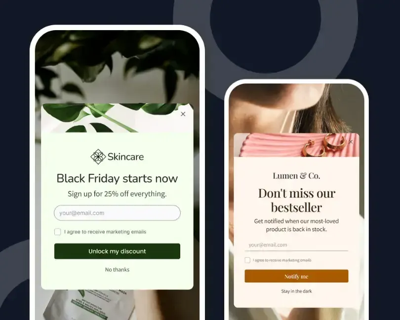
Imagine walking into a physical store where every customer, whether they're browsing for the first time or returning to buy, hears the same sales pitch. It would feel impersonal, and most people would tune it out.
The same thing happens on many Shopify stores.
A visitor lands on a product page, starts comparing options, and within seconds sees a popup asking for an email address in exchange for 10% off.
Another visitor returns to complete a purchase and receives the very same message. Different shopping journeys, identical interruption.
Many merchants spend time tweaking popup timing, colors, or discounts, believing those elements drive better results. The bigger issue is relevance.
A popup becomes useful when it reflects why someone is visiting the store in that moment, not simply because they landed on a page.
The Popup Is Not the Strategy
A popup is only a delivery surface. Its value comes from the decision behind it: who should see it, what should it offer, and when should it appear?
Shopify merchants often spend time adjusting animation, fonts, and discount copy while leaving the audience rule untouched. That reverses the order of work.
POWR’s guide to Shopify lead capture makes a related point: one form cannot serve every stage of the buying journey. The same logic applies to popups.
A message built for everyone becomes vague enough to matter to no one.
You Already Have the Signals to Segment By
Popup personalization sounds technical when it is described as a data project. In practice, a merchant can begin with signals already visible during a store visit.
- Page type: A product page, collection page, blog post, and cart page each reveal a different level of purchase intent.
- Visit history: A returning visitor may need reassurance or a reminder, not another first-order discount.
- Traffic source: A shopper from a product advertisement has context that a direct visitor may not have.
- Cart state: A shopper with items in the cart should see help tied to purchase friction, such as shipping information, rather than a generic newsletter request.
- Device: A message that works on desktop can block too much of a mobile screen.
Shopify also supports rule-based customer segments based on shared customer traits. Those saved customer groups are most useful after identification, while on-site popup rules help shape the experience before or during sign-up.
Merchants should treat both as parts of the same customer logic.
Source: Pexels
Four Visitor Types, Four Different Popups
The goal is not to create dozens of campaigns. Four clear matches cover many Shopify stores without making campaign management difficult.
1. First-Time Product Viewer: Reduce Uncertainty
A new visitor on a product page may still be deciding whether the item fits their needs. A discount can work, but information may be more useful.
Try offering a sizing guide, care guide, comparison chart, or short product quiz. The popup should answer a buying question, not create a new interruption.
Trigger it after meaningful engagement, such as scrolling through product details or viewing a second product, rather than showing it immediately on arrival.
2. Returning Visitor: Continue the Earlier Visit
A returning shopper already knows the store. Repeating the welcome offer wastes that context and may train people to ignore future messages.
Use a reminder tied to recently viewed products, a back-in-stock option, or a prompt to save an item.
The copy should acknowledge familiarity without sounding intrusive. “Still comparing?” is often a better opening than “Welcome to our store.”
3. Cart Visitor: Remove the Last Obstacle
A shopper with products in the cart is closer to purchase, so a broad email signup is poorly timed.
Use the popup to answer the question most likely to stop checkout. That might be delivery timing, returns, payment options, or the order value needed to receive free shipping.
Reserve a discount for cases where it supports margin and customer value. A coupon should not be the automatic response to every pause.
4. Exit Signal: Make One Relevant Final Offer
Exit intent works best when the message reflects the page the shopper is leaving.
A visitor leaving a product page might want a price-drop alert. Someone leaving a guide may want a related checklist.
POWR’s article on using exit-intent popups well explains why timing and relevance matter more than simply displaying a last-minute offer.
Source: Pexels
Personalization Should Protect the Shopping Experience
More targeting does not justify more interruption. A relevant popup can still be badly timed, difficult to close, or too large for the screen.
Google advises site owners to avoid intrusive interstitials that make page content difficult to access, especially on mobile.
That guidance supports a practical design rule for Shopify stores: the shopper should always understand the page before the popup asks for attention.
Use a clear close control, keep mobile layouts compact, and suppress repeated displays after a shopper dismisses or completes the offer.
Legal notices and required consent messages have different purposes, so do not treat them as marketing campaigns.
Build a Small Popup System, Not a Pile of Campaigns
A useful popup plan can fit on one page. For each campaign, record five choices:
- Audience: Who should see it
- Trigger: What behavior should open it
- Offer: What the visitor receives
- Exclusion: Who should not see it
- Success measure: What action counts
This keeps the work tied to a reason. It also makes testing easier because the merchant can change one part without losing track of the campaign’s job.
For stores that need a no-code way to control popup content and display rules, POWR Popup for Shopify can serve as a practical starting point.
Measure the Match, Not Only the Conversion Rate
A popup conversion rate can look healthy while the campaign harms the wider visit.
A deep discount may collect many emails yet reduce full-price purchases. A cart popup may earn clicks while adding friction before checkout.
Review the popup alongside the visitor’s next action. Track:
- Sign-ups
- Offer redemptions
- Checkout completion
- Revenue per visitor
- Popup dismissals
Compare mobile and desktop results because the same creative can behave differently across screen sizes.
Run tests by audience. Combining all visitors into one report hides whether a campaign helps one group and frustrates another.
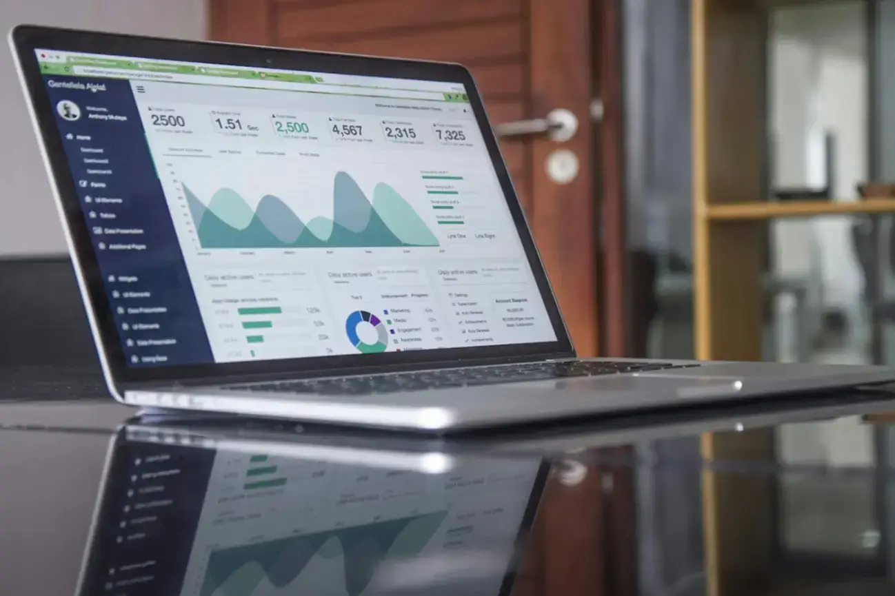
POWR’s Shopify popup setup guide also covers campaign measurement and provides a useful starting point for stores moving beyond a single site-wide message.
Source: Unsplash
How POWR Popup Handles the Four Matches
POWR Popup covers the four matches natively without custom code or theme edits. Intent match runs through the trigger controls: fire on entry, on scroll, after a delay, or on exit intent, and split those triggers by page or product.
Message and offer match come from the template library, which includes over 250 pre-built layouts across discount offers, newsletter signups, and urgency-driven promo prompts. Campaign scheduling lets one variant swap for another when the calendar shifts to a new sale.
Audience match runs through the integrations rather than the popup itself. POWR Popup connects to Klaviyo, Mailchimp, Omnisend, and Zapier, so the email captured by an exit-intent popup lands in the segment that already knows what the visitor was looking at.
Popup analytics on views, clicks, and responses let a merchant see which match is working and which isn't. Without that visibility, iteration turns into guessing.
Start With One Split, Not a Personalization Program
The best Shopify popup is not the one with the loudest offer. It is the one that makes sense at the exact moment it appears.
Merchants do not need a complex personalization program to reach that point. Start with one clear split, such as new versus returning visitors, or product viewers versus cart visitors.
Give each group a message that helps with its next decision. Then measure what happens after the popup, not only inside it.
When the same popup follows every visitor across the store, it signals that the campaign knows nothing about the visit.
Shopify merchants don't need dozens of popup campaigns or complex AI models to create better customer experiences. Small adjustments based on visitor intent often produce more meaningful improvements than another site-wide discount.
When each popup has a clear purpose and appears at the right moment, it feels less like a marketing interruption and more like helpful guidance that supports the shopper's decision.

Author Bio
Arjun is a business growth strategist at WeblineIndia, a software development company. Apart from building long-term customer relationships and boosting business revenue, he is also interested in sharing his knowledge of various technologies through successful blog posts and articles.