
Every merchant I've worked with keeps the same list somewhere: fifteen plausible checkout tweaks, each one somebody's favorite, all competing for the same modest stream of checkout traffic.
Move the trust badges. Shorten the form. Change the button color, again, because apparently that's where conversion lives. What the list never contains is a way to find out which idea is actually true.
That second part changed this spring. Shopify's Spring '26 Editions shipped Rollouts, and with it native A/B testing for themes and checkout configurations, no third-party testing stack required.
One qualifier before anyone gets excited: rollouts themselves are available from the Basic plan up, but running an actual experiment requires the Grow plan or higher.
And one caution, which is really the thesis of this article: Shopify made checkout tests easier to launch, not easier to interpret.
The button is new. The discipline it needs is not. So let's design one worked-first test, end to end, and let the fifteen-item list wait its turn.
What Can Shopify Rollouts Actually Test?
Rollouts can compare checkout configurations, and that part is new. What hasn't changed is the merchant's homework: a clean control and treatment, plus a clear idea of who actually sees each one.
In Shopify's terminology, a rollout carries changes to your main theme, your checkout and customer-accounts configuration, or both.
Eligibility is where first-time experimenters get surprised. The visitors in your test are shaped by three settings stacked together: the launch reach percentage, the markets the rollout applies to, and the experiment's own traffic split, which applies to the eligible visitors rather than to everyone.
Set a 50% reach and a 50% split, and your treatment is seeing a quarter of traffic, not half. Note also that rollouts only cover online-store checkouts, so headless storefronts are out, and that experiments are mutually exclusive, with launches taking traffic first, which means your planned allocation and your effective allocation can differ.
Creating the rollout takes minutes. Write down what the settings actually produce before trusting the result.
And hold the line on one change per treatment. A duplicated configuration with one deliberate difference is an experiment; a redesign plus a new shipping threshold plus an app block is a lottery ticket with analytics.
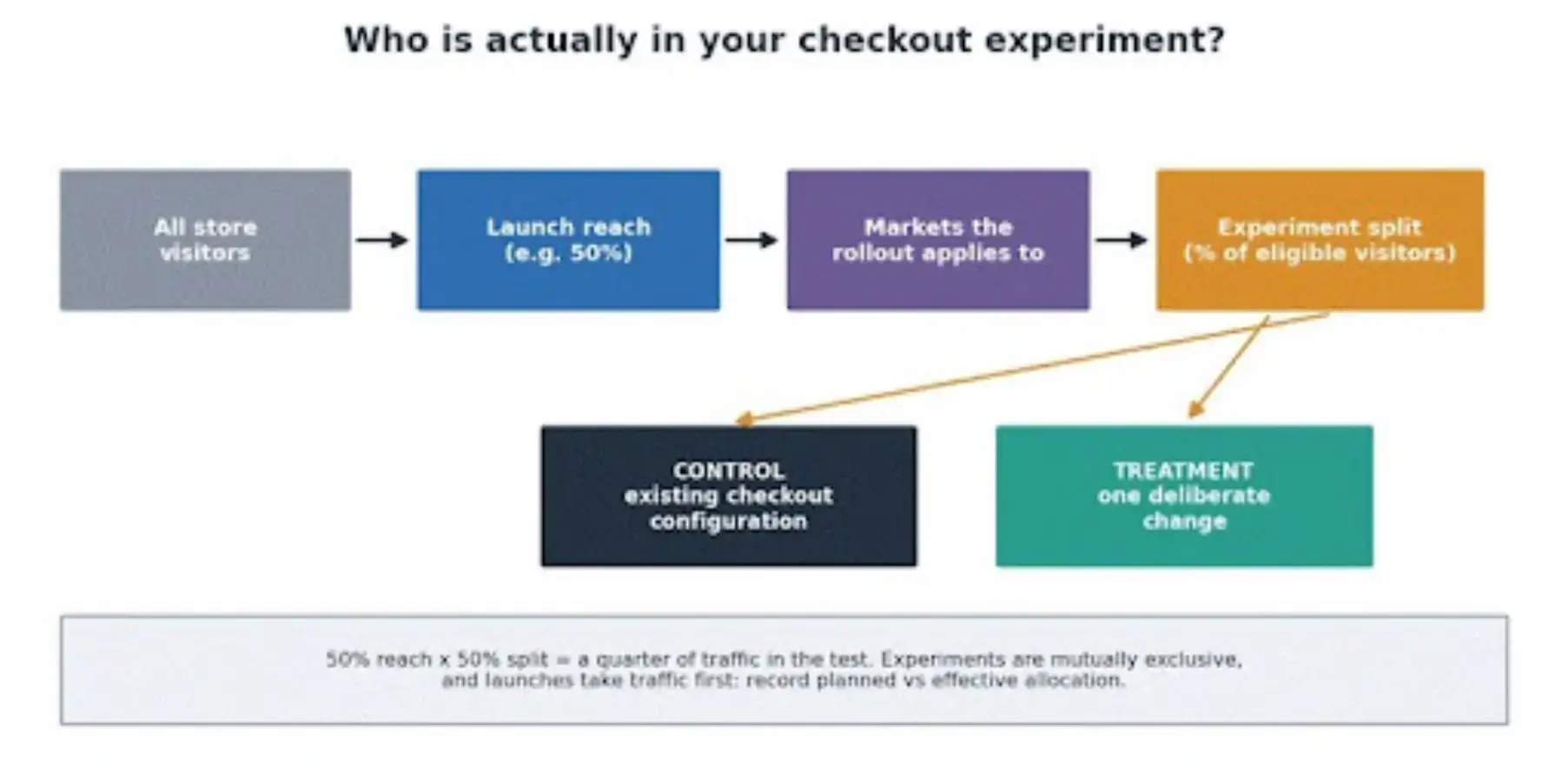
How a checkout experiment's audience is actually determined: launch reach, then markets, then the traffic split, with control and treatment on the far side.
Which Checkout Problem Should You Test First?
The one with the clearest evidence behind it, not the one that's easiest to decorate. Checkout friction leaves fingerprints: abandonment concentrated at the shipping step, support tickets asking when orders will arrive, session recordings of people stalling at the same field.
Our guide to optimizing checkout flow is a solid menu of candidate friction points; treat it as a place to find your suspect, not a list to implement in bulk.
For a worked first test, take the suspect I meet most often: vague delivery expectations. The hypothesis writes itself in five parts. Observed problem: buyers hesitate and abandon when delivery timing stays unclear. Affected audience: checkout visitors in your primary market.
One change: a checkout configuration that makes delivery expectations clearer at the decision point. Expected effect: more completed checkouts. Unacceptable tradeoffs: a rise in cancellations or delivery-related support contacts, because a promise that wins the conversion and breaks in fulfillment is a loss wearing a medal.
If the evidence for your own suspect is thin, collect some before testing. A short customer survey aimed at recent buyers or abandoners will surface what people found unclear, and it belongs outside the active checkout treatment so the research doesn't contaminate the experiment it's meant to inform.
Survey answers generate hypotheses; they don't prove them. That's the experiment's job, and it connects directly to the cart-abandonment groundwork this test is designed to build on.
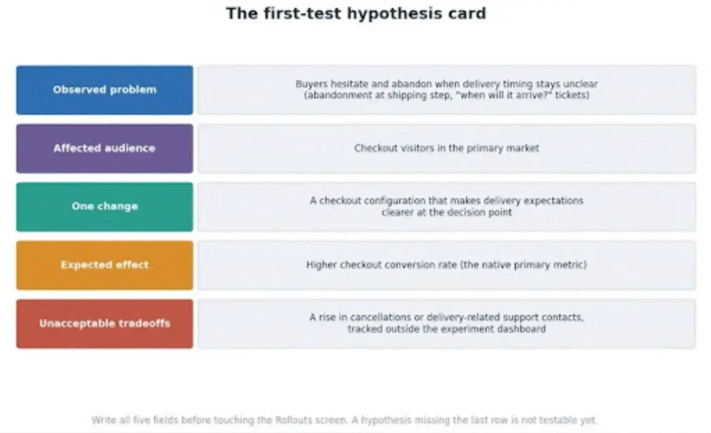
The worked hypothesis card: evidence, audience, one change, expected effect, and the tradeoffs you refuse to accept.
Which Metric Decides the Winner?
Shopify decides this for you, which turns out to be the most instructive limitation in the whole feature.
Rollouts analytics can't be customized, and a checkout-configuration experiment reports checkout conversion rate: sessions with completed purchases relative to visits that reached checkout. That's your primary metric, and honestly it's a sensible one for a checkout change.
It's also nowhere near the whole business. A delivery promise that lifts completion can raise cancellations a week later. A change that nudges conversion up can nudge order value down.
None of that appears in the experiment dashboard, so it has to live on a guardrail sheet you build before launch: average order value and refunds or cancellations from your order reports, failed payments, discount leakage, and checkout-related support contacts from wherever your tickets live, with abandoned checkouts as the before-and-after context.
For each guardrail, write down the source, the owner, the comparison window, and the movement you won't accept. The distinction between conversion and the signals around it is the same one our behavioral science piece keeps circling: a lifted metric is a clue about behavior, not a verdict on the business.
Microsoft's experimentation researchers, who run A/B testing across Bing and Office at a scale no Shopify store will ever need, put the underlying rule in one line in their pre-experiment guidance: "the hypothesis should be falsifiable or provable by the set of metrics considered," as Widad Machmouchi and her ExP colleagues write.
Your hypothesis includes those unacceptable tradeoffs. If nothing on your sheet can detect them, the hypothesis isn't testable yet, whatever the dashboard says.
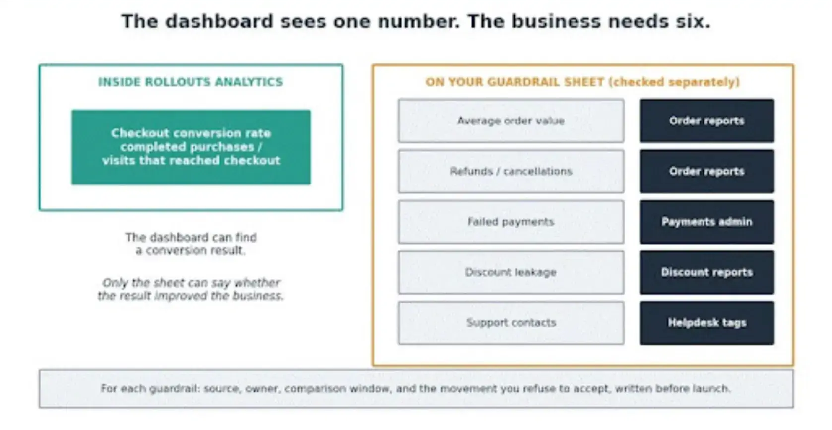
One native metric inside the dashboard, five guardrails checked outside it, each with a named source and owner.
How Do You Set Up the Test Cleanly?
Duplicate, change one thing, then prove the whole purchase path still works before a single real visitor sees it.
Shopify's draft checkout configurations exist for exactly this: copy the published configuration, make the delivery-clarity change, and leave everything else untouched.
Then run test orders through the treatment, on mobile first since that's where your traffic probably is, and confirm payment, shipping, and tax behavior all survive contact with the change, and that your analytics keep recording through both variants.
The last preflight item is the calendar. Any other launch, experiment, app install, or theme change that touches the same traffic during your test window is a confound you invited.
Check what else is scheduled, remember that launches receive traffic ahead of experiments, and record the planned versus effective allocation on day one so nobody's confused later about what the percentages really were.
How Long Should a Shopify Checkout Test Run?
Longer than feels natural, and no, there isn't a universal day count, whatever a CRO listicle promised you.
The tempting shortcut is watching the dashboard until it turns green and declaring victory, and it's precisely the shortcut that manufactures false winners. Early results swing on small numbers; repeated peeking converts those swings into decisions.
Microsoft's during-experiment guidance treats mid-flight results as monitoring, not verdicts, and its alerting work exists because even instrumentation can lie.
Decide the stopping condition before launch, then let the test be boring. And if your volume makes the math bleak, that's information too: test a bolder change with a bigger expected effect, or gather evidence by survey and interview instead of running an experiment your traffic can't power.
What Should You Check After a Winner Appears?
Data quality first, celebration later. The order matters. Start with allocation and instrumentation: did the traffic split roughly match the plan, and did anything change mid-test?
Then the primary result: how large is the checkout-conversion difference, and does it hold across the full window rather than one lucky week? Then the guardrail sheet: order value, cancellations and refunds, payment failures, support contacts, each checked at its named source. Then any segments you planned, mobile versus desktop being the usual suspect.
Only after all four does the real decision arrive: ship it, rerun it bigger, or reject it. Microsoft's post-experiment guidance draws the line this article has been drawing throughout: a detectable result and a worthwhile result are different findings, and only the second one deserves a rollout.
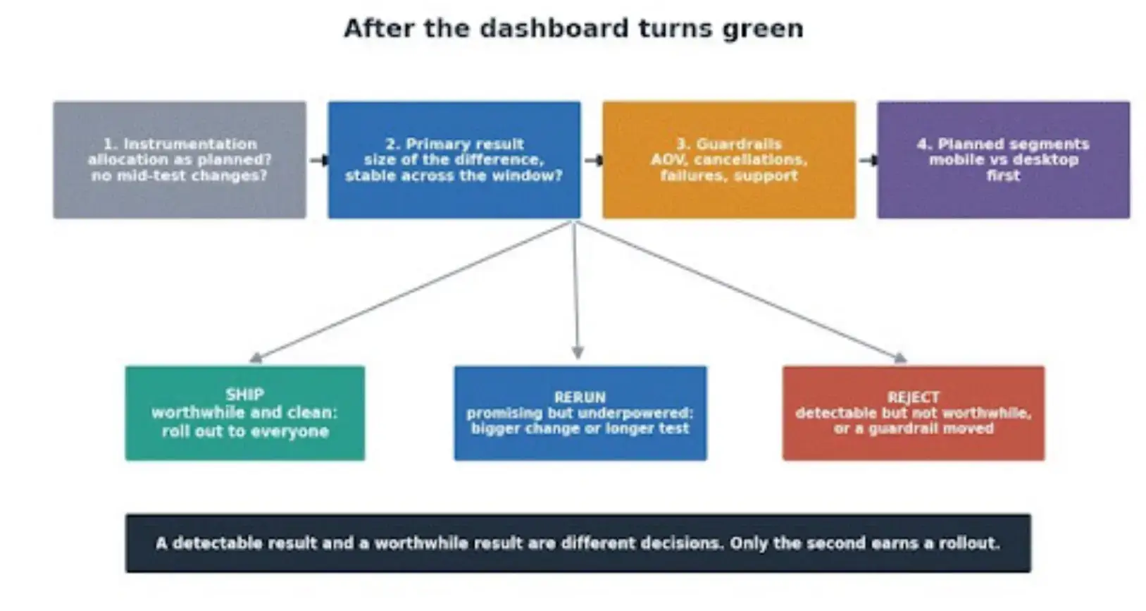
The post-test sequence: instrumentation, primary metric, guardrails, segments, then the ship, rerun, or reject decision.
Make the First Test Boring Enough to Trust
Here's the experiment card this whole article has been filling in, and it fits on one page: one friction signal backed by evidence, one checkout change, checkout conversion rate as the primary metric, a guardrail sheet with named sources and owners, a preflight that proved the purchase path, and a stopping rule written before launch.
Run that once, and you own something rarer than a conversion bump: a result you can explain to anyone who asks, including yourself in six months.
Before designing the next test, ask the people who just went through your checkout what was unclear.
Our Customer Survey makes that a ten-minute setup on any Shopify store, and the answers will hand you a better second hypothesis than any list of tweaks. Button-color theatre will always be cheap and available. A result you can explain is the thing that compounds.

Author Bio
Magnus Eriksen is a copywriter and ecommerce SEO specialist with a degree in Marketing and Brand Management. Before embarking on his copywriting career, he was a content writer for digital marketing agencies such as Synlighet AS and Omega Media, where he mastered on-page and technical SEO.