Despite popup forms gaining bad popularity, brands continue to use them on their website. Why? Because a recent study by AWeber revealed that popups drove 1,375% more email subscribers than a sidebar opt-in.
You can easily create interactive email popup forms using a popup builder and integrate your lead data from your popups with your email marketing software. It's that easy!
So, why isn't it converting for you? Or are you simply skeptical about giving it a shot?
What is an Email Popup?
An email popup is a simple yet effective way to gather email addresses from people who visit your website. They can be used as a lead collection tool to further nurture through automated email nurture campaigns.
Have you noticed that sometimes when you are browsing a site, a form pops up unexpectedly? That's what a popup form is. It darkens the page with an offer and requires you to submit your details or close the form.
Additionally, email is a great way to keep your customers engaged, update them on your products and services, and build lasting relationships.
Overall, email marketing is more effective at converting customers compared to other media. This is why you shouldn't rule out the option of using popup forms to start building your email list.
Best Practices For Using Pop-Up Forms to Grow Your Email List
Instead of completely ruling out popup forms as obnoxious, they could just be bad popups that people find annoying.
There's a right and a wrong way to do it. However, while creating an email popup, you should remember that the ultimate objective is to convince website visitors to share their contact details.
But how? Follow these best practices to collect data and grow your email list effectively.
1. Display your popups at the right time
As soon as you land on a website, a popup comes through. How annoying that can be. You would simply close it down even before giving it a second thought. This is why timing plays a crucial role in deciding when to trigger popups.
Ideally, you should give your visitors a chance to engage with your content before throwing your popup form on their faces.
To begin with, you can experiment with 50% of your average time on a page. That means if a visitor spends one minute viewing your page, you can show your popup form right after 30 seconds.
Using a marketing automation tool, you can track how users interact with your popups. For example, you can test different delay settings on your email marketing software to find what works best for your visitors.
2. Offer an incentive to boost subscriptions
If you interrupt someone while they are browsing, it should at least be compelling. After all, who doesn't love free stuff or attractive offers?
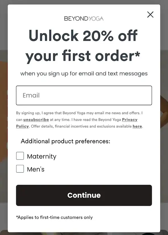
If you are an ecommerce brand, you can quickly expand your email list by offering discount coupons, promo codes, and free delivery.
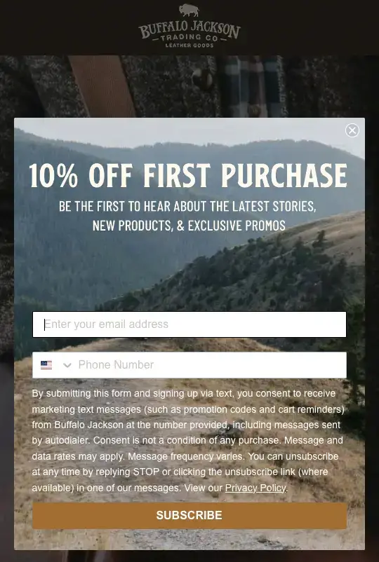
Buffalo Jackson, a company that makes custom leather products offers their customers a discount through a targeted popup. Here's what their popup looks like:

Similarly, if you are a SaaS company, you can give out free resources that persuade them to join your email list. This resource could be ebooks, whitepapers, exclusive access to your community, and more.
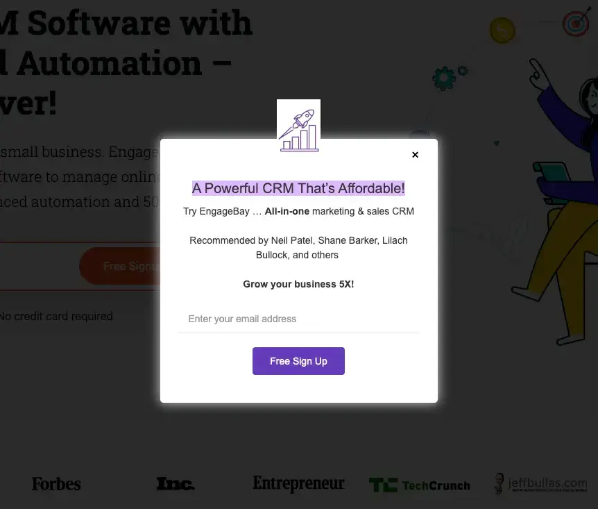
EngageBay, an all-in-one CRM platform, offers visitors a free signup to evaluate whether the software fits their business needs. It's a win-win for both the company and the customer.
The potential customer can try it before buying. The company can collect their lead email details and further nurture them throughout their buying journey.

Incentives don't have to be financial rewards alone; they must be valuable. If you have a great piece of content to offer, use it to grow your email list.
These offers are referred to as 'lead magnet' because they help attract visitors/leads interested in your product or service. In addition to growing your email list, you expand your pool of potential customers.
3. Have a clear message on your pop-up form
You don't want to beat around the bush when displaying an email popup form.
Clearly state what information or offer you are giving out in exchange for their email address. Also, remember that visitors are here to browse your content; you don't want to disrupt their experience.
Thus, you should aim to go straight to the point with your popup and allow them to leave as fast as they want to. Moreover, aligning the offering or message in your popup with the content of your page increases the chance of signup.
4. Find the right tools
If you want to effectively use your popup form to grow your email list, you need the right tool to manage your popups.
For instance, POWR offers an easy-to-use template that allows you to create an interactive popup.
You can also optimize your popups for a specific target audience, keep track of your signups, and connect leads with sales.
You can gather lead data and use it to initiate email marketing campaigns as soon as a visitor enters their email address in a popup form.
How Do I Make an Email Pop-up Form?
The next step is learning how to create a popup form for higher conversion. Here are a few tips to keep in mind while designing a popup form.
1. Be mindful of the number of fields in your form
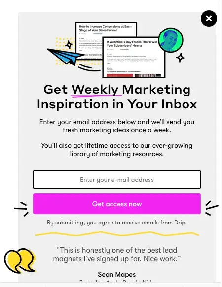
You might be tempted to collect as much information as you want from your visitors. But research by Drip shows that five-field forms have the lowest conversion rate, while one-field forms have the highest.

You can, of course, request a name, which will help you personalize your emails to subscribers. But when designing your popup form, only ask for what's most essential and nothing more.
Remember, the easier the form is to complete, the more likely visitors are to share their data.
2. Keep the design clear to understand
We are referring to design as the color palette here. You do not want to mix many colors while designing your popup.
While colors can help grab attention, the popup form is already placed on the screen, which can be hard to ignore. So stick to a small number of color combinations, preferably three to four.
One bright color could be used to highlight the headline, where you mention your offering. The second bright color will help you highlight your CTA button. The rest of the area, where you mention different fields and other text, can be done in a slightly lighter tone.
3. Use clear CTAs
A CTA button is what ultimately persuades visitors to take a specific action. Therefore, the ideal rule is always use an actionable verb in your CTAs.
Examples include sign up now, buy now, subscribe, download for free, and more.
Additionally, strategically placing CTAs can increase your overall conversion rate and ultimately grow your email list. So grab your users' attention by keeping your CTA clear, short, and concise.
The second most common CTA on a local business website is to call. Therefore, regional businesses should focus on listing their local details such as local phone number, address, and active email.
Examples:
- "Call Now"
- "Email Us"
- "Toll-Free Number"
4. Make it mobile-friendly
Another important aspect of building an email popup form is ensuring it is mobile-responsive. This means that when a user browses your website on their smartphone, it doesn't appear cluttered or misshapen.

A mobile-friendly popup means the form doesn't occupy the full screen. Additionally, there's no need to scroll to complete the form or read the full form.
Before you release your pop-ups, check how your final popup form will appear on mobile and tablet.
5. Always include images
Is it necessary to include an image for a popup? Not necessarily!
But including an image can make your form more appealing. For example, if you are a product-based company, you can easily include a product snapshot. Or, if you are offering a content piece, you can use an illustration of that content.
What you are offering becomes crystal clear when you use an image. Your eyes immediately shift to the image, allowing your users to quickly claim the offer you are providing.
Wrap Up
Popup forms are an effective digital marketing tactic for growing your email list on your website. There are various popup forms, including a floating bar, full-screen, lightbox, and slide-in.
These pop-ups directly impact your conversion rate. It allows you to reach more prospects and nurture them to become paying customers.
Follow these best practices to increase the likelihood of converting your website visitors into subscribers.

Author Bio
Nikita Agarwal is a content strategist, editor, and published poet, creating content primarily for SaaS companies. She writes on topics related to business, technology, and branding. In her leisure time, you will find her binge-watching TV series or exploring new cafes in town. You can find her on LinkedIn.

