If you want to welcome any web visitors to your site, it’s a good idea to look into how to make your website more accessible and inclusive. We’ll cover some of the best web design practices to help you achieve that.
In this article:
- Why Do Accessibility and Inclusivity Design Matter?
- 9 Web Design Practices for a Good User Experience
- Bonus Practice: Improve login page design and security
2. Add alt text to your images
3. Have a proper contrast
4. Add captions and transcripts to videos
5. Use descriptive labels with form-fields
6. Add proper content structure
7. Use correct content markup
8. Prioritize text clarity
9. Use plugins with proper design and functionality
Why Do Accessibility and Inclusivity Design Matter?
Before we go over some inclusive and accessible design approaches you should apply to your website, let's take a step back and understand where it all begins.
At the core of crafting an inclusive and accessible digital space lies an essential aspect: User Interface (UI) design. UI design isn't just about aesthetics; it's the very foundation upon which the principles of accessibility and inclusivity are built. Integrating the best web design practices ensures your site is welcoming to all users.
Collaborating with a professional web design agency can ensure your website meets accessibility standards while delivering a seamless user experience for diverse audiences.
And now, let's discuss the importance of these changes -
According to Sytian Productions, inclusivity and accessibility in design is more than a design “trend.”
Creating an accessible and inclusive website helps everyone, regardless of their abilities or disabilities, have a positive user experience on your website.
Accessible design involves designing websites that individuals with visual impairments, hearing impairments, motor disabilities, or cognitive limitations can use easily.
This design includes providing alternative text for images, using clear and readable fonts, implementing keyboard navigation options, and ensuring compatibility with screen readers.
Inclusive design goes beyond accessibility by considering the needs and preferences of diverse user groups.
This shift may incorporate features such as Hiragana, adjustable font sizes, color contrast options for visually impaired users, and language translation capabilities for non-native speakers or individuals with limited language proficiency.
This is why choosing the right web design software is crucial—it ensures accessibility features like color contrast checks, making your design work for everyone.
By embracing accessible and inclusive design principles in web design, you not only enhance the user experience for all visitors but also tap into a more extensive audience base.
Additionally, it demonstrates your commitment to social responsibility and equality.
Now that you know how relevant and vital it is to adopt, here are some design practices you can use to do some website optimization and make your website inclusive and accessible to as many people as possible.
1. Enable keyboard navigation

One thing that you can apply to your website’s design that would help with accessibility would be keyboard navigation.
Keyboard navigation allows individuals who cannot use a mouse or other pointing devices to navigate through your website using only Keyboard Shortcuts. This navigation benefits people with motor disabilities, visual impairments, and those who rely on assistive technologies such as screen readers.
By enabling keyboard navigation, you provide an alternative means for users to access your website’s content and functionalities.
This navigation ability promotes inclusivity by removing barriers that may prevent specific individuals from fully engaging with your site.
Furthermore, keyboard navigation enhances the overall user experience for everyone. It allows faster navigation between website sections without relying on precise mouse movements. Users can quickly jump from one interactive element to another, improving efficiency and reducing frustration.
2. Add alt text to your images
The images on your website are an essential element that helps visitors better understand your website and its content.
However, people with visual disabilities may have a more challenging time appreciating them or understanding your website if you rely on the images to communicate your message. That’s why you should learn to add alt text to your images. Alt text should describe your image, but only images crucial to your content.
You can even use AI to enhance your images and have it add the correct meta tags to it and alt text that is beneficial to visually impaired people. This simple addition allows individuals with visual impairments or those using screen readers to understand the context and purpose of the image.
By providing alt text for images, you ensure that everyone, regardless of their abilities or disabilities, can access and engage with your website’s content. This addition improves user experience and opens up opportunities for reaching a wider audience.
Moreover, incorporating alt text into your web design aligns with the principles of accessible and inclusive design. It can be an opportunity to add more keywords and improve SEO in a minor way.
3. Have a proper contrast

Some people’s visual impairments don’t mean that they are entirely blind. However, it might make it more difficult to discern specific details in your website if you don’t correctly design your site.
For example, if the colors are too similar, it might make it difficult for people with specific visual issues to differentiate critical details.
It would be best to incorporate proper contrast in your web design whenever possible.
Contrast is crucial in ensuring that text and essential elements stand out against their background. Individuals with low vision or visual impairments can better read and understand the content more easily.
Choosing colors that significantly differ in brightness or hue ensures that text is legible and visible to all users. Moreover, contrast also aids in improving the overall user experience by guiding users’ attention to critical elements on the page.
Users can quickly identify where to focus their attention when there is a clear distinction between different sections or interactive elements. This design benefits individuals with cognitive disabilities or difficulty navigating complex layouts.
Related articles on design tips:
Choose colors wisely, create clear distinctions between elements, and ensure that text remains legible against its background.
4. Add captions and transcripts to videos

Video content is a great way to engage visitors to your website, but it’s also challenging to consume for those differently-abled individuals visiting your site.
People using screen readers to go through your content can better understand the video by adding captions and transcripts to videos.
It can also be helpful for people who are hard of hearing and can’t hear the audio of your videos.
5. Use descriptive labels with form fields

Some parts of your website might be where someone needs to fill in the information. It’s common in places like the checkout process and when someone signs up for a membership or a newsletter.
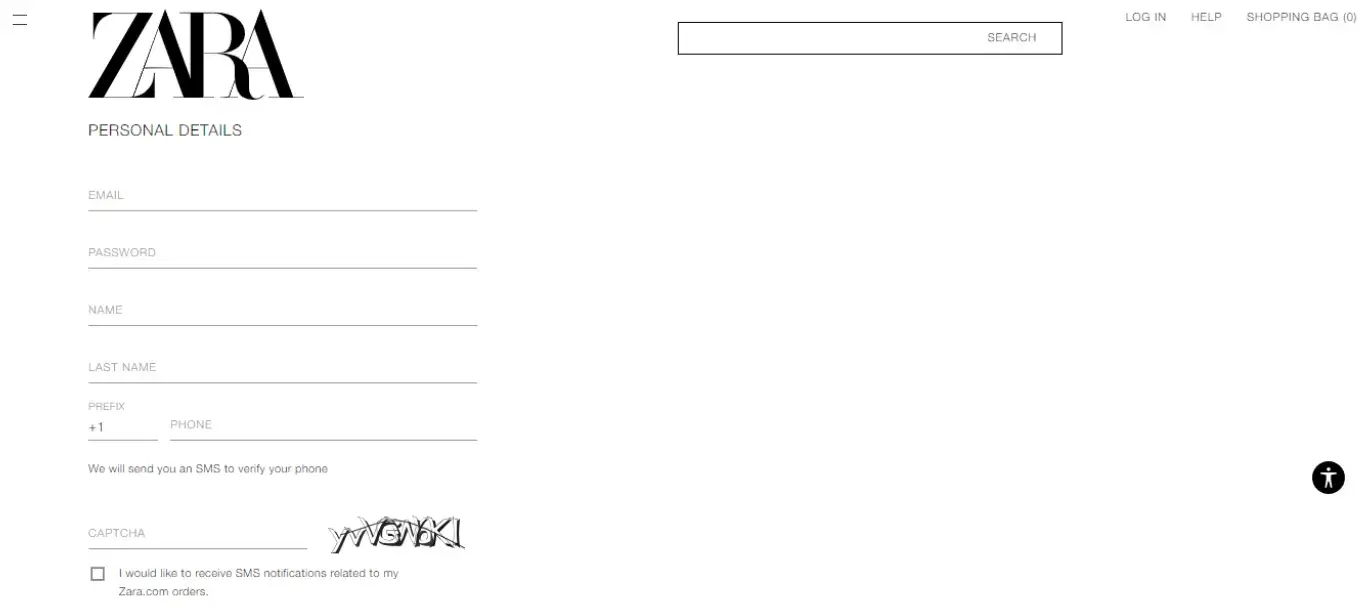
It’s a good idea to ensure you have descriptive labels and descriptions of form fields that aren’t inside the form fields themselves.
For example, suppose you’re running an ecommerce store. In that case, you can make your differently-abled ecommerce customers feel more valuable by adding descriptions to labels of form fields when they’re checking out.
6. Add proper content structure

As mentioned earlier, some visual impairments might make it difficult for people to read written content. You can prevent this issue by ensuring proper content structure and spacing between content so the written text doesn’t blur together.
Also, some screen readers might change the cadence of your content based on how you space them. Properly structuring your content might make it easier to understand if something dictates it to someone, like through a screen reader.
7. Use correct content markup
Proper content structuring won’t work if you use incorrect content markup on your website.
By correctly structuring headings, paragraphs, lists, tables, and other elements with semantic HTML tags, you provide clear navigation and comprehension cues for assistive technologies.
Additionally, proper content markup enables responsive design across different devices and screen sizes. This step ensures your website can adapt seamlessly to various platforms without sacrificing accessibility or user experience.
Moreover, search engines rely on well-structured markup to better understand your content’s context. Using semantic tags appropriately and incorporating relevant metadata like alt text for images or video captions enhances search engine optimization (SEO) while improving accessibility.
8. Prioritize text clarity
Written text is a common challenge for people with visual impairment, so it’s a good idea to prioritize text clarity in your web design for startups.
You want the words and letters to be legible from one another. You also want to ensure that your blocks of text together are easy to read.
Your font size and word spacing, and paragraph spacing are also some parts that you should pay attention to when improving text clarity.
9. Use plugins with proper design and functionality

If you add plugins to your website, ensure they come from a reputable web development company with a track record of delivering suitable designs and functionalities.
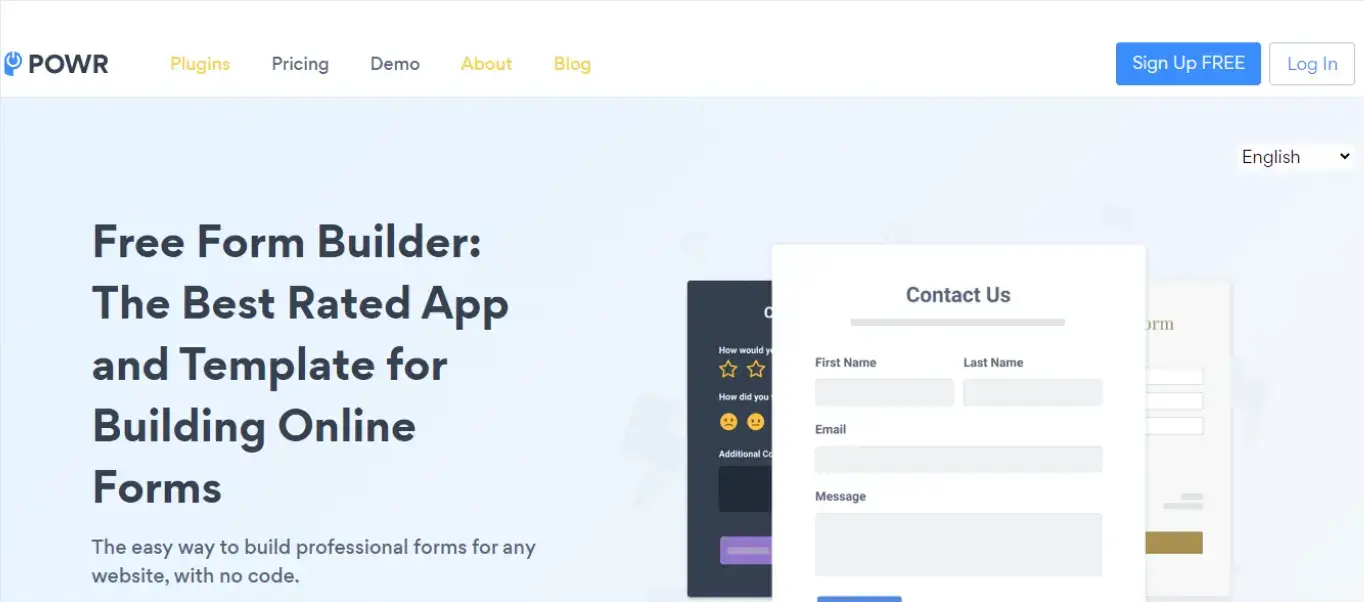
In some cases, you can even use plugins like this Form Builder that already come with the proper design to ensure that your website is easy to use for everyone.
You can even install plugins that automatically change your site to adopt some of these accessibility web design practices. That way, you don’t have to make these website changes manually.
Bonus Practice: Improve login page design and security
A well-designed, secure login page is more than just an entry point—it’s a crucial touchpoint for building trust and brand recognition. Customizing login pages with elements like logos, colors, and taglines reinforces brand identity and ensures consistency across the website.
Data breaches can cost businesses millions and erode customer loyalty.
In May 2020, EasyJet revealed that a sophisticated cyberattack exposed the sensitive information of 9 million customers, including the credit card details of 2,200 individuals.
This breach resulted in financial losses, potential regulatory fines, and a loss of customer trust. The UK Information Commissioner's Office (ICO) investigated the incident, and EasyJet faced a potential fine of up to 4% of its annual turnover—approximately £252 million for 2019.
This example highlights the importance of protecting sensitive information, as breaches not only harm finances but also damage brand reputation and customer loyalty.
Using a WordPress plugin for customizing login pages allows businesses to seamlessly integrate branding with advanced security measures, creating a user experience that is both professional and secure.
Features like reCAPTCHA, Social login, Login redirects, and Limited login attempts protect user data and deter unauthorized access.
A well-designed login page ensures a seamless user experience, enhances brand identity, and safeguards users against potential threats, making it a key design practice for any website.
Conclusion
These practices make your website easier to use for people with specific impairments and disabilities while still making it suitable to use for those without impairments.
All websites should be optimized to fullest, accounting for any type of user from anywhere, regardless of your industry or product offerings. That’s why it’s a no-brainer to take the time to also make your site accessible and inclusive.
Author Bio
Kenneth Sytian is the Owner and CEO of Sytian Productions. He is a Philippines web developer who has been designing websites and developing web apps for over a decade. He is the driving force behind the company and an influencer in the web design and development industry in the Philippines.


