Design is a powerful weapon in your business arsenal, no matter how you look at it. From building a stellar brand identity to running successful campaign ads and gathering a loyal following on social media platforms – none of this would be possible without graphic design.
The one thing people (and even some designers!) don’t realize is the role graphic design plays in SEO. You can link-build and keyword all day, but if you’re guilty of any of the following graphic design faux pas, you’ve negatively impacted your search ranking. Let’s dive in and gauge whether you might be an unknowing guilty party:
9 Biggest Design Mistakes That Impact Google Search Ranking
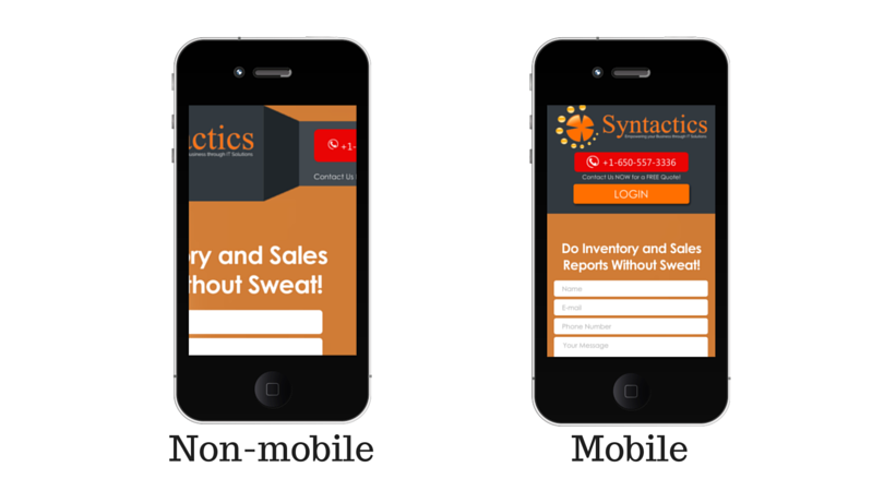
1. Your website and images are not mobile-friendly
A decade ago, this could still be a forgivable act of self-sabotage. But this mistake today can hammer the proverbial digital nail in your business’s coffin. The latest statistics show that 90% of the global population uses mobile phones to access the internet.
When mobile and desktop enter the usage ring, mobile is the clear winner, generating 54.25% of all online traffic compared to desktop’s 42.9%. If your site and images are not 100% mobile compatible, you can expect a little Google demotion. This is due to the mobile-first indexing that Google instated in 2020.
A few things that you need to keep in mind when designing for mobile are the following:
- Use geometric shapes and abstract patterns
- Use plenty of light and dark contrast colors
- Set the brightness to the minimum
- Keep the quality high. Just because you’re designing for a smaller screen size doesn’t mean it should be done at the cost of quality.
- Always keep the user experience in mind. That should always be a top priority.
2. You still believe size doesn't matter
Maybe size doesn’t really matter behind closed doors, but it matters a LOT above the fold. The fold refers to the bottom of your screen before scrolling on a specific website. You might’ve noticed that most websites boast impressive banners that sometimes take up the entire screen.
This is where the sneaky Google algorithm often trips up newbies. Unlike the good old days of content marketing, your website page copy (no matter how strategically optimized) no longer automatically becomes “the chosen one” regarding SEO.
Now, LCP (Largest Contentful Paint) is the king of the SEO castle. LCP is when the algorithm scans the page above the fold to identify the largest content element. In the case of most modern websites with those gigantic trendy banners, it’s images.
Then it measures the time the content loads on the site. You get ranked by order of good old-fashioned race rules – fastest first. To be in the running for first place, you must ensure that all these images have been optimized and compressed.
The same rule applies to the rest of the images on your website. The larger the image files, the longer it takes to load, and will inevitably negatively impact your website loading speed. According to recent studies, a page shouldn’t take longer than 2-3 seconds to load; otherwise, users might abandon the action altogether.
3. You don’t understand how text on images work
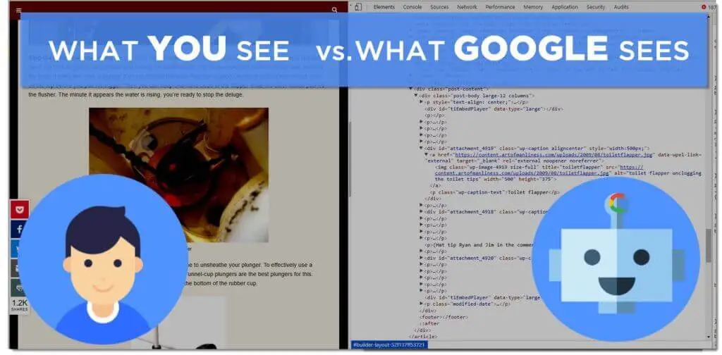
Yes, we can all see and read the text on your image, but the algorithm can’t. The algorithm sees everything as just one big image file unless specifically layered.
That means that your image text (even if it’s extremely catchy, valuable information containing your main keyword) will count for naught regarding your SEO. So what should you focus on when creating images with text?
- Always add your alt attributes. This can be done when uploading the images to a particular platform. This essentially acts as a text description of the algorithms.
- Stop putting addresses, contact details, and other business info on unresponsive images. People won’t be able to click on it or copy and paste it, and this entire exercise is frustrating.
- Do a proper audit on all your image text every couple of months to ensure that you’re still on the right SEO track. There are plenty of online tools you can use for this.

Source
4. You have no product or service page
Not only do these pages filled with images give an individual a better idea of what your product or services actually translate to in real life. But these pages and their images are crucial for ranking for industry keywords. Most also put all their services and products on one page.
This is a big mistake since the algorithm ranks each page separately based on its content. Therefore, it’s obvious that it would be better to divide your pots and pans into numerous pages consisting of pots and pans, then subdivide each in terms of brands, etc. The same rule of thumb applies to services.
5. You have popups that mess with the user experience
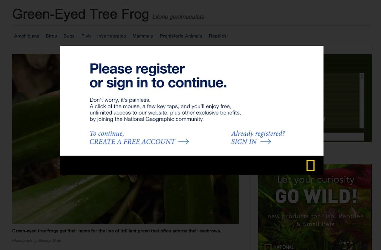
Ever tried reading an article while constant popups keep blocking your view? Does it feel like you’re eternally clicking on crosses attempting to get to the information you came for in the first place? Well, that’s a pretty good example of pop-ups that are not optimized and are being over-used.
Google has already rolled out the interstitial update in 2017, which states that the algorithm will always prioritize the user experience regarding rankings. That means the more your popups disrupt the user experience, the lower your rank on the search engine.
6. You’re still using auto-play
The moment video gathered momentum, it was like the floodgates opened – from social media platforms to websites. Static or responsive image banners were replaced by video content set to play automatically. Cue disaster waiting to happen.
Many find it incredibly annoying (imagine trying to sneak a peek during a meeting and then being caught out by a noisy video set on autoplay!).
And since mobile usage is so high these days, many individuals complained that companies had no respect for their mobile data usage and its costs. And let’s face it – we’re not always within Wi-Fi range.
7. You disregard psychology
A big part of getting that ranking boost is traffic. The more traffic to your website, the more the algorithm assumes people like your content and gives you a little nudge up the search results. But to have a steady traffic flow on your website, you need to attract people there first.
There are various ways to do that, the most common these days being social media and PPC ads. But these kinds of advertising campaigns need graphic design images. And not just graphic design images – images tailored to your target audience. To do that, you can’t ignore the psychology of design.
Suppose your brand targets those interested in upmarket real estate investment. In that case, your target audience will definitely not be attracted to cartoon-like, silly fonts and bright, neon colors.
Similarly, a parent searching for a crèche for their baby is not very likely to click on the ad where the image is in greyscale and sporting some fancy calligraphy font.
Part of why this is such a common occurrence is that people tend to design their brand identity and marketing collateral based on their preferences, likes, and dislikes and not their target audience's preferences. This is a mistake that can end up costing you dearly.
8. You use clickbait tactics in your social media marketing
It should come as no surprise that many unethical companies use questionable marketing tactics. One of these sly tactics can cost you dearly regarding your social media business pages and accounts, as well as website ranking.
You have probably experienced this annoying strategy yourself. Imagine scrolling through your newsfeed and seeing an image of a real-life mermaid lying on a local beach.
You know it can't possibly be true. Still, when the copy reads "Look what we found today!" with a link attached, you can't resist the temptation to at least check it out. You click on it… only to be on a cryptocurrency broker's website. You have clearly been misled by the imagery used.
And it’s even more apparent that the photo had to be doctored by a graphic designer proficient in photo editing software.
This sneaky tactic is called “clickbait” and has formed a large part of social media content now known as “fake news”. Both the social media and search engine algorithms have been set to harshly penalize those guilty of this marketing ploy.

Source
9. Your mistakes lead to a high bounce rate
If you look at all the above-mentioned mistakes and their consequences, it’s almost hard to believe that they can have even more damaging consequences.
Unfortunately, that is exactly the case. A high bounce rate is one of the biggest SEO killers in the cyber world. Your bounce rate is determined by the time people spend on your site before leaving. The shorter their time before "bouncing" out of there, the worse your ranking gets.
If you take any of the mistakes mentioned above, such as annoying pop-ups, a slow-loading website, etc., how long do you think someone will stay on your site? They’ll probably leave as fast as their bandwidth allows.
The importance of design when it comes to your SEO is abundantly clear. And in a world filled with stiff competition, you (quite literally) cannot afford to ignore it.
Audit your site and socials and see if you are guilty of any of the major mistakes mentioned in this article. Remember, it’s never too late to start walking the SEO straight and narrow and make your business the success you’ve dreamed of!
------------------------------------------------------------
Author Bio:
Gizela has over 17 years of experience within the Digital Marketing sphere. She has come a long way, from having her creative writing published for the first time at 9 to becoming a thought leader within the marketing industry. She has traveled extensively, working in many of the most prominent agencies globally, and has consulted for many international brands.


